Ecosyste.ms: Awesome
An open API service indexing awesome lists of open source software.
https://github.com/chulwoo-park/timelines
A powerful & easy to use timeline package for Flutter! 🚀
https://github.com/chulwoo-park/timelines
dart flutter flutter-package flutter-ui flutter-widget flutter-widgets timeline timeline-component timelines
Last synced: about 2 months ago
JSON representation
A powerful & easy to use timeline package for Flutter! 🚀
- Host: GitHub
- URL: https://github.com/chulwoo-park/timelines
- Owner: chulwoo-park
- License: mit
- Created: 2020-11-16T13:35:48.000Z (over 3 years ago)
- Default Branch: main
- Last Pushed: 2023-02-06T17:24:53.000Z (over 1 year ago)
- Last Synced: 2024-01-29T22:46:59.505Z (5 months ago)
- Topics: dart, flutter, flutter-package, flutter-ui, flutter-widget, flutter-widgets, timeline, timeline-component, timelines
- Language: Dart
- Homepage: https://pub.dev/packages/timelines
- Size: 3.26 MB
- Stars: 676
- Watchers: 8
- Forks: 136
- Open Issues: 22
-
Metadata Files:
- Readme: README.md
- Changelog: CHANGELOG.md
- License: LICENSE
- Code of conduct: CODE_OF_CONDUCT.md
Lists
- awesome-flutter - Timelines - Powerful & Easy to use timeline package by [Chulwoo Park](https://github.com/chulwoo-park). (Components / UI)
- awesome-flutter - Timelines - Powerful & Easy to use timeline package by [Chulwoo Park](https://github.com/chulwoo-park). (Components / UI)
- awesome-flutter-cn - Timelines - 强大且易于使用的时间轴包,由[Chulwoo Park](https://github.com/chulwoo-park)创建。 (组件 / UI)
- awesome-flutter - Timelines - Powerful & Easy to use timeline package by [Chulwoo Park](https://github.com/chulwoo-park). (Components / UI)
- awesome-flutter - Timelines - Powerful & Easy to use timeline package by [Chulwoo Park](https://github.com/chulwoo-park). (Components / UI)
- awesome-flutter - Timelines - Powerful & Easy to use timeline package by [Chulwoo Park](https://github.com/chulwoo-park). (Components / UI)
- awesome-flutter-cn - Timelines - 强大又简单的时间轴库,[Chulwoo Park](https://github.com/chulwoo-park). (组件 / UI)
- awesome-stars - timelines - park | 696 | (Dart)
- awesome-stars - chulwoo-park/timelines - A powerful & easy to use timeline package for Flutter! 🚀 (Dart)
- awesome-flutter - Timelines - A powerful & easy to use timeline package for Flutter! ` 📝 3 months ago ` (UI [🔝](#readme))
README
[](https://github.com/chulwoo-park/timelines)


A powerful & easy to use timeline package for Flutter! 🚀
> ***Caveat***: This package is an early stage. Not enough testing has been done to guarantee stability. Some APIs may change.
# Examples
Check it out on the [web](https://chulwoo.dev/timelines/) or look at the [source code](https://github.com/chulwoo-park/timelines/tree/main/example).
| Timeline status | Package delivery tracking | Process timeline |
| - | - | - |
| [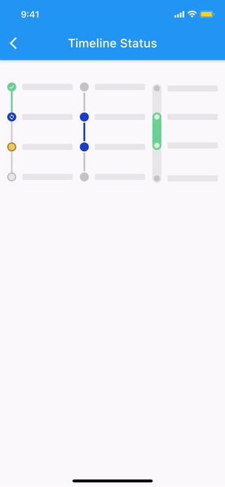](https://chulwoo.dev/timelines/#/timeline_status) | [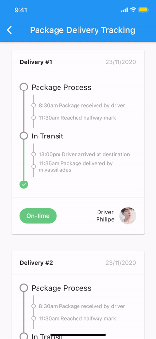](https://chulwoo.dev/timelines/#/package_delivery_tracking) | [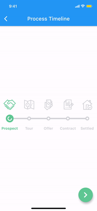](https://chulwoo.dev/timelines/#/process_timeline) |
More examples
🚧 WIP 🚧
# Features
### The [timeline](#timeline) and each [components](#components) are all WIDGET.
* Common styles can be easily implemented with predefined components.
* Vertical, horizontal direction.
* Alternating contents.
* Combination with Flutter widgets(Row, Column, CustomScrollView, etc).
* Customize each range with themes.
# Getting started
- [Installation](#installation)
- [Basic Usage](#basic-usage)
- [Components](#components)
- [Theme](#theme)
- [Indicator](#indicator)
- [Connector](#connector)
- [TimelineNode](#timelinenode)
- [TimelineTile](#timelinetile)
- [Timeline](#timeline)
- [TimelineTileBuilder](#timelinetilebuilder)
## Installation
#### 1. Depend on it
Add this to your package's pubspec.yaml file:
``` yaml
dependencies:
timelines: ^[latest_version]
```
#### 2. Install it
You can install packages from the command line:
with Flutter:
``` console
$ flutter pub get
```
Alternatively, your editor might support flutter pub get. Check the docs for your editor to learn more.
#### 3. Import it
Now in your Dart code, you can use:
``` dart
import 'package:timelines/timelines.dart';
```
## Basic Usage
``` dart
@override
Widget build(BuildContext context) {
return Timeline.tileBuilder(
builder: TimelineTileBuilder.fromStyle(
contentsAlign: ContentsAlign.alternating,
contentsBuilder: (context, index) => Padding(
padding: const EdgeInsets.all(24.0),
child: Text('Timeline Event $index'),
),
itemCount: 10,
),
);
}
```
Check the [Example](https://github.com/chulwoo-park/timelines/tree/main/example) or the [API reference](https://pub.dev/documentation/timelines/latest/) for more details.
## Components
### Theme
Check out [Theme Demo](https://chulwoo.dev/timelines/#/theme) to see how the values inside TimelineTile work with the theme.
To customize the timeline component with a theme, do the following:
``` dart
TimelineTheme(
data: TimelineThemeData(...),
child: DotIndicator(...),
);
```
If you only want to change part of the parent theme, use `TimelineTheme.of(context)`:
``` dart
TimelineTheme(
data: TimelineThemeData.of(context).copyWith(...),
child: DotIndicator(...),
);
```
If the component you want to customize is `Timeline` or `FixedTimeline`, this is also possible:
``` dart
FixedTimeline(
theme: TimelineThemeData(...),
children: [...],
);
```
### Indicator
ContainerIndicator

ContainerIndicator(
child: Container(
width: 15.0,
height: 15.0,
color: Colors.blue,
),
)
DotIndicator

DotIndicator()
OutlinedDotIndicator

OutlinedDotIndicator()
### Connector
SolidLineConnector

SizedBox(
height: 20.0,
child: SolidLineConnector(),
)
DashedLineConnector

SizedBox(
height: 20.0,
child: DashedLineConnector(),
)
DecoratedLineConnector

SizedBox(
height: 20.0,
child: DecoratedLineConnector(
decoration: BoxDecoration(
gradient: LinearGradient(
begin: Alignment.topCenter,
end: Alignment.bottomCenter,
colors: [Colors.blue, Colors.lightBlueAccent[100]],
),
),
),
)
### TimelineNode
Pure timeline UI component with no content.
The TimelineNode contains an indicator and two connectors on both sides of the indicator:
Simple TimelineNode

SizedBox(
height: 50.0,
child: TimelineNode.simple(),
)
Complex TimelineNode
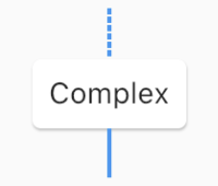
SizedBox(
height: 80.0,
child: TimelineNode(
indicator: Card(
margin: EdgeInsets.zero,
child: Padding(
padding: EdgeInsets.all(8.0),
child: Text('Complex'),
),
),
startConnector: DashedLineConnector(),
endConnector: SolidLineConnector(),
),
)
### TimelineTile
Displays content on both sides of the node:
TimelineTile

TimelineTile(
oppositeContents: Padding(
padding: const EdgeInsets.all(8.0),
child: Text('opposite\ncontents'),
),
contents: Card(
child: Container(
padding: EdgeInsets.all(8.0),
child: Text('contents'),
),
),
node: TimelineNode(
indicator: DotIndicator(),
startConnector: SolidLineConnector(),
endConnector: SolidLineConnector(),
),
)
### TimelineTileBuilder
TimelineTileBuilder provides powerful build features.
#### Connection
Each tile draws only half of the line connecting the neighboring tiles.
Using the `connected` constructor, lines connecting adjacent tiles can build as one index.
ConnectionDirection.before
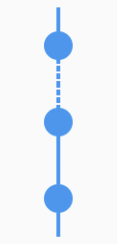
FixedTimeline.tileBuilder(
builder: TimelineTileBuilder.connectedFromStyle(
connectionDirection: ConnectionDirection.before,
connectorStyleBuilder: (context, index) {
return (index == 1) ? ConnectorStyle.dashedLine : ConnectorStyle.solidLine;
},
indicatorStyleBuilder: (context, index) => IndicatorStyle.dot,
itemExtent: 40.0,
itemCount: 3,
),
)
ConnectionDirection.after
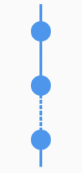
FixedTimeline.tileBuilder(
builder: TimelineTileBuilder.connectedFromStyle(
connectionDirection: ConnectionDirection.after,
connectorStyleBuilder: (context, index) {
return (index == 1) ? ConnectorStyle.dashedLine : ConnectorStyle.solidLine;
},
indicatorStyleBuilder: (context, index) => IndicatorStyle.dot,
itemExtent: 40.0,
itemCount: 3,
),
)
#### ContentsAlign
This value determines how the contents of the timeline will be built:
ContentsAlign.basic
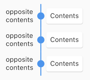
FixedTimeline.tileBuilder(
builder: TimelineTileBuilder.connectedFromStyle(
contentsAlign: ContentsAlign.basic,
oppositeContentsBuilder: (context, index) => Padding(
padding: const EdgeInsets.all(8.0),
child: Text('opposite\ncontents'),
),
contentsBuilder: (context, index) => Card(
child: Padding(
padding: const EdgeInsets.all(8.0),
child: Text('Contents'),
),
),
connectorStyleBuilder: (context, index) => ConnectorStyle.solidLine,
indicatorStyleBuilder: (context, index) => IndicatorStyle.dot,
itemCount: 3,
),
)
ContentsAlign.reverse
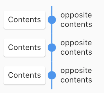
FixedTimeline.tileBuilder(
builder: TimelineTileBuilder.connectedFromStyle(
contentsAlign: ContentsAlign.reverse,
oppositeContentsBuilder: (context, index) => Padding(
padding: const EdgeInsets.all(8.0),
child: Text('opposite\ncontents'),
),
contentsBuilder: (context, index) => Card(
child: Padding(
padding: const EdgeInsets.all(8.0),
child: Text('Contents'),
),
),
connectorStyleBuilder: (context, index) => ConnectorStyle.solidLine,
indicatorStyleBuilder: (context, index) => IndicatorStyle.dot,
itemCount: 3,
),
)
ContentsAlign.alternating
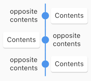
FixedTimeline.tileBuilder(
builder: TimelineTileBuilder.connectedFromStyle(
contentsAlign: ContentsAlign.alternating,
oppositeContentsBuilder: (context, index) => Padding(
padding: const EdgeInsets.all(8.0),
child: Text('opposite\ncontents'),
),
contentsBuilder: (context, index) => Card(
child: Padding(
padding: const EdgeInsets.all(8.0),
child: Text('Contents'),
),
),
connectorStyleBuilder: (context, index) => ConnectorStyle.solidLine,
indicatorStyleBuilder: (context, index) => IndicatorStyle.dot,
itemCount: 3,
),
)
### Timeline
The timeline component has two widgets, `Timeline` similar to ScrollView and `FixedTimeline` similar to Flex.
Also their constructors are similar to ScrollView and Flex.
The main difference is that they has TimelineTheme as an ancestor.
The `tileBuilder` constructor provides more powerful features using [TimelineTileBuilder](https://pub.dev/documentation/timelines/latest/timelines/TimelineTileBuilder-class.html).
If you don't need TimelineTileBuilder, you can use other flutter widgets like ListView, Column, Row, etc.
Even if you use the flutter widget, you can use TimelineTheme.
# Documentation
See full [documentation](https://pub.dev/documentation/timelines/latest/)
# Changelog
See [CHANGELOG.md](https://github.com/chulwoo-park/timelines/blob/main/CHANGELOG.md).
# Code of conduct
See [CODE_OF_CONDUCT.md](https://github.com/chulwoo-park/timelines/blob/main/CODE_OF_CONDUCT.md).
# License
[MIT](https://github.com/chulwoo-park/timelines/blob/main/LICENSE)