Ecosyste.ms: Awesome
An open API service indexing awesome lists of open source software.
https://github.com/SimformSolutionsPvtLtd/flutter_showcaseview
Flutter plugin that allows you to showcase your features on flutter application. 👌🔝🎉
https://github.com/SimformSolutionsPvtLtd/flutter_showcaseview
android dart flutter flutter-package flutter-plugin flutter-widget highlight ios package showcaseview showcaseview-library spotlight tooltip
Last synced: about 2 months ago
JSON representation
Flutter plugin that allows you to showcase your features on flutter application. 👌🔝🎉
- Host: GitHub
- URL: https://github.com/SimformSolutionsPvtLtd/flutter_showcaseview
- Owner: SimformSolutionsPvtLtd
- License: mit
- Created: 2019-05-10T05:03:09.000Z (about 5 years ago)
- Default Branch: master
- Last Pushed: 2024-04-25T11:11:43.000Z (about 2 months ago)
- Last Synced: 2024-04-25T12:28:02.127Z (about 2 months ago)
- Topics: android, dart, flutter, flutter-package, flutter-plugin, flutter-widget, highlight, ios, package, showcaseview, showcaseview-library, spotlight, tooltip
- Language: Dart
- Homepage: https://pub.dev/packages/showcaseview
- Size: 10.4 MB
- Stars: 1,388
- Watchers: 16
- Forks: 381
- Open Issues: 17
-
Metadata Files:
- Readme: README.md
- Changelog: CHANGELOG.md
- Contributing: CONTRIBUTING.md
- License: LICENSE
- Code of conduct: CODE_OF_CONDUCT.md
Lists
- awesome-flutter - ShowCaseView - Way to showcase your app features on iOS and Android by [Simform](https://github.com/simformsolutions). (Components / UI)
- awesome-stars - flutter_showcaseview
- my-awesome-list - flutter_showcaseview
- awesome-stars - flutter_showcaseview
- awesome-stars-webVueBlog - SimformSolutionsPvtLtd/flutter\_showcaseview - Flutter plugin that allows you to showcase your features on flutter application. 👌🔝🎉 (Dart / 运维\&DevOps)
README
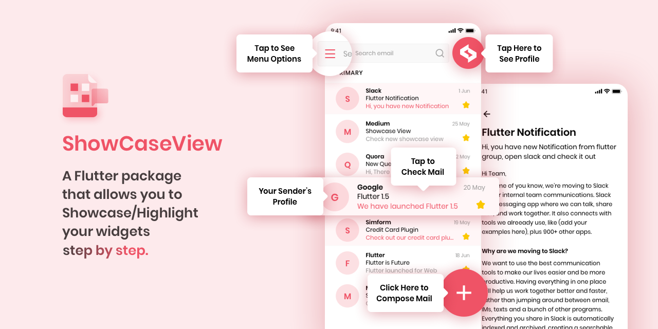
# ShowCaseView
[](https://github.com/SimformSolutionsPvtLtd/flutter_showcaseview/actions) [](https://pub.dev/packages/showcaseview)
A Flutter package allows you to Showcase/Highlight your widgets step by step.
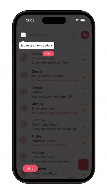
## Preview
## Migration guide for release 2.0.0
Renamed properties/fields of widgets mentioned below in the table.
| Before | After |
|-------------------------|--------------------------|
| autoPlayLockEnable | enableAutoPlayLock |
| shapeBorder | targetShapeBorder |
| showcaseBackgroundColor | tooltipBackgroundColor |
| contentPadding | tooltipPadding |
| overlayPadding | targetPadding |
| radius | targetBorderRadius |
| tipBorderRadius | tooltipBorderRadius |
| disableAnimation | disableMovingAnimation |
| animationDuration | movingAnimationDuration |
Removed unused parameter of `Showcase.withWidget()` mentioned below:
- title
- titleAlignment
- titleTextStyle
- description
- descriptionAlignment
- descTextStyle
- textColor
- tooltipBackgroundColor
- tooltipBorderRadius
- tooltipPadding
## Installing
1. Add dependency to `pubspec.yaml`
*Get the latest version in the 'Installing' tab on [pub.dev](https://pub.dev/packages/showcaseview)*
```dart
dependencies:
showcaseview:
```
2. Import the package
```dart
import 'package:showcaseview/showcaseview.dart';
```
3. Adding a `ShowCaseWidget` widget.
```dart
ShowCaseWidget(
builder: Builder(
builder : (context)=> Somewidget()
),
),
```
4. Adding a `Showcase` widget.
```dart
GlobalKey _one = GlobalKey();
GlobalKey _two = GlobalKey();
GlobalKey _three = GlobalKey();
...
Showcase(
key: _one,
title: 'Menu',
description: 'Click here to see menu options',
child: Icon(
Icons.menu,
color: Colors.black45,
),
),
Showcase.withWidget(
key: _three,
height: 80,
width: 140,
targetShapeBorder: CircleBorder(),
container: Column(
crossAxisAlignment: CrossAxisAlignment.start,
children: [
...
],
),
child: ...,
),
```
5. Starting the `ShowCase`
```dart
someEvent(){
ShowCaseWidget.of(context).startShowCase([_one, _two, _three]);
}
```
If you want to start the `ShowCaseView` as soon as your UI built up then use below code.
```dart
WidgetsBinding.instance.addPostFrameCallback((_) =>
ShowCaseWidget.of(context).startShowCase([_one, _two, _three])
);
```
## Functions of `ShowCaseWidget.of(context)`:
| Function Name | Description |
|------------------------------------------|--------------------------|
| startShowCase(List widgetIds) | Starting the showcase |
| next() | Starts next showcase |
| previous() | Starts previous showcase |
| dismiss() | Dismisses all showcases |
## Properties of `ShowCaseWidget`:
| Name | Type | Default Behaviour | Description |
|---------------------------|----------------------------|------------------------------|--------------------------------------------------------------------------------|
| builder | Builder | | |
| blurValue | double | 0 | Provides blur effect on overlay |
| autoPlay | bool | false | Automatically display Next showcase |
| autoPlayDelay | Duration | Duration(milliseconds: 2000) | Visibility time of showcase when `autoplay` is enabled |
| enableAutoPlayLock | bool | false | Block the user interaction on overlay when autoPlay is enabled. |
| enableAutoScroll | bool | false | Allows to auto scroll to next showcase so as to make the given target visible. |
| scrollDuration | Duration | Duration(milliseconds: 300) | Time duration for auto scrolling |
| disableBarrierInteraction | bool | false | Disable barrier interaction |
| disableScaleAnimation | bool | false | Disable scale transition for all showcases |
| disableMovingAnimation | bool | false | Disable bouncing/moving transition for all showcases |
| onStart | Function(int?, GlobalKey)? | | Triggered on start of each showcase. |
| onComplete | Function(int?, GlobalKey)? | | Triggered on completion of each showcase. |
| onFinish | VoidCallback? | | Triggered when all the showcases are completed |
| enableShowcase | bool | true | Enable or disable showcase globally. |
## Properties of `Showcase` and `Showcase.withWidget`:
| Name | Type | Default Behaviour | Description | `Showcase` | `ShowCaseWidget` |
|------------------------------|------------------|--------------------------------------------------|----------------------------------------------------------------------------------------------------|------------|------------------|
| key | GlobalKey | | Unique Global key for each showcase. | ✅ | ✅ |
| child | Widget | | The Target widget that you want to be showcased | ✅ | ✅ |
| title | String? | | Title of default tooltip | ✅ | |
| description | String? | | Description of default tooltip | ✅ | |
| container | Widget? | | Allows to create custom tooltip widget. | | ✅ |
| height | double? | | Height of custom tooltip widget | | ✅ |
| width | double? | | Width of custom tooltip widget | | ✅ |
| titleTextStyle | TextStyle? | | Text Style of title | ✅ | |
| descTextStyle | TextStyle? | | Text Style of description | ✅ | |
| titleAlignment | TextAlign | TextAlign.start | Alignment of title | ✅ | |
| descriptionAlignment | TextAlign | TextAlign.start | Alignment of description | ✅ | |
| targetShapeBorder | ShapeBorder | | If `targetBorderRadius` param is not provided then it applies shape border to target widget | ✅ | ✅ |
| targetBorderRadius | BorderRadius? | | Border radius of target widget | ✅ | ✅ |
| tooltipBorderRadius | BorderRadius? | BorderRadius.circular(8.0) | Border radius of tooltip | ✅ | |
| blurValue | double? | `ShowCaseWidget.blurValue` | Gaussian blur effect on overlay | ✅ | ✅ |
| tooltipPadding | EdgeInsets | EdgeInsets.symmetric(vertical: 8, horizontal: 8) | Padding to tooltip content | ✅ | |
| targetPadding | EdgeInsets | EdgeInsets.zero | Padding to target widget | ✅ | ✅ |
| overlayOpacity | double | 0.75 | Opacity of overlay layer | ✅ | ✅ |
| overlayColor | Color | Colors.black45 | Color of overlay layer | ✅ | ✅ |
| tooltipBackgroundColor | Color | Colors.white | Background Color of default tooltip | ✅ | |
| textColor | Color | Colors.black | Color of tooltip text | ✅ | |
| scrollLoadingWidget | Widget | | Loading widget on overlay until active showcase is visible to viewport when `autoScroll` is enable | ✅ | ✅ |
| movingAnimationDuration | Duration | Duration(milliseconds: 2000) | Duration of time this moving animation should last. | ✅ | ✅ |
| showArrow | bool | true | Shows tooltip with arrow | ✅ | |
| disableDefaultTargetGestures | bool | false | disable default gestures of target widget | ✅ | ✅ |
| disposeOnTap | bool? | false | Dismiss all showcases on target/tooltip tap | ✅ | ✅ |
| disableMovingAnimation | bool? | `ShowCaseWidget.disableMovingAnimation` | Disable bouncing/moving transition | ✅ | ✅ |
| disableScaleAnimation | bool? | `ShowCaseWidget.disableScaleAnimation` | Disable initial scale transition when showcase is being started and completed | ✅ | |
| scaleAnimationDuration | Duration | Duration(milliseconds: 300) | Duration of time scale animation should last. | ✅ | |
| scaleAnimationCurve | Curve | Curves.easeIn | Curve to use in scale animation. | ✅ | |
| scaleAnimationAlignment | Alignment? | | Origin of the coordinate in which the scale takes place, relative to the size of the box. | ✅ | |
| onToolTipClick | VoidCallback? | | Triggers when tooltip is being clicked. | ✅ | |
| onTargetClick | VoidCallback? | | Triggers when target widget is being clicked | ✅ | ✅ |
| onTargetDoubleTap | VoidCallback? | | Triggers when target widget is being double clicked | ✅ | ✅ |
| onTargetLongPress | VoidCallback? | | Triggers when target widget is being long pressed | ✅ | ✅ |
| onBarrierClick | VoidCallback? | | Triggers when barrier is clicked | ✅ | ✅ |
| tooltipPosition | TooltipPosition? | | Defines vertical position of tooltip respective to Target widget | ✅ | ✅ |
| titlePadding | EdgeInsets? | EdgeInsets.zero | Padding to title | ✅ | |
| descriptionPadding | EdgeInsets? | EdgeInsets.zero | Padding to description | ✅ | |
| titleTextDirection | TextDirection? | | Give textDirection to title | ✅ | |
| descriptionTextDirection | TextDirection? | | Give textDirection to description | ✅ | |
| descriptionTextDirection | TextDirection? | | Give textDirection to description | ✅ | |
| disableBarrierInteraction | bool | false | Disables barrier interaction for a particular showCase | ✅ | ✅ |
| toolTipSlideEndDistance | double | 7 | Defines motion range for tooltip slide animation | ✅ | ✅ |
## How to use
Check out the **example** app in the [example](example) directory or the 'Example' tab on pub.dartlang.org for a more complete example.
## Scrolling to active showcase
Auto Scrolling to active showcase feature will not work properly in scroll views that renders widgets on demand(ex, ListView, GridView).
In order to scroll to a widget it needs to be attached with widget tree. So, If you are using a scrollview that renders widgets on demand, it is possible that the widget on which showcase is applied is not attached in widget tree. So, flutter won't be able to scroll to that widget.
So, If you want to make a scroll view that contains less number of children widget then prefer to use SingleChildScrollView.
If using SingleChildScrollView is not an option, then you can assign a ScrollController to that scrollview and manually scroll to the position where showcase widget gets rendered. You can add that code in onStart method of `ShowCaseWidget`.
Example,
```dart
// This controller will be assigned to respected sctollview.
final _controller = ScrollController();
ShowCaseWidget(
onStart: (index, key) {
if(index == 0) {
WidgetsBinding.instance.addPostFrameCallback((_) {
// If showcase widget is at offset 1000 in the listview.
// If you don't know the exact position of the showcase widget,
// You can provide nearest possible location.
//
// In this case providing 990 instead of 1000 will work as well.
_controller.jumpTo(1000);
});
}
},
);
```
## Main Contributors
Birju Vachhani
Devarsh Ranpara
Ankit Panchal
Kashifa Laliwala
Vatsal Tanna
Sanket Kachhela
Parth Baraiya
Shweta Chauhan
Dhaval Kansara
Happy Makadiya
Ujas Majithiya
Aditya Chavda
Sahil Totala


## License
```text
MIT License
Copyright (c) 2021 Simform Solutions
Permission is hereby granted, free of charge, to any person obtaining a copy
of this software and associated documentation files (the "Software"), to deal
in the Software without restriction, including without limitation the rights
to use, copy, modify, merge, publish, distribute, sublicense, and/or sell
copies of the Software, and to permit persons to whom the Software is
furnished to do so, subject to the following conditions:
The above copyright notice and this permission notice shall be included in all
copies or substantial portions of the Software.
THE SOFTWARE IS PROVIDED "AS IS", WITHOUT WARRANTY OF ANY KIND, EXPRESS OR
IMPLIED, INCLUDING BUT NOT LIMITED TO THE WARRANTIES OF MERCHANTABILITY,
FITNESS FOR A PARTICULAR PURPOSE AND NONINFRINGEMENT. IN NO EVENT SHALL THE
AUTHORS OR COPYRIGHT HOLDERS BE LIABLE FOR ANY CLAIM, DAMAGES OR OTHER
LIABILITY, WHETHER IN AN ACTION OF CONTRACT, TORT OR OTHERWISE, ARISING FROM,
OUT OF OR IN CONNECTION WITH THE SOFTWARE OR THE USE OR OTHER DEALINGS IN THE
SOFTWARE.
```