Ecosyste.ms: Awesome
An open API service indexing awesome lists of open source software.
https://github.com/niuware/mui-rte
Material-UI Rich Text Editor and Viewer
https://github.com/niuware/mui-rte
draft-js material-ui mui react rich-text-editor rte text-editor typescript
Last synced: 25 days ago
JSON representation
Material-UI Rich Text Editor and Viewer
- Host: GitHub
- URL: https://github.com/niuware/mui-rte
- Owner: niuware
- License: mit
- Created: 2019-06-13T07:22:48.000Z (about 5 years ago)
- Default Branch: master
- Last Pushed: 2024-02-14T18:52:22.000Z (5 months ago)
- Last Synced: 2024-06-06T13:43:23.419Z (about 1 month ago)
- Topics: draft-js, material-ui, mui, react, rich-text-editor, rte, text-editor, typescript
- Language: TypeScript
- Homepage:
- Size: 642 KB
- Stars: 429
- Watchers: 7
- Forks: 161
- Open Issues: 99
-
Metadata Files:
- Readme: README.md
- License: LICENSE
Lists
- awesome-stars - mui-rte - UI Rich Text Editor and Viewer | niuware | 429 | (TypeScript)
README
# mui-rte
The Material-UI Rich Text Editor and Viewer
**mui-rte** is a complete text editor and viewer for the MUI library (formerly Material-UI) based on `draft-js` and written in Typescript. It is ready to use out of the box yet supports user defined blocks, styles, autocomplete strategies, async/sync custom atomic blocks, callbacks, and decorators as well as toolbar and theme customization to enhance the editor to all needs.
## Installation
```
npm install mui-rte --save
```
Install the peer dependencies: `@mui/material`, `@mui/icons-material`, `@mui/styles`, `react` and `react-dom`. Also you will need to install the peer dependencies for MUI: `@emotion/react` and `@emotion/styled`.
## Demo
[](https://codesandbox.io/s/mui-rte-basic-ypfdo?fontsize=14)
## Usage
```js
import { createTheme, ThemeProvider } from '@mui/material/styles'
import MUIRichTextEditor from 'mui-rte'
const myTheme = createTheme({
// Set up your custom MUI theme here
})
ReactDOM.render(
,
document.getElementById("root")
)
```
You can load default content as the following example. The value should be a stringified `RawDraftContentState` object:
```js
import MUIRichTextEditor from 'mui-rte'
const data = getContentStateAsStringFromSomewhere()
ReactDOM.render(
,
document.getElementById("root")
)
```
## Material-UI v4 compatibility
`mui-rte` version 2.x is compatible with MUI (v5) only. You can still use version [1.x](https://github.com/niuware/mui-rte/releases/tag/1.29.0) for Material-UI v4. Current code using `mui-rte` version 1.x should be compatible with version 2.x, the only breaking change is that it requires to be wrapped on a `ThemeProvider` as shown in the examples.
## Examples
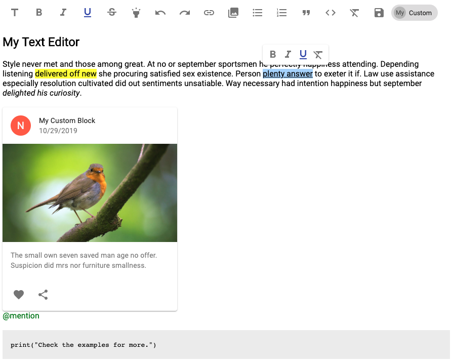
Check the [examples](https://github.com/niuware/mui-rte/tree/master/examples) directory for more.
## Custom Controls
You can define your custom inline styles, blocks, atomic blocks and callback actions to the editor. Just select an icon from `@mui/icons-material` or create your own `FunctionComponent` and define your rules.
### Adding a custom inline style
This sample adds a control to change the background color and font color of the typed or selected text:
```js
import MUIRichTextEditor from 'mui-rte'
import InvertColorsIcon from '@mui/icons-material/InvertColors'
,
type: "inline",
inlineStyle: {
backgroundColor: "black",
color: "white"
}
}
]}
/>
```
### Adding a custom block
This sample adds a block to the editor based on a `React Element`:
```js
import MUIRichTextEditor from 'mui-rte'
import TableChartIcon from '@mui/icons-material/TableChart'
const MyBlock = (props) => {
return (
My Block content is:
{props.children}
)
}
,
type: "block",
blockWrapper:
}
]}
/>
```
### Adding a custom atomic block (Async)
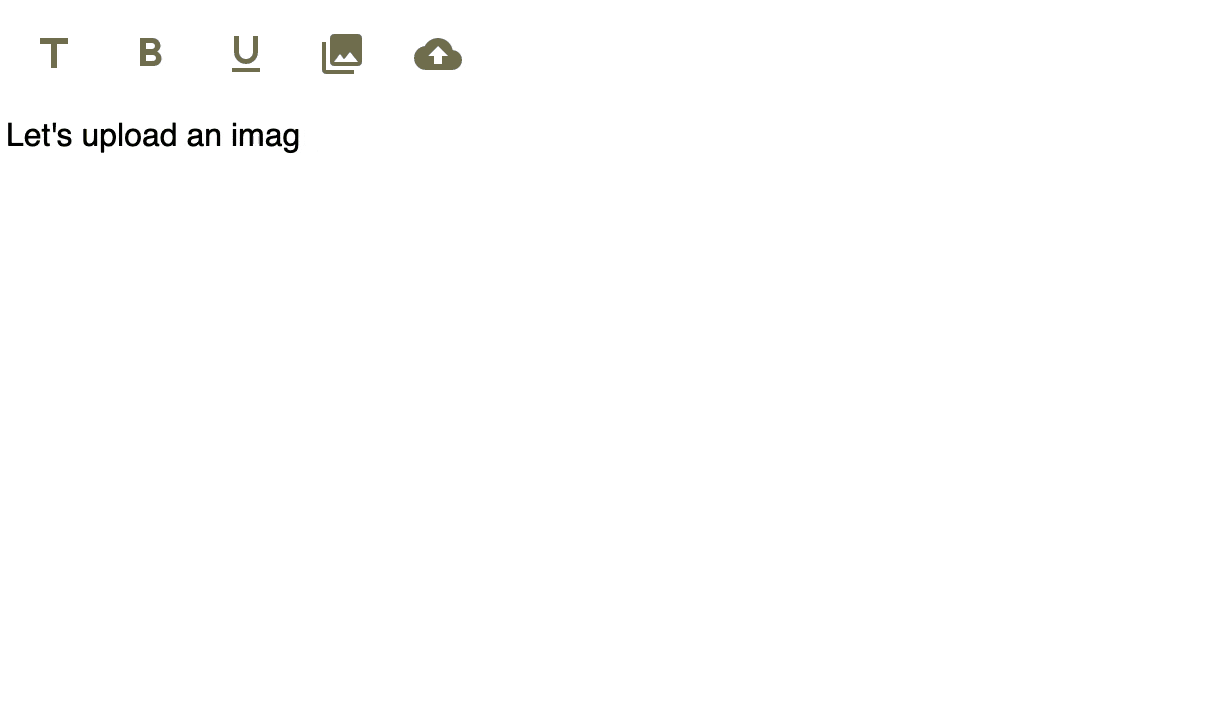
It is possible to insert custom blocks based on asynchronous behavior using the `insertAtomicBlockAsync` API. The above example shows an [example](https://github.com/niuware/mui-rte/blob/master/examples/async-image-upload/index.tsx) on how to upload an image and use the `MUIRichTextEditor` default image control for further edition. You can use this behavior to upload a file when dropping it inside the editor and render it as an image entity after upload.
Check this [other sample](https://github.com/niuware/mui-rte/blob/master/examples/async-atomic-custom-block/index.tsx) that shows how to add a `@mui/material` Card with asynchronous downloaded content.
### Adding a custom atomic block (Sync)
Check [this sample](https://github.com/niuware/mui-rte/blob/master/examples/atomic-custom-block/index.tsx) that shows how to create a control to add a `@mui/material` Card component to the editor.
### Adding a custom callback control
This sample adds a control that will trigger a custom callback function to clear the editor state:
```js
import MUIRichTextEditor from 'mui-rte'
import DoneIcon from '@mui/icons-material/Done'
import { EditorState } from 'draft-js'
,
type: "callback",
onClick: (editorState, name, anchor) => {
console.log(`Clicked ${name} control`)
return EditorState.createEmpty()
}
}
]}
/>
```
## Autocomplete strategies
You can define autocomplete strategies to present suggested content lists based on the text input. Just set your trigger character, add some search keys and the content to insert and the editor will do everything for you. You can navigate through suggestions using the keyboard arrows and finally press 'Enter' to insert your content into the editor.
### Simple strategy example
This is an example to show emoji suggestions when the user start typing a text like ':face', ':joy', or ':grin':
```js
import MUIRichTextEditor from 'mui-rte'
const emojis = [
{
keys: ["face", "grin"],
value: "😀",
content: "😀",
},
{
keys: ["face", "joy"],
value: "😂",
content: "😂",
},
{
keys: ["face", "sweat"],
value: "😅",
content: "😅",
}
]
```
Check [this sample](https://github.com/niuware/mui-rte/blob/master/examples/autocomplete/index.tsx) that shows how to add multiple autocomplete strategies to a single editor.
### Atomic strategy example
Check [this sample](https://github.com/niuware/mui-rte/blob/master/examples/autocomplete/index.tsx) that shows how to combine atomic custom controls with the autocomplete strategy feature.
## Custom Decorators
You can define custom decorators to apply styles and/or functionality based on a provided regular expression.
### Adding custom functionality with a decorator
To add some functionality when a user inputs a `#hashtag` use the following example. In this case, everytime the user inputs a word starting with a `#` character it will be automatically converted into a styled link:
```js
import MUIRichTextEditor from 'mui-rte'
const MyHashTagDecorator = (props) => {
const hashtagUrl = "http://myurl/" + props.decoratedText
return (
{props.children}
)
}
```
## Inline toolbar
The editor includes an inline toolbar option which renders a pop-up inside the editor area when the user makes a selection. The inline toolbar supports user defined controls. Notice that only `inline` type controls will be rendered. The controls displayed on the main toolbar can be different from the ones in the inline toolbar. You can also hide the main toolbar and just enable the inline toolbar.
```js
import MUIRichTextEditor from 'mui-rte'
```
## Styling the editor
You can style the editor using the `Material-UI` theming feature. First create a theme with `createMuiTheme` and override classes such as `root`, `container`, `editor`, and `editorContainer`. Check the examples directory for more.
```js
import { createMuiTheme, MuiThemeProvider } from '@mui/material/styles'
import MUIRichTextEditor from 'mui-rte'
const defaultTheme = createMuiTheme()
Object.assign(defaultTheme, {
overrides: {
MUIRichTextEditor: {
root: {
marginTop: 20,
width: "80%"
},
editor: {
borderBottom: "1px solid gray"
}
}
}
})
```
## API
` (TMUIRichTextEditorProps)`
|Property|Type||description|
|---|---|---|---|
|id|`string`|optional|Base Id name for the component HTML elements.|
|ref|`TMUIRichTextEditorRef`|optional|Sets a reference instance of the editor component.|
|label|`string`|optional|String to show when there is no content.|
|readOnly|`boolean`|optional|Read only mode. The toolbar is disabled by default.|
|value|`string`|deprecated|Use `defaultValue` instead.|
|defaultValue|`string`|optional|Default content to load. Should be a stringified `Draft.Model.Encoding.RawDraftContentState` object.|
|inheritFontSize|`boolean`|optional|Inherit font size from parent. Useful for read only mode.|
|error|`boolean`|optional|Renders the editor with an error style.|
|controls|`string[]`|optional|List of controls to display in the main toolbar. If not provided, all controls will be rendered. Current available values are: "title", "bold", "italic", "underline", "strikethrough", "highlight", "undo", "redo", "link", "media", "numberList", "bulletList", "quote", "code", "clear", "save".|
|customControls|`TCustomControl[]`|optional|Defines an array of user custom inline styles, blocks and callbacks. See more information in 'Custom Controls' below.|
|decorators|`TDecorator[]`|optional|Defines an array of user custom decorators. See more information in 'Custom Decorators'.|
|toolbar|`boolean`|optional|Defines if the main toolbar should be rendered.|
|toolbarButtonSize|`small` \| `medium`|optional|Sets the size on the default `IconButton` component for the main toolbar.|
|inlineToolbar|`boolean`|optional|Defines if the inline toolbar should be rendered.|
|inlineToolbarControls|`string[]`|optional|List of controls to display in the inline toolbar. Available values are: "bold", "italic", "underline", "strikethrough", "highlight", "link", "clear", and user defined inline controls. If not provided and `inlineToolbar` is `true` the following inline styles will be displayed: bold, italic, underline and clear.|
|keyCommands|`TKeyCommand[]`|optional|Defines an array of `TKeyCommand` objects for adding key bindings to the editor.|
|draftEditorProps|`TDraftEditorProps`|optional|Defines an object containing specific `draft-js` `Editor` properties.|
|maxLength|`number`|optional|Sets the maximum characters count that can be input into the editor.|
|autocomplete|`TAutocomplete`|optional|Sets autocomplete strategies to present suggestion lists as the user types into the editor.|
|onSave|`(data:string) => void`|optional|Function triggered when the save button is pressed. The `data` is a stringified `Draft.Model.Encoding.RawDraftContentState` object.|
|onChange|`(state: EditorState) => void`|optional|Function triggered on any change in the editor (key input, delete, etc.). The `state` is a `Draft.Model.ImmutableData.EditorState` object.|
|onFocus|`() => void`|optional|Function triggered when when the editor acquires focus.|
|onBlur|`() => void`|optional|Function triggered when when the editor loses focus.|
`TCustomControl`
|Property|Type||description|
|---|---|---|---|
|id|`string`|optional|The HTML id attribute for the control|
|name|`string`|required|The name of the custom control. For rendering the control this name should be added to the `MUIRichTextEditor` `controls` property.|
|icon|`JSX.Element`|optional|The `@mui/icons-material` icon for the control. For "atomic" control type, the icon is not required. [Check this](https://material.io/resources/icons/?style=baseline) for available icons.|
|component|`React.FunctionComponent`|optional|The custom function component for the control. The icon has priority over the component, so if the icon is set the component will be ignored. For "atomic" control type, the component is not required.|
|type|`string`|required|Either "inline", "block", "atomic" or "callback"|
|inlineStyle|`string`|optional|The `React.CSSProperties` object for styling the text when using a custom inline style.|
|blockWrapper|`React.ReactElement`|optional|The custom React component used for rendering a custom block.|
|atomicComponent|`React.FunctionComponent`|optional|The custom React FunctionComponent used for rendering a custom atomic block.|
|onClick|`(editorState: EditorState, name: string, anchor: HTMLElement \| null) => EditorState \| void`|optional|The callback function triggered when the custom control is clicked. The received arguments include the current `EditorState` object, the name of the clicked control and the `HTMLElement` from which the click was raised. If a new `EditorState` object is returned it will be replace the current one in the editor (useful to explicitly modify the `EditorState`).|
`TToolbarComponentProps`
|Property|Type|description|
|---|---|---|
|id|`string`|The id for the component.|
|onMouseDown|`(e: React.MouseEvent) => void`|The `mousedown` handler.|
|active|`boolean`|Defines if the block or inline type is active for the current editor selection.|
|disabled|`boolean`|Sets if the toolbar is disabled.|
`TDecorator`
|Property|Type||description|
|---|---|---|---|
|component|`React.FunctionComponent`|required|The React component to use for rendering the decorator.|
|regex|`RegExp`|required|The regular expression to match a decorator.|
`TKeyCommand`
|Property|Type||description|
|---|---|---|---|
|key|`number`|required|The code of the key to bind.|
|name|`string`|required|The name of the command.|
|callback|`(state: EditorState) => EditorState`|required|The callback function to execute when the key binding is matched. It should return the `EditorState` to set.|
`TDraftEditorProps`
|Property|Type||description|
|---|---|---|---|
|spellCheck|`boolean`|optional|Use browser spelling check.|
|stripPastedStyles|`boolean`|optional|Remove styles when pasting text into the editor.|
|handleDroppedFiles|`(selectionState: SelectionState, files: Blob[]) => DraftHandleValue`|optional|Handle files that have been dropped into the editor. The `DraftHandleValue` is either `handled` or `not-handled`.|
`TAutocomplete`
|Property|Type||description|
|---|---|---|---|
|strategies|`TAutocompleteStrategy[]`|required|Array of autocomplete strategies.|
|suggestLimit|`number`|optional|Defines the amount of suggestions to present to the user. Default is `5`.|
`TAutocompleteStrategy`
|Property|Type||description|
|---|---|---|---|
|triggerChar|`string`|required|A single character that triggers the autocomplete strategy.|
|items|`TAutocompleteItem[]`|required|List of autocomplete suggestion items.|
|insertSpaceAfter|`boolean`|optional|If `false` it won't add an space after inserting the content into the editor. Default is `true`.|
|atomicBlockName|`string`|optional|Use an *atomic* custom control type to add the content to the editor.|
`TAutocompleteItem`
|Property|Type||description|
|---|---|---|---|
|keys|`string[]`|required|The list of keys that the user needs to type to reveal this item suggestion.|
|value|`any`|required|The value to insert into the editor when the item is selected.|
|content|`string \| JSX.Element`|required|The content presented in the autocomplete suggestion list for this item. Note that this content is render under a `ListItem` component.|
`TMUIRichTextEditorRef`
|Property|Type||description|
|---|---|---|---|
|focus|`() => void`||Triggers the focus event on the editor.|
|save|`() => void`||Triggers the save method on the editor.|
|insertAtomicBlock|`(name: string, data: any)`|deprecated|Use `insertAtomicBlockSync` instead.|
|insertAtomicBlockSync|`(name: string, data: any)`||Inserts an atomic block named as `name` (if exists) with the provided `data` into the editor.|
|insertAtomicBlockAsync|`(name: string, promise: Promise, placeholder?: string) => void`||Inserts an atomic block named as `name` (if exists) asynchronously with the provided `data` into the editor. The `placeholder` text will be shown on the editor until the promise is resolved.|
`TAsyncAtomicBlockResponse`
|Property|Type||description|
|---|---|---|---|
|data|`any`|required|The data assigned to the entity added into the editor.|
## Changelog
Check the [release notes](https://github.com/niuware/mui-rte/releases) for the changelog.
## Development
For development use:
```
$ npm run build
$ npm run serve
```
## Future plans
- Add test coverage
- Refactor code
- Add new features
## Suggestions and issues
Please feel free to leave your comment on the [Issues](https://github.com/niuware/mui-rte/issues) tab.
## License
Licensed under MIT License.