Ecosyste.ms: Awesome
An open API service indexing awesome lists of open source software.
https://github.com/notDmDrl/pull_down_button
A package that implements Pull-Down Button from iOS 14 in Flutter. Highly customizable.
https://github.com/notDmDrl/pull_down_button
cupertino dart flutter menu popup-menu pull-down-button pull-down-menu
Last synced: 24 days ago
JSON representation
A package that implements Pull-Down Button from iOS 14 in Flutter. Highly customizable.
- Host: GitHub
- URL: https://github.com/notDmDrl/pull_down_button
- Owner: notDmDrl
- License: mit
- Created: 2022-05-25T10:42:40.000Z (about 2 years ago)
- Default Branch: main
- Last Pushed: 2024-04-18T16:25:17.000Z (3 months ago)
- Last Synced: 2024-04-18T18:17:04.877Z (3 months ago)
- Topics: cupertino, dart, flutter, menu, popup-menu, pull-down-button, pull-down-menu
- Language: Dart
- Homepage: https://pub.dev/packages/pull_down_button
- Size: 2.05 MB
- Stars: 65
- Watchers: 0
- Forks: 19
- Open Issues: 6
-
Metadata Files:
- Readme: README.md
- Changelog: CHANGELOG.md
- License: LICENSE
Lists
- awesome-stars - pull_down_button - Down Button from iOS 14 with great customisation options. | notDmDrl | 14 | (Dart)
README
# Pull-Down Button from iOS 14 for Flutter
[](https://pub.dev/packages/pull_down_button)
[](https://pub.dev/packages/pull_down_button)
[](https://pub.dev/packages/pull_down_button)
[](https://pub.dev/packages/very_good_analysis)
[](https://common-changelog.org)
**pull_down_button** is an attempt to bring
[Pop-Up](https://developer.apple.com/design/human-interface-guidelines/components/menus-and-actions/pop-up-buttons) and
[Pull-Down](https://developer.apple.com/design/human-interface-guidelines/components/menus-and-actions/pull-down-buttons)
Buttons from iOS 14+ to Flutter with some additional customisation options.
##### This package only tries to visually replicate the native counterpart, some parts might be somewhat different.
#### Flutter availability:
Since this package uses the new Flutter feature `ThemeExtension` for theming, the minimum supported version is stable **3.0.0**.
---
### Contents:
- [PullDownButton](#pulldownbutton)
- [PullDownMenuItem](#pulldownmenuitem)
- [PullDownMenuItem.selectable](#pulldownmenuitemselectable)
- [PullDownMenuActionsRow](#pulldownmenuactionsrow)
- [PullDownMenuDivider](#pulldownmenudivider)
- [PullDownMenuTitle](#pulldownmenutitle)
- [PullDownMenuHeader](#pulldownmenuheader)
- [showPullDownMenu](#showpulldownmenu)
- [PullDownMenu](#pulldownmenu)
- [Theming](#theming)
- [PullDownButtonTheme](#pulldownbuttontheme)
- [Contributions](#contributions)
---
## PullDownButton
`PullDownButton` is a widget used to show the pull-down menu.
While the pull-down menu is opened, the button from where this menu was called will have lower opacity.
```dart
PullDownButton(
itemBuilder: (context) => [
PullDownMenuItem(
title: 'Menu item',
onTap: () {},
),
const PullDownMenuDivider(),
PullDownMenuItem(
title: 'Menu item 2',
onTap: () {},
),
],
buttonBuilder: (context, showMenu) => CupertinoButton(
onPressed: showMenu,
padding: EdgeInsets.zero,
child: const Icon(CupertinoIcons.ellipsis_circle),
),
);
```
Properties table
| Properties | Description |
|-------------------|----------------------------------------------------------------------------------------------------------|
| itemBuilder | Called when the button is pressed to create the items to show in the menu. |
| buttonBuilder | Builder that provides `BuildContext` as well as `showMenu` function to pass to any custom button widget. |
| onCanceled | Called when the user dismisses the pull-down menu. |
| position | Whether the pull-down menu is positioned above, over, or under the pull-down menu button. |
| itemsOrder | Whether the pull-down menu orders its items from `itemBuilder` in downward or upwards way. |
| buttonAnchor | Whether the pull-down menu is anchored to the center, left, or right side of `buttonBuilder`. |
| menuOffset | Additional offset for the pull-down menu if the menu's desired position. |
| scrollController | A custom menu scroll controller. |
| routeTheme | The theme of the pull-down menu box. |
| animationBuilder | Custom animation for `buttonBuilder` when the pull-down menu is opening or closing. |
---
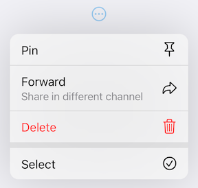
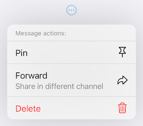
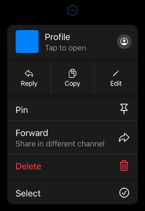
### PullDownMenuItem
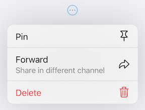
`PullDownMenuItem` is a widget used to create cupertino-style pull-down menu item.
```dart
PullDownMenuItem(
onTap: () {},
title: 'Pin',
icon: CupertinoIcons.pin,
),
PullDownMenuItem(
title: 'Forward',
subtitle: 'Share in different channel',
onTap: () {},
icon: CupertinoIcons.arrowshape_turn_up_right,
),
PullDownMenuItem(
onTap: () {},
title: 'Delete',
isDestructive: true,
icon: CupertinoIcons.delete,
),
```
Properties table
| Properties | Description |
|---------------|--------------------------------------------------|
| onTap | The action this item represents. |
| tapHandler | Handler to resolve how `onTap` callback is used. |
| enabled | Whether the user is permitted to tap this item. |
| title | Title of this `PullDownMenuItem`. |
| subtitle | Subtitle of this `PullDownMenuItem`. |
| icon | Trailing icon of this `PullDownMenuItem`. |
| iconColor | Trailing icon's color. |
| iconWidget | Custom trailing widget. |
| isDestructive | Whether this item represents destructive action. |
| itemTheme | The theme of the menu item. |
---
### PullDownMenuItem.selectable
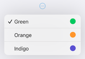
`PullDownMenuItem.selectable` is a widget used to create cupertino-style pull-down menu item with selection state.
```dart
PullDownMenuItem.selectable(
onTap: () {},
selected: true,
title: 'Green',
icon: CupertinoIcons.circle_fill,
iconColor: CupertinoColors.systemGreen.resolveFrom(context),
),
PullDownMenuItem.selectable(
onTap: () {},
selected: false,
title: 'Orange',
icon: CupertinoIcons.circle_fill,
iconColor: CupertinoColors.systemOrange.resolveFrom(context),
),
PullDownMenuItem.selectable(
onTap: () {},
selected: false,
title: 'Indigo',
icon: CupertinoIcons.circle_fill,
iconColor: CupertinoColors.systemIndigo.resolveFrom(context),
),
```
Properties table
`PullDownMenuItem.selectable` uses all of `PullDownMenuItem` properties as well as a boolean value `selected`, to indicate whether the menu item is selected or not.
---
### PullDownMenuActionsRow
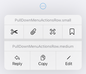
`PullDownMenuActionsRow` is a widget used to create cupertino-style pull-down menu row of actions
([small or medium size](https://developer.apple.com/documentation/uikit/uimenu/4013313-preferredelementsize)).
```dart
PullDownMenuActionsRow.medium(
items: [
PullDownMenuItem(
onTap: () {},
title: 'Reply',
icon: CupertinoIcons.arrowshape_turn_up_left,
),
PullDownMenuItem(
onTap: () {},
title: 'Copy',
icon: CupertinoIcons.doc_on_doc,
),
PullDownMenuItem(
onTap: () {},
title: 'Edit',
icon: CupertinoIcons.pencil,
),
],
),
```
`PullDownMenuItem` is used to populate `PullDownMenuActionsRow.items`.
Depending on `PullDownMenuActionsRow`s size, `PullDownMenuItem` might be either icon only or icon and title in a vertical array.
| Properties | Description |
|------------|-----------------------------|
| items | List of `PullDownMenuItem`. |
---
### PullDownMenuDivider
`PullDownMenuDivider.large` is a widget used to create cupertino-style pull-down menu large divider.
There is no need in adding `PullDownMenuDivider` by hand, pull-down menu does it automatically!
### PullDownMenuTitle
`PullDownMenuTitle` is a widget used to create cupertino-style pull-down menu title (usually at the top of menu).
```dart
const PullDownMenuTitle(title: Text('Menu title')),
```
| Properties | Description |
|------------|--------------------------|
| title | Title widget. |
| titleStyle | Title widget text style. |
---
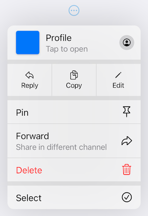
### PullDownMenuHeader
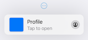
`PullDownMenuHeader` is a widget used to create cupertino-style pull-down menu document header (usually at the top of menu).
```dart
PullDownMenuHeader(
leading: ColoredBox(
color: CupertinoColors.systemBlue.resolveFrom(context),
),
title: 'Profile',
subtitle: 'Tap to open',
onTap: () {},
icon: CupertinoIcons.profile_circled,
),
```
Properties table
| Properties | Description |
|------------|--------------------------------------------------|
| onTap | The action this header represents. |
| tapHandler | Handler to resolve how `onTap` callback is used. |
| leading | Leading widget of this `PullDownMenuItem`. |
| title | Title of this `PullDownMenuItem`. |
| subtitle | Subtitle of this `PullDownMenuItem`. |
| itemTheme | The theme of the menu item. |
| icon | Trailing icon of this `PullDownMenuItem`. |
| iconWidget | Custom trailing widget. |
---
### showPullDownMenu
An alternative way of displaying pull-down menu via a function call.
```dart
onPressed: () async {
/* get tap position and / or do something before opening menu */
await showPullDownMenu(
context: context,
items: [...],
position: position,
);
}
```
Properties table
| Properties | Description |
|---------------------|---------------------------------------------------------------------------------------------|
| context | For looking up `Navigator` for the menu. |
| items | List of `PullDownMenuEntry` widgets. |
| position | The `Rect` is used to align the top of the menu with the top of the **position** rectangle. |
| itemsOrder | Whether the popup menu orders its items from `itemBuilder` in a downward or upwards way. |
| menuOffset | Additional offset for the pull-down menu if the menu's desired position. |
| scrollController | A custom menu scroll controller. |
| onCanceled | Called when the user dismisses the pull-down menu. |
| routeTheme | The theme of the pull-down menu box. |
### PullDownMenu
Another alternative way of displaying the pull-down menu as a simple widget, with no animations or adding routes to the navigation stack.
```dart
PullDownMenu(
items: [
PullDownMenuItem(
title: 'Menu item',
onTap: () {},
),
const PullDownMenuDivider(),
PullDownMenuItem(
title: 'Menu item 2',
onTap: () {},
),
]
),
```
Properties table
| Properties | Description |
|---------------------|--------------------------------------|
| items | List of `PullDownMenuEntry` widgets. |
| scrollController | A custom menu scroll controller. |
| routeTheme | The theme of pull-down menu box. |
---
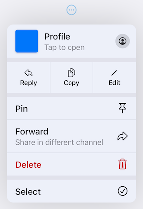
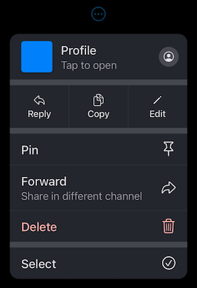
## Theming
This package also provides additional customization. By default, the iOS 16 theme is used, but it is also possible to override defaults with widget properties (see above) or with `PullDownButtonTheme` theme extension.
| Light Theme | Dark Theme |
|---------------------------------------------------------------------------------------------------------------------------|-------------------------------------------------------------------------------------------------------------------------------|
|  |  |
### PullDownButtonTheme
To use `PullDownButtonTheme` define it in your `ThemeData` as follows:
```dart
ThemeData(
...,
extensions: [
PullDownButtonTheme(
routeTheme: PullDownMenuRouteTheme(
backgroundColor: Colors.grey,
),
itemTheme: PullDownMenuItemTheme(
destructiveColor: Colors.red,
),
dividerTheme: PullDownMenuDividerTheme(
dividerColor: Colors.black,
),
),
],
),
```
`PullDownButtonTheme` uses a set of sub-themes (for items, dividers, the menu itself, etc.) to define the needed theme. See below for every property each sub-theme provides.
PullDownButtonTheme
| Properties | Description |
|--------------|-----------------------------------------------------------|
| routeTheme | Menu container theme (`PullDownMenuRouteTheme`). |
| itemTheme | `PullDownMenuItem` theme (`PullDownMenuItemTheme`). |
| dividerTheme | `PullDownMenuDivider` theme (`PullDownMenuDividerTheme`). |
| titleTheme | `PullDownMenuTitle` theme (`PullDownMenuTitleTheme`). |
PullDownMenuRouteTheme
| Properties | Description |
|--------------------|---------------------------------------------|
| backgroundColor | The background color of the pull-down menu. |
| borderRadius | The border radius of the pull-down menu. |
| shadow | The pull-down menu shadow. |
| width | Pull-down menu width. |
| accessibilityWidth | Pull-down menu accessibility width. |
`backgroundColor` usually has opacity in the range of **0.7-0.8** so that menu has a blur effect.
If `backgroundColor` is fully opaque (opacity set to **1**), no blur effect will be applied.
PullDownMenuItemTheme
| Properties | Description |
|--------------------------|-------------------------------------------------------------------|
| destructiveColor | Color for destructive action. |
| checkmark | Checkmark icon. |
| textStyle | `PullDownMenuItem` text style. |
| subtitleStyle | `PullDownMenuItem` subtitle text style. |
| iconActionTextStyle | `PullDownMenuItem` text style inside of `PullDownMenuActionsRow`. |
| onHoverBackgroundColor | On hover color of `PullDownMenuItem`. |
| onPressedBackgroundColor | On pressed color of `PullDownMenuItem`. |
| onHoverTextColor | On hover color of text of `PullDownMenuItem`. |
PullDownMenuDividerTheme
| Properties | Description |
|-------------------|----------------------|
| dividerColor | Small divider color. |
| largeDividerColor | Large divider color. |
`largeDividerColor` is usually lighter than `dividerColor`.
PullDownMenuTitleTheme
| Properties | Description |
|------------|---------------------------------|
| style | `PullDownMenuTitle` text style. |
#### PullDownButtonInheritedTheme
If defining `PullDownButtonTheme` in `ThemeData` is not possible, for example, if you are using `CupertinoApp`, you can use `PullDownButtonInheritedTheme`:
```dart
CupertinoApp(
builder: (context, child) => PullDownButtonInheritedTheme(
data: const PullDownButtonTheme(
...
),
child: child!,
),
home: ...,
),
```
---
Here is example of using `PullDownButtonTheme` with Material 3 color scheme colors
(generated from `CupertinoColors.systemBlue` with `ColorScheme.fromSeed`) from [Material 3 Menu specs](https://m3.material.io/components/menus/specs).
| Custom Material 3 light theme | Custom Material 3 dark theme |
|-------------------------------------------------------------------------------------------------------------------------|-----------------------------------------------------------------------------------------------------------------------|
|  |  |
---
### Contributions
Feel free to contribute to this project.
Please file feature requests and bugs at the [issue tracker](https://github.com/notDmDrl/pull_down_button).
If you fixed a bug or implemented a feature by yourself, feel free to send a [pull request](https://github.com/notDmDrl/pull_down_button/pulls).