Ecosyste.ms: Awesome
An open API service indexing awesome lists of open source software.
https://github.com/skozer/react-instagram-zoom-slider
🌄↔️ A slider component with pinch to zoom capabilities inspired by Instagram
https://github.com/skozer/react-instagram-zoom-slider
carousel instagram pinch-to-zoom react slider zoom
Last synced: 2 months ago
JSON representation
🌄↔️ A slider component with pinch to zoom capabilities inspired by Instagram
- Host: GitHub
- URL: https://github.com/skozer/react-instagram-zoom-slider
- Owner: skozer
- License: mit
- Created: 2020-02-16T00:44:22.000Z (over 4 years ago)
- Default Branch: master
- Last Pushed: 2023-01-05T07:23:05.000Z (over 1 year ago)
- Last Synced: 2023-12-08T07:01:08.686Z (7 months ago)
- Topics: carousel, instagram, pinch-to-zoom, react, slider, zoom
- Language: JavaScript
- Homepage: https://skozer.github.io/react-instagram-zoom-slider/
- Size: 3.44 MB
- Stars: 74
- Watchers: 4
- Forks: 27
- Open Issues: 39
-
Metadata Files:
- Readme: README.md
- Changelog: CHANGELOG.md
- Contributing: CONTRIBUTING.md
- License: LICENSE
Lists
- awesome-react-components - react-instagram-zoom-slider - [demo](https://skozer.github.io/react-instagram-zoom-slider/) - A slider component with pinch to zoom capabilities inspired by Instagram. (UI Components / Carousel)
- awesome-react - react-instagram-zoom-slider - A slider component with pinch to zoom capabilities inspired by Instagram.  (UI Components / Carousel)
- awesome-react-components - react-instagram-zoom-slider - [demo](https://skozer.github.io/react-instagram-zoom-slider/) - A slider component with pinch to zoom capabilities inspired by Instagram. (UI Components / Carousel)
- awesome-react-components - react-instagram-zoom-slider - [demo](https://skozer.github.io/react-instagram-zoom-slider/) - A slider component with pinch to zoom capabilities inspired by Instagram. (UI Components / Carousel)
- awesome-stars - skozer/react-instagram-zoom-slider - 🌄↔️ A slider component with pinch to zoom capabilities inspired by Instagram (JavaScript)
- awesome-react-components- - react-instagram-zoom-slider - [demo](https://skozer.github.io/react-instagram-zoom-slider/) - A slider component with pinch to zoom capabilities inspired by Instagram. (UI Components / Carousel)
- awesome-react-components - react-instagram-zoom-slider - [demo](https://skozer.github.io/react-instagram-zoom-slider/) - A slider component with pinch to zoom capabilities inspired by Instagram. (UI Components / Carousel)
- awesome-react-components - react-instagram-zoom-slider - [demo](https://skozer.github.io/react-instagram-zoom-slider/) - A slider component with pinch to zoom capabilities inspired by Instagram. (UI Components / Carousel)
- awesome-react-components - react-instagram-zoom-slider - [demo](https://skozer.github.io/react-instagram-zoom-slider/) - A slider component with pinch to zoom capabilities inspired by Instagram. (UI Components / Carousel)
- fucking-awesome-react-components - react-instagram-zoom-slider - 🌎 [demo](skozer.github.io/react-instagram-zoom-slider/) - A slider component with pinch to zoom capabilities inspired by Instagram. (UI Components / Carousel)
README
**react-instagram-zoom-slider** is a slider component with pinch to zoom capabilities inspired by Instagram.
[](https://www.npmjs.com/package/react-instagram-zoom-slider)
[](https://bundlephobia.com/result?p=react-instagram-zoom-slider)
## Example
[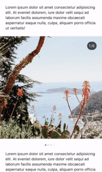](https://skozer.github.io/react-instagram-zoom-slider/)
[**👉 View this interactive demo here**](https://skozer.github.io/react-instagram-zoom-slider/)
## Install
```bash
yarn add react-instagram-zoom-slider react-spring react-use-gesture styled-components
```
## Usage
```jsx
import React, { Component } from 'react'
import ZoomSlider from 'react-instagram-zoom-slider'
function App() {
const slides = [ , ]
, ]
return
}
```
### Common Props
Common props you may want to specify include:
| Prop | Description | Default |
| ----------------------- | ---------------------------------------------------------------------------------------------------- | ---------- |
| `slides` | List of slides to render | _Required_ |
| `initialSlide` | Index of the slide to be rendered by default | 0 |
| `maxScale` | Maximum zoom level | 4 |
| `minScale` | Minimum zoom level | 1 |
| `slideOverlay` | Content to overlay on the slider | null |
| `slideIndicatorTimeout` | Time in milliseconds until the slide indicator fades out.
Set to `null` to disable this behavior. | 5000 |
| `activeDotColor` | Pagination dot color for the active slide | #4e99e9 |
| `dotColor` | Pagination dot color for all other slides | #dadbdc |
### Building a custom slider
If you need to customize the slider components beyond what is available
via props, you can use the `useSlider` and `useZoom` hooks to build your
own components with slide and zoom functionality.
## License
MIT Licensed. Copyright © [Sean Kozer](https://github.com/skozer) 2020.