Ecosyste.ms: Awesome
An open API service indexing awesome lists of open source software.
https://github.com/macosui/macos_ui
Flutter widgets and themes implementing the current macOS design language.
https://github.com/macosui/macos_ui
flutter macos
Last synced: about 2 months ago
JSON representation
Flutter widgets and themes implementing the current macOS design language.
- Host: GitHub
- URL: https://github.com/macosui/macos_ui
- Owner: macosui
- License: mit
- Created: 2021-03-29T23:58:49.000Z (about 3 years ago)
- Default Branch: dev
- Last Pushed: 2024-03-11T10:19:00.000Z (3 months ago)
- Last Synced: 2024-04-21T16:47:15.789Z (about 2 months ago)
- Topics: flutter, macos
- Language: Dart
- Homepage: https://macosui.github.io/macos_ui/#/
- Size: 16.5 MB
- Stars: 1,704
- Watchers: 24
- Forks: 167
- Open Issues: 55
-
Metadata Files:
- Readme: README.md
- Changelog: CHANGELOG.md
- Contributing: CONTRIBUTING.md
- Funding: .github/FUNDING.yml
- License: LICENSE
Lists
- awesome-flutter - MacOS UI - Widgets and themes implementing the current macOS design language by [Groovin Chip](https://twitter.com/GroovinChip). (Utilities / Desktop)
- awesome-stars - macosui/macos_ui - Flutter widgets and themes implementing the current macOS design language. (Dart)
- awesome-stars - macos_ui
README
# macos_ui
Flutter widgets and themes implementing the current macOS design language.
Check out our **interactive widget gallery** online at https://macosui.github.io/macos_ui/#/
Guides, codelabs, and other documentation can be found at https://macosui.dev
[](https://pub.dev/packages/macos_ui)
[](https://pub.dev/packages/macos_ui)
[](https://github.com/GroovinChip/macos_ui/actions/workflows/flutter_analysis.yml)
[](https://github.com/GroovinChip/macos_ui/actions/workflows/pana_analysis.yml)
[](https://github.com/GroovinChip/macos_ui/actions/workflows/codecov.yaml)
[](https://codecov.io/gh/macosui/macos_ui)
## 🚨 Usage notes
###  Flutter channel
`macos_ui` is developed against Flutter's `stable` channel. To ensure a smooth development experience with `macos_ui`, you should build your application on Flutter's `stable` channel.
### Platform Compatibility
pub.dev shows that `macos_ui` only supports macOS. This is because `macos_ui` calls some native code, and therefore
specifies macOS as a plugin platform in the `pubspec.yaml` file.
`macos_ui` _technically_ will work on any platform that
Flutter supports, **but you will get best results on macOS**. non-macOS platform support is ***not*** guaranteed.
The features of `macos_ui` that will _not_ work on platforms other than macOS due to calling native code are:
* Anything related to `macos_window_utils`
* The `MacosColors.controlAccentColor()` function
* The `MacosColorWell` widget
###  Popups & window resizing
Since at this time Flutter does not allow UI elements to overflow the bounds of the window, popups are constrained to
the available space.
Therefore, if you are using widgets that create popups in your toolbar, like `ToolBarPopupButton`, you
should avoid allowing your application window to be resized below the height of your tallest popup.
## Contents
Contributing & Resources
- [Contributing](#contributing)
- [Resources](#resources)
Layout
- [Layout](#layout)
- [MacosWindow](#macoswindow)
- [Sidebar](#sidebar)
- [MacosScaffold](#macosscaffold)
- [Modern Window Look](#modern-window-look)
- [ToolBar](#toolbar)
- [SliverToolBar](#SliverToolBar)
- [MacosListTile](#MacosListTile)
- [MacosTabView](#MacosTabView)
Icons
- [Icons](#icons)
- [MacosIcon](#MacosIcon)
Buttons
- [Buttons](#buttons)
- [MacosCheckbox](#macoscheckbox)
- [HelpButton](#helpbutton)
- [RadioButton](#radiobutton)
- [PulldownButton](#pulldownbutton)
- [PopupButton](#popupbutton)
- [PushButton](#pushbutton)
- [MacosSwitch](#macosswitch)
- [MacosSegmentedControl](#macossegmentedcontrol)
Dialogs & Sheets
- [Dialogs & Sheets](#dialogs)
- [MacosAlertDialog](#MacosAlertDialog)
- [MacosSheet](#MacosSheet)
Fields & Labels
- [Fields](#fields)
- [MacosTextField](#macostextfield)
- [MacosSearchField](#macossearchfield)
- [Labels](#labels)
- [MacosTooltip](#macostooltip)
Indicators
- [Indicators](#indicators)
- [Progress Indicators](#progress-indicators)
- [ProgressCircle](#progresscircle)
- [ProgressBar](#progressbar)
- [Level Indicators](#level-indicators)
- [CapacityIndicator](#capacityindicator)
- [RatingIndicator](#ratingindicator)
Selectors
- [Selectors](#selectors)
- [MacosDatePicker](#macosdatepicker)
- [MacosTimePicker](#macostimepicker)
- [MacosColorWell](#macoscolorwell)
---
## Contributing
`macos_ui` welcomes contributions! Please see `CONTRIBUTING.md` for more information.
## Resources
- [macOS Sonoma Figma kit](https://www.figma.com/file/M6K5L3GK0WJh6pnsASyVeE/macOS-Big-Sur-UI-Kit?node-id=1%3A2)
- [macOS Human Interface Guidelines](https://developer.apple.com/design/human-interface-guidelines/designing-for-macos)
- [macOS Design Resources](https://developer.apple.com/design/resources/)
# Layout
## MacosWindow
`MacosWindow` is the basic frame for a macOS-style layout.
It supports a `Sidebar` on the left, an optional `TitleBar` at the top, and the rest of the window is typically filled out
with a `MacosScaffold`.
A scope for the `MacosWindow` is provided by `MacosWindowScope`.
The sidebar can be toggled with `MacosWindowScope.of(context).toggleSidebar()`. **Please note** that you must wrap
your `MacosScaffold` in a `Builder` widget in order for this to work properly.
## Sidebar
A sidebar enables app navigation and provides quick access to top-level collections of content in your app.
Sidebars may be placed at the left or right of your app. To place a sidebar on the left, use the `MacosWindow.sidebar` property. To place a sidebar on the right, use the `MacosWindow.endSidebar` property.
Example usage:
```dart
int pageIndex = 0;
...
MacosWindow(
sidebar: Sidebar(
minWidth: 200,
builder: (context, scrollController) {
return SidebarItems(
currentIndex: pageIndex,
scrollController: scrollController,
itemSize: SidebarItemSize.large,
onChanged: (i) {
setState(() => pageIndex = i);
},
items: const [
SidebarItem(
label: Text('Page One'),
),
SidebarItem(
label: Text('Page Two'),
),
],
);
},
),
endSidebar: Sidebar(
startWidth: 200,
minWidth: 200,
maxWidth: 300,
shownByDefault: false,
builder: (context, _) {
return const Center(
child: Text('End Sidebar'),
);
},
),
),
```
## MacosScaffold
The `MacosScaffold` is what you might call a "page".
The scaffold has a `toolbar` property and a `children` property. `children` accepts a `ContentArea` widget and
multiple `ResizablePane` widgets. To catch navigation or routes below the scaffold, consider wrapping the
`MacosScaffold` in a [`CupertinoTabView`](https://api.flutter.dev/flutter/cupertino/CupertinoTabView-class.html).
By doing so, navigation inside the `MacosScaffold` will be displayed inside the `MacosScaffold` area instead of
covering the entire window. To push a route outside a `MacosScaffold` wrapped in a
[`CupertinoTabView`](https://api.flutter.dev/flutter/cupertino/CupertinoTabView-class.html), use the root navigator
`Navigator.of(context, rootNavigator: true)`
See the documentation for customizations and `ToolBar` examples.
## Modern window look
A new look for macOS apps was introduced in Big Sur (macOS 11). To match that look in your Flutter app, macos_ui relies on [macos_window_utils](https://pub.dev/packages/macos_window_utils), which requires a minimum macOS deployment target of 10.14.6. Therefore, make sure to open the `macos/Runner.xcworkspace` folder of your project using Xcode and search for `Runner.xcodeproj`. Go to `Info` > `Deployment Target` and set the `macOS Deployment Target` to `10.14.6` or above. Then, open your project's `Podfile` (if it doesn't show up in Xcode, you can find it in your project's `macos` directory via VS Code) and set the minimum deployment version in the first line to `10.14.6` or above:
```podspec
platform :osx, '10.14.6'
```
You may also need to open up your app's `Runner.xcodeproj` in XCode and set the minimum deployment version there.
Now, configure your window inside your `main()` as follows:
```dart
/// This method initializes macos_window_utils and styles the window.
Future _configureMacosWindowUtils() async {
const config = MacosWindowUtilsConfig(
toolbarStyle: NSWindowToolbarStyle.unified,
);
await config.apply();
}
void main() async {
await _configureMacosWindowUtils();
runApp(const YourAppHere());
}
```
Please note that if you are using a title bar (`TitleBar`) in your `MacosWindow`, you should set the `toolbarStyle` of your window to `NSWindowToolbarStyle.expanded`, in order to properly align the close, minimize, zoom window buttons:
```dart
Future _configureMacosWindowUtils() async {
const config = MacosWindowUtilsConfig(
toolbarStyle: NSWindowToolbarStyle.expanded,
);
await config.apply();
}
```
In any other case, you should keep it as `NSWindowToolbarStyle.unified`.
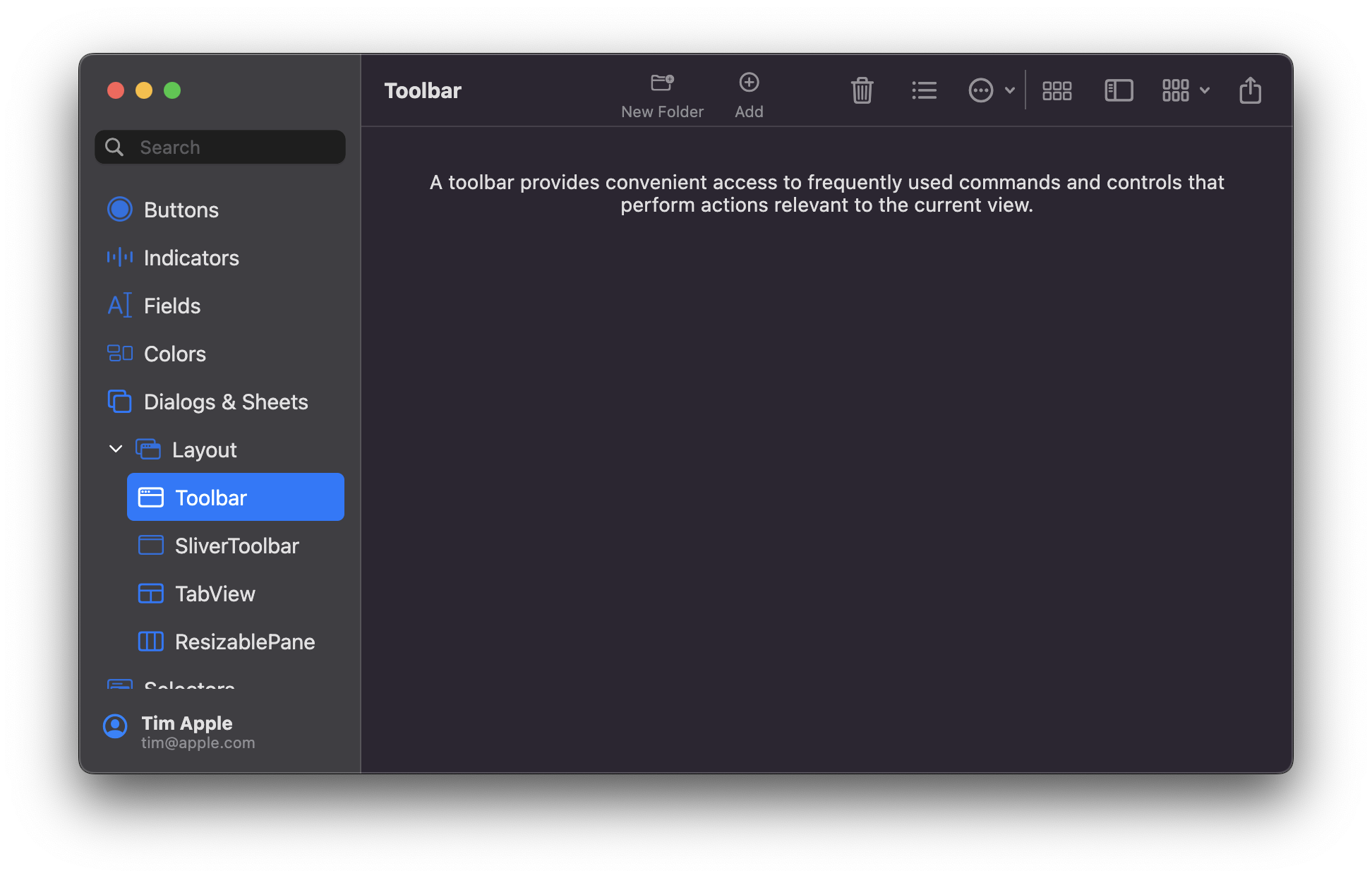
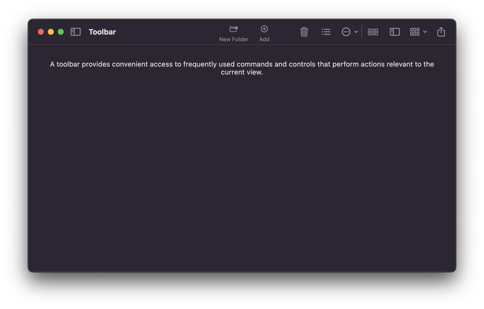
## ToolBar
Creates a toolbar in the `MacosScaffold`. The toolbar appears below the title bar (if present) of the macOS app or integrates with it, by using its `title` property.
A toolbar provides convenient access to frequently used commands and features (toolbar items). Different routes of your app could have different toolbars.
Toolbar items include `ToolBarIconButton`, `ToolBarPulldownButton`, and `ToolBarSpacer` widgets, and should be provided via the `items` property. The action of every toolbar item should also be provided as a menu bar command of your app.
Toolbars look best and are easiest to understand when they contain elements of the same type (so either use labels for every toolbar item or not).
You can use the `ToolBarSpacer` widgets to set the grouping of the different toolbar actions.
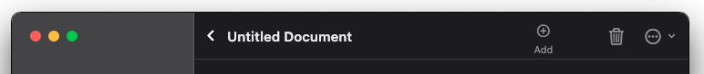
An example toolbar would be:
```dart
ToolBar(
title: const Text('Untitled Document'),
titleWidth: 200.0,
leading: MacosBackButton(
onPressed: () => debugPrint('click'),
fillColor: Colors.transparent,
),
actions: [
ToolBarIconButton(
label: "Add",
icon: const MacosIcon(
CupertinoIcons.add_circled,
),
onPressed: () => debugPrint("Add..."),
showLabel: true,
),
const ToolBarSpacer(),
ToolBarIconButton(
label: "Delete",
icon: const MacosIcon(
CupertinoIcons.trash,
),
onPressed: () => debugPrint("Delete"),
showLabel: false,
),
ToolBarPullDownButton(
label: "Actions",
icon: CupertinoIcons.ellipsis_circle,
items: [
MacosPulldownMenuItem(
label: "New Folder",
title: const Text("New Folder"),
onTap: () => debugPrint("Creating new folder..."),
),
MacosPulldownMenuItem(
label: "Open",
title: const Text("Open"),
onTap: () => debugPrint("Opening..."),
),
],
),
]
),
```
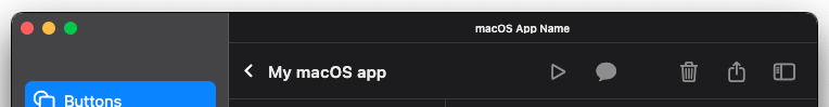
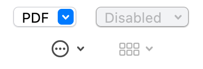
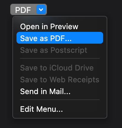
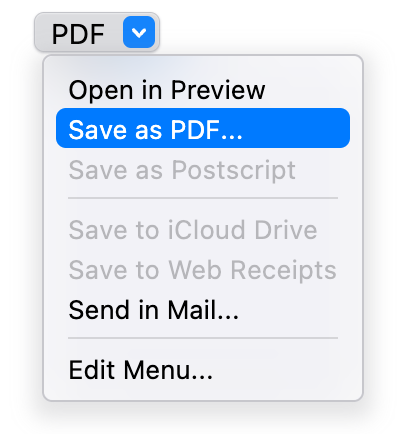
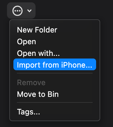
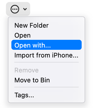
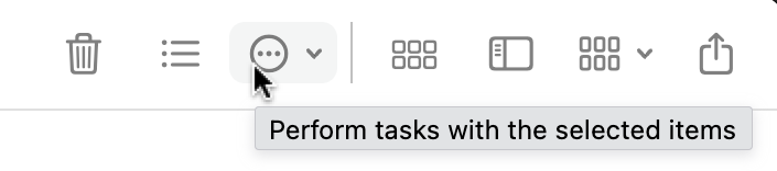
This builds this simple toolbar:
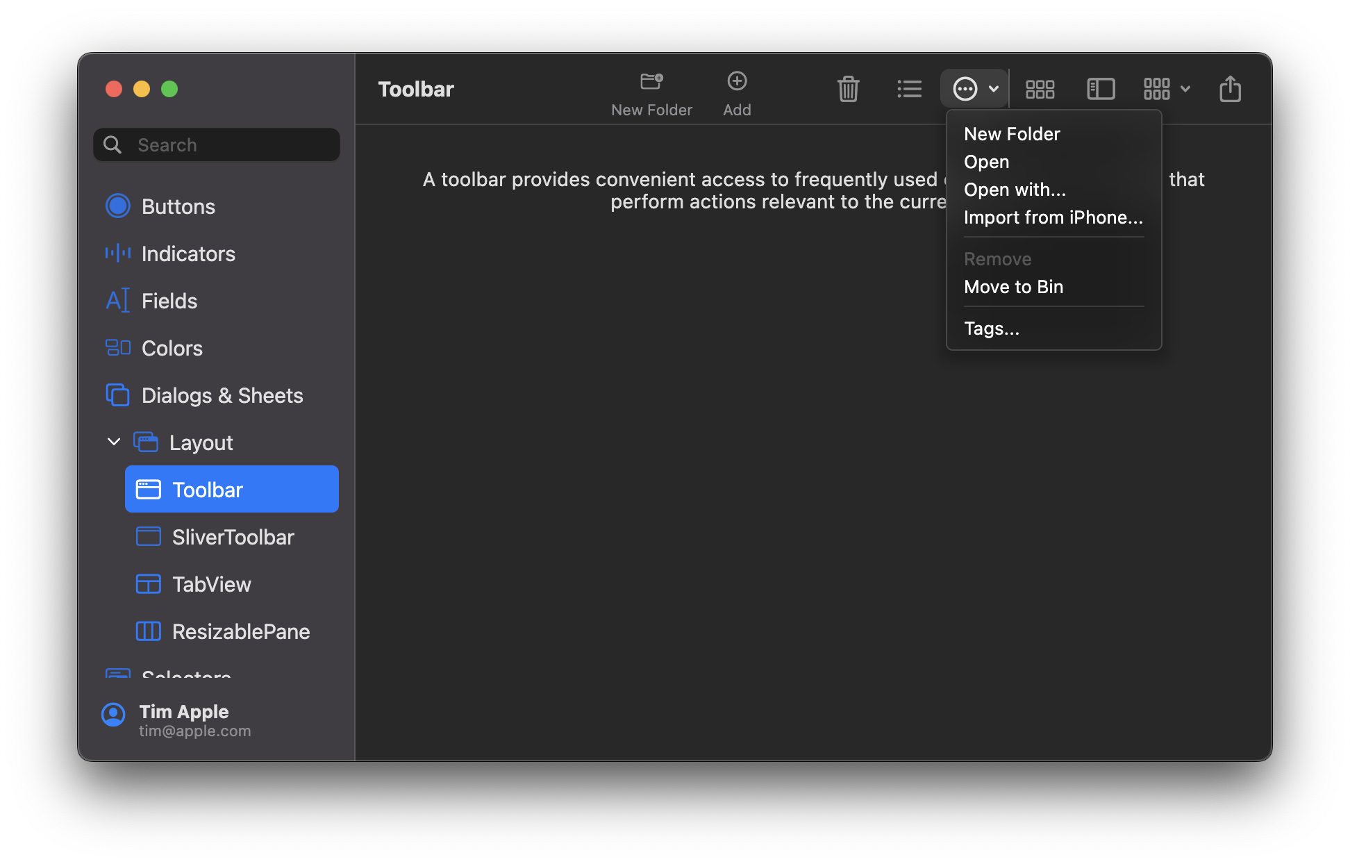
Other toolbar examples:
- Toolbar with icon buttons (no labels):

- Toolbar with icon buttons and labels:

- Toolbar with a pulldown button open:
- Toolbar with title bar above (also see [the note above](#modern-window-look)):
You can also create your own `CustomToolbarItem` to include any type of widget in the toolbar:
```dart
// Add a grey vertical line as a custom toolbar item:
CustomToolbarItem(
inToolbarBuilder: (context) => Padding(
padding: const EdgeInsets.all(8.0),
child: Container(color: Colors.grey, width: 1, height: 30),
),
inOverflowedBuilder: (context) =>
Container(color: Colors.grey, width: 30, height: 1),
),
```
## `SliverToolBar`

`SliverToolbar` is a variant of the standard `ToolBar`, with the key difference being that (as the name implies), it
is compatible with scrollable widgets like `CustomScrollView` and `NestedScrollView`. There are three additional
properties on `SliverToolBar`:
* `pinned`, which determines if the toolbar should remain visible while scrolling
* `floating`, which determines if the toolbar should become visible as soon as the use starts scrolling upwards
* `opacity`, which manages the translucency effect of the toolbar
This widget enables developers to achieve the toolbar behaviors seen in Apple's App Store.
Sample usage:
```dart
return CustomScrollView(
controller: scrollController,
slivers: [
SliverToolBar(
title: const Text('SliverToolbar'),
pinned: true,
toolbarOpacity: 0.75,
),
// Other slivers below
],
);
```
## MacosListTile
A widget that aims to approximate the [`ListTile`](https://api.flutter.dev/flutter/material/ListTile-class.html) widget found in
Flutter's material library.
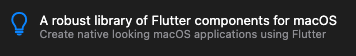
Sample usage:
```dart
MacosListTile(
leading: const Icon(CupertinoIcons.lightbulb),
title: Text(
'A robust library of Flutter components for macOS',
style: MacosTheme.of(context).typography.headline,
),
subtitle: Text(
'Create native looking macOS applications using Flutter',
style: MacosTheme.of(context).typography.subheadline.copyWith(
color: MacosColors.systemGrayColor,
),
),
),
```
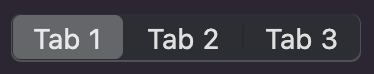
## MacosTabView
A multipage interface that displays one page at a time. Must be used in a `StatefulWidget`.
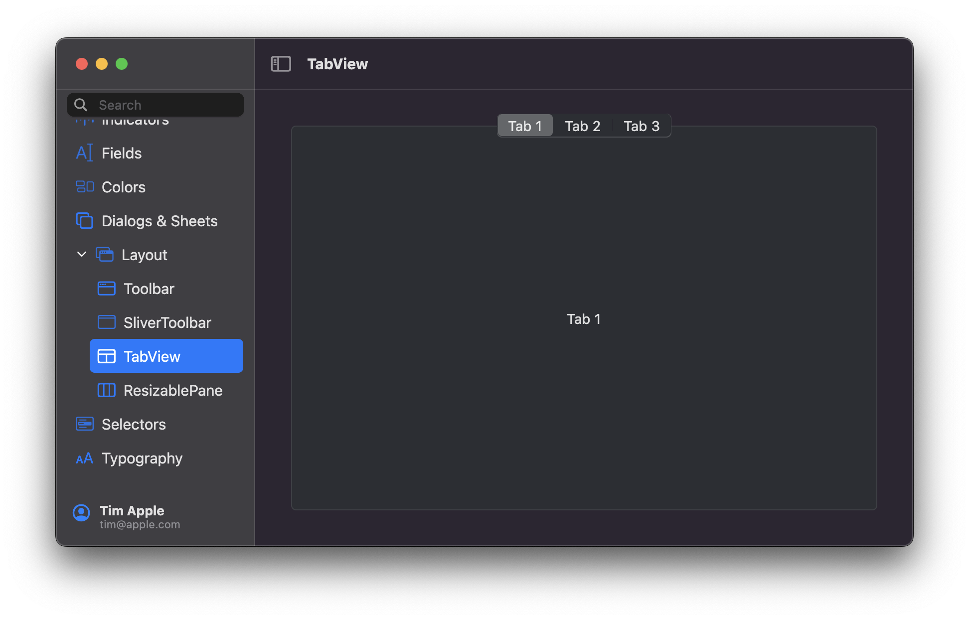
You can control the placement of the tabs using the `position` property.
Usage:
```dart
final _controller = MacosTabController(
initialIndex: 0,
length: 3,
);
...
MacosTabView(
controller: _controller,
tabs: const [
MacosTab(
label: 'Tab 1',
),
MacosTab(
label: 'Tab 2',
),
MacosTab(
label: 'Tab 3',
),
],
children: const [
Center(
child: Text('Tab 1'),
),
Center(
child: Text('Tab 2'),
),
Center(
child: Text('Tab 3'),
),
],
),
```
# Icons
## MacosIcon
A `MacosIcon` is identical to a regular `Icon` in every way with one exception - it respects
a `MacosTheme`. Use it the same way you would a regular icon:
```dart
MacosIcon(
CupertinoIcons.add,
// color: CupertinoColors.activeBlue.color,
// size: 20,
),
```
# Buttons
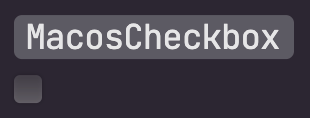
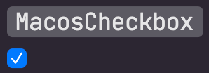
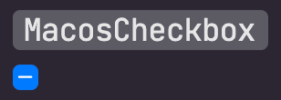
## MacosCheckbox
A checkbox is a type of button that lets the user choose between two opposite states, actions, or values. A selected
checkbox is considered on when it contains a checkmark and off when it's empty. A checkbox is almost always followed
by a title unless it appears in a checklist. [Learn more](https://developer.apple.com/design/human-interface-guidelines/macos/buttons/checkboxes/)
| Unchecked | Checked | Mixed |
| --------------------------------------------------------------------------------------------------------------------- | ------------------------------------------------------------------------------------------------------------------ | ------------------------------------------------------------------------------------------------------------------ |
|  |  |  |
Here's an example of how to create a basic checkbox:
```dart
bool selected = false;
MacosCheckbox(
value: selected,
onChanged: (value) {
setState(() => selected = value);
},
)
```
To make a checkbox in the `mixed` state, set `value` to `null`.
## HelpButton
A help button appears within a view and opens app-specific help documentation when clicked. All help buttons are
circular, consistently sized buttons that contain a question mark icon. [Learn more](https://developer.apple.com/design/human-interface-guidelines/macos/buttons/help-buttons/)

Here's an example of how to create a help button:
```dart
HelpButton(
onPressed: () {
print('pressed help button'),
},
)
```
You can customize the help button appearance and behaviour using the `HelpButtonTheme`, but it's not recommended by
apple to change help button's appearance.
## RadioButton
A radio button is a small, circular button followed by a title. Typically presented in groups of two to five, radio
buttons provide the user a set of related but mutually exclusive choices. A radio button’s state is either on
(a filled circle) or off (an empty circle). [Learn more](https://developer.apple.com/design/human-interface-guidelines/macos/buttons/radio-buttons/)
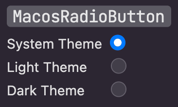
Here's an example of how to create a basic radio button:
```dart
bool selected = false;
MacosRadioButton(
value: selected,
onChanged: (value) {
setState(() => selected = value);
},
),
```
## PulldownButton
A pull-down button (often referred to as a pull-down menu) is a type of pop-up button that, when clicked, displays a
menu containing a list of choices. The menu appears below the button. Once the menu is displayed onscreen, it remains
open until the user chooses a menu item, clicks outside of the menu, switches to another app, or quits the app; or
until the system displays an alert. [Learn more](https://developer.apple.com/design/human-interface-guidelines/macos/buttons/pull-down-buttons/)
Use a pull-down button to present a list of commands. A pull-down button can either show a `title` or an `icon` to
describe the contents of the button's menu. If you use an icon, make sure it clearly communicates the button’s purpose.
If `items` is null, the button will be disabled (greyed out).
A `title` or an `icon` must be provided, to be displayed as the pull-down button's title, but not both at the same time.
The menu can also be navigated with the up/down keys and an action selected with the Return key.
It can also appear in the toolbar, via the `ToolBarPulldownButton` widget.
| Dark Theme | Light Theme |
| ------------------------------------------ | ------------------------------------------ |
|  |
|  |
|
|  |
|  |
|
|  |
|  |
|
Here's an example of how to create a basic pull-down button:
```dart
MacosPulldownButton(
title: "Actions",
// Or provide an icon to use as title:
// icon: CupertinoIcons.ellipsis_circle,
items: [
MacosPulldownMenuItem(
title: const Text('Save'),
onTap: () => debugPrint("Saving..."),
),
MacosPulldownMenuItem(
title: const Text('Save as...'),
onTap: () => debugPrint("Opening Save As dialog..."),
),
const MacosPulldownMenuDivider(),
MacosPulldownMenuItem(
enabled: false,
title: const Text('Export'),
onTap: () => debugPrint("Exporting"),
),
],
),
```
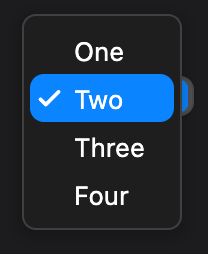
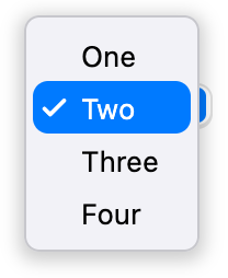
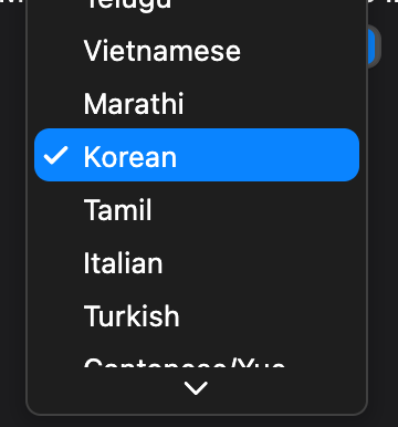
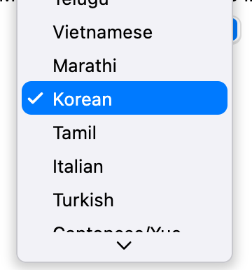
## PopupButton
A pop-up button (often referred to as a pop-up menu) is a type of button that, when clicked, displays a menu containing
a list of mutually exclusive choices. The menu appears on top of the button. Like other types of menus, a pop-up
button’s menu can include separators and symbols like checkmarks. After the menu is revealed, it remains open until the
user chooses a menu item, clicks outside of the menu, switches to another app, or quits the app; or until the system
displays an alert. [Learn more](https://developer.apple.com/design/human-interface-guidelines/macos/buttons/pop-up-buttons/)
The type `T` of the `MacosPopupButton` is the type of the value that each pop-up menu item represents. All the entries
in a given menu must represent values with consistent types. Typically, an `enum` is used. Each `MacosPopupMenuItem`
in items must be specialized with that same type argument.
The `onChanged` callback should update a state variable that defines the pop-up menu's value. It should also call
`State.setState` to rebuild the pop-up button with the new value.
When there are menu items that cannot be displayed within the available menu constraints, a caret is shown at the top
or bottom of the open menu to signal that there are items that are not currently visible.
The menu can also be navigated with the up/down keys and an item selected with the Return key.
| Dark Theme | Light Theme |
| ------------------------------------------ | ------------------------------------------ |
| 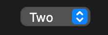 |
| 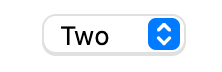 |
|
|  |
|  |
|
|  |
|  |
|
Here's an example of how to create a basic pop-up button:
```dart
String popupValue = 'One';
MacosPopupButton(
value: popupValue,
onChanged: (String? newValue) {
setState(() {
popupValue = newValue!;
});
},
items: ['One', 'Two', 'Three', 'Four']
.map>((String value) {
return MacosPopupMenuItem(
value: value,
child: Text(value),
);
}).toList(),
),
```
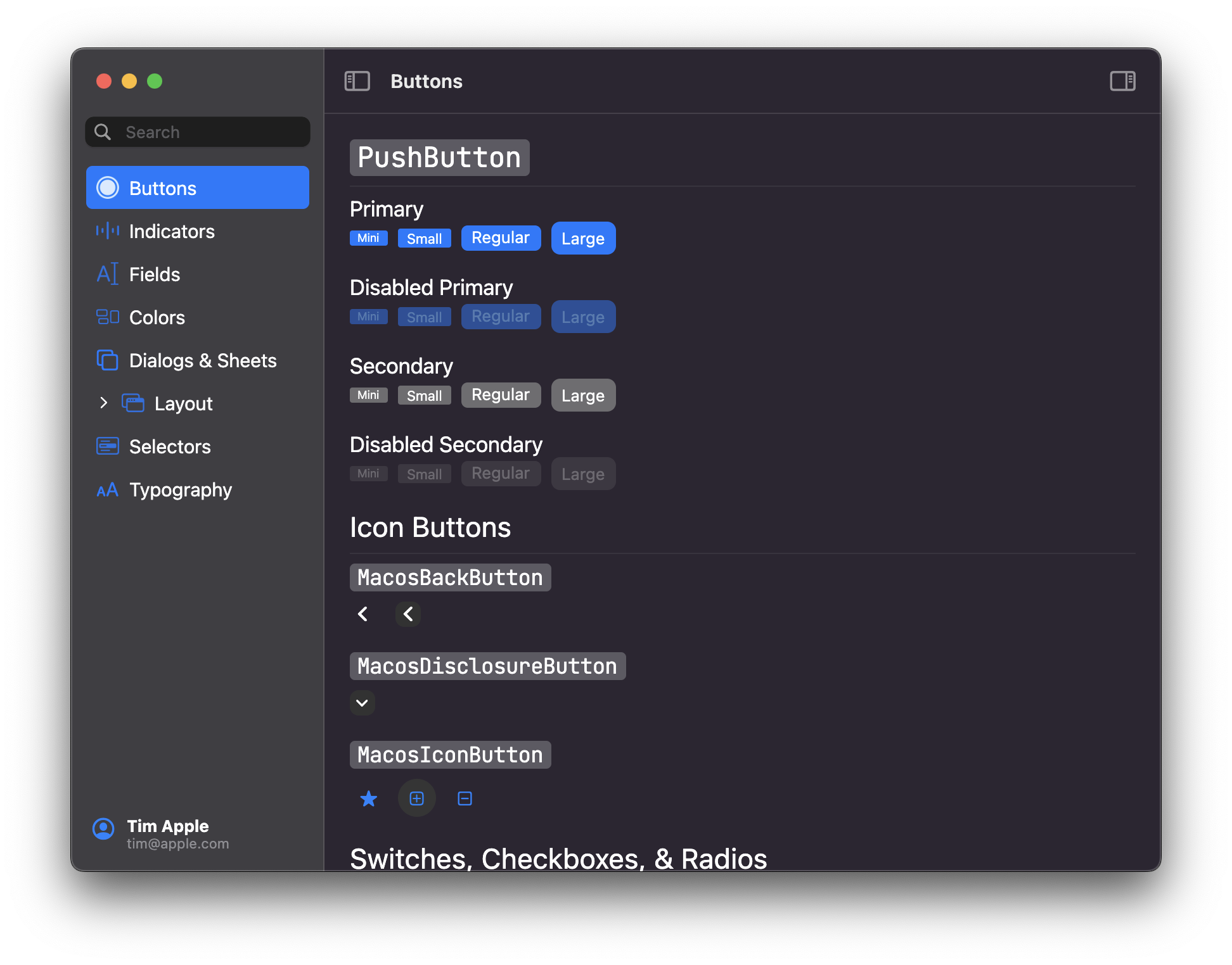
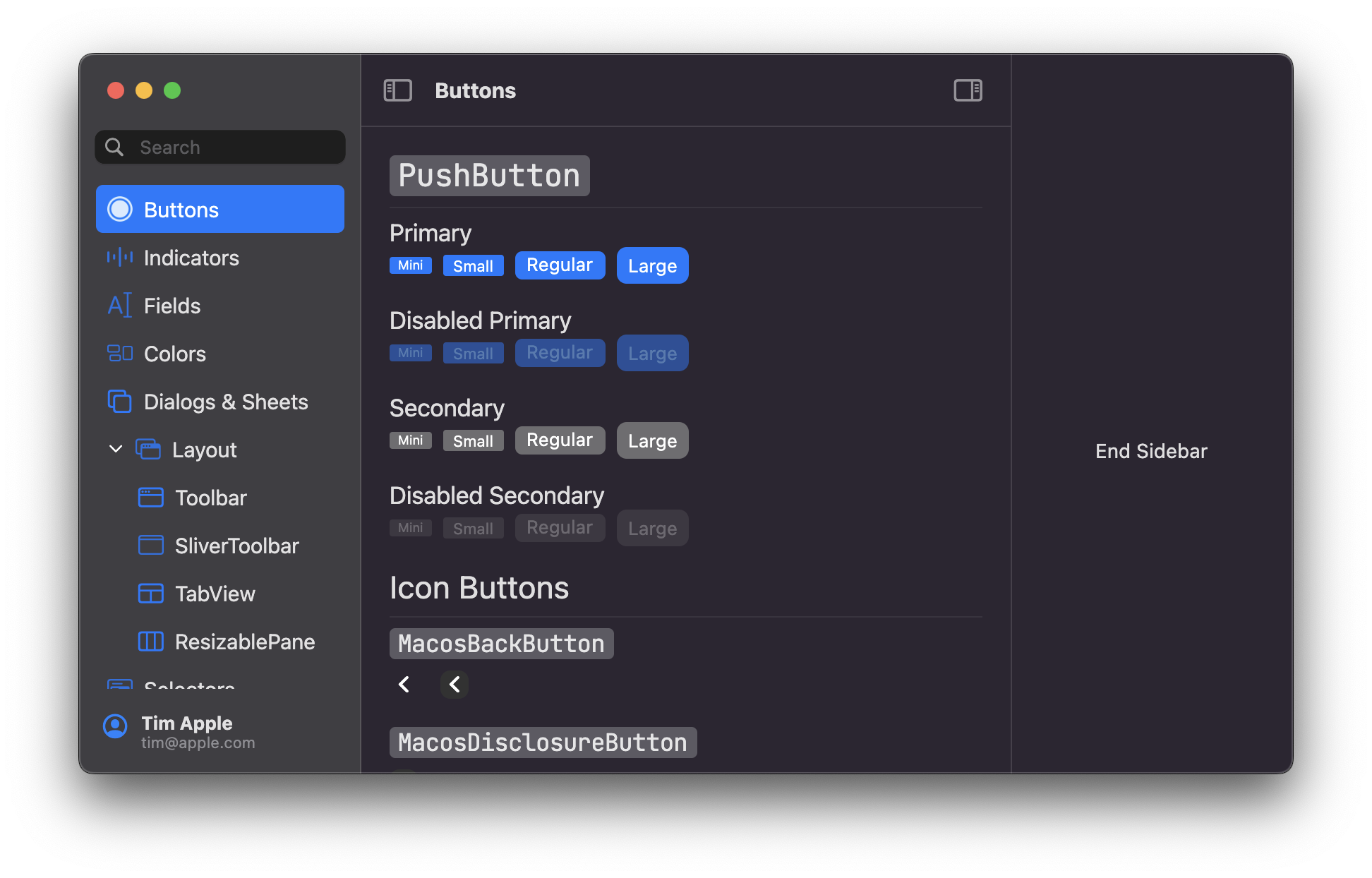
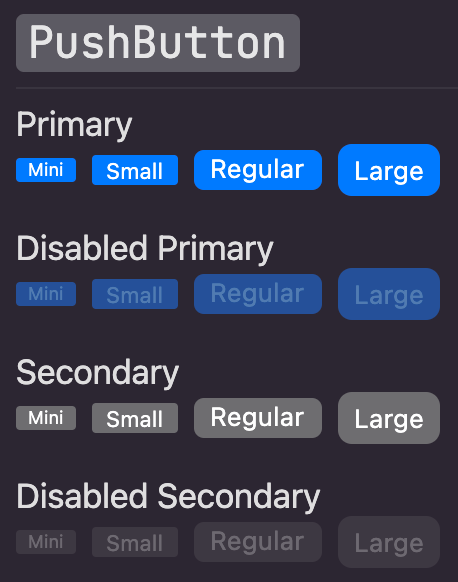
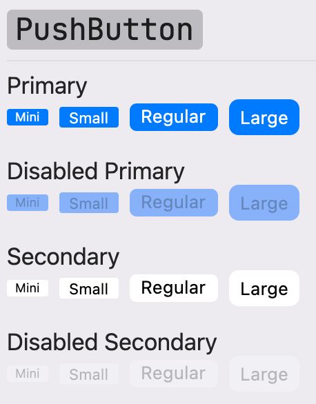
## PushButton
Push buttons are the standard button type in macOS. Push buttons contain text—not icons—and often open a separate window, dialog, or app so the user can
complete a task. [Learn more](https://developer.apple.com/design/human-interface-guidelines/macos/buttons/push-buttons/)
| Dark Theme | Light Theme |
| ------------------------------------------ | ------------------------------------------ |
|  |
|  |
|
ℹ️ **Note** ℹ️
Native push buttons can be styled as text-only, text with an icon, or icon-only. Currently, text-only push buttons are supported. To create an icon-only button, use the `MacosIconButton` widget.
Here's an example of how to create a basic push button:
```dart
PushButton(
child: Text('button'),
controlSize: ControlSize.regular,
onPressed: () {
print('button pressed');
},
),
```
## MacosSwitch
A switch (also known as a toggle) is a control that offers a binary choice between two mutually exclusive states — on and off. A switch shows that it's on when the
accent color is visible and off when the switch appears colorless.
The `ContolSize` enum can be passed to the `size` property to control the size of the switch. `MacosSwitch` supports the following
control sizes:
* `mini`
* `small`
* `regular`
| Off | On |
| ------------------------------------------ | ------------------------------------------ |
| 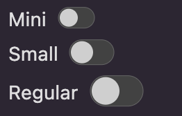 |
| 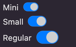 |
|
Here's an example of how to create a basic toggle switch:
```dart
bool switchValue = false;
MacosSwitch(
value: switchValue,
onChanged: (value) {
setState(() => switchValue = value);
},
),
```
Learn more about switches [here](https://developer.apple.com/design/human-interface-guidelines/toggles).
## MacosSegmentedControl
Displays one or more navigational tabs in a single horizontal group. Used by `MacosTabView` to navigate between the
different tabs of the tab bar.
The typical usage of this widget is by `MacosTabView`, to control the navigation of its children. You do not need to
specify a `MacosSegmentedControl` with your `MacosTabView`, as it is built by that widget.
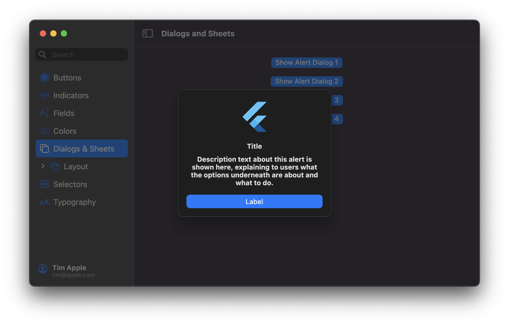
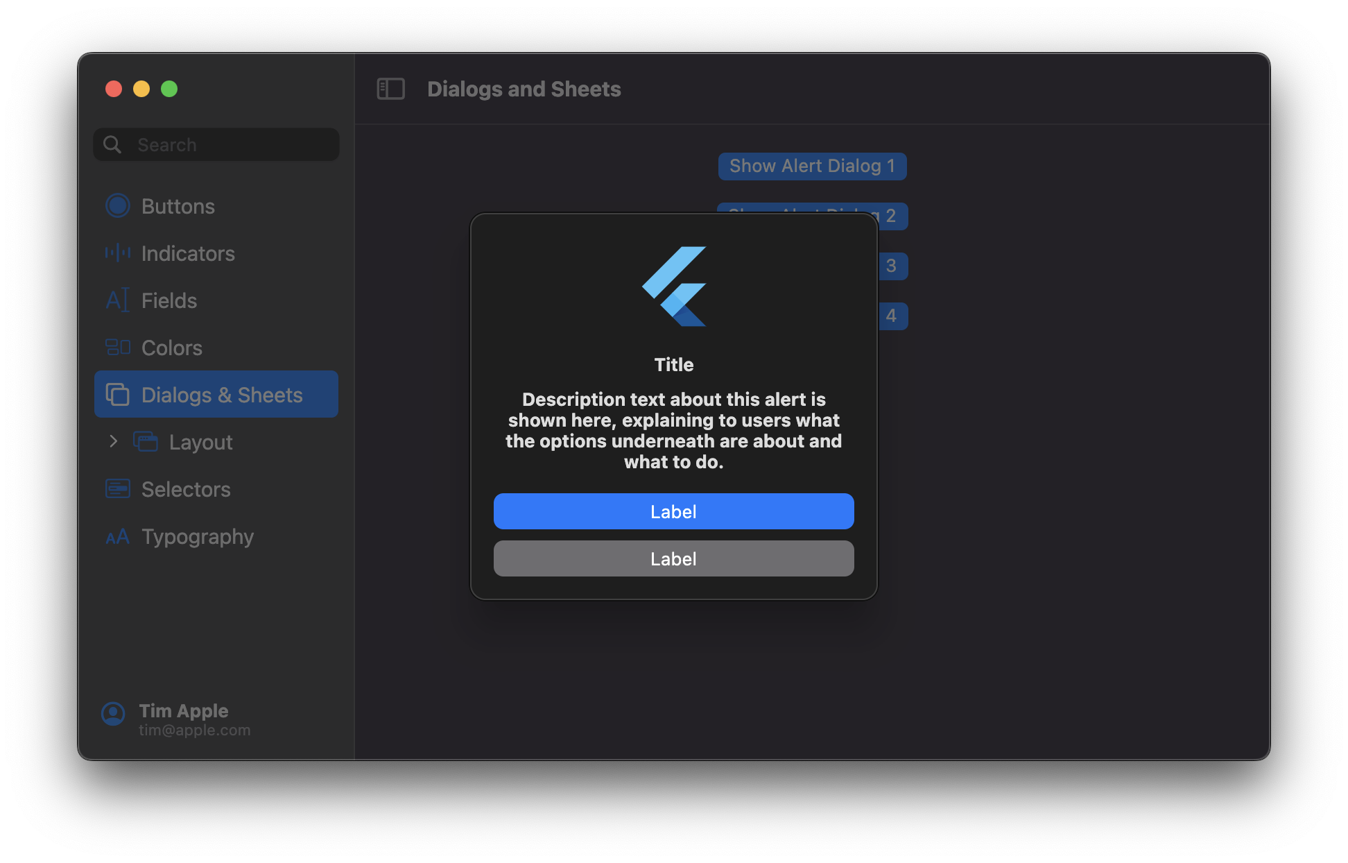
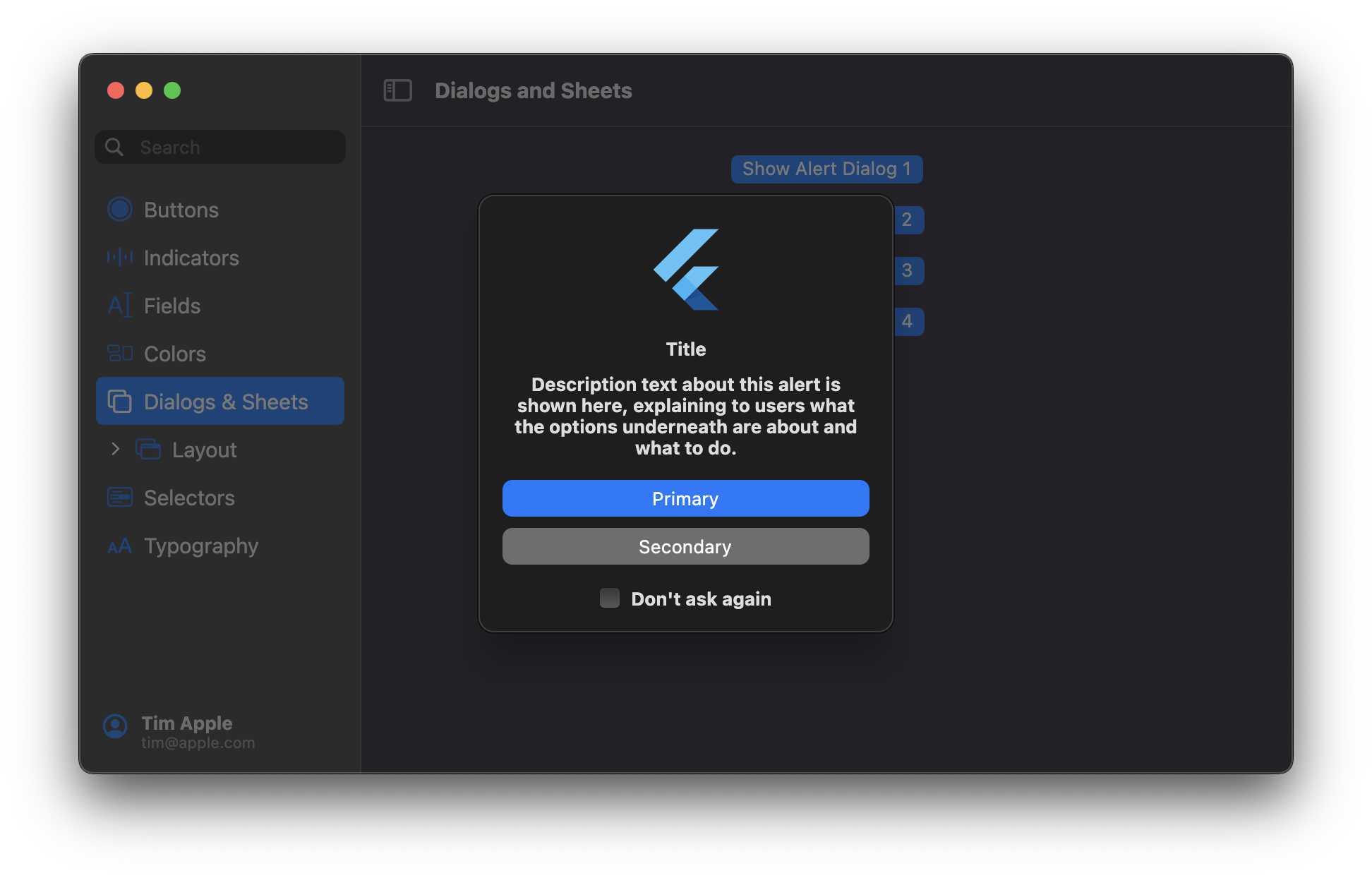
# Dialogs and Sheets
## MacosAlertDialog
Usage:
```dart
showMacosAlertDialog(
context: context,
builder: (_) => MacosAlertDialog(
appIcon: FlutterLogo(size: 64),
title: Text(
'Alert Dialog with Primary Action',
style: MacosTheme.of(context).typography.headline,
),
message: Text(
'This is an alert dialog with a primary action and no secondary action',
textAlign: TextAlign.center,
style: MacosTypography.of(context).headline,
),
primaryButton: PushButton(
controlSize: ControlSize.large,
child: Text('Primary'),
onPressed: () {},
),
),
);
```

## MacosSheet
Usage:
```dart
showMacosSheet(
context: context,
builder: (_) => const MacosuiSheet(),
);
```
# Fields
## MacosTextField
A text field is a rectangular area in which the user enters or edits one or more lines of text. A text field can
contain plain or styled text.
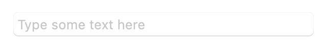
Here's an example of how to create a basic text field:
```dart
MacosTextField(
placeholder: 'Type some text here',
)
```
## MacosSearchField
A search field is a style of text field optimized for performing text-based searches in a large collection of values.
When the user starts typing into the search field, a list of selectable results appears in an overlay below (or above) the field.
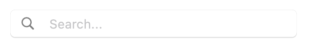
| Dark Theme | Light Theme |
| ------------------------------------------ | ------------------------------------------ |
| 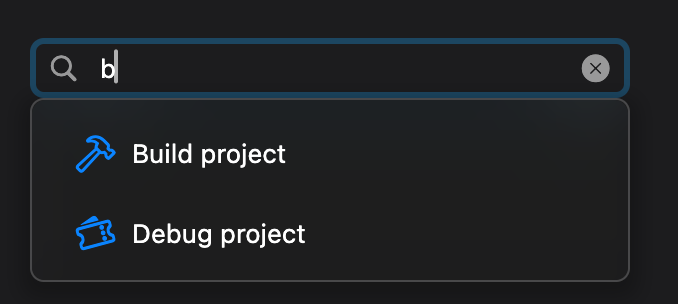 |
| 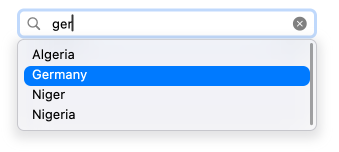 |
|
Here's an example of how to create a search field:
```dart
MacosSearchField(
placeholder: 'Search for a country...',
results: countries.map((e) => SearchResultItem(e)).toList(),
onResultSelected: (resultItem) {
debugPrint(resultItem.searchKey);
},
)
```
Check the `examples/fields_page` for more examples.
# Labels
Labels are a short description of what an element on the screen does.
## MacosTooltip
Tooltips succinctly describe how to use controls without shifting people’s focus away from the primary interface.
Help tags appear when the user positions the pointer over a control for a few seconds. A tooltip remains visible for
10 seconds, or until the pointer moves away from the control.
| Dark Theme | Light Theme |
| ------------------------------------------ | ------------------------------------------ |
|  |
|  |
|
To create a tooltip, wrap any widget on a `MacosTooltip`:
```dart
MacosTooltip(
message: 'This is a tooltip',
child: Text('Hover or long press to show a tooltip'),
),
```
You can customize the tooltip the way you want by customizing the theme's `TooltipTheme`. A tooltip automatically adapts to its
environment, responding to touch and pointer events. To use a tooltip with a toolbar item, provide it with a `tooltipMessage` property.
# Indicators
## Progress Indicators
Don’t make people sit around staring at a static screen waiting for your app to load content or perform lengthy data
processing operations. Use progress indicators to let people know your app hasn't stalled and to give them some idea
of how long they’ll be waiting.
Progress indicators have two distinct styles:
- **Bar indicators**, more commonly known as progress bars, show progress in a horizontal bar.
- **Spinning indicators** show progress in a circular form, either as a spinner or as a circle that fills in as progress continues.
People don't interact with progress indicators; however, they are often accompanied by a button for canceling the
corresponding operation. [Learn more](https://developer.apple.com/design/human-interface-guidelines/macos/indicators/progress-indicators/)
### ProgressCircle
A `ProgressCircle` can be either determinate or indeterminate.
| Determinate Progress Circle | Indeterminate Progress Circle |
| ------------------------------------------ | ------------------------------------------ |
| 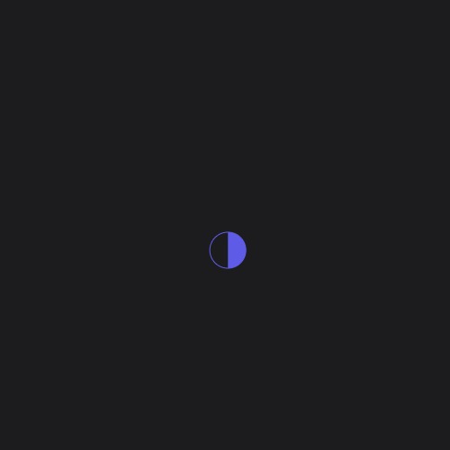 |
|  |
|
Here's an example of how to create an indeterminate progress circle:
```dart
ProgressCircle(
value: null,
),
```
You can provide a non-null value to `value` to make the progress circle determinate.
### ProgressBar
A `ProgressBar` can only be determinate.

Here's an example of how to create a determinate progress bar:
```dart
ProgressBar(
value: 30,
)
```
## Level Indicators
A level indicator graphically represents of a specific value within a range of numeric values. It’s similar to a
[slider](#slider) in purpose, but more visual and doesn’t contain a distinct control for selecting a value—clicking and
dragging across the level indicator itself to select a value is supported, however. A level indicator can also include
tick marks, making it easy for the user to pinpoint a specific value in the range. There are three different level
indicator styles, each with a different appearance, for communicating capacity, rating, and relevance.
### CapacityIndicator
A capacity indicator illustrates the current level in relation to a finite capacity. Capacity indicators are often used
when communicating factors like disk and battery usage. [Learn more](https://developer.apple.com/design/human-interface-guidelines/macos/indicators/level-indicators#capacity-indicators)
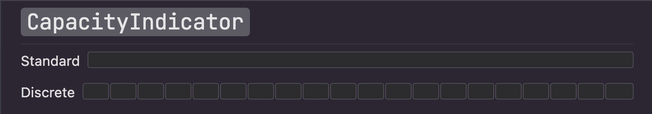
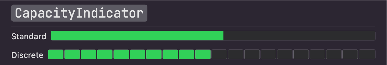
Here's an example of how to create an interactive continuous capacity indicator:
```dart
double value = 30;
CapacityIndicator(
value: value,
discrete: false,
onChanged: (v) {
setState(() => value = v);
},
),
```
You can set `discrete` to `true` to make it a discrete capacity indicator.
### MacosSlider
A slider is a control that lets people select a value from a continuous or discrete range of values by moving the slider thumb.
| Continuous | Discrete |
| ------------------------------------------------------------------------------------------ | ---------------------------------------------------------------------------------------------------------------------------------------- |
|  |  |
| A horizontal slider where any value continuous value between a min and max can be selected | A horizontal slider where only discrete values between a min and max can be selected. Tick marks are often displayed to provide context. |
Here's an example of how to create an interactive continuous slider:
```dart
double value = 0.5;
MacosSlider(
value: value,
onChanged: (v) {
setState(() => value = v);
},
),
```
### RatingIndicator
A rating indicator uses a series of horizontally arranged graphical symbols to communicate a ranking level. The default
symbol is a star.

A rating indicator doesn’t display partial symbols—its value is rounded in order to display complete symbols only.
Within a rating indicator, symbols are always the same distance apart and don't expand or shrink to fit the control.
[Learn more](https://developer.apple.com/design/human-interface-guidelines/macos/indicators/level-indicators#rating-indicators)
Here's an example of how to create an interactive rating indicator:
```dart
double value = 3;
RatingIndicator(
amount: 5,
value: value,
onChanged: (v) {
setState(() => value = v);
}
)
```
# Selectors
## MacosDatePicker
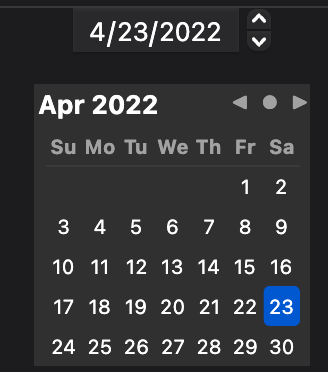
Lets the user choose a date.
There are three styles of `MacosDatePickers`:
* `textual`: a text-only date picker where the user must select the day,
month, or year and use the caret-control buttons to change the value.
This is useful when space in your app is constrained.
* `graphical`: a visual date picker where the user can navigate through a
calendar-like interface to select a date.
* `combined`: provides both `textual` and `graphical` interfaces.
Localization of the time picker is supported by the `weekdayAbbreviations` and `monthAbbreviations` parameters (instead of e.g. standard `localizations.narrowWeekdays()` in order to match Apple's spec).
* `weekdayAbbreviations` should be a list of 7 strings, one for each day of the week, starting with Sunday
* `monthAbbreviations` should be a list of 12 strings, one for each month of the year, starting with January
You can also define the `dateFormat` to change the way dates are displayed in the textual interface.
It takes a string of tokens (case-insensitive) and replaces them with their corresponding values.
The following tokens are supported:
* `D`: day of the month (1-31)
* `DD`: day of the month (01-31)
* `M`: month of the year (1-12)
* `MM`: month of the year (01-12)
* `YYYY`: year (0000-9999)
* Any separator between tokens is preserved (e.g. `/`, `-`, `.`)
The default format is `M/D/YYYY`.
Example usage:
```dart
MacosDatePicker(
onDateChanged: (date) => debugPrint('$date'),
),
```
## MacosTimePicker
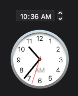
Lets the user choose a time.
There are three styles of `MacosTimePickers`:
* `textual`: a text-only time picker where the user must select the hour
or minute and use the caret-control buttons to change the value.
This is useful when space in your app is constrained.
* `graphical`: a visual time picker where the user can move the hands of a
clock-like interface to select a time.
* `combined`: provides both `textual` and `graphical` interfaces.
Example usage:
```dart
MacosTimePicker(
onTimeChanged: (time) => debugPrint('$time'),
),
```
## MacosColorWell

Lets the user choose a color via the native macOS color picker.
You can choose which mode to launch the picker in using the `ColorPickerMode` enum. The default is `ColorPickerMode.wheel`
🚨 This widget will not work on platforms other than macOS!
Example usage:
```dart
MacosColorWell(
onColorSelected: (color) => debugPrint('$color'),
),
```