Ecosyste.ms: Awesome
An open API service indexing awesome lists of open source software.
https://github.com/exyte/mediapicker
Customizable media picker written with SwiftUI
https://github.com/exyte/mediapicker
ios photo-gallery photo-picker swiftui swiftui-components
Last synced: about 2 months ago
JSON representation
Customizable media picker written with SwiftUI
- Host: GitHub
- URL: https://github.com/exyte/mediapicker
- Owner: exyte
- License: mit
- Created: 2022-07-04T07:03:04.000Z (almost 2 years ago)
- Default Branch: main
- Last Pushed: 2024-04-01T08:47:52.000Z (3 months ago)
- Last Synced: 2024-04-27T10:31:43.555Z (about 2 months ago)
- Topics: ios, photo-gallery, photo-picker, swiftui, swiftui-components
- Language: Swift
- Homepage:
- Size: 233 KB
- Stars: 271
- Watchers: 5
- Forks: 35
- Open Issues: 5
-
Metadata Files:
- Readme: README.md
- License: LICENSE
Lists
- awesome-ios - ExyteMediaPicker - Customizable media picker (Hardware / Camera)
- awesome-swift - MediaPicker - SwiftUI customizable media picker - supports camera and gallery with albums (Libs / Hardware)
- awesome-swiftui-libraries - MediaPicker - Customizable media picker written with SwiftUI (Photo-Picker / Content)
- awesome-swifte - MediaPicker - SwiftUI customizable media picker - supports camera and gallery with albums (Libs / Hardware)
- awesome-swifty - MediaPicker - SwiftUI customizable media picker - supports camera and gallery with albums (Libs / Hardware)
- awesome-swift4 - MediaPicker - SwiftUI customizable media picker - supports camera and gallery with albums (Libs / Hardware)
- awesome-ios-star - ExyteMediaPicker - Customizable media picker (Hardware / Camera)
- awesome-swiftxx - MediaPicker - SwiftUI customizable media picker - supports camera and gallery with albums (Libs / Hardware)
- fucking-awesome-swift - MediaPicker - SwiftUI customizable media picker - supports camera and gallery with albums (Libs / Hardware)
- awesome-swiftqq - MediaPicker - SwiftUI customizable media picker - supports camera and gallery with albums (Libs / Hardware)
- awesome-iosx - ExyteMediaPicker - Customizable media picker (Hardware / Camera)
- awesome-iosr - ExyteMediaPicker - Customizable media picker (Hardware / Camera)
README


Media Picker
SwiftUI library for a customizable media picker.

[](https://swiftpackageindex.com/exyte/MediaPicker)
[](https://swiftpackageindex.com/exyte/MediaPicker)
[](https://swiftpackageindex.com/exyte/MediaPicker)
[](https://cocoapods.org/pods/ExyteMediaPicker)
[](https://github.com/Carthage/Carthage)
[](https://opensource.org/licenses/MIT)
# Features
* Photo and video picker
* Single and multiple selection
* Full-screen view
* Live photo preview & capture
* Full customization
# MediaPicker vs PhotosPicker
* The iOS 16 PhotosPicker only provides you with a button, while this library gives you the whole view, meaning you can build it into you own screens and customize it as you see fit.
* PhotosPicker only lets you pick photos from the library - no camera.
* MediaPicker provides a default looking library picker, with ability to manage albums, and also a camera view to take photos/video
## !SPM Renaming!
SPM package is now called `ExyteMediaPicker` instead of `MediaPicker`, sorry for any inconveniences.
# Usage
1. Add a binding Bool to control the picker presentation state.
2. Add Media array to save selection (`[Media]`).
3. Initialize the media picker and present it however you like - for example, using the .sheet modifier
```swift
.sheet(isPresented: $showMediaPicker) {
MediaPicker(
isPresented: $showMediaPicker,
onChange: { medias = $0 }
)
}
```
## Media model
The lbrary will return an array of `Media` structs for you to use as you see fit. It has the following fields and methods (all the methods use async/await API):
- `type` - .image or .video
- `duration` - nil for .image
- `getURL()` - returns `URL` to media (automatically stores in temporary directory if needed)
- `getThumbnailURL()` - returns `URL` to media's thumbnail (for image just returns the image itself)
- `getData()` - returns media's `Data` representation
- `getThumbnailData()` - returns media's thumbnail `Data` representation
## Modes
This library lets you use both photo library and camera
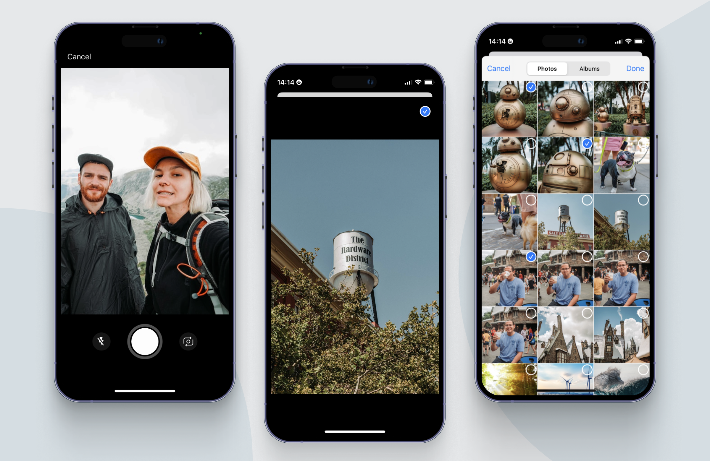
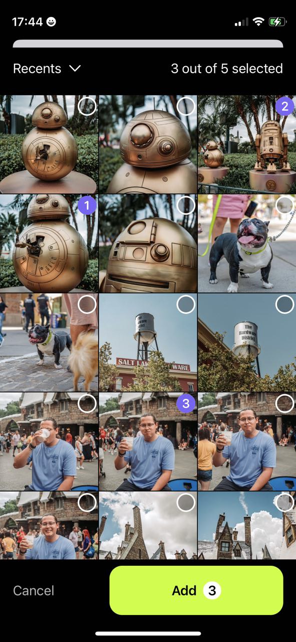
### Photos grid
Default photos grid screen has a standard header which contains the 'Done' and 'Cancel' buttons, and a simple switcher between Photos and Albums. Use it for a basic out-of-the box picker (see default picker in example project for an usage example). This can be customized (see "Init - view builders" section)
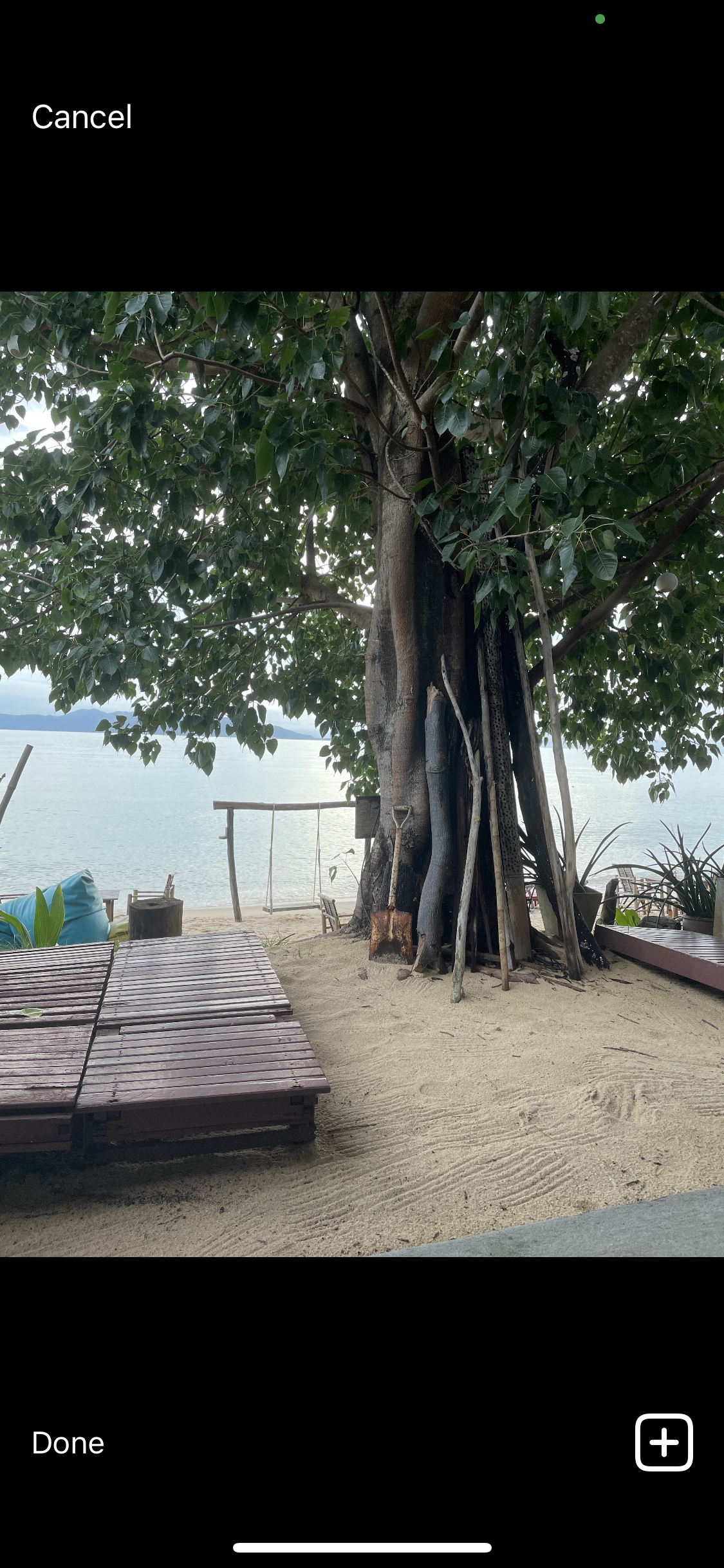
### Camera
After making one photo, you see a preview of it and a little plus icon, by tapping it you return back to camera mode and can continue making as many photos as you like. Press "Done" once you're finished and you will be able to scroll through all the photos you've taken before confirming you'd like to use them. This preview screen of photos you've taken can also be customized (see "Init - view builders" section)
## Init - required parameters
`isPresented` - a binding to determine whether the picker should be displayed or not
`onChange` - a closure that returns the selected media every time the selection changes
### Init - optional view builders
You can pass 1-3 view builders in order to add your own buttons and other elements to media picker screens. You can pass all, some or none of these when creating your `MediaPicker` (see the custom picker in the example project for usage example). First screen you can customize is default photos grid view. Pass `albumSelectionBuilder` closure like this to replace the standard one with your own view:
```swift
MediaPicker(
isPresented: $isPresented,
onChange: { selectedMedia = $0 },
albumSelectionBuilder: { defaultHeaderView, albumSelectionView, isInFullscreen in
VStack {
if !isInFullscreen {
defaultHeaderView
}
albumSelectionView
Spacer()
footerView
}
.background(Color.black)
}
)
```
`albumSelectionBuilder` gives you two views to work with:
- `defaultHeaderView` - a default looking `header` with photos/albums mode switcher
- `albumSelectionView` - the photos grid itself
- `isInFullscreen` - is fullscreen photo details screen displayed. Use for example to hide the header while in fullscreen mode.
The second customizable screen is the one you see after taking a photo. Pass `cameraSelectionBuilder` like this:
```swift
MediaPicker(
isPresented: $isPresented,
onChange: { selectedMedia = $0 },
cameraSelectionBuilder: { addMoreClosure, cancelClosure, cameraSelectionView in
VStack {
HStack {
Spacer()
Button("Done", action: { isPresented = false })
}
cameraSelectionView
HStack {
Button("Cancel", action: cancelClosure)
Spacer()
Button(action: addMoreClosure) {
Text("Take more photos")
}
}
}
}
)
```
`cameraSelectionBuilder` gives you these parameters:
- `addMoreClosure` - you can call this closure on tap of your own button, it will work same as default plus icon on camera selection preview screen
- `cancelClosure` - show confirmation and return to photos grid screen if confirmed
- `cameraSelectionView` - swipable camera photos preview collection itself
The last one is live camera screen
```swift
MediaPicker(
isPresented: $isPresented,
onChange: { selectedMedia = $0 },
cameraViewBuilder: { cameraSheetView, cancelClosure, showPreviewClosure, takePhotoClosure, startVideoCaptureClosure, stopVideoCaptureClosure, toggleFlash, flipCamera in
cameraSheetView
.overlay(alignment: .topLeading) {
HStack {
Button("Cancel") { cancelClosure() }
.foregroundColor(Color("CustomPurple"))
Spacer()
Button("Done") { showPreviewClosure() }
.foregroundColor(Color("CustomPurple"))
}
.padding()
}
.overlay(alignment: .bottom) {
HStack {
Button("Take photo") { takePhotoClosure() }
.greenButtonStyle()
Button(videoIsBeingRecorded ? "Stop video capture" : "Capture video") {
videoIsBeingRecorded ? stopVideoCaptureClosure() : startVideoCaptureClosure()
videoIsBeingRecorded.toggle()
}
.greenButtonStyle()
}
.padding()
}
}
)
```
`cameraViewBuilder` live camera capture view and a lot of closures to do with as you please:
- `cameraSheetView` - live camera capture view
- `cancelClosure` - if you want to display "are you sure" before closing
- `showPreviewClosure` - shows preview of taken photos
- `cancelClosure` - if you want to display "are you sure" before closing
- `startVideoCaptureClosure` - starts video capture, you'll need a bollean varialbe to track recording state
- `stopVideoCaptureClosure` - stops video capture
- `toggleFlash` - flash off/on
- `flipCamera` - camera back/front
## Available modifiers
`showLiveCameraCell` - show live camera feed cell in the top left corner of the gallery grid
`mediaSelectionType` - limit displayed media type: .photo, .video or both
`mediaSelectionStyle` - a way to display selected/unselected media state: a counter or a simple checkmark
`mediaSelectionLimit` - the maximum selection quantity allowed, 'nil' for unlimited selection
`showFullscreenPreview` - if true - tap on media opens fullscreen preview, if false - tap on image immediately selects this image and closes the picker
### Available modifiers - filtering
`applyFilter((Media) async -> Media?)` - pass a closure to apply to each of medias individually. Closures's return type is `Media?`: return `Media` the closure gives to you if you want it to be displayed on photo grid, or `nil` if you want to exclude it. The code you apply to each media can be asyncronous (using async/await syntactics, check out `FilterMediaPicker` in example project)
`applyFilter(([Media]) async -> [Media])` - same but apply the closure to whole medias array. Can also be used for reodering.
### Available modifiers - screen rotation
If your app restricts screen rotation, you can skip this section.
We recommend locking orientation for MediaPicker, because default rotation animations don't look good on the camera screen. At the moment SwiftUI doesn't provide a way of locking screen orientation, so the library has an initializer with an `orientationHandler` parameter - a closure that is called when you enter/leave the camera screen inside MediaPicker. In this closure you need to use AppDelegate to lock/unlock the rotation - see example project for implementation.
### Available modifiers: managing albums
`albums` - a list of user's albums (like in Photos app), if you want to display them differently than `showingDefaultHeader` does.
`pickerMode` - set this if you don't plan to use the default header. Available options are:
* .photos - displays the default photos grid
* .albums - displays a list of albums with one preview photo for each
* .album(Album) - displays one album
* .camera - shows a fullscreen cover camera sheet
* .cameraSelection - displays a preview of photos taken with camera
(see the custom picker in the example project for implementation)
### Available modifiers: theme
`mediaPickerTheme` - color settings. Example usage (see `MediaPickerTheme` for all available settings):
```swift
MediaPicker(...)
.mediaPickerTheme(
main: .init(
background: .black
),
selection: .init(
emptyTint: .white,
emptyBackground: .black.opacity(0.25),
selectedTint: Color("CustomPurple")
)
)
```
Here is an example of how you can customize colors and elements to create a custom looking picker:
## Examples
To try out the MediaPicker examples:
- Clone the repo `https://github.com/exyte/MediaPicker.git`
- Open `Examples/Examples.xcworkspace` in the Xcode
- Run it!
## Installation
### [Swift Package Manager](https://swift.org/package-manager/)
```swift
dependencies: [
.package(url: "https://github.com/exyte/ExyteMediaPicker.git")
]
```
### CocoaPods
```ruby
pod 'ExyteMediaPicker'
```
### Carthage
```ogdl
github "Exyte/MediaPicker"
```
## Requirements
* iOS 16+
* Xcode 13+
## Our other open source SwiftUI libraries
[PopupView](https://github.com/exyte/PopupView) - Toasts and popups library
[Grid](https://github.com/exyte/Grid) - The most powerful Grid container
[ScalingHeaderScrollView](https://github.com/exyte/ScalingHeaderScrollView) - A scroll view with a sticky header which shrinks as you scroll
[AnimatedTabBar](https://github.com/exyte/AnimatedTabBar) - A tabbar with number of preset animations
[Chat](https://github.com/exyte/chat) - Chat UI framework with fully customizable message cells, input view, and a built-in media picker
[ConcentricOnboarding](https://github.com/exyte/ConcentricOnboarding) - Animated onboarding flow
[FloatingButton](https://github.com/exyte/FloatingButton) - Floating button menu
[ActivityIndicatorView](https://github.com/exyte/ActivityIndicatorView) - A number of animated loading indicators
[ProgressIndicatorView](https://github.com/exyte/ProgressIndicatorView) - A number of animated progress indicators
[SVGView](https://github.com/exyte/SVGView) - SVG parser
[LiquidSwipe](https://github.com/exyte/LiquidSwipe) - Liquid navigation animation