Ecosyste.ms: Awesome
An open API service indexing awesome lists of open source software.
https://github.com/uber/manifold
A model-agnostic visual debugging tool for machine learning
https://github.com/uber/manifold
incubation machine-learning visualization
Last synced: 3 months ago
JSON representation
A model-agnostic visual debugging tool for machine learning
- Host: GitHub
- URL: https://github.com/uber/manifold
- Owner: uber
- License: apache-2.0
- Created: 2019-02-08T21:05:30.000Z (over 5 years ago)
- Default Branch: master
- Last Pushed: 2023-03-19T22:52:47.000Z (about 1 year ago)
- Last Synced: 2024-02-17T03:40:49.635Z (4 months ago)
- Topics: incubation, machine-learning, visualization
- Language: JavaScript
- Homepage: http://manifold.mlvis.io/
- Size: 6.8 MB
- Stars: 1,639
- Watchers: 53
- Forks: 121
- Open Issues: 85
-
Metadata Files:
- Readme: README.md
- Changelog: CHANGELOG.md
- Contributing: CONTRIBUTING.md
- License: LICENSE
- Code of conduct: CODE_OF_CONDUCT.md
Lists
- awesome-machine-learning-interpretability - manifold - agnostic visual debugging tool for machine learning." | (Technical Resources / Open Source/Access Responsible AI Software Packages)
- awesome-mlops - Manifold - A model-agnostic visual debugging tool for machine learning. (Visual Analysis and Debugging)
- awesome - uber/manifold - A model-agnostic visual debugging tool for machine learning (JavaScript)
- awesome-stars - manifold - agnostic visual debugging tool for machine learning | uber | 1636 | (JavaScript)
- awesome-open-source-mlops - Maniford - A model-agnostic visual debugging tool for machine learning. (Visualization)
- awesome-llmops - Maniford - agnostic visual debugging tool for machine learning. |  | (Training / Visualization)
- Awesome-LLMOps - Maniford - A model-agnostic visual debugging tool for machine learning. (Visualization)
- my-awesome-stars - uber/manifold - A model-agnostic visual debugging tool for machine learning (JavaScript)
README
[](https://gitpod.io/#https://github.com/uber/manifold)
[](https://travis-ci.com/uber/manifold)
[](https://bestpractices.coreinfrastructure.org/projects/3062)
# Manifold
_This project is stable and being incubated for long-term support._
[ ](https://uber.github.io/manifold/)
Manifold is a model-agnostic visual debugging tool for machine learning.
Understanding ML model performance and behavior is a non-trivial process, given the intrisic opacity of ML algorithms. Performance summary statistics such as AUC, RMSE, and others are not instructive enough for identifying what went wrong with a model or how to improve it.
As a visual analytics tool, Manifold allows ML practitioners to look beyond overall summary metrics to detect which subset of data a model is inaccurately predicting. Manifold also explains the potential cause of poor model performance by surfacing the feature distribution difference between better and worse-performing subsets of data.
## Table of contents
- [Prepare your data](#prepare-your-data)
- [Interpret visualizations](#interpret-visualizations)
- [Using the demo app](#using-the-demo-app)
- [Using the component](#using-the-component)
- [Contributing](#contributing)
- [Versioning](#versioning)
- [License](#license)
## Prepare Your Data
There are 2 ways to input data into Manifold:
- [csv upload](#upload-csv-to-demo-app) if you use the Manifold demo app, or
- [convert data programatically](#load-and-convert-data) if you use the Manifold component in your own app.
In either case, data that's directly input into Manifold should follow this format:
```js
const data = {
x: [...], // feature data
yPred: [[...], ...] // prediction data
yTrue: [...], // ground truth data
};
```
Each element in these arrays represents one data point in your evaluation dataset, and the order of data instances in `x`, `yPred` and `yTrue` should all match.
The recommended instance count for each of these datasets is 10000 - 15000. If you have a larger dataset that you want to analyze, a random subset of your data generally suffices to reveal the important patterns in it.
##### `x`: {Object[]}
A list of instances with features. Example (2 data instances):
```js
[{feature_0: 21, feature_1: 'B'}, {feature_0: 36, feature_1: 'A'}];
```
##### `yPred`: {Object[][]}
A list of lists, where each child list is a prediction array from one model for each data instance. Example (3 models, 2 data instances, 2 classes `['false', 'true']`):
```js
[
[{false: 0.1, true: 0.9}, {false: 0.8, true: 0.2}],
[{false: 0.3, true: 0.7}, {false: 0.9, true: 0.1}],
[{false: 0.6, true: 0.4}, {false: 0.4, true: 0.6}],
];
```
##### `yTrue`: {Number[] | String[]}
A list, ground truth for each data instance. Values must be numbers for regression models, must be strings that match object keys in `yPred` for classification models. Example (2 data instances, 2 classes ['false', 'true']):
```js
['true', 'false'];
```
## Interpret visualizations
This guide explains how to interpret Manifold visualizations.
Manifold consists of:
- [Performance Comparison View](#performance-comparison-view) which compares
prediction performance across models, across data subsets
- [Feature Attribution View](#feature-attribution-view) which visualizes feature
distributions of data subsets with various performance levels
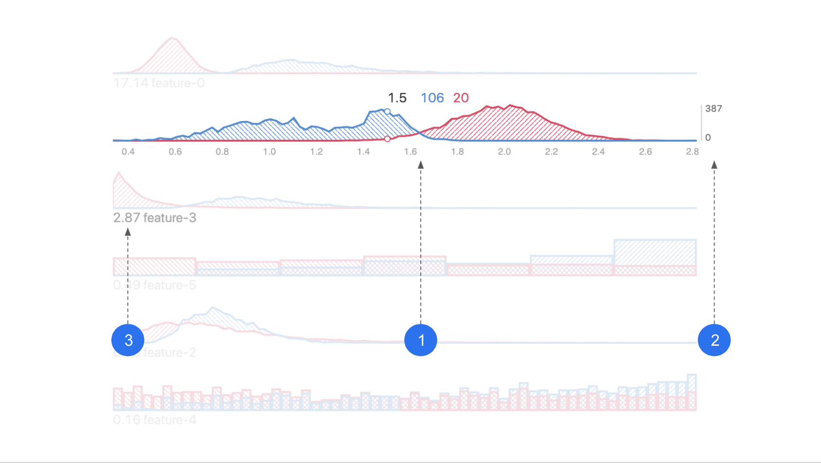
### Performance Comparison View
This visualization is an overview of performance of your model(s) across
different segments of your data. It helps you identify under-performing data subsets for further inspection.
#### Reading the chart
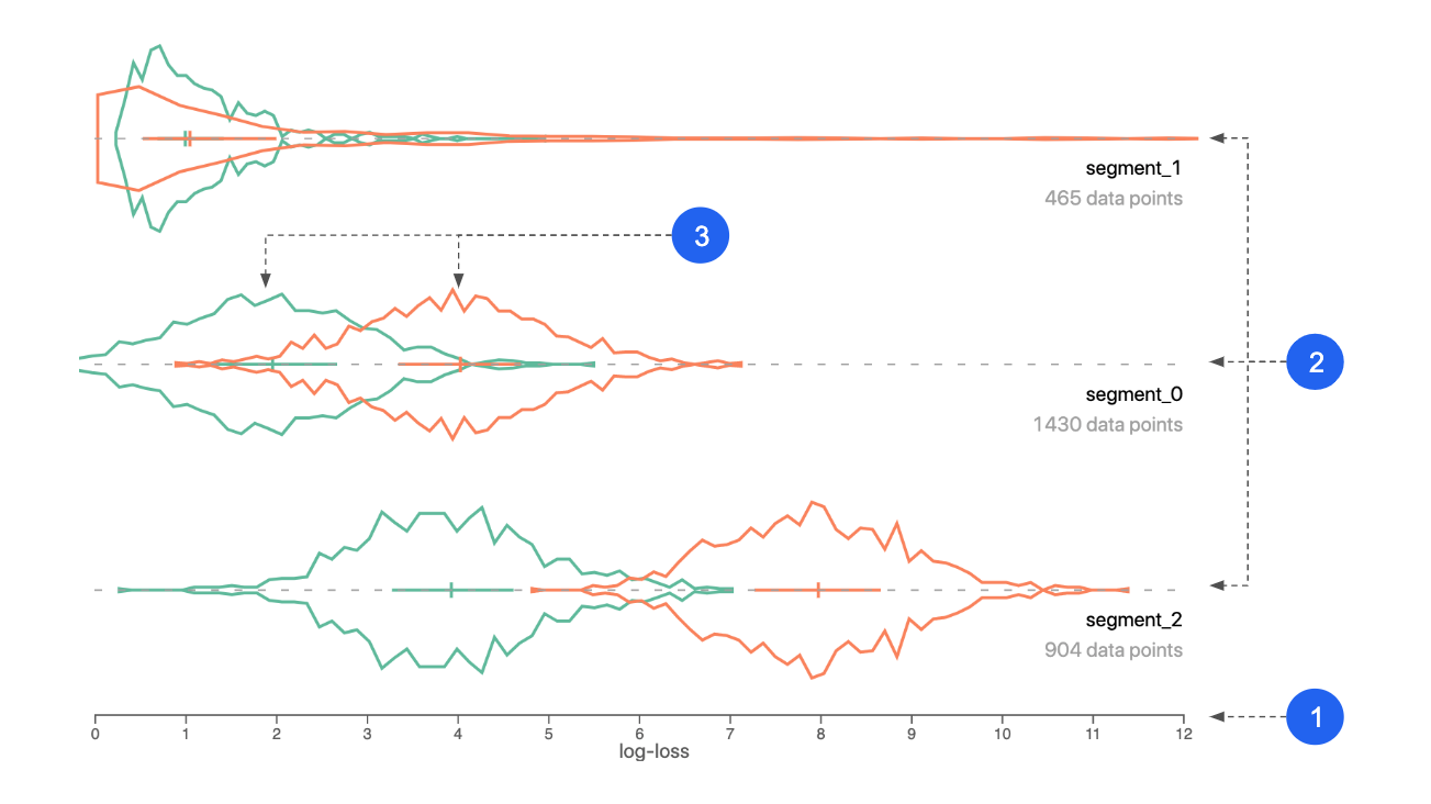
1. **X axis:** performance metric. Could be log-loss, squared-error, or raw prediction.
2. **Segments:** your dataset is automatically divided into segments based on performance similarity between instances, across models.
3. **Colors:** represent different models.
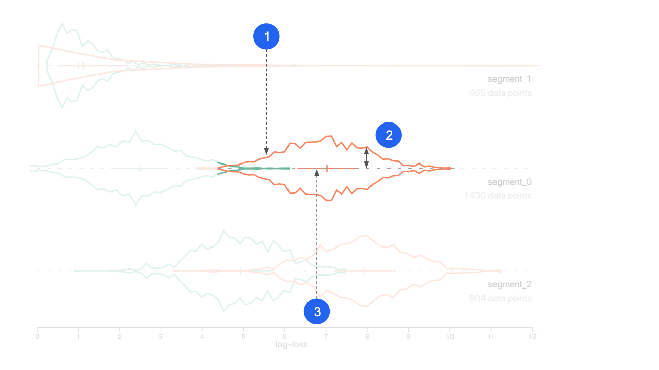
1. **Curve:** performance distribution (of one model, for one segment).
2. **Y axis:** data count/density.
3. **Cross:** the left end, center line, and right end are the 25th, 50th and 75th percentile of the distribution.
#### Explanation
Manifold uses a clustering algorithm (k-Means) to break prediction data into N segments
based on performance similarity.
The input of the k-Means is per-instance performance scores. By default, that is the log-loss value for classification models and the squared-error value for regression models. Models with a lower log-loss/squared-error perform better than models with a higher log-loss/squared-error.
If you're analyzing multiple models, all model performance metrics will be included in the input.
#### Usage
- Look for segments of data where the error is higher (plotted to the right). These are areas you should analyze and try to improve.
- If you're comparing models, look for segments where the log-loss is different for each model. If two models perform differently on the same set of data, consider using the better-performing model for that part of the data to boost performance.
- After you notice any performance patterns/issues in the segments, slice the data to compare feature distribution for the data subset(s) of interest. You can create two segment groups to compare (colored pink and blue), and each group can have 1 or more segments.
**Example**
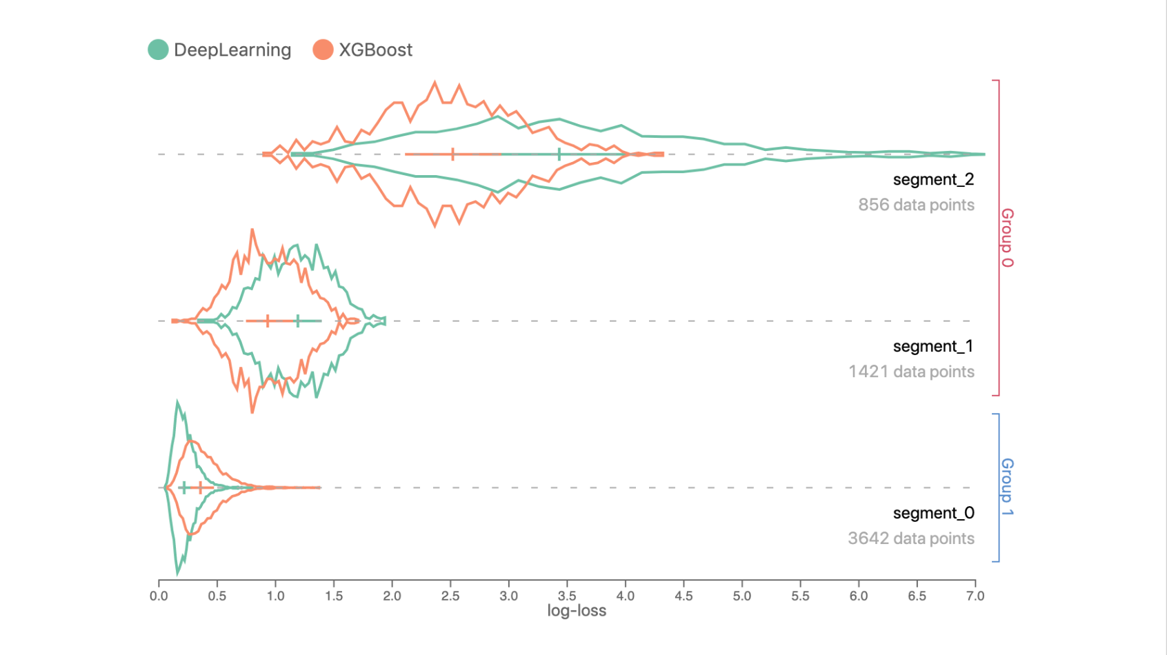
Data in Segment 0 has a lower log-loss prediction error compared to Segments 1 and 2, since curves in Segment 0 are closer to the left side.
In Segments 1 and 2, the XGBoost model performs better than the DeepLearning model, but DeepLearning outperforms XGBoost in Segment 0.
### Feature Attribution View
This visualization shows feature values of your data, aggregated by user-defined segments. It helps you identify any input feature distribution that might correlate with inaccurate prediction output.
#### Reading the chart
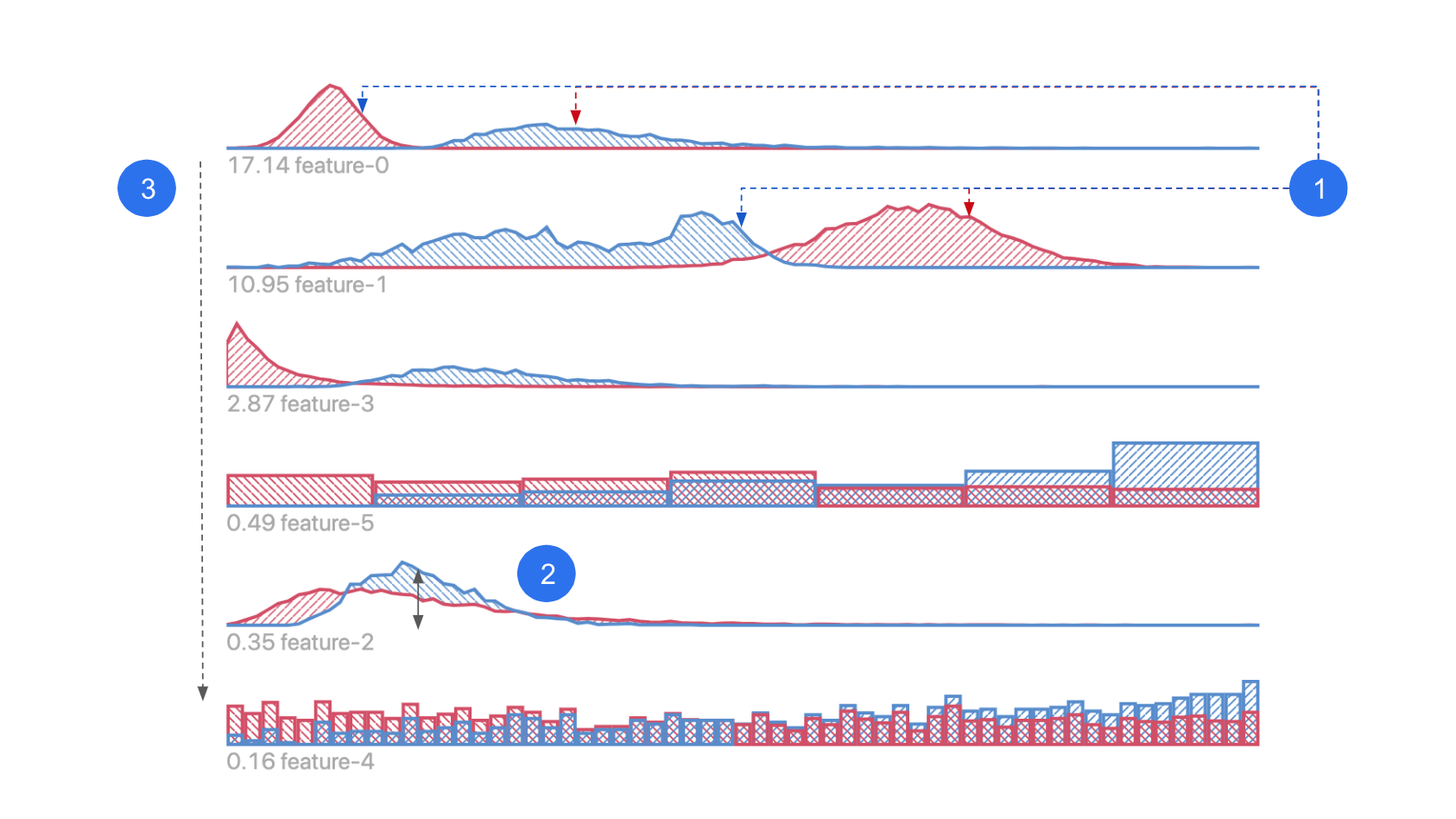
1. **Histogram / heatmap:** distribution of data from each data slice, shown in the corresponding color.
2. **Segment groups:** indicates data slices you choose to compare against each other.
3. **Ranking:** features are ranked by distribution difference between slices.
1. **X axis:** feature value.
2. **Y axis:** data count/density.
3. **Divergence score:** measure of difference in distributions between slices.
#### Explanation
After you slice the data to create segment groups, feature distribution histograms/heatmaps from the two segment groups are shown in this view.
Depending on the feature type, features can be shown as heatmaps on a map for geo features, distribution curve for numerical features, or distribution bar chart for categorical features. (In bar charts, categories on the x-axis are sorted by instance count difference. Look for differences between the two distributions in each feature.)
Features are ranked by their KL-Divergence - a measure of _difference_ between the two contrasting distributions. The higher the divergence is, the more likely this feature is correlated with the factor that differentiates the two Segment Groups.
#### Usage
- Look for the differences between the two distributions (pink and blue) in each feature. They represent the difference in data from the two segment groups you selected in the Performance Comparison View.
**Example**
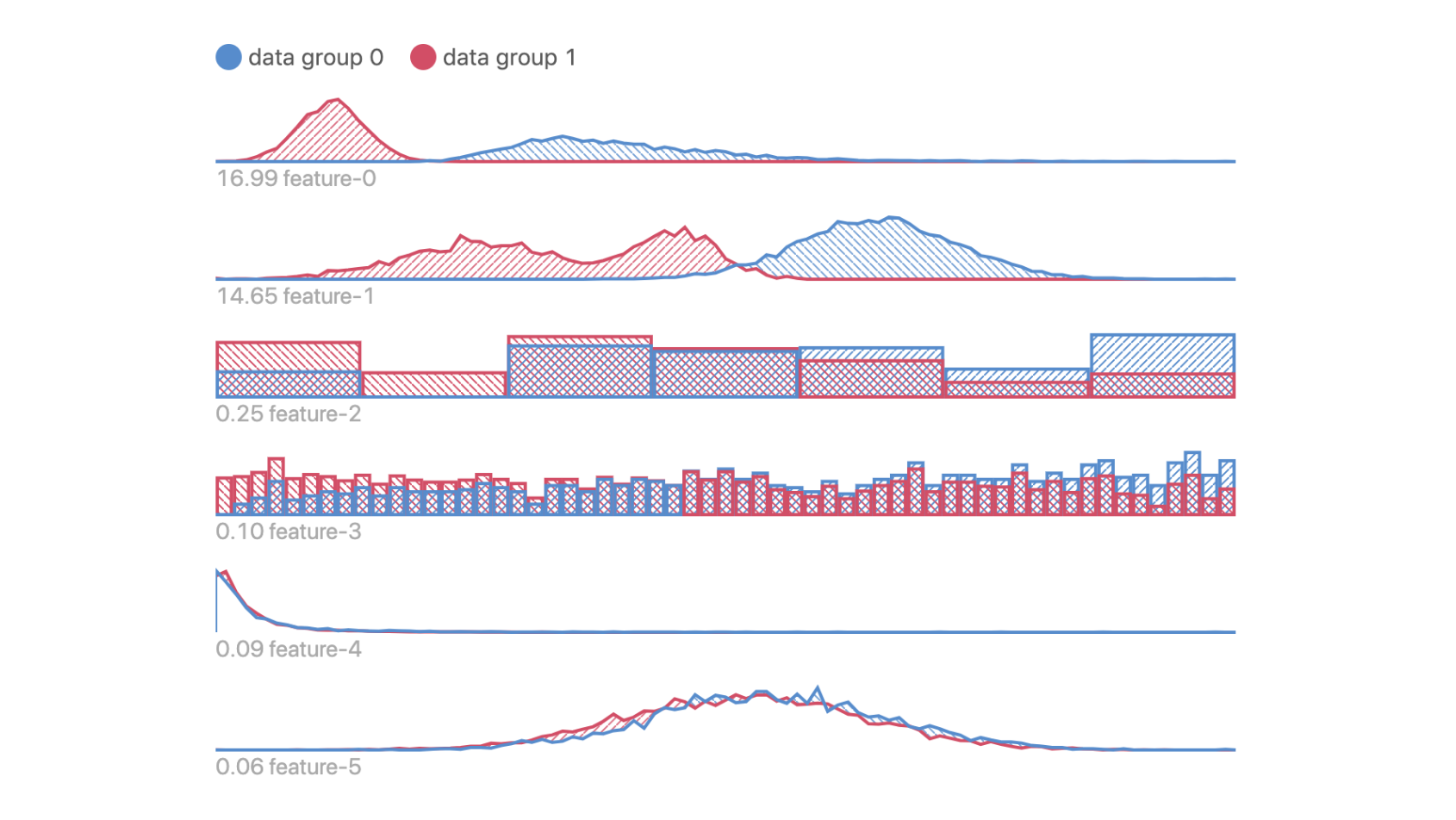
Data in Groups 0 and 1 have obvious differences in Features 0, 1, 2 and 3; but they are not so different in features 4 and 5.
Suppose Data Groups 0 and 1 correspond to data instances with low and high prediction error respectively, this means that data with higher errors tend to have _lower_ feature values in Features 0 and 1, since peak of pink curve is to the left side of the blue curve.
### Geo Feature View
If there are geospatial features in your dataset, they will be displayed on a map. Lat-lng coordinates and [h3](https://github.com/uber/h3-js) hexagon ids are currently supoorted geo feature types.
#### Reading the chart
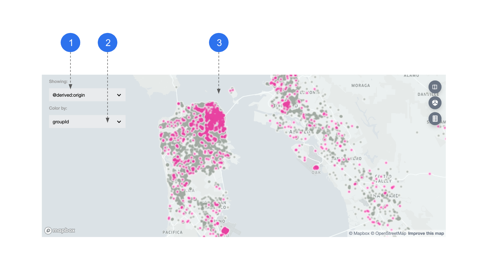
1. **Feature name:** when multiple geo features exist, you can choose which one to display on the map.
2. **Color-by:** if a lat-lng feature is chosen, datapoints are colored by group ids.
3. **Map:** Manifold defaults to display the location and density of these datapoints using a heatmap.
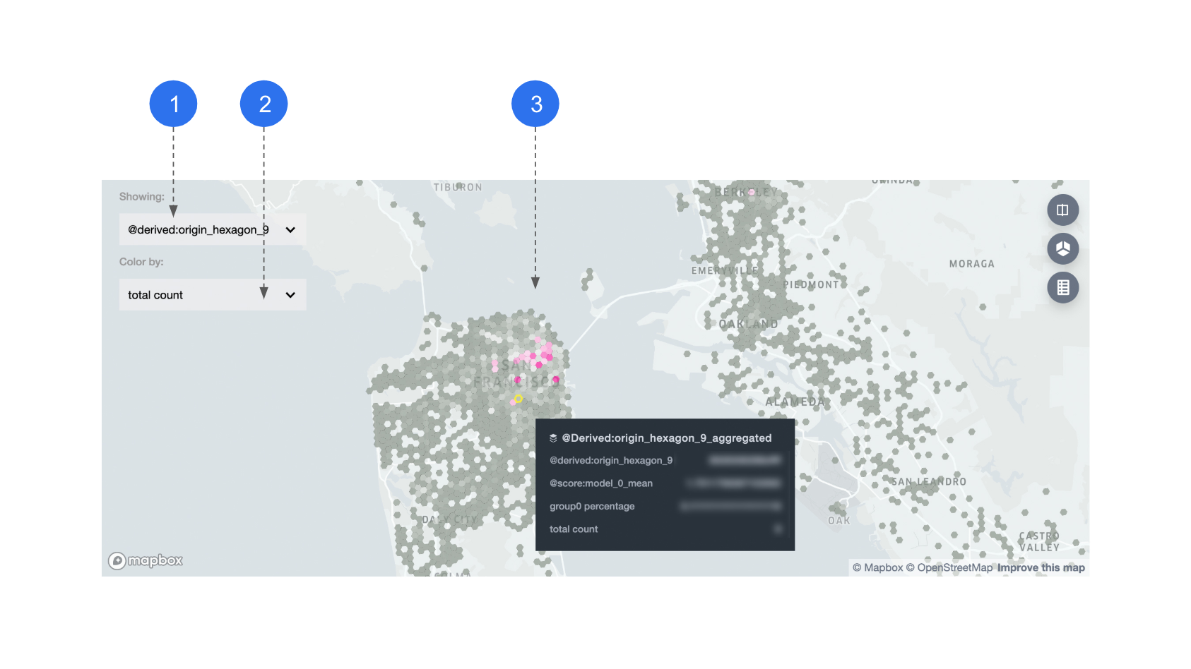
1. **Feature name:** when choosing a hex-id feature to display, datapoints with the same hex-id are displayed in aggregate.
2. **Color-by:** you can color the hexagons by: average model performance, percentage of segment group 0, or total count per hexagon.
3. **Map:** all metrics that are used for coloring are also shown in tooltips, on the hexagon level.
#### Usage
- Look for the differences in geo location between the two segment groups (pink and grey). They represent the spation distribution difference between the two subsets you previously selected.
**Example**
In the first map above, Group 0 has a more obvious tendency to be concentrated in downtown San Francisco area.
## Using the Demo App
To do a one-off evaluation using static outputs of your ML models, use the demo app.
Otherwise, if you have a system that programmatically generates ML model outputs, you might consider [using the Manifold component](#using-the-component) directly.
### Running Demo App Locally
Run the following commands to set up your environment and run the demo:
```bash
# install all dependencies in the root directory
yarn
# demo app is in examples/manifold directory
cd examples/manifold
# install dependencies for the demo app
yarn
# run the app
yarn start
```
Now you should see the demo app running at `localhost:8080`.
### Upload CSV to Demo App
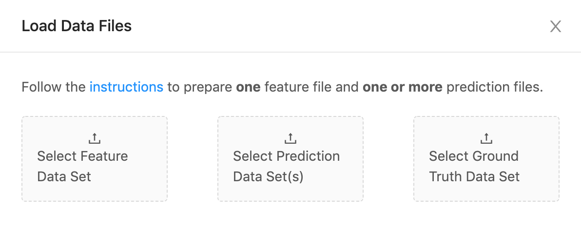
Once the app starts running, you will see the interface above asking you to upload **"feature"**, **"prediction"** and **"ground truth"** datasets to Manifold.
They correspond to `x`, `yPred`, and `yTrue` in the "[prepare your data](#prepare-your-data)" section, and you should prepare your CSV files accordingly, illustrated below:
| Field | **`x`** (feature) | **`yPred`** (prediction) | **`yTrue`** (ground truth) |
| :------------------------: | :--------------------: | :-----------------------: | :-------------------------: |
| Number of CSVs | 1 | multiple | 1 |
| Illustration of CSV format | ![][feature csv image] | ![][prediction csv image] | ![][ground truth csv image] |
Note, the index columns should be excluded from the input file(s).
Once the datasets are uploaded, you will see visualizations generated by these datasets.
## Using the Component
Embedding the Manifold component in your app allows you to programmatically generate ML model data and visualize.
Otherwise, if you have some static output from some models and want to do a one-off evaluation, you might consider [using the demo app](#using-the-demo-app) directly.
Here are the basic steps to import Manifold into your app and load data for visualizing. You can also take a look at the examples folder.
### Install Manifold
```bash
$ npm install @mlvis/manifold styled-components styletron-engine-atomic styletron-react
```
### Load and Convert Data
In order to load your data files to Manifold, use the `loadLocalData` action. You could also reshape your data into the required Manifold format using `dataTransformer`.
```js
import {loadLocalData} from '@mlvis/manifold/actions';
// create the following action and pass to dispatch
loadLocalData({
fileList,
dataTransformer,
});
```
##### `fileList`: {Object[]}
One or more datasets, in CSV format. Could be ones that your backend returns.
##### `dataTransformer`: {Function}
A function that transforms `fileList` into the [Manifold input data format](#prepare-your-data). Default:
```js
const defaultDataTransformer = fileList => ({
x: [],
yPred: [],
yTrue: [],
});
```
### Mount reducer
Manifold uses Redux to manage its internal state. You need to register `manifoldReducer` to the main reducer of your app:
```js
import manifoldReducer from '@mlvis/manifold/reducers';
import {combineReducers, createStore, compose} from 'redux';
const initialState = {};
const reducers = combineReducers({
// mount manifold reducer in your app
manifold: manifoldReducer,
// Your other reducers here
app: appReducer,
});
// using createStore
export default createStore(reducer, initialState);
```
### Mount Component
If you mount `manifoldReducer` in another address instead of `manifold` in the step above, you need to specify the path to it when you mount the component with the `getState` prop. `width` and `height` are both needed explicitly. If you have geospatial features and need to see them on a map, you also need a [mapbox token](https://docs.mapbox.com/help/how-mapbox-works/access-tokens/).
```js
import Manifold from '@mlvis/manifold';
const manifoldGetState = state => state.pathTo.manifold;
const yourMapboxToken = ...;
const Main = props => (
);
```
### Styling
Manifold uses baseui, which uses Styletron as a styling engine. If you don't already use Styletron in other parts of your app, make sure to wrap Manifold with the [styletron provider](https://baseweb.design/getting-started/setup/#adding-base-web-to-your-application).
Manifold uses the baseui [theming API](https://baseweb.design/guides/theming/). The default theme used by Manifold is exported as `THEME`. You can customize the styling by extending `THEME` and passing it as a `theme` prop of the `Manifold` component.
```js
import Manifold, {THEME} from '@mlvis/manifold';
import {Client as Styletron} from 'styletron-engine-atomic';
import {Provider as StyletronProvider} from 'styletron-react';
const engine = new Styletron();
const myTheme = {
...THEME,
colors: {
...THEME.colors,
primary: '#ff0000',
},
}
const Main = props => (
);
```
## Built With
- [TensorFlow.js](https://js.tensorflow.org/)
- [React](https://reactjs.org/)
- [Redux](https://redux.js.org/)
## Contributing
Please read our [code of conduct](CODE_OF_CONDUCT.md) before you contribute! You can find details for submitting pull requests in the [CONTRIBUTING.md](CONTRIBUTING.md) file. Refer to the issue [template](https://help.github.com/articles/about-issue-and-pull-request-templates/).
## Versioning
We document versions and changes in our changelog - see the [CHANGELOG.md](CHANGELOG.md) file for details.
## License
Apache 2.0 License
[feature csv image]: https://d1a3f4spazzrp4.cloudfront.net/manifold/docs/x.png
[prediction csv image]: https://d1a3f4spazzrp4.cloudfront.net/manifold/docs/yPred.png
[ground truth csv image]: https://d1a3f4spazzrp4.cloudfront.net/manifold/docs/yTrue.png