Ecosyste.ms: Awesome
An open API service indexing awesome lists of open source software.
https://github.com/xlhaw/wfmap
WaferMap Visualization
https://github.com/xlhaw/wfmap
data-visualization pandas wafer
Last synced: 2 months ago
JSON representation
WaferMap Visualization
- Host: GitHub
- URL: https://github.com/xlhaw/wfmap
- Owner: xlhaw
- License: mit
- Created: 2020-02-17T13:28:31.000Z (over 4 years ago)
- Default Branch: master
- Last Pushed: 2022-11-01T02:52:21.000Z (over 1 year ago)
- Last Synced: 2024-01-24T22:05:08.305Z (5 months ago)
- Topics: data-visualization, pandas, wafer
- Language: Python
- Homepage: https://wfmap.xlhaw.com
- Size: 24.3 MB
- Stars: 37
- Watchers: 3
- Forks: 6
- Open Issues: 0
-
Metadata Files:
- Readme: README.md
- License: LICENSE
Lists
- awesome_photonics - wafermap
README
# WaferMap Visualization with Heatmap and Trend Charts
This package is built upon **_matplotlib_** & **_seaborn_**. It provides basic wafer heatmap for numerical & categorical variables, as well as highly customized trend charts regarding to different wafer shot map definitions. You can built your own wafermap on the top of the API provided.
> This package only tested under Windows, the aesthetics of charts might be slightly different under Mac/Linux.
## Example Gallery
This gallery contains a selection of examples of the plots _**wfmap**_ created. _Basic Usages_ and _API Reference_ please refer to the [Online Docs](https://wfmap.ml).
## Installation
To install _**wfmap**_ via PyPI using pip:
```bash
pip install wfmap
```
or build the latest release from Github:
```bash
git clone https://github.com/xlhaw/wfmap.git
cd wfmap
python setup.py install
```
## Basic Usage
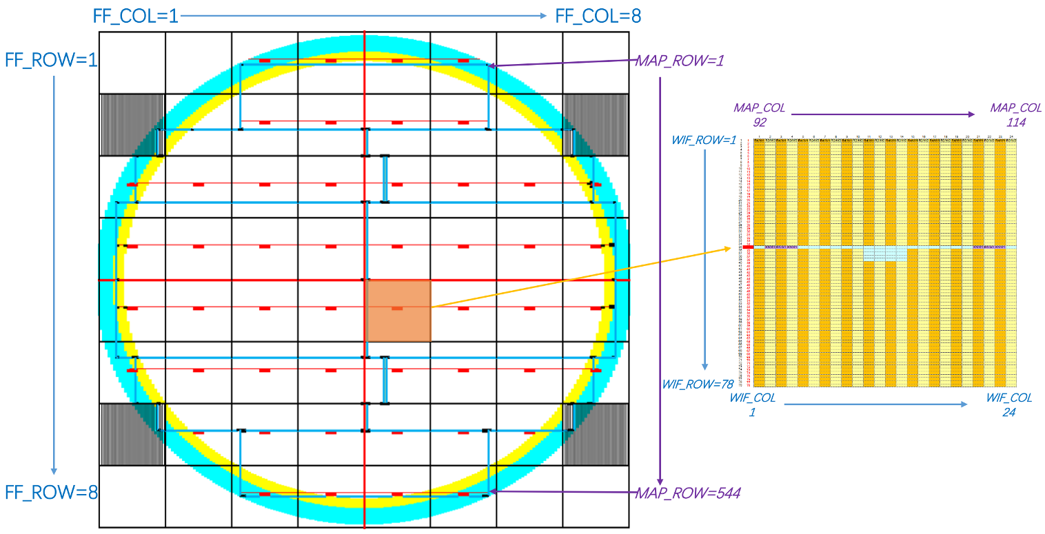
Before you get started, please have a look at the definition used in this package for wafer mapping. You can modify it refer to your own terminology.
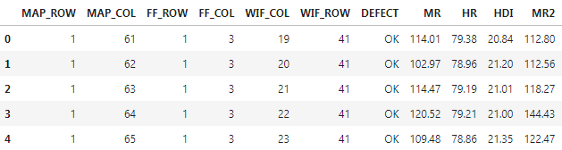
Sample data is shipped within this package, you can load it as following snippet:
```python
from wfmap.data import load_data
data=load_data()
```
### BasePlot
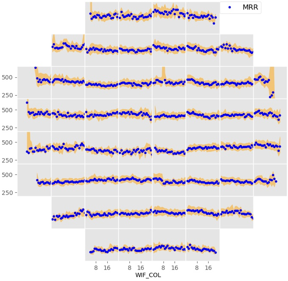
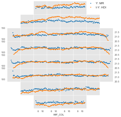
`num_heatmap` and `cat_heatmap` are core functions used to generate `matplotlib.axes`, dealing with numerical & categorical variables respectively. Remain functions provides in packages return `matplotlib.figure.Figure` instead.
```python
from wfmap import num_heatmap,cat_heatmap
fig,axs=plt.subplots(1,2,figsize=(8,3))
_=num_heatmap(data,'MRR',ax=axs[0])
_=cat_heatmap(data,'DEFECT',ax=axs[1])
#fig.savefig('BasePlot.png',dpi=200)
```
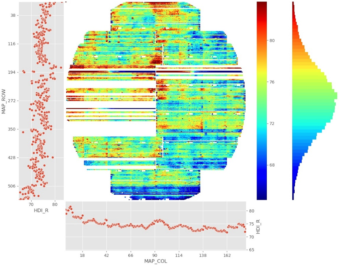
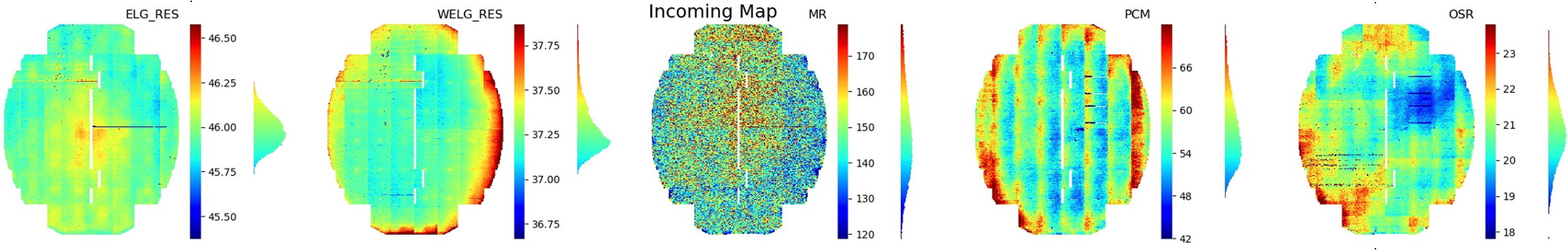
### WaferMap
WaferMap is a customized plot for numerical variables built with `num_heatmap`, beside the basic heatmap, an horizontal distribution plot sits along with the colorbar. For full details please refer to the [API Reference](https://wfmap.ml).
```python
from wfmap import wafermap
fig=wafermap(data,'HDI_R',wtype='UP3')
```
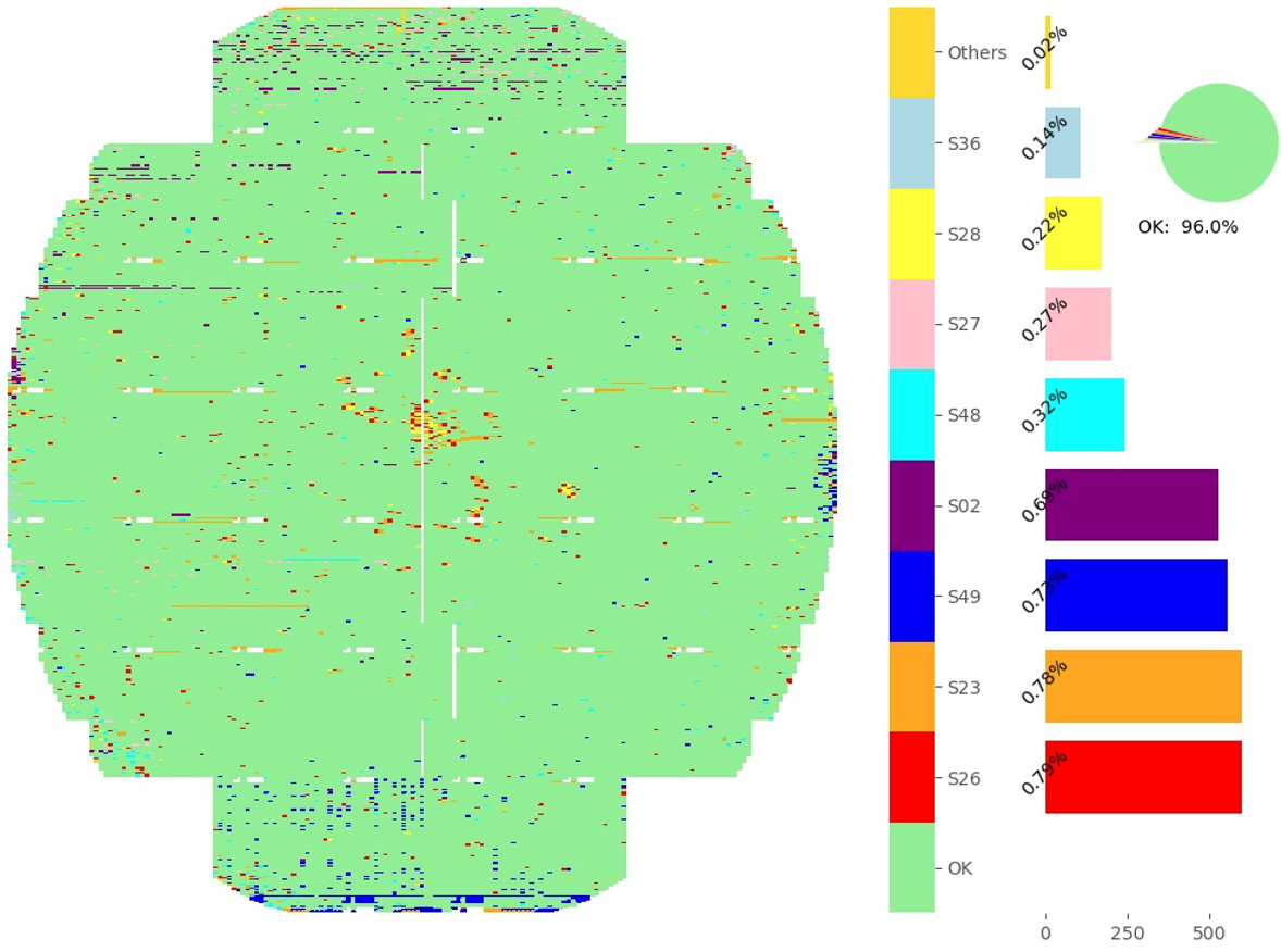
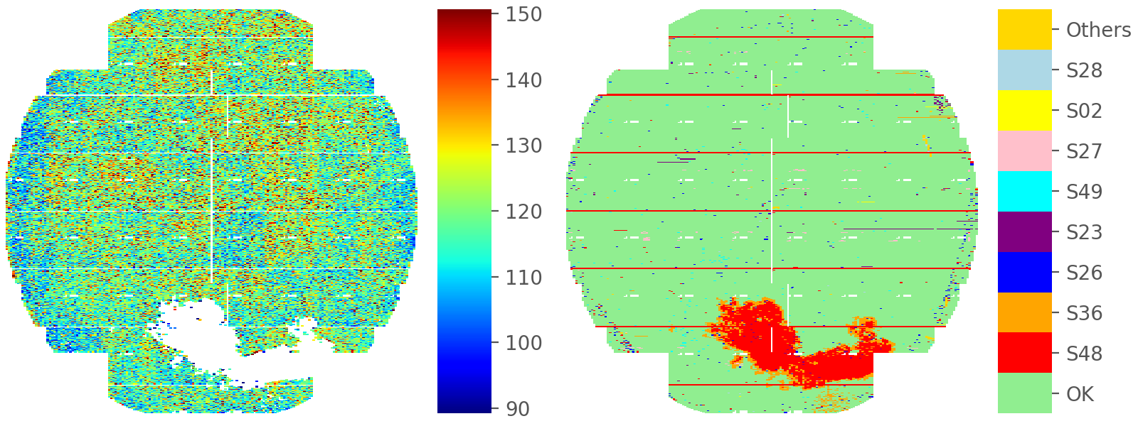
### DefectMap
DefectMap is a customized plot for categorical variables using `cat_heatmap`, which put additional pareto histogram and pie chart aside. For full details please refer to the `API Reference`.
```python
from wfmap import defectmap
fig=defectmap(data,'DEFECT')
```
## License
[](https://app.fossa.com/projects/git%2Bgithub.com%2Fxlhaw%2Fwfmap?ref=badge_large)