Ecosyste.ms: Awesome
An open API service indexing awesome lists of open source software.
https://github.com/GetStream/avatarview-android
✨ Supports loading profile images with fractional styles, shapes, borders, indicators, and initials for Android.
https://github.com/GetStream/avatarview-android
android android-library coil glide image kotlin loading loading-images profile
Last synced: 3 months ago
JSON representation
✨ Supports loading profile images with fractional styles, shapes, borders, indicators, and initials for Android.
- Host: GitHub
- URL: https://github.com/GetStream/avatarview-android
- Owner: GetStream
- License: apache-2.0
- Created: 2021-12-17T10:44:56.000Z (over 2 years ago)
- Default Branch: main
- Last Pushed: 2022-10-05T12:47:46.000Z (over 1 year ago)
- Last Synced: 2024-03-16T01:49:03.919Z (3 months ago)
- Topics: android, android-library, coil, glide, image, kotlin, loading, loading-images, profile
- Language: Kotlin
- Homepage: https://getstream.github.io/avatarview-android/
- Size: 18.3 MB
- Stars: 429
- Watchers: 4
- Forks: 24
- Open Issues: 7
-
Metadata Files:
- Readme: README.md
- Contributing: CONTRIBUTING.md
- License: LICENSE
- Code of conduct: CODE_OF_CONDUCT.md
- Codeowners: .github/CODEOWNERS
Lists
- awesome-list - GetStream/avatarview-android - ✨ Supports loading profile images with fractional styles, shapes, borders, indicators, and initials for Android. (Kotlin)
README


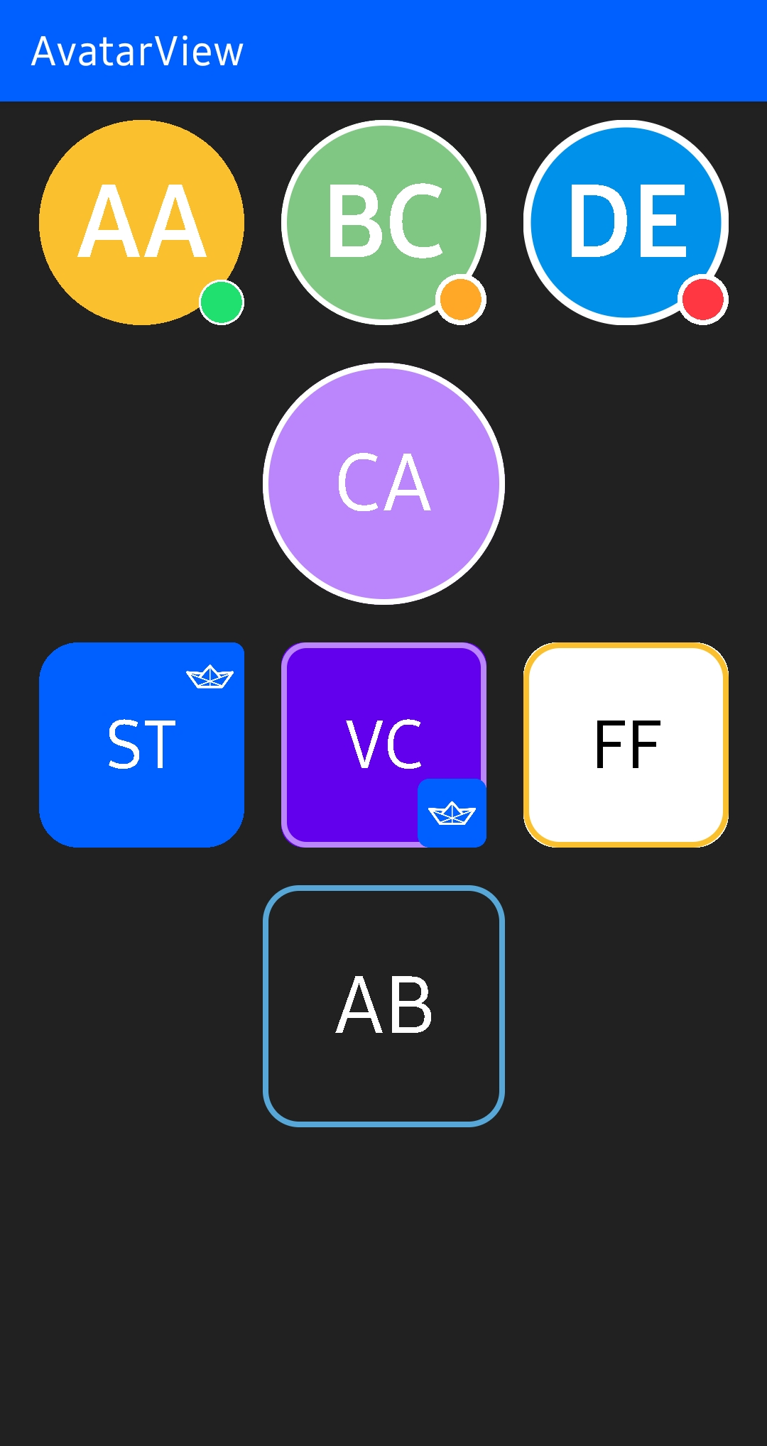
✨ AvatarView supports loading profile images with fractional style, borders, indicators, and initials for Android.
## Preview


## Contribution 💙
AvatarView is maintained by __[Stream](https://getstream.io/)__.
If you’re interested in adding powerful In-App Messaging to your app, check out the __[Stream Chat Tutorial for Android](https://getstream.io/tutorials/android-chat/?utm_source=Github&utm_campaign=Devrel_oss&utm_medium=avatarview-android)__!
Also, anyone can contribute to improving code, docs, or something following our [Contributing Guideline](/CONTRIBUTING.md).
## Blog Posts
Learn how to create stylish, highly-customized profile images using AvatarView for Android.
- __[AvatarView for Android: Take Your Profile Images to the Next Level](https://getstream.io/blog/avatarview-android/)__
## Download
[](https://search.maven.org/search?q=g:%22io.getstream%22%20AND%20a:%22avatarview%22)
### Gradle
Add the below codes to your **root** `build.gradle` file (not your module build.gradle file).
```gradle
allprojects {
repositories {
mavenCentral()
}
}
```
Next, add the below dependency to your **module**'s `build.gradle` file.
```gradle
dependencies {
implementation "io.getstream:avatarview-coil:1.0.7"
}
```
> **Note**: The `io.getstream.avatarview-coil` dependency includes [Coil](https://github.com/coil-kt/coil) to load images internally. So if you're using Coil in your project, please make sure your project is using the same Coil version or exclude Coil dependencies to adapt yours.
We highly recommend using **AvatarView-Coil** to load images. However, if you'd more prefer to use [Glide](https://github.com/bumptech/glide), you can use [AvatarView-Glide](/avatarview-glide/README.md) instead.
## SNAPSHOT
See how to import the snapshot
### Including the SNAPSHOT
Snapshots of the current development version of AvatarView are available, which track [the latest versions](https://oss.sonatype.org/content/repositories/snapshots/io/getstream/avatarview/).
To import snapshot versions on your project, add the code snippet below on your gradle file.
```Gradle
repositories {
maven { url 'https://oss.sonatype.org/content/repositories/snapshots/' }
}
```
Next, add the below dependency to your **module**'s `build.gradle` file.
```gradle
dependencies {
implementation "io.getstream:avatarview-coil:1.0.7-SNAPSHOT"
implementation "io.getstream:avatarview-glide:1.0.7-SNAPSHOT"
}
```
## Usage
First, add the following XML namespace inside your XML layout file.
```gradle
xmlns:app="http://schemas.android.com/apk/res-auto"
```
### **AvatarView** in XML layout
You can customize `AvatarView` in your XML layout by setting attributes.
```gradle
```
### Loading Single Image
You can load an image on your `AvatarView` by using the `loadImage` method as in the example below:
```kotlin
avatarView.loadImage(data)
```
The default supported **data** types are `String`, `Uri`, `HttpUrl` , `File`, `DrawableRes`, `Drawable`, and `Bitmap`.
You can also set a place holder and request listeners as in the example below:
```kotlin
avatarView.loadImage(
data = data,
placeholder = drawable,
onStart = {
// started requesting an image
},
onComplete = {
// completed requesting an image
}
)
```

### Loading Images with Fractional Style
`AvatarView` supports loading up to four images with the fractional style as in the example below:
```kotlin
avatarView.loadImage(
data = listof(url1, url2, url3, url4)
)
```
We can set the maximum section size of the avatar when we load multiple images by using the `avatarViewMaxSectionSize` attribute as in the exmample below:
```xml
app:avatarViewMaxSectionSize="4"
```
The default value is 4, and you can set the fractional formats to your taste.

### Loading Placeholder
We can set a placeholder to show a placeholder during loading an image as in the example below:
```xml
app:avatarViewPlaceholder="@drawable/stream"
```
Or we can set a drawable manually on the `AvatarView`.
```kotlin
avatarView.placeholder = drawable
```

### Error Placeholder
We can set an error placeholder to show a placeholder when the request failed as in the example below:
```xml
app:avatarViewErrorPlaceholder="@drawable/stream"
```
Or we can set a drawable manually on the `AvatarView`.
```kotlin
avatarView.errorPlaceholder = drawable
```
### Custom ImageRequest
You can customize [ImageRequest](https://coil-kt.github.io/coil/image_requests/) and provide information to load an image as in the example below:
```kotlin
avatarView.loadImage(
data = data
) {
crossfade(true)
crossfade(300)
transformations(CircleCropTransformation())
lifecycle(this@MainActivity)
}
```

## Border
You can customize border relevant attributes as in the example below:
```gradle
```
Also, you can make a gradient for the border with an `avatarViewIndicatorBorderColorArray` attribute. First, declare an array of color in you **colors.xml** file as in the example below:
#### colors.xml
```gradle
@color/red
@color/orange
@color/yellow
@color/chartreuse
@color/green
```
Next, apply the color array with the `avatarViewBorderColorArray` attribute instread of the `avatarViewBorderColor` as in the below example:
```gradle
```

## Shape
AvatarView supports two shapes; circle and rounded rect. You can customize the shapes as in the example below:
### Circle
You can set the shape as a circle by setting the `avatarViewShape` attribute to `circle`.
```gradle
```
### Rounded Rect
You can set the shape as a rounded rect by setting the `avatarViewShape` attribute to `rounded_rect`. Also, you can customize a radius of the border with an `avatarViewBorderRadius` attribute.
```gradle
```

## Indicator
AvatarView supports drawing an indicator, which can be used for presenting a user online status or badges. You can enable it by giving **true** for an `avatarViewIndicatorEnabled` attribute as in the example below:
```gradle
```
As you can see above, you can customize the color of the indicator and border of the indicator, size criteria, and position. Also, you can customize the whole indicator with your custom drawable resource:
```gradle
```

## Initials
`AvatarView` supports drawing initials. You can draw and customize initials instead of loading an image over the `AvatarView` as in the example below:
```gradle
```
## AvatarCoil
The `io.getstream.avatarview-coil` dependency supports customizing the internal Coil that is called `AvatarCoil`.
### Custom ImageLoader
You can load images with your custom `ImageLoader` to load `AvatarView` by setting an `ImageLoaderFactory` on the `AvatarCoil`. Then all `AvatarView` will be loaded by the provided `ImageLoader` as in example the below:
```kotlin
AvatarCoil.setImageLoader(
AvatarImageLoaderFactory(context) {
crossfade(true)
crossfade(400)
okHttpClient {
OkHttpClient.Builder()
.cache(CoilUtils.createDefaultCache(context))
.build()
}
}
)
```
### Custom AvatarBitmapFactory
#### Loading custom Avatar bitmaps
Avatar bitmaps are created by the internal bitmap factory called `AvatarBitmapFactory`. However, you can override the image loading methods and provide your own bitmap loader like the example below:
> **Note**: The `loadAvatarBitmapBlocking` method takes precedence over this one if both are implemented.
```kotlin
AvatarCoil.setAvatarBitmapFactory(
object : AvatarBitmapFactory(context) {
override suspend fun loadAvatarBitmap(data: Any?): Bitmap? {
return withContext(Dispatchers.IO) {
val imageResult = context.imageLoader.execute(
ImageRequest.Builder(context)
.headers(AvatarCoil.imageHeadersProvider.getImageRequestHeaders().toHeaders())
.data(data)
.build()
)
(imageResult.drawable as? BitmapDrawable)?.bitmap
}
}
}
)
```
If you don't use coroutines, you can override `loadAvatarBitmapBlocking` method instead.
```kotlin
AvatarCoil.setAvatarBitmapFactory(
object : AvatarBitmapFactory(context) {
override fun loadAvatarBitmapBlocking(): Bitmap? {
return // return your loaded Bitmap
}
}
)
```
#### Loading custom Avatar placeholder bitmaps
Basically, you can draw your placeholder drawable by setting the `placeholder` property on the `AvatarView`. However, you can provide your own bitmap loader by overriding the `loadAvatarPlaceholderBitmap` method like the example below:
> **Note**: The `loadAvatarPlaceholderBitmap` will be executed if the previous image request failed. And the `loadAvatarPlaceholderBitmapBlocking` method takes precedence over this one if both are implemented.
```kotlin
AvatarCoil.setAvatarBitmapFactory(
object : AvatarBitmapFactory(context) {
override fun loadAvatarPlaceholderBitmap(): Bitmap? {
return // return your loaded placeholder Bitmap
}
}
)
```
If you don't use coroutines, you can override `loadAvatarPlaceholderBitmapBlocking` method instead like the example below:
```kotlin
AvatarCoil.setAvatarBitmapFactory(
object : AvatarBitmapFactory(context) {
override fun loadAvatarPlaceholderBitmapBlocking(): Bitmap? {
return // return your loaded placeholder Bitmap
}
}
)
```
### Custom ImageHeadersProvider
If you're using your own CDN, you can set the `imageHeadersProvider` on `AvatarCoil` to load image data with your own header as in the example below:
```kotlin
AvatarCoil.imageHeadersProvider = yourImageHeadersProvider
```
## AvatarView with Glide
We highly recommend using **AvatarView-Coil** to load images if possible. However, you can also use [Glide](https://github.com/bumptech/glide) instead.
> 👉 Check out [AvatarView-Glide](/avatarview-glide/README.md).
## Stream Integration
[](https://search.maven.org/search?q=g:%22io.getstream%22%20AND%20a:%22avatarview-stream-integration%22)
AvatarView supports integrating features with [Stream Chat SDK for Android](https://getstream.io/chat/sdk/android/). First, You can simply integrate with **Stream Chat SDK** by adding the dependency below:
```gradle
dependencies {
implementation "io.getstream:avatarview-stream-integration:$avatarview_version"
}
```
Next, you should set the `StreamAvatarBitmapFactory` on the `AvatarCoil` as in the below:
```kotlin
AvatarCoil.setAvatarBitmapFactory(StreamAvatarBitmapFactory(context))
```
Basically, it will load the `image` extra data of the `User`. But if there's no valid image data, the initials from the `name` will be loaded.

Then you can set your `User` model to the `AvatarView` as in the example below:
```kotlin
val currentUser = ChatClient.instance().getCurrentUser()
avatarView.setUserData(currentUser)
```
Also, you can set your `Channel` model to the `AvatarView` as in the example below:
```kotlin
avatarView.setChannel(channel)
```
The channel image will be loaded. But if there is no valid channel image, an image composed of members will be loaded.
## AvatarView Attributes
For more details, you can check out the [Dokka-AvatarView](https://getstream.github.io/avatarview-android/avatarview/io.getstream.avatarview/-avatar-view/index.html).
| Attributes | Type | Description |
| ------------------------------------- | --------- | ------------------------------------------------------------ |
| avatarViewBorderColor | color | AvatarView border color |
| avatarViewBorderColorArray | array | AvatarView border color array |
| avatarViewBorderRadius | dimension | AvatarView border radius |
| avatarViewBorderWidth | dimension | AvatarView Border width |
| avatarViewInitials | string | AvatarView initials to be drawn instead of an image |
| avatarViewInitialsTextSize | integer | AvatarView initials text size |
| avatarViewInitialsTextSizeRatio | float | AvatarView initials text size ratio following the width size |
| avatarViewInitialsTextColor | color | AvatarView initials text color |
| avatarViewInitialsBackgroundColor | color | AvatarView initials background color |
| avatarViewInitialsTextStyle | enum | AvatarView initials text style |
| avatarViewShape | enum | AvatarView shapes |
| avatarViewIndicatorEnabled | boolean | Sets the visibility of the indicator |
| avatarViewIndicatorPosition | enum | Sets the position of the indicator |
| avatarViewIndicatorColor | color | Color of the indicator |
| avatarViewIndicatorBorderColor | color | Border color of the indicator |
| avatarViewIndicatorBorderColorArray | array | Border color array of the indicator |
| avatarViewIndicatorSizeCriteria | float | Size criteria of the indicator |
| avatarViewIndicatorBorderSizeCriteria | float | Border Size criteria of the indicator |
| avatarViewSupportRtlEnabled | boolean | Supports RTL layout is enabled or not |
| avatarViewMaxSectionSize | enum | The maximum section size of the avatar when loading multiple images |
| avatarViewPlaceholder | drawable | A placeholder that should be shown when loading an image |
| avatarViewErrorPlaceholder | drawable | An error placeholder that should be shown when request failed |

## Find this library useful? :heart:
Support it by joining __[stargazers](https://github.com/getStream/avatarview-android/stargazers)__ for this repository. :star:
Also, follow **[Stream](https://twitter.com/getstream_io)** on Twitter for our next creations!
# License
```xml
Copyright 2022 Stream.IO, Inc. All Rights Reserved.
Licensed under the Apache License, Version 2.0 (the "License");
you may not use this file except in compliance with the License.
You may obtain a copy of the License at
http://www.apache.org/licenses/LICENSE-2.0
Unless required by applicable law or agreed to in writing, software
distributed under the License is distributed on an "AS IS" BASIS,
WITHOUT WARRANTIES OR CONDITIONS OF ANY KIND, either express or implied.
See the License for the specific language governing permissions and
limitations under the License.
```