Ecosyste.ms: Awesome
An open API service indexing awesome lists of open source software.
https://github.com/lriccardo/TimelineView
A customizable and easy-to-use Timeline View library for Android. Works as a RecyclerView decorator (ItemDecoration)
https://github.com/lriccardo/TimelineView
android itemdecoration kotlin kotlin-android library recyclerview recyclerview-item-decoration timeline timelineview view
Last synced: 3 months ago
JSON representation
A customizable and easy-to-use Timeline View library for Android. Works as a RecyclerView decorator (ItemDecoration)
- Host: GitHub
- URL: https://github.com/lriccardo/TimelineView
- Owner: lriccardo
- License: apache-2.0
- Created: 2021-12-08T14:10:50.000Z (over 2 years ago)
- Default Branch: main
- Last Pushed: 2022-02-07T17:26:23.000Z (over 2 years ago)
- Last Synced: 2024-01-17T02:31:33.882Z (5 months ago)
- Topics: android, itemdecoration, kotlin, kotlin-android, library, recyclerview, recyclerview-item-decoration, timeline, timelineview, view
- Language: Kotlin
- Homepage:
- Size: 5.78 MB
- Stars: 218
- Watchers: 1
- Forks: 12
- Open Issues: 3
-
Metadata Files:
- Readme: README.md
- License: LICENSE
Lists
- awesome-list - lriccardo/TimelineView - A customizable and easy-to-use Timeline View library for Android. Works as a RecyclerView decorator (ItemDecoration) (Kotlin)
README
# TimelineView
[](https://jitpack.io/#lriccardo/TimelineView)
[](https://android-arsenal.com/api?level=21)
[](https://android-arsenal.com/details/1/8268)
[](https://androidweekly.net/issues/issue-498)
A customizable and easy-to-use Timeline View library for Android
Can be used as a standalone view or as a RecyclerView decorator
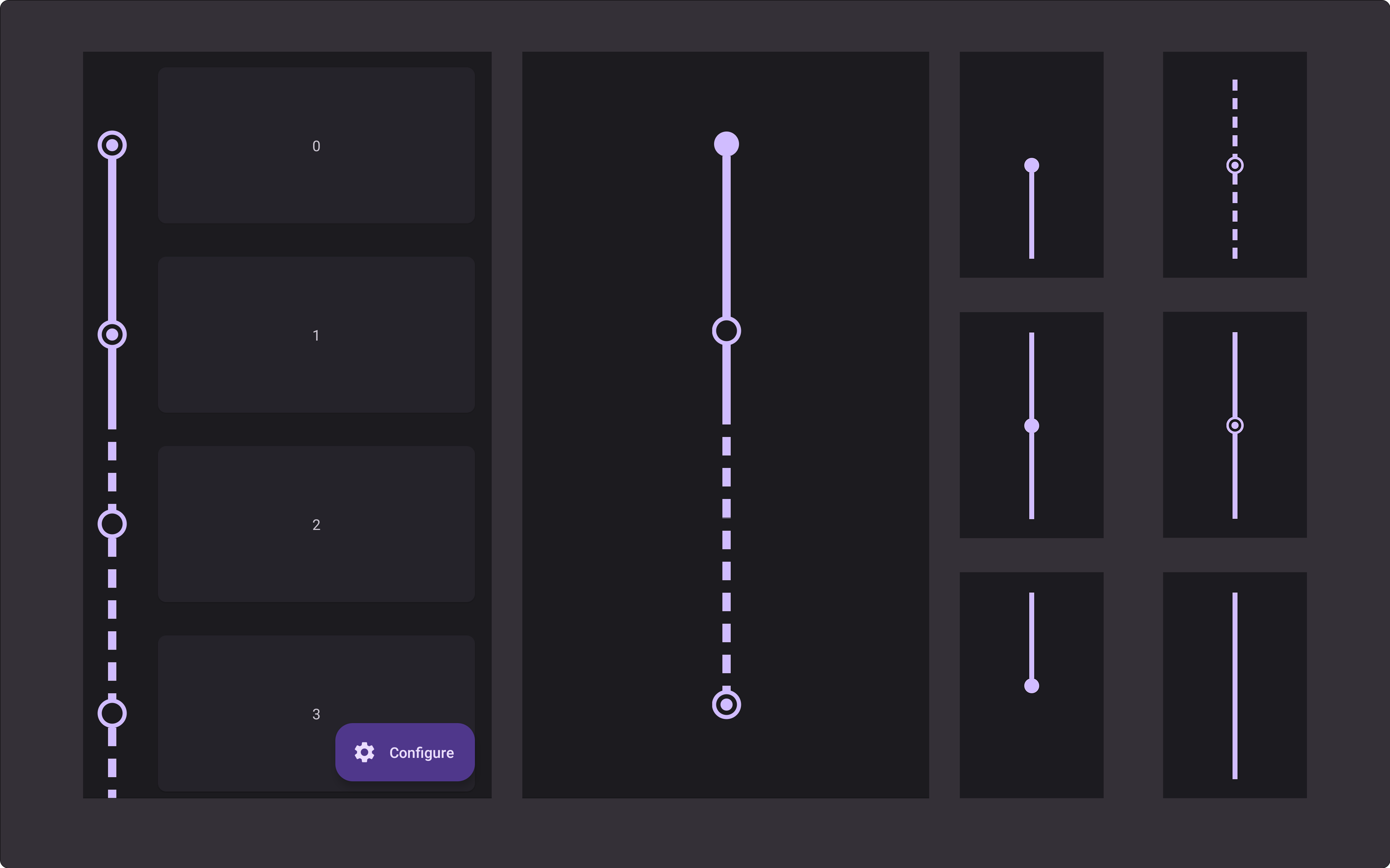
## Previews
Automatically adapts to the item height and supports expand animations
View type
Preview
View type
Preview
View type
Preview

first

middle

checked

last

spacer

dashed

## Setup
### 1. Add Jitpack to your root build.gradle
```gradle
allprojects {
repositories {
maven { url "https://jitpack.io" }
}
}
```
### 2. Add the dependency
```gradle
dependencies {
implementation 'com.github.lriccardo:TimelineView:1.1.2'
}
```
## Usage
### RecyclerView Decorator
```kotlin
recyclerView.addItemDecoration(
TimelineDecorator(
indicatorSize = 24f,
lineWidth = 15f,
padding = 48f,
position = TimelineDecorator.Position.Left,
indicatorColor = Color.RED,
lineColor = Color.RED
)
)
```
- Customization
You can provide a custom drawable for the indicators using `indicatorDrawable` or `indicatorDrawableRes` (`indicatorDrawable` overrides `indicatorDrawableRes`), if both are `null` a circle will be drawn (using the other customization parameters).
If you pass a drawable reference (`indicatorDrawableRes`), `ContextCompat.getDrawable()` will be used internally.
Field
Accepted values
Default
indicatorStyle
IndicatorStyle (Filled | Empty | Checked)
Filled
indicatorDrawable
Drawable
null
indicatorDrawableRes
@DrawableRes Int
null
indicatorSize
Float
24f
indicatorYPosition
Percentage (0.0f - 1.0f)
0.5f
checkedIndicatorSize
Float
TimelineView default value
checkedIndicatorStrokeWidth
Float
4dp
lineStyle
Normal (Normal | Dashed)
TimelineView default value
linePadding
Float
TimelineView default value
lineDashLength
Float
TimelineView default value
lineDashGap
Float
TimelineView default value
lineWidth
Float
TimelineView default value
padding
Float
16dp
position
Position (Left | Right)
Left
indicatorColor
@ColorInt
TimelineView default value
lineColor
@ColorInt
TimelineView default value
- Advanced customization
If your `RecyclerView.Adapter` implements `TimelineAdapter` you can customize how each item of your list is drawn.
Implementing one or more of these methods, allows you to use the `position` argument to return a different customization for some of your items.
```kotlin
interface TimelineAdapter {
fun getTimelineViewType(position: Int): TimelineView.ViewType?
fun getIndicatorDrawable(position: Int): Drawable?
@DrawableRes fun getIndicatorDrawableRes(position: Int): Int?
fun getIndicatorStyle(position: Int): TimelineView.IndicatorStyle?
fun getIndicatorColor(position: Int): Int?
fun getLineColor(position: Int): Int?
fun getLineStyle(position: Int): TimelineView.LineStyle?
fun getLinePadding(position: Int): Float?
}
```
### Standalone view
```xml
```
- Customization
Attribute
Accepted values
Default
app:timeline_item_type
first | middle | last | spacer
first
app:indicator_style
filled | empty | checked
filled
app:indicator_drawable
Drawable
null
app:indicator_size
Dimension
12dp
app:indicator_color
Color
Color.RED
app:indicator_y_position
Percentage (0.0 - 1.0)
0.5f
app:checked_indicator_size
Dimension
6dp
app:checked_indicator_stroke_width
Dimension
4dp
app:line_style
normal | dashed
normal
app:line_width
Dimension
8dp
app:line_color
Color
Color.RED
app:line_dash_length
Dimension
18
app:line_dash_gap
Dimension
12
# License
```
Copyright 2022 Riccardo Lattarulo
Licensed under the Apache License, Version 2.0 (the "License");
you may not use this file except in compliance with the License.
You may obtain a copy of the License at
http://www.apache.org/licenses/LICENSE-2.0
Unless required by applicable law or agreed to in writing, software
distributed under the License is distributed on an "AS IS" BASIS,
WITHOUT WARRANTIES OR CONDITIONS OF ANY KIND, either express or implied.
See the License for the specific language governing permissions and
limitations under the License.
```