Ecosyste.ms: Awesome
An open API service indexing awesome lists of open source software.
https://github.com/oneHamidreza/Meow-Framework-MVVM
Develop MVVM & Material Android App Easy
https://github.com/oneHamidreza/Meow-Framework-MVVM
Last synced: 3 months ago
JSON representation
Develop MVVM & Material Android App Easy
- Host: GitHub
- URL: https://github.com/oneHamidreza/Meow-Framework-MVVM
- Owner: oneHamidreza
- Created: 2020-02-11T00:28:47.000Z (over 4 years ago)
- Default Branch: master
- Last Pushed: 2021-02-10T19:23:07.000Z (over 3 years ago)
- Last Synced: 2024-01-17T02:31:56.669Z (5 months ago)
- Language: Kotlin
- Homepage:
- Size: 7.12 MB
- Stars: 122
- Watchers: 6
- Forks: 18
- Open Issues: 0
-
Metadata Files:
- Readme: README.md
- License: LICENSE-2.0.txt
Lists
- awesome-list - oneHamidreza/Meow-Framework-MVVM - Develop MVVM & Material Android App Easy (Kotlin)
README
# Meow Framework MVVM Android/Kotlin
A Framework that simplify developing MVVM Architecture and Material Design in Android with Kotlin language including useful Extensions and Sample Application. This Framework has some tools for Retrofit and OKHttp and Coroutine for calling REST API requests.
Dynamic Localization and Day/Night Theme & Meow Custom Widgets are another features.

## 📱 Sample Application
We suggest you to install [Meow-Sample.apk](https://github.com/oneHamidreza/Meow-Framework-MVVM/releases/download/v0.10.2/Meow-Framework-Sample-v0.10.2.apk) to be familiar with `Meow Framework`.


## 😍 Donate & Support
We are developing this framework in open source community without financial planning but the maintenance & preparing updates at periodic times is Time-consuming.
If you like this project and you want to give us peace of mind, you can support us by clicking this button :

## 🛠 Setup
```groovy
implementation("com.etebarian:meow-framework-mvvm:0.10.2")
```
After adding library, some of most useful libraries (such as `Androidx AppCompat` , `Coroutine` , `Glide` , `Kodein` , `Kotlinx Serialization` , `Material Components` , `Moshi` , `Navigation Components` , `Retrofit` ) will be added in your app. So you would'nt need to add this libraries manually.
List of dependencies can be found in [meow.AppConfig.kt](https://github.com/oneHamidreza/Meow-Framework-MVVM/blob/master/buildSrc/src/main/java/meow/AppConfig.kt) in `Dependencies` Object.
Check out [build.gradle.kts](https://github.com/oneHamidreza/Meow-Framework-MVVM/blob/master/MeowFramework/build.gradle.kts) in Sample module to avoid any issues that related to setup & adding Framework.
We recommend that use `Kotlin DSL Gradle` instead of `Groovy` . That is not Buggy 😊.
> Enable androidx in `gradle.properties`.
>
> ```properties
>android.useAndroidX=true
>android.enableJetifier=true
>```
>
> Remember that you'll need to enable Java 8 & DataBinding & Kotlin Kapt in your app module `build.gradle`.
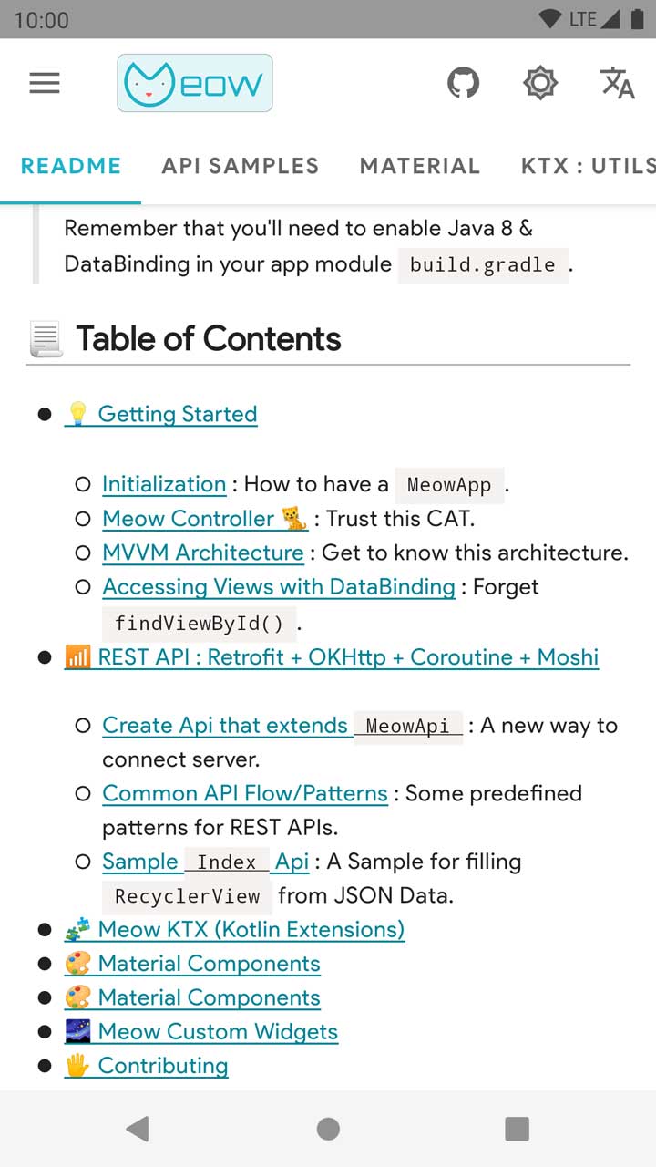
## 📃 Table of Contents
- [💡 Getting Started](https://github.com/oneHamidreza/Meow-Framework-MVVM#-getting-started)
- [Initialization](https://github.com/oneHamidreza/Meow-Framework-MVVM#-initialization) : How to have a `MeowApp`.
- [Meow Controller 🐈](https://github.com/oneHamidreza/Meow-Framework-MVVM#-meow-controller-) : Trust this CAT.
- [MVVM Architecture](https://github.com/oneHamidreza/Meow-Framework-MVVM#-mvvm-architecture) : Get to know this architecture.
- [Accessing Views with DataBinding](https://github.com/oneHamidreza/Meow-Framework-MVVM#accessing-views-with-databinding) : Forget `findViewById()`.
- [📶 REST API : Retrofit + OKHttp + Coroutine + Moshi](https://github.com/oneHamidreza/Meow-Framework-MVVM#-rest-api--retrofit--okhttp--coroutine--moshi)
- [Create Api that extends `MeowApi`](https://github.com/oneHamidreza/Meow-Framework-MVVM#create-api-that-extends-meowapi) : A new way to connect server.
- [Common API Flow/Patterns](https://github.com/oneHamidreza/Meow-Framework-MVVM#common-api-flowpatterns) : Some predefined patterns for REST APIs.
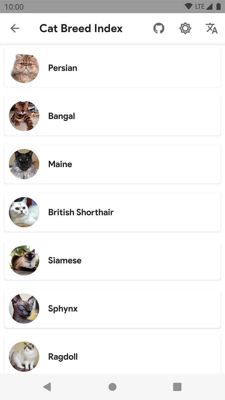
- [Sample `Index` Api](https://github.com/oneHamidreza/Meow-Framework-MVVM#sample-index-api) : A Sample for filling `RecyclerView` from JSON Data.
- [🧩 Meow KTX (Kotlin Extensions)](https://github.com/oneHamidreza/Meow-Framework-MVVM#-meow-ktx-kotlin-extensions)
- [Ⓜ Material Design Setup](https://github.com/oneHamidreza/Meow-Framework-MVVM#-material-design-setup)
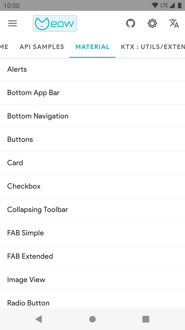
- [🎨 Material Components](https://github.com/oneHamidreza/Meow-Framework-MVVM#-material-components)
- [🌌 Meow Custom Widgets](https://github.com/oneHamidreza/Meow-Framework-MVVM#-meow-custom-widgets)
- [🖐 Contributing](https://github.com/oneHamidreza/Meow-Framework-MVVM#-contributing)
## 💡 Getting Started
We assume that you know MVVM architecture, but if you have some problems in understanding its, this [Articles](https://proandroiddev.com/tagged/mvvm) can help you.
### 🎮 Initialization
Create your application class which extends `MeowApp` and set it in `AndroidManifest.xml`. Dependency Injection in MVVM architecture is necessary, so we use `Kodein-DI` Framework.
You'll need to define `appModule` for View Models. Update application class like below :
```kotlin
class App : MeowApp() {
// Create a kodein module.
val appModule = Module("App Module", false) {
// Provide object of SomeOfClass(such as View Models) in Kodein with bind() function.
// bind() from singleton { SomeOfClass(instance()) }
}
// Source is `KodeinAware` interface.
override val kodein = Kodein.lazy {
// Import org.kodein.di.Kodein.*
bind() from singleton { kodein.direct }
bind() from singleton { this@App }
import(androidXModule(this@App))
import(meowModule) // Important
import(appModule)
}
}
```
### 🐱 Meow Controller
This Framework has two Highlighted Features :
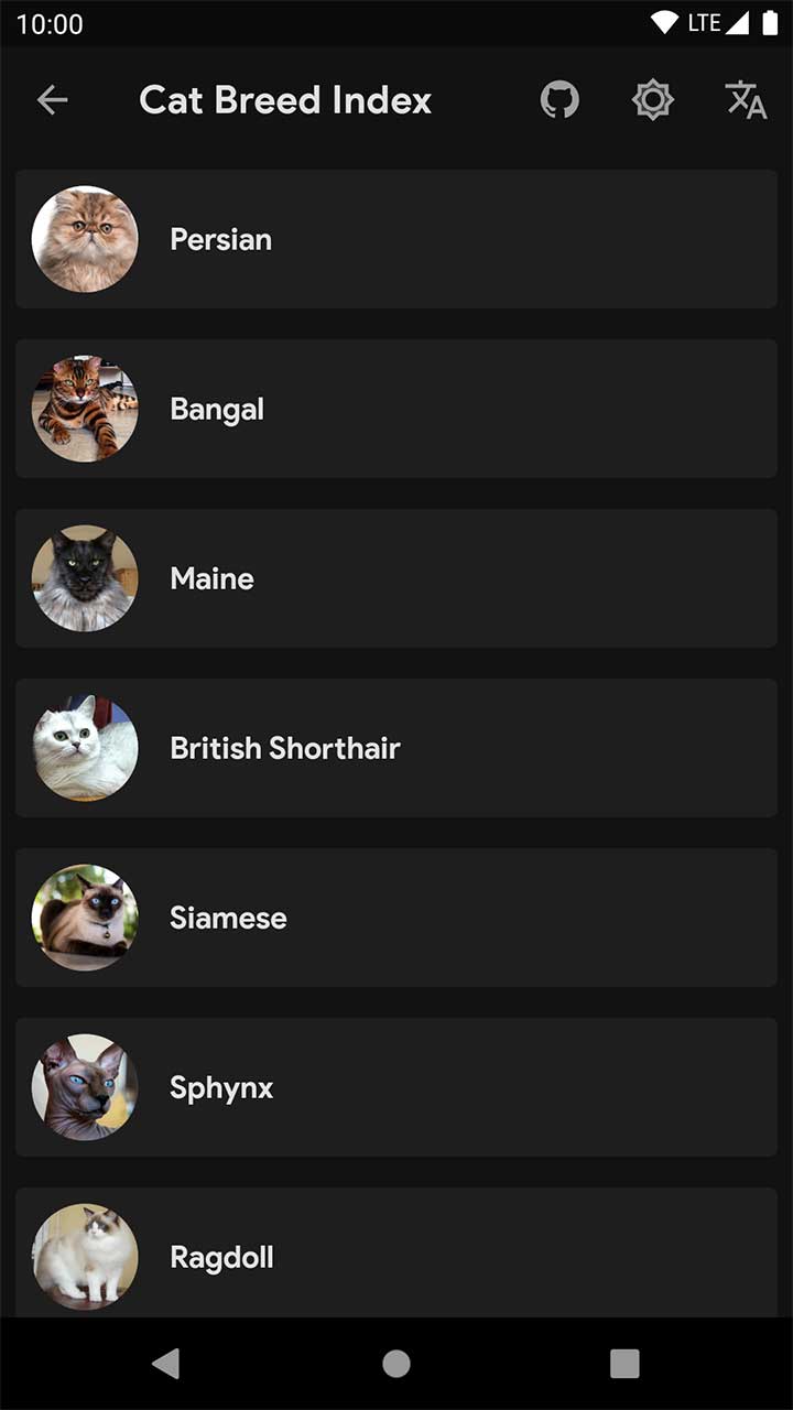
- Dynamic **Day/Night** Theme to switch from `LIGHT` to `DARK` mode.
- Dynamic **Localization** to change language , currency formatting , date formatting of app at Realtime.
to use above features, you'll need to define your `MeowController`.
`MeowController` is a class that controls some features in app such as above.
If you want to use `avoidException` in your app, this class can controls Exception Handlers with `onException` property.
Update your application class like this :
```kotlin
class App : MeowApp() {
// Layout Direction would be set automatically by Android System.
// (Example: "en": LayoutDirection.LTR "fa": LayoutDirection.RTL).
// Our Primary Sample app's language is English.
override fun getLanguage(context: Context?) = "en" // or any language such as ("fa","fr","ar",etc.)
// Our Sample app's theme is set by Android System Light/Dark (Day/Night) mode.
override fun getTheme(context: Context?) =
if (context.isNightModeFromSettings()) MeowController.Theme.NIGHT else MeowController.Theme.DAY
override fun onCreate() {
super.onCreate()
bindMeow { // Import it from meow package.
it.isDebugMode = BuildConfig.DEBUG
// Set other properties here.
it.onException = { // Only non-fatal error
// Log to Fabric or any other Crash Management System. Just use `avoidException` instead of `try{}catch{}`
}
}
}
}
```
You can update language and theme from UI Thread by using `MeowController` global instance.
```kotlin
import meow.controller
controller.updateLanguage(meowActivity, string)
controller.updateTheme(meowActivity, theme)
```
The Sample Application has above features. try to install [Meow-Sample.apk](https://github.com/oneHamidreza/Meow-Framework-MVVM/releases/download/v0.10.2/Meow-Framework-Sample-v0.10.2.apk) .
### 📐 MVVM Architecture
MVVM is Model-View-ViewModel that we define it in Android App as Data Model - View (Activity, Fragment, DialogFragment, BottomSheetDialogFragment) - MeowViewModel.
Follow below steps to have an activity with MVVM Architecture.
#### 1. Create your ViewModel that extends `MeowViewModel`.
```kotlin
class MainViewModel(app: App): MeowViewModel(app)
```
#### 2. Provide your View Model in appModule in `App`.
```kotlin
val appModule = Module("App Module", false) {
bindAutoTag() with provider {
MainViewModel(kodein.direct.instance())
}
}
```
>`bindAutoTag()` was imported from `meow.ktx.*` package.
#### 3. Create XML layout with `DataBinding` structure.
```xml
```
#### 4. Create Activity/Fragment ( extends `MeowActivity/MeowFragment` ) + `DataBinding` + `ViewModel`.
`MainActivity` is a sample activity that needs Kodein Dependency Injection and ViewDataBinding and View Model. See this example :
```kotlin
class MainActivity : MeowActivity() {
// ActivityMainBinding is generated by Androidx Lifecycle DataBinding Utils.
private val viewModel: MainViewModel by instanceViewModel()
override fun layoutId() = R.layout.activity_main
override fun initViewModel() {// Set View Model in binding.
binding.viewModel = viewModel
}
}
```
### Accessing Views with DataBinding
You can access views like this code :
```xml
```
```kotlin
class MainActivity : MeowActivity() {
override fun layoutId() = R.layout.activity_main
override fun onCreate(savedInstanceState: Bundle?) {
// ...
binding.toolbar.title = "custom_title" // Use binding variable
}
}
```
Now you have an Activity with MVVM architecture. In above sample, you can replace `MeowActivity` with `MeowFragment` to have MVVM Fragment.
## 📶 REST API : Retrofit + OKHttp + Coroutine + Moshi
Meow Framework provides some tools to call Server REST API actions from Android App with `Retrofit`. Creating client connections will be with `OKHttp` . `Moshi` helps us to serialize json responses. We replaced `RxJava` with `Coroutine` for multi thread handling.
### Create Api that extends `MeowApi`
```kotlin
class AppApi(
var app: App,
baseUrl : String = "http://api-url.any/api/v1/"
): MeowApi(baseUrl)
```
### Common API Flow/Patterns
We'll show you how to call a request to server and get response from it. Then Data has been shown in UI by parsing Data.
Some of actions that is related to REST API can be have a flow/pattern. We define this patterns as :
- `Index` : Response with simple request from server can be parsed as List of Data Model.
- `Detail` : Response with simple request from server can be parsed as a Data Model.
- `Form` : Response with advanced request (send a form) from server can be parsed as a Data Model.
### Sample `Index` Api
For example, server gives this JSON response when we call `/api/v1/persons` with GET method :
```json
[
{
"id":1,
"username":"oneHamidreza",
"alias":"Hamidreza Etebarian"
},
{
"id":2,
"username":"samdh82",
"alias":"Ali Modares"
}
]
```
#### Data Model
Create a data class for JSON response which uses Moshi `@Json` annotation.
```kotlin
@JsonClass(generateAdapter = true)
data class Person(
@Json(name = "id") var id: Int = 0,
@Json(name = "username") var username: String? = null,
@Json(name = "alias") var alias: String? = null) {
// RecyclerView List Adapter requires DiffCallBack.
class DiffCallback : DiffUtil.ItemCallback() {
override fun areItemsTheSame(oldItem: Person, newItem: Person) = oldItem.id == newItem.id
override fun areContentsTheSame(oldItem: Person, newItem: Person) = oldItem == newItem
}
}
```
#### Retrofit API Interface
Define an interface containing Rest API actions. Meow Framework uses `Coroutine` library to calling Rest API actions, so you must write `suspend` prefix for functions.
```kotlin
interface PersonApi {
@GET("persons") // Don't need to write absolute path. OKHTTP appends this string at end of your baseUrl API.
suspend fun getPersonIndex(): List
}
```
#### Call API action from ViewModel by using `safeCallApi()`. Update your ViewModel class like this :
```kotlin
class PersonIndexViewModel(override var app: App) : MeowViewModel(app) {
// Define LiveData variables. use `SingleLiveData` to observe only when changed.
var eventLiveData = SingleLiveData>()
var listLiveData = SingleLiveData>()
var customLiveData = SingleLiveData()
fun callApi() {
safeCallApi(
liveData = eventLiveData,
apiAction = { AppApi(app).createServiceByAdapter().getPersonIndex() }
) { _, it ->
// If connection was Success and Retrofit can parse json data as list of models, this line will be run.
// Otherwise MeowEvent.Api.Error will be posted into eventLiveData.
// You can observe it manually or use MeowFlow.
listLiveData.postValue(it)
}
}
}
```
#### XML Layout
Create `activity_sample_index.xml` which has `RecyclerView` to showing items as List.
```xml
```
#### MeowActivity/MeowFragment + MeowFlow
Use `MeowFlow` to handle events from ViewModel automatically.
```kotlin
class SampleIndexActivity : MeowActivity() {
//...
private val viewModel by instance()
override fun layoutId() = R.layout.activity_sample_index
override fun initViewModel() {
binding.viewModel = viewModel
callApiAndObserve()
}
private fun callApiAndObserve() {
MeowFlow.GetDataApi(this) { // You must pass the type of API response. For Example : `Person`.
viewModel.callApi()
}.apply {
errorHandlerType = MeowFlow.ErrorHandlerType.TOAST // Error handling will be with toast().
progressBarInterface = binding.progressbar
}.observeForIndex(viewModel.eventLiveData, viewModel.listLiveData)
// Optional - call safeObserve function for observe changes of liveData safely.
viewModel.customLiveData.safeObserve(this) {
// Access the value of liveData with it parameter.
}
}
}
```
`MeowFlow` is a helper class that observes `eventLiveData` and it handles errors from API automatically. You can set error handling with `errorHandlerType`. Supported types : `TOAST` , `SNACKBAR` , `EMPTY_STATE`.
For example, when `errorHandlerType` is `Toast` errors has been shown in toast form. See [strings_error.xml](https://github.com/oneHamidreza/Meow-Framework-MVVM/blob/master/MeowFramework/src/main/res/values/strings_error.xml) to edit error messages.
#### Show API response into `RecyclerView`
`item_person.xml` describes the layout of each row of list and you can set properties with `DataBinding` structure. Define layout like this :
```xml
```
We suggest you to use `MeowAdapter`. Let's take a look at this sample :
```kotlin
class PersonAdapter : MeowAdapter(Person.DiffCallback()) {
override fun onCreateViewHolder(parent: ViewGroup, viewType: Int): ViewHolder {
val binding = ItemPersonBinding.inflate(LayoutInflater.from(parent.context), parent, false)
return MeowViewHolder(binding.root) { position, model ->
binding.let {
it.setVariable(BR.model, model)
it.executePendingBindings()
}
}
}
}
```
Finally bind adapter to `RecyclerView`.
```kotlin
class PersonIndexActivity : MeowActivity(){
override fun onCreate(savedInstanceState: Bundle?) {
//...
binding.recyclerView.adapter = PersonAdapter()
}
}
```
Now you have a activity that connect to **REST API** and parse the response (if the response code is HttpCode.OK (200)) and it shows items into a `RecyclerView` as a list.
Above sample can be used for other types of REST API patterns/flows (such as `Detail` ,`Form`). for more details see [API Package](https://github.com/oneHamidreza/Meow-Framework-MVVM/blob/master/Sample/src/main/kotlin/sample/ui/api) in `Sample` module.
## 🧩 Meow KTX (Kotlin Extensions)
We have developed some Kotlin Extensions that can be help us in building Android Apps. Just import `meow.ktx` package which include the following :
- [🧩 Androidx Extensions](https://github.com/oneHamidreza/Meow-Framework-MVVM/blob/master/Docs/ReadME_Extensions_Androidx.md)
- [💵 Currency Extensions](https://github.com/oneHamidreza/Meow-Framework-MVVM/blob/master/Docs/ReadME_Extensions_Currency.md)
- [📅 Date Extensions](https://github.com/oneHamidreza/Meow-Framework-MVVM/blob/master/Docs/ReadME_Extensions_Date.md)
- [📂 File Extensions](https://github.com/oneHamidreza/Meow-Framework-MVVM/blob/master/Docs/ReadME_Extensions_File.md)
- [📇 JSON Extensions](https://github.com/oneHamidreza/Meow-Framework-MVVM/blob/master/Docs/ReadME_Extensions_Json.md)
- [💉 Kodein Extensions](https://github.com/oneHamidreza/Meow-Framework-MVVM/blob/master/Docs/ReadME_Extensions_Kodein.md)
- [💎 Kotlin Extensions](https://github.com/oneHamidreza/Meow-Framework-MVVM/blob/master/Docs/ReadME_Extensions_Kotlin.md)
- [📃 Log Extensions](https://github.com/oneHamidreza/Meow-Framework-MVVM/blob/master/Docs/ReadME_Extensions_Log.md)
- [🧮 Math Extensions](https://github.com/oneHamidreza/Meow-Framework-MVVM/blob/master/Docs/ReadME_Extensions_Math.md)
- [📶 Network Extensions](https://github.com/oneHamidreza/Meow-Framework-MVVM/blob/master/Docs/ReadME_Extensions_Network.md)
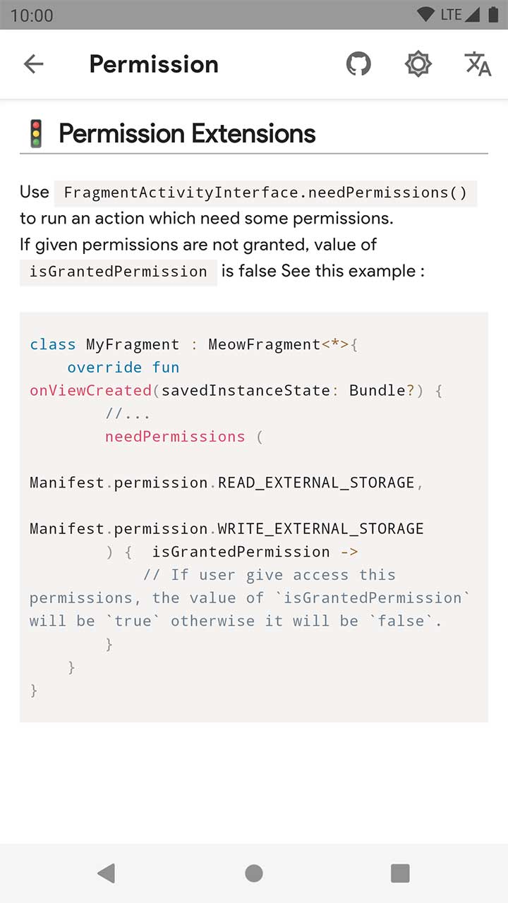
- [🚦 Permission Extensions](https://github.com/oneHamidreza/Meow-Framework-MVVM/blob/master/Docs/ReadME_Extensions_Permission.md)
- [📬 Shared Preferences Extensions](https://github.com/oneHamidreza/Meow-Framework-MVVM/blob/master/Docs/ReadME_Extensions_Shared_Preferences.md)
- [🍟 Snackbar Extensions](https://github.com/oneHamidreza/Meow-Framework-MVVM/blob/master/Docs/ReadME_Extensions_Snackbar.md)
- [🧬 String Extensions](https://github.com/oneHamidreza/Meow-Framework-MVVM/blob/master/Docs/ReadME_Extensions_String.md)
- [🚂 System Extensions](https://github.com/oneHamidreza/Meow-Framework-MVVM/blob/master/Docs/ReadME_Extensions_System.md)
- [🍞 Toast Extensions](https://github.com/oneHamidreza/Meow-Framework-MVVM/blob/master/Docs/ReadME_Extensions_Toast.md)
- [✅ Validate Extensions](https://github.com/oneHamidreza/Meow-Framework-MVVM/blob/master/Docs/ReadME_Extensions_Validate.md)
## Ⓜ Material Design Setup
Update App Theme in `styles.xml` with `DayNight` Material Theme. More details are at [Official Material Design Site](https://material.io/develop/android/docs/getting-started/).
```xml
<!-- Original AppCompat attributes. -->
<!-- Define colors in colors.xml -->
<item name="colorPrimary">YOUR_PRIMARY_COLOR</item>
<item name="colorSecondary">YOUR_SECONDARY_COLOR</item>
<item name="android:colorBackground">@color/meow_background</item>
<!-- New MaterialComponents attributes. -->
<item name="colorPrimaryVariant">YOUR_PRIMARY_VARIANT_COLOR</item>
<item name="colorSecondaryVariant">YOUR_SECONDARY_VARIANT_COLOR</item>
<item name="colorOnPrimary">YOUR_ON_PRIMARY_COLOR</item>
<item name="colorOnSecondary">YOUR_ON_SECONDARY_COLOR</item>
<item name="colorSurface">@color/meow_surface</item>
<item name="colorOnSurface">@color/meow_on_surface</item>
<item name="colorOnBackground">@color/meow_on_background</item>
<item name="colorError">@color/meow_error</item>
<item name="colorOnError">@color/meow_on_error</item>
<item name="scrimBackground">@color/mtrl_scrim_color</item>
```
### 🖌 Material Text Styles + Font by using `Meow.TextAppearance` Style
Just do same as [styles_text_appearances.xml](https://github.com/oneHamidreza/Meow-Framework-MVVM/blob/master/Sample/src/main/res/values/styles_text_appearances.xml).
> You must apply styles in `AppTheme`.
>
>```xml
>
> <item name="textAppearanceHeadline1">@style/App.TextAppearance.Headline1</item>
> <item name="textAppearanceHeadline2">@style/App.TextAppearance.Headline2</item>
> <item name="textAppearanceHeadline3">@style/App.TextAppearance.Headline3</item>
> <item name="textAppearanceHeadline4">@style/App.TextAppearance.Headline4</item>
> <item name="textAppearanceHeadline5">@style/App.TextAppearance.Headline5</item>
> <item name="textAppearanceHeadline6">@style/App.TextAppearance.Headline6</item>
> <item name="textAppearanceSubtitle1">@style/App.TextAppearance.Subtitle1</item>
> <item name="textAppearanceSubtitle2">@style/App.TextAppearance.Subtitle2</item>
> <item name="textAppearanceBody1">@style/App.TextAppearance.Body1</item>
> <item name="textAppearanceBody2">@style/App.TextAppearance.Body2</item>
> <item name="textAppearanceCaption">@style/App.TextAppearance.Caption</item>
> <item name="textAppearanceButton">@style/App.TextAppearance.Button</item>
> <item name="textAppearanceOverline">@style/App.TextAppearance.Overline</item>
>
>```
## 🎨 Material Components
### Alerts
You can show Alert Dialog with `alert()` function in `MeowActivity/MeowFragment`.
```kotlin
fun testAlert() {
alert(R.string.alert_title,R.string.alert_message)
.setPositiveButton(R.string.ok) { d, _ ->
toastL(R.string.alerts_warn_ok_clicked)
d.dismiss()
}
.setNegativeButton(R.string.cancel) { d, _ ->
toastL(R.string.alerts_warn_cancel_clicked)
d.dismiss()
}.show()
}
```
### Loading Alert

A Dialog with `MeowLoadingView` to showing progress bar with text into Dialog.
```kotlin
fun testLoadingAlertDialog() {
loadingAlert(R.string.loading_title_custom).show()
}
```
Learn more about it at [AlertsFragment.kt](https://github.com/oneHamidreza/Meow-Framework-MVVM/blob/master/Sample/src/main/kotlin/sample/ui/material/alerts/AlertsFragment.kt).
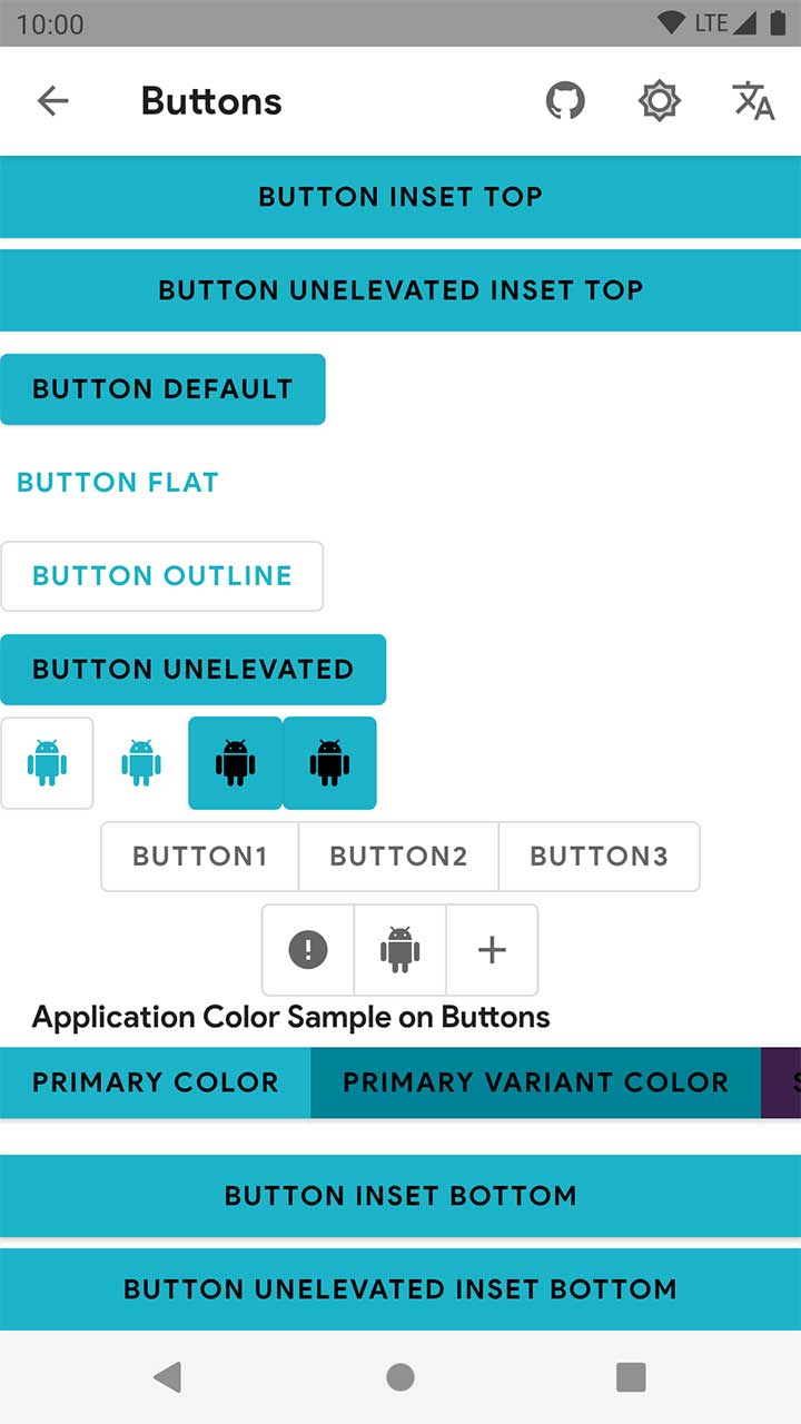
### Button
There are some customized styles that is related to `Material Button`.
|Style|Usage|
|---|:---:|
|`Meow.Button`|Regular Button with `primary` background color|
|`Meow.Button.Outlined`|Outlined Button with `transparent` background color and `stroke_color.xml` outline color|
|`Meow.Button.Flat`|Flat Button with `transparent` background color|
|`Meow.Button.Unelevated`|Regular Button with `primary` background color with `0dp` elevation|
|`Meow.Button.IconOnly`|A Meow Button that shows has not text|
Use it like this in XML Layout :
```xml
```
Learn more about it at [Material Card Component](https://material.io/components/android/catalog/cards/) and [fragment_cards.xml](https://github.com/oneHamidreza/Meow-Framework-MVVM/blob/master/Sample/src/main/kotlin/sample/ui/material/cards/res/layout/fragment_cards.xml).
### CardView
There are some customized styles that is related to `Material CardView`.
|Style|Usage|
|---|:---:|
|`Meow.CardView`|Regular Card with `surface` background color|
|`Meow.CardView.Outlined`|Outlined Card with `surface` background color and `stroke_color.xml` outline color|
Use it like this in XML Layout :
```xml
```
Learn more about it at [Material Card Component](https://material.io/components/android/catalog/cards/) and [fragment_cards.xml](https://github.com/oneHamidreza/Meow-Framework-MVVM/blob/master/Sample/src/main/kotlin/sample/ui/material/cards/res/layout/fragment_cards.xml).
### Checkbox
There are some customized styles that is related to `Material CheckBox`.
|Style|Usage|
|---|:---:|
|`Meow.Checkbox`|Checkbox with `accent_color` button tint|
|`Meow.Checkbox.Primary`|Checkbox with `primary` button tint|
|`Meow.Checkbox.Secondary`|Checkbox with `secondary` button tint|
|`Meow.Checkbox.OnPrimary`|Checkbox with `onPrimary` button tint & `textColor`|
|`Meow.Checkbox.OnSecondary`|Checkbox with `onSecondary` button tint & `textColor`|
Use it like this in XML Layout :
```xml
```
Learn more about it at [Material Checkbox Component](https://material.io/develop/android/components/checkbox/) and [fragment_checkboxes.xml](https://github.com/oneHamidreza/Meow-Framework-MVVM/blob/master/Sample/src/main/kotlin/sample/ui/material/checkboxes/res/layout/fragment_checkboxes.xml).
### Floating Action Button
Use it like this in XML Layout :
```xml
```
Learn more about it at [Material Floating Action Button Component](https://material.io/develop/android/components/floating-action-button/) and [fragment_fab_simple.xml](https://github.com/oneHamidreza/Meow-Framework-MVVM/blob/master/Sample/src/main/kotlin/sample/ui/material/fab/simple/res/layout/fragment_fab_simple.xml).
### Extended Floating Action Button
A FAB that supports `android:text` property.
Use it like this in XML Layout :
```xml
```
Learn more about it at [Material Extended Floating Action Button Component](https://material.io/develop/android/components/extended-floating-action-button/) and [fragment_fab_simple.xml](https://github.com/oneHamidreza/Meow-Framework-MVVM/blob/master/Sample/src/main/kotlin/sample/ui/material/fab/extended/res/layout/fragment_fab_extended.xml).
### Radio Group
There are some customized styles that is related to `Material Radio Group`.
|Style|Usage|
|---|:---:|
|`Meow.RadioGroup.Horizontal`|RadioGroup with Horizontal Radio Buttons|
|`Meow.RadioGroup.Vertical`|RadioGroup with Vertical Radio Buttons|
### Radio Button
There are some customized styles that is related to `Material Radio Button`.
|Style|Usage|
|---|:---:|
|`Meow.RadioButton.Vertical`|Vertical RadioButton with `accent_color` button tint|
|`Meow.RadioButton.Horizontal`|Horizontal RadioButton with `accent_color` button tint|
|`Meow.RadioButton.Vertical.Primary`|Vertical RadioButton with `primary` button tint|
|`Meow.RadioButton.Horizontal.Primary`|Horizontal RadioButton with `primary` button tint|
|`Meow.RadioButton.Vertical.Secondary`|Vertical RadioButton with `secondary` button tint|
|`Meow.RadioButton.Horizontal.Secondary`|Horizontal RadioButton with `secondary` button tint|
|`Meow.RadioButton.Vertical.OnPrimary`|Vertical RadioButton with `onPrimary` button tint & `textColor`|
|`Meow.RadioButton.Horizontal.OnPrimary`|Horizontal RadioButton with `onPrimary` button tint & `textColor`|
|`Meow.RadioButton.Vertical.OnSecondary`|Vertical RadioButton with `onSecondary` button tint & `textColor`|
|`Meow.RadioButton.Horizontal.OnSecondary`|Horizontal RadioButton with `onSecondary` button tint & `textColor`|
Use it like this in XML Layout :
```xml
```
Learn more about it at [Material Radio Button Component](https://material.io/develop/android/components/radiobutton/) and [fragment_radio_buttons.xml](https://github.com/oneHamidreza/Meow-Framework-MVVM/blob/master/Sample/src/main/kotlin/sample/ui/material/radiobuttons/res/layout/fragment_radio_buttons.xml).
### Snack Bars
You can show Snack Bars with `snackL()` or `snackS()` functions in `MeowActivity/MeowFragment`.
```kotlin
fun testSnackbars(){
// Shows Snack Bars with LENGTH_SHORT.
snackS(R.string.snackbars_message)
// Shows Snack Bars with LENGTH_LONG.
snackL(R.string.snackbars_message)
// Shows Snack Bars with LENGTH_INDEFINITE.
snackI(R.string.snackbars_message)
// Shows Snack Bars with LENGTH_LONG with action button.
snackL(
message = R.string.snackbars_message,
resActionText = R.string.snackbars_action,
// Optional - if you want to set custom textAppearances to message and action, set this attributes.
messageTextAppearanceId = R.style.textAppearance_Snack_Message,
actionTextAppearanceId = R.style.textAppearance_Snack_Action
) {
// Callback for action button click
}
}
```
Learn more about it at [SnackBarsFragment](https://github.com/oneHamidreza/Meow-Framework-MVVM/blob/master/Sample/src/main/kotlin/sample/ui/material/snackbars/SnackBarsFragment.kt).
### Switch
There are some customized styles that is related to `Material Switch`.
|Style|Usage|
|---|:---:|
|`Meow.Switch`|Switch with `accent_color` button tint|
|`Meow.Switch.Primary`|Switch with `primary` button tint|
|`Meow.Switch.Secondary`|Switch with `secondary` button tint|
|`Meow.Switch.OnPrimary`|Switch with `onPrimary` button tint & `textColor`|
|`Meow.Switch.OnSecondary`|Switch with `onSecondary` button tint & `textColor`|
Use it like this in XML Layout :
```xml
```
Learn more about it at [Material Switch Component](https://material.io/develop/android/components/switch/) and [fragment_switches.xml](https://github.com/oneHamidreza/Meow-Framework-MVVM/blob/master/Sample/src/main/kotlin/sample/ui/material/switches/res/layout/fragment_switches.xml).
### TabLayout + ViewPager2
If you want to show contents into a ViewPager, we recommend to use `ViewPager2`. `TabLayout` is the indicator of ViewPager state. Follow below steps to have a View with Swipe Gesture.
#### 1. Define XML layout like this :
```xml
```
#### 2. Create Custom Pager Adapter that extends `MeowPagerAdapter`
```kotlin
class MyPagerAdapter(
fragmentManager: FragmentManager,
lifecycle: Lifecycle) : MeowPagerAdapter(fragmentManager, lifecycle) {
// Replace this with the array of Fragments that you want to show into ViewPager.
private val fragmentArray = Array(3) { ChildFragment.newInstance(it) }
override fun getFragments() = fragmentArray
}
```
#### 3. Bind Adapter to `ViewPager2` & Attach `TabLayout` to `ViewPager2`
```kotlin
fun onCreate(savedInstanceState: Bundle?) {
// ...
binding.apply {
binding.viewPager.adapter = MyPagerAdapter(childFragmentManager, lifecycle)
TabLayoutMediator(tabLayout, viewpager) { tab, position ->
tab.text = "Tab Title #" + (position + 1) // Set Tab titles here.
}.attach()
// Optional - If you want to show Material Badge on TabLayout.
tabLayout.getTabAt(0)?.orCreateBadge?.apply {
isVisible = true
number = 10
}
}
}
```
Now you have `ViewPager2` + `TabLayout` in an Activity/Fragment.
There are some customized styles that is related to `Material TabLayout`.
|Style|Usage|
|---|:---:|
|`Meow.TabLayout.Surface`|TabLayout with `surface` background color|
|`Meow.TabLayout.Primary`|TabLayout with `primary` background color|
|`Meow.TabLayout.Secondary`|TabLayout with `primary` background color|
|`Meow.TabLayout.PrimarySurface`|TabLayout with `primary` background color in DAY mode and `surface` background color in NIGHT Mode|
Learn more about it at [Material TabLayout Component](https://material.io/develop/android/components/tab-layout/).
### TextView
Use it like this in XML Layout :
```xml
```
Learn more about it at [fragment_textviews.xml](https://github.com/oneHamidreza/Meow-Framework-MVVM/blob/master/Sample/src/main/kotlin/sample/ui/material/textviews/res/layout/fragment_textviews.xml).
Colors for texts based on Material Colors which contains `EMPHASIS_HIGH` , `EMPHASIS_MEDIUM` , `DISABLED` states.
|Color|Value|
|---|:---:|
|`@color/on_background_high`| `onBackground` color with %87 transparency|
|`@color/on_background_medium`| `onBackground` color with %60 transparency|
|`@color/on_background_disabled`| `onBackground` color with %38 transparency|
|`@color/on_surface_high`| `onSurface` color with %87 transparency|
|`@color/on_surface_medium`| `onSurface` color with %60 transparency|
|`@color/on_surface_disabled`| `onSurface` color with %38 transparency|
|`@color/on_primary_high`| `onPrimary` color with %87 transparency|
|`@color/on_primary_medium`| `onPrimary` color with %60 transparency|
|`@color/on_primary_disabled`| `onPrimary` color with %38 transparency|
|`@color/on_secondary_high`| `onSecondary` color with %87 transparency|
|`@color/on_secondary_medium`| `onSecondary` color with %60 transparency|
|`@color/on_secondary_disabled`| `onSecondary` color with %38 transparency|
### Top App Bar using `Material Toolbar`
Use it like this in XML Layout :
```xml
```
There are some customized styles that is related to `Material Toolbar`.
|Style|Usage|
|---|:---:|
|`Meow.Toolbar.Surface`|Toolbar with `surface` background color|
|`Meow.Toolbar.PrimarySurface`|Toolbar with `primary` background color in DAY mode and `surface` background color in NIGHT Mode|
|`Meow.Toolbar.Primary`|Toolbar with `primary` background color|
|`Meow.Toolbar.Secondary`|Toolbar with `secondary` background color|
Learn more about it at [Material Top App Bars Component](https://material.io/develop/android/components/top-app-bars/).
## 🌌 Meow Custom Widgets
### Meow Circle ImageView
Meow CircleImageView Attributes:
|Attributes|Descriptions|
|---|:---:|
|`meow_strokeColor`|The stroke color of image|
|`meow_strokeWidth`|The stroke width of image|
Use it like this in XML Layout :
```xml
```
Learn more about it at [fragment_imageviews.xml](https://github.com/oneHamidreza/Meow-Framework-MVVM/blob/master/Sample/src/main/kotlin/sample/ui/material/imageviews/res/layout/fragment_imageviews.xml).
### Meow Dash View
There are some styles that is related to `Dash View`.
|Style|Usage|
|---|:---:|
|`Meow.Dash.Horizontal`|DashView with `Horizontal` orientation|
|`Meow.Dash.Horizontal.Primary`|DashView with `Horizontal` orientation and `primary` color|
|`Meow.Dash.Horizontal.PrimaryVariant`|DashView with `Horizontal` orientation and `PrimaryVariant` color|
|`Meow.Dash.Horizontal.PrimarySurface`|DashView with `Horizontal` orientation and `PrimarySurface` color|
|`Meow.Dash.Horizontal.Secondary`|DashView with `Horizontal` orientation and `secondary` color|
|`Meow.Dash.Horizontal.SecondaryVariant`|DashView with `Horizontal` orientation and `SecondaryVariant` color|
|`Meow.Dash.Horizontal.OnPrimary`|DashView with `Horizontal` orientation and `OnPrimary` color|
|`Meow.Dash.Horizontal.OnSecondary`|DashView with `Horizontal` orientation and `OnSecondary` color|
|`Meow.Dash.Horizontal.OnSurface`|DashView with `Horizontal` orientation and `OnSurface` color|
|`Meow.Dash.Vertical`|DashView with `Vertical` orientation|
|`Meow.Dash.Vertical.Primary`|DashView with `Vertical` orientation and `primary` color|
|`Meow.Dash.Vertical.PrimaryVariant`|DashView with `Vertical` orientation and `PrimaryVariant` color|
|`Meow.Dash.Vertical.PrimarySurface`|DashView with `Vertical` orientation and `PrimarySurface` color|
|`Meow.Dash.Vertical.Secondary`|DashView with `Vertical` orientation and `secondary` color|
|`Meow.Dash.Vertical.SecondaryVariant`|DashView with `Vertical` orientation and `SecondaryVariant` color|
|`Meow.Dash.Vertical.OnPrimary`|DashView with `Vertical` orientation and `OnPrimary` color|
|`Meow.Dash.Vertical.OnSecondary`|DashView with `Vertical` orientation and `OnSecondary` color|
|`Meow.Dash.Vertical.OnSurface`|DashView with `Vertical` orientation and `OnSurface` color|
Meow Dash Attributes:
|Attributes|Descriptions|
|---|:---:|
|`meow_dash_gap`|Dash Gap|
|`meow_dash_length`|Dash length|
|`meow_dash_thickness`|Dash thickness|
|`meow_dash_color`|Dash color|
Use it like this in XML Layout :
```xml
```
Learn more about it at [fragment_dash.xml](https://github.com/oneHamidreza/Meow-Framework-MVVM/blob/master/Sample/src/main/kotlin/sample/ui/meowwidget/dash/res/layout/fragment_dash.xml).
### Meow Divider
There are some styles that is related to `Divider`.
|Style|Usage|
|---|:---:|
|`Meow.Divider.Horizontal`|Divider with `Horizontal` orientation|
|`Meow.Divider.Vertical`|Divider with `Vertical` orientation|
|`Meow.Divider.Horizontal.OnPrimary`|Divider with `Horizontal` orientation and `primary` divider background type|
|`Meow.Divider.Horizontal.OnSecondary`|Divider with `Horizontal` orientation and `secondary` divider background type|
|`Meow.Divider.Horizontal.OnSurface`|Divider with `Horizontal` orientation and `surface` divider background type|
|`Meow.Divider.Vertical.OnPrimary`|Divider with `Vertical` orientation and `primary` divider background type|
|`Meow.Divider.Vertical.OnSecondary`|Divider with `Vertical` orientation and `secondary` divider background type|
|`Meow.Divider.Vertical.OnSurface`|Divider with `Vertical` orientation and `surface` divider background type|
Meow Divider Attributes:
|Attributes|Descriptions|
|---|:---:|
|`meow_orientation`|Orientation: `vertical` or `horizontal`|
|`meow_background_type`|Types: `background`,`surface`,`secondary`,`primary`|
Use it like this in XML Layout :
> You just need use style.😉
>
```xml
```
Learn more about it at [fragment_dividers.xml](https://github.com/oneHamidreza/Meow-Framework-MVVM/blob/master/Sample/src/main/kotlin/sample/ui/meowwidget/dividers/res/layout/fragment_dividers.xml).
### Meow Empty State
There are some styles that is related to `Empty State`.
|Style|Usage|
|---|:---:|
|`Meow.EmptyState`|EmptyState default style with icon size and icon tint|
|`Meow.EmptyState.OnBackground`|EmptyState with title and description `OnBackground` color|
|`Meow.EmptyState.OnPrimary`|EmptyState with title and description `OnPrimary` color|
|`Meow.EmptyState.OnSecondary`|EmptyState with title and description `OnSecondary` colore|
|`Meow.EmptyState.OnSurface`|EmptyState with title and description `OnSurface` color|
Meow Empty state Attributes:
|Attributes|Descriptions|
|---|:---:|
|`meow_icon`|Icon resource|
|`meow_iconSize`|Icon size|
|`meow_iconTint`|Icon tint color|
|`meow_title`|Title text|
|`meow_titleTextColor`|Title text color|
|`meow_desc`|Description text|
|`meow_descTextColor`|Description text color|
|`meow_primaryActionText`|Button text|
Use it like this in XML Layout :
```xml
```
> Not Completed yet!.
### Meow Hint Button
There are some styles that is related to `Hint Button`.
|Style|Usage|
|---|:---:|
|`Meow.HintButton`|HintButton default style with icon color|
Meow HintButton Attributes:
|Attributes|Descriptions|
|---|:---:|
|`meow_hint`|Hint text|
|`meow_hintColor`|Hint text color|
|`meow_hintTextAppearance`|Hint textAppearance|
|`meow_title`|Title text|
|`meow_titleColor`|Title text color|
|`meow_titleTextAppearance`|Title textAppearance|
|`meow_icon`|Icon resource|
|`meow_iconColor`|Icon color|
Use it like this in XML Layout :
```xml
```
Learn more about it at [fragment_form.xml](https://github.com/oneHamidreza/Meow-Framework-MVVM/blob/master/Sample/src/main/kotlin/sample/ui/meowwidget/form/res/layout/fragment_form.xml).
### Meow PinView
There are some styles that is related to `PinView`.
|Style|Usage|
|---|:---:|
|`Meow.PinView.Filled`|PinView Filled box style|
|`Meow.PinView.Outlined`|PinView Outlined box style|
Meow PinView Attributes:
|Attributes|Descriptions|
|---|:---:|
|`meow_hint`|Hint text|
|`meow_hintColor`|Hint text color|
|`meow_hintTextAppearance`|Hint textAppearance|
|`meow_count`|Length of pin (box count)|
|`meow_textColor`|Boxes text color|
|`meow_textAppearance`|Boxes textAppearance|
|`meow_icon`|Icon resource|
|`meow_iconTint`|Icon color|
|`meow_showBack`|Show clear boxes text|
|`meow_errorTextAppearance`|Error textAppearance|
|`meow_boxStyle`|Styles: `outlined` or `filled`|
Use it like this in XML Layout :
```xml
```
Learn more about it at [fragment_form.xml](https://github.com/oneHamidreza/Meow-Framework-MVVM/blob/master/Sample/src/main/kotlin/sample/ui/meowwidget/form/res/layout/fragment_form.xml).
### Meow ProgressBar
There are some styles that is related to `ProgressBar`.
|Style|Usage|
|---|:---:|
|`Meow.ProgressBar.Small`|Small ProgressBar|
|`Meow.ProgressBar.Small.Primary`|Small ProgressBar with `primary` color|
|`Meow.ProgressBar.Small.PrimaryVariant`|Small ProgressBar with `PrimaryVariant` color|
|`Meow.ProgressBar.Small.PrimarySurface`|Small ProgressBar with `PrimarySurface` color|
|`Meow.ProgressBar.Small.Secondary`|Small ProgressBar with `secondary` color|
|`Meow.ProgressBar.Small.SecondaryVariant`|Small ProgressBar with `SecondaryVariant` color|
|`Meow.ProgressBar.Small.OnPrimary`|Small ProgressBar with `OnPrimary` color|
|`Meow.ProgressBar.Small.OnSecondary`|Small ProgressBar with `OnSecondary` color|
|`Meow.ProgressBar.Small.OnSurface`|Small ProgressBar with `OnSurface` color|
|`Meow.ProgressBar.Medium`|Medium ProgressBar|
|`Meow.ProgressBar.Medium.Primary`|Medium ProgressBar with `primary` color|
|`Meow.ProgressBar.Medium.PrimaryVariant`|Medium ProgressBar with `PrimaryVariant` color|
|`Meow.ProgressBar.Medium.PrimarySurface`|Medium ProgressBar with `PrimarySurface` color|
|`Meow.ProgressBar.Medium.Secondary`|Medium ProgressBar with `secondary` color|
|`Meow.ProgressBar.Medium.SecondaryVariant`|Medium ProgressBar with `SecondaryVariant` color|
|`Meow.ProgressBar.Medium.OnPrimary`|Medium ProgressBar with `OnPrimary` color|
|`Meow.ProgressBar.Medium.OnSecondary`|Medium ProgressBar with `OnSecondary` color|
|`Meow.ProgressBar.Medium.OnSurface`|Medium ProgressBar with `OnSurface` color|
|`Meow.ProgressBar.Large`|Large ProgressBar|
|`Meow.ProgressBar.Large.Primary`|Large ProgressBar with `primary` color|
|`Meow.ProgressBar.Large.PrimaryVariant`|Large ProgressBar with `PrimaryVariant` color|
|`Meow.ProgressBar.Large.PrimarySurface`|Large ProgressBar with `PrimarySurface` color|
|`Meow.ProgressBar.Large.Secondary`|Large ProgressBar with `secondary` color|
|`Meow.ProgressBar.Large.SecondaryVariant`|Large ProgressBar with `SecondaryVariant` color|
|`Meow.ProgressBar.Large.OnPrimary`|Large ProgressBar with `OnPrimary` color|
|`Meow.ProgressBar.Large.OnSecondary`|Large ProgressBar with `OnSecondary` color|
|`Meow.ProgressBar.Large.OnSurface`|Large ProgressBar with `OnSurface` color|
Meow ProgressBar Attributes:
|Attributes|Descriptions|
|---|:---:|
|`meow_showOnInit`|Specify that the progress can be show on Initialization|
Use it like this in XML Layout :
```xml
```
Learn more about it at [fragment_progress_bars.xml](https://github.com/oneHamidreza/Meow-Framework-MVVM/blob/master/Sample/src/main/kotlin/sample/ui/meowwidget/progressbars/res/layout/fragment_progress_bars.xml).
### Meow Rating Bar
There are some styles that is related to `RatingBar`.
|Style|Usage|
|---|:---:|
|`Meow.RatingBar`|RatingBar with default style|
|`Meow.RatingBar.Indicator`|RatingBar with enabled Indicator style (just show and not clickable)|
Meow RatingBar Attributes:
|Attributes|Descriptions|
|---|:---:|
|`meow_numStars`|The number of stars|
|`meow_minimumStars`|The minimum selected stars|
|`meow_rating`|Show while when use it|
|`meow_starPadding`|Stars padding|
|`meow_drawableEmpty`|Stars drawable when is empty|
|`meow_drawableFilled`|Stars drawable when is filled|
|`meow_isIndicator`|Specify that it is indicator or not|
|`meow_scrollable`|Specify that it is scrollable or not|
|`meow_clickable`|Specify that it is clickable or not|
|`meow_clearRatingEnabled`|Specify that `clearRating` is enabled or not|
|`meow_starWidth`|Stars Width|
|`meow_starHeight`|Stars Height|
|`meow_stepSize`|Step Size|
Use it like this in XML Layout :
```xml
```
Learn more about it at [fragment_rating_bars.xml](https://github.com/oneHamidreza/Meow-Framework-MVVM/blob/master/Sample/src/main/kotlin/sample/ui/meowwidget/ratingbars/res/layout/fragment_rating_bars.xml).
### Meow FormView (a cool widget😎)
>With this widget, you no longer need to check the form fields (like editTexts and spinners) one by one.
Use it like this in XML Layout :
```xml
```
You can call `validate()` function to validate all widgets which are in `MeowFormView` as children :
```kotlin
binding.fv.validate {
// When MeowFormView validate all widgets with their validate type, this line runs.
}
```
Learn more about it at [fragment_form.xml](https://github.com/oneHamidreza/Meow-Framework-MVVM/blob/master/Sample/src/main/kotlin/sample/ui/meowwidget/form/res/layout/fragment_form.xml).
### Meow Spinner
There are some styles that is related to `Spinner`.
|Style|Usage|
|---|:---:|
|`Meow.Spinner.Outlined`|Spinner with outlined style|
|`Meow.Spinner.Outlined.Dense`|Spinner with outlined dense style|
|`Meow.Spinner.Filled`|Spinner with Filled style|
|`Meow.Spinner.Filled.Dense`|Spinner with Filled dense style|
> If you want to use Validation Feature, you should add `MeowSpinner` to `FormView` Layout.
|Attributes|Descriptions|
|---|:---:|
|`meow_validateType`|Types: `empty`,`optional`|
|`meow_errorEmpty`|Error empty Text (when spinner was empty you can show your customize error)|
Use it like this in XML Layout :
```xml
```
And for add Item in `MeowSpinner` :
Supports : title , description and icon
```kotlin
binding.spinner
.addItem(R.string.item1, R.string.description1, R.drawable.ic_error)
.addItem(R.string.item2, R.string.description2, R.drawable.ic_error)
.addItem(R.string.item3, imageViewResId = R.drawable.ic_error)
.addItem(R.string.item4, imageViewResId = R.drawable.ic_error)
.addItem(R.string.item5, R.string.description3)
.addItem(R.string.item6, R.string.description4)
.addItem(R.string.item7)
.addItem(R.string.item8)
.build()
```
Learn more about it at [Material Exposed Dropdown Menu Component](https://material.io/components/menus#exposed-dropdown-menu) and [fragment_form.xml](https://github.com/oneHamidreza/Meow-Framework-MVVM/blob/master/Sample/src/main/kotlin/sample/ui/meowwidget/form/res/layout/fragment_form.xml).
### Meow TextField
There are some styles that is related to `TextField`.
|Style|Usage|
|---|:---:|
|`Meow.TextField.Outlined`|TextField with outlined style|
|`Meow.TextField.Outlined.Dense`|TextField with outlined dense style|
|`Meow.TextField.Filled`|TextField with Filled style|
|`Meow.TextField.Filled.Dense`|TextField with Filled dense style|
Meow TextField Attributes:
> For use validation Feature you should add `MeowTextField` to `FormView` Layout.
>
> If the error text is blank, the default message will be displayed.
>
|Attributes|Descriptions|
|---|:---:|
|`meow_validateType`|Types: `empty`,`mobile`,`mobileLegacy`,`email`,`optional`|
|`meow_errorEmpty`|Error empty Text (when textfield was empty you can show your customize error)|
|`meow_errorMobile`|Error invalid mobile number|
|`meow_errorMobileLegacy`|Error invalid mobile legacy (persian) number|
|`meow_errorEmail`|Error invalid email|
|`meow_textSize`|TextField text size|
|`meow_inputType`|Default android `TextInputLayout` input type|
Use it like this in XML Layout :
```xml
```
Learn more about it at [Material TextField Component](https://material.io/components/text-fields) and [fragment_form.xml](https://github.com/oneHamidreza/Meow-Framework-MVVM/blob/master/Sample/src/main/kotlin/sample/ui/meowwidget/form/res/layout/fragment_form.xml).
## 👮 R8/Proguard
Just include rules of [proguard-rules.pro](http://github.com/oneHamidreza/Meow-Framework-MVVM/blob/master/Sample/proguard-rules.pro) at your application Proguard config file.
## 🖐 Contributing
If you want to contribute to this project, just send an email to [email protected] with `Meow-Framework-Contributing` subject.
License
--------
Copyright 2020 Hamidreza Etebarian
Licensed under the Apache License, Version 2.0 (the "License");
you may not use this file except in compliance with the License.
You may obtain a copy of the License at
http://www.apache.org/licenses/LICENSE-2.0
Unless required by applicable law or agreed to in writing, software
distributed under the License is distributed on an "AS IS" BASIS,
WITHOUT WARRANTIES OR CONDITIONS OF ANY KIND, either express or implied.
See the License for the specific language governing permissions and
limitations under the License.