Ecosyste.ms: Awesome
An open API service indexing awesome lists of open source software.
https://github.com/exyte/Chat
A SwiftUI Chat UI framework with fully customizable message cells and a built-in media picker
https://github.com/exyte/Chat
chat ios swift swift-library swiftui swiftui-components
Last synced: about 1 month ago
JSON representation
A SwiftUI Chat UI framework with fully customizable message cells and a built-in media picker
- Host: GitHub
- URL: https://github.com/exyte/Chat
- Owner: exyte
- License: mit
- Created: 2022-05-23T07:29:19.000Z (over 2 years ago)
- Default Branch: main
- Last Pushed: 2024-04-26T10:57:18.000Z (5 months ago)
- Last Synced: 2024-04-27T11:42:20.654Z (5 months ago)
- Topics: chat, ios, swift, swift-library, swiftui, swiftui-components
- Language: Swift
- Homepage:
- Size: 2.36 MB
- Stars: 647
- Watchers: 6
- Forks: 85
- Open Issues: 7
-
Metadata Files:
- Readme: README.md
- License: LICENSE
Awesome Lists containing this project
- awesome-ios - ExyteChat - SwiftUI Chat UI framework with fully customizable message cells, input view, and a built-in media picker. (Messaging / Video)
- awesome-ios-star - ExyteChat - SwiftUI Chat UI framework with fully customizable message cells, input view, and a built-in media picker. (Messaging / Video)
README


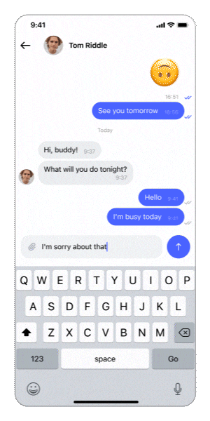
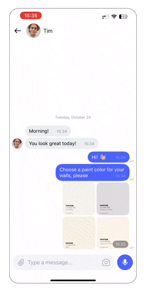
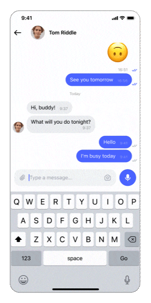
Chat
Media
Audio Messages
Extra

Chat
A SwiftUI Chat UI framework with fully customizable message cells and a built-in media picker

[](https://swiftpackageindex.com/exyte/Chat)
[](https://swiftpackageindex.com/exyte/Chat)
[](https://swiftpackageindex.com/exyte/Chat)
[](https://cocoapods.org/pods/ExyteChat)
[](https://github.com/Carthage/Carthage)
[](https://opensource.org/licenses/MIT)
# Features
- Displays your messages with pagination and allows you to create and "send" new messages (sending means calling a closure since user will be the one providing actual API calls)
- Allows you to pass a custom view builder for messages and input views
- Has a built-in photo and video library/camera picker for multiple media asset selection
- Can display a fullscreen menu on long press a message cell (automatically shows scroll for big messages)
- Supports "reply to message" via message menu or through a closure. Remove and edit are **coming soon**
- This library allows to send the following content in messages in any combination:
- Text with/without markdown
- Photo/video
- Audio recording
**Coming soon:**
- User's location
- Documents
- Link with preview
# Usage
Create a chat view like this:
```swift
@State var messages: [Message] = []
var body: some View {
ChatView(messages: messages) { draft in
yourViewModel.send(draft: draft)
}
}
```
where:
`messages` - list of messages to display
`didSendMessage` - a closure which is called when the user presses the send button
`Message` is a type that `Chat` uses for the internal implementation. In the code above it expects the user to provide a list of `Message` structs, and it returns a `DraftMessage` in the `didSendMessage` closure. You can map it both ways to your own `Message` model that your API expects or use as is.
## Available chat types
Chat type - determines the order of messages and direction of new message animation. Available options:
- `conversation` - the latest message is at the bottom, new messages appear from the bottom
- `comments` - the latest message is at the top, new messages appear from the top
Reply mode - determines how replying to message looks. Available options:
- `quote` - when replying to message A, new message will appear as the newest message, quoting message A in its body
- `answer` - when replying to message A, new message with appear direclty below message A as a separate cell without duplicating message A in its body
To specify any of these pass them through `init`:
```swift
ChatView(messages: viewModel.messages, chatType: .comments, replyMode: .answer) { draft in
yourViewModel.send(draft: draft)
}
```
## Custom UI
You may customize message cells like this:
```swift
ChatView(messages: viewModel.messages) { draft in
viewModel.send(draft: draft)
} messageBuilder: { message, positionInUserGroup, positionInCommentsGroup, showContextMenuClosure, messageActionClosure, showAttachmentClosure in
VStack {
Text(message.text)
if !message.attachments.isEmpty {
ForEach(message.attachments, id: \.id) { at in
AsyncImage(url: at.thumbnail)
}
}
}
}
```
`messageBuilder`'s parameters:
- `message` - the message containing user info, attachments, etc.
- `positionInUserGroup` - the position of the message in its continuous collection of messages from the same user
- `positionInCommentsGroup` - position of message in its continuous group of comments (only works for .answer ReplyMode, nil for .quote mode)
- `showContextMenuClosure` - closure to show message context menu
- `messageActionClosure ` - closure to pass user interaction, .reply for example
- `showAttachmentClosure` - you can pass an attachment to this closure to use ChatView's fullscreen media viewer
You may customize the input view (a text field with buttons at the bottom) like this:
```swift
ChatView(messages: viewModel.messages) { draft in
viewModel.send(draft: draft)
} inputViewBuilder: { textBinding, attachments, inputViewState, inputViewStyle, inputViewActionClosure, dismissKeyboardClosure in
Group {
switch inputViewStyle {
case .message: // input view on chat screen
VStack {
HStack {
Button("Send") { inputViewActionClosure(.send) }
Button("Attach") { inputViewActionClosure(.photo) }
}
TextField("Write your message", text: textBinding)
}
case .signature: // input view on photo selection screen
VStack {
HStack {
Button("Send") { inputViewActionClosure(.send) }
}
TextField("Compose a signature for photo", text: textBinding)
.background(Color.green)
}
}
}
}
```
`inputViewBuilder`'s parameters:
- `textBinding` to bind your own TextField
- `attachments` is a struct containing photos, videos, recordings and a message you are replying to
- `inputViewState` - the state of the input view that is controlled by the library automatically if possible or through your calls of `inputViewActionClosure`
- `inputViewStyle` - `.message` or `.signature` (the chat screen or the photo selection screen)
- `inputViewActionClosure` for calling on taps on your custom buttons. For example, call `inputViewActionClosure(.send)` if you want to send your message with your own button, then the library will reset the text and attachments and call the `didSendMessage` sending closure
- `dismissKeyboardClosure` - call this to dismiss keyboard
## Custom message menu
Long tap on a message will display a menu for this message (can be turned off, see Modifiers). To define custom message menu actions declare an enum conforming to `MessageMenuAction`. Then the library will show your custom menu options on long tap on message instead of default ones, if you pass your enum's name to it (see code sample). Once the action is selected special callbcak will be called. Here is a simple example:
```swift
enum Action: MessageMenuAction {
case reply, edit
func title() -> String {
switch self {
case .reply:
"Reply"
case .edit:
"Edit"
}
}
func icon() -> Image {
switch self {
case .reply:
Image(systemName: "arrowshape.turn.up.left")
case .edit:
Image(systemName: "square.and.pencil")
}
}
}
ChatView(messages: viewModel.messages) { draft in
viewModel.send(draft: draft)
} messageMenuAction: { (action: Action, defaultActionClosure, message) in // <-- here: specify the name of your `MessageMenuAction` enum
switch action {
case .reply:
defaultActionClosure(message, .reply)
case .edit:
defaultActionClosure(message, .edit { editedText in
// update this message's text on your BE
print(editedText)
})
}
}
```
`messageMenuAction`'s parameters:
- `selectedMenuAction` - action selected by the user from the menu. NOTE: when declaring this variable, specify its type (your custom descendant of MessageMenuAction) explicitly
- `defaultActionClosure` - a closure taking a case of default implementation of MessageMenuAction which provides simple actions handlers; you call this closure passing the selected message and choosing one of the default actions (.reply, .edit) if you need them; or you can write a custom implementation for all your actions, in that case just ignore this closure
- `message` - message for which the menu is displayed
When implementing your own `MessageMenuActionClosure`, write a switch statement passing through all the cases of your `MessageMenuAction`, inside each case write your own action handler, or call the default one. NOTE: not all default actions work out of the box - e.g. for `.edit` you'll still need to provide a closure to save the edited text on your BE. Please see CommentsExampleView in ChatExample project for MessageMenuActionClosure usage example.
## Small view builders:
These use `AnyView`, so please try to keep them easy enough
- `betweenListAndInputViewBuilder` - content to display in between the chat list view and the input view
- `mainHeaderBuilder` - a header for the whole chat, which will scroll together with all the messages and headers
- `headerBuilder` - date section header builder
## Modifiers
`isListAboveInputView` - messages table above the input field view or not
`showDateHeaders` - show section headers with dates between days, default is `true`
`isScrollEnabled` - forbid scrolling for messages' `UITabelView`
`showMessageMenuOnLongPress` - turn menu on long tap on/off
`showNetworkConnectionProblem` - display network error on/off
`assetsPickerLimit` - set a limit for MediaPicker built into the library
`setMediaPickerSelectionParameters` - a struct holding MediaPicker selection parameters (assetsPickerLimit and others like mediaType, selectionStyle, etc.).
`orientationHandler` - handle screen rotation
`enableLoadMore(offset: Int, handler: @escaping ChatPaginationClosure)` - when user scrolls to `offset`-th message from the end, call the handler function, so the user can load more messages
`chatNavigation(title: String, status: String? = nil, cover: URL? = nil)` - pass the info for the Chat's navigation bar
### makes sense only for built-in message view
`avatarSize` - the default avatar is a circle, you can specify its diameter here
`tapAvatarClosure` - closure to call on avatar tap
`messageUseMarkdown` - use markdown (e.g. ** to make something bold) or not
`showMessageTimeView` - show timestamp in a corner of the message
`setMessageFont` - pass custom font to use for messages
### makes sense only for built-in input view
`setAvailableInput` - hide some buttons in default InputView. Available options are:
- `.full` - media + text + audio
- `.textAndMedia`
- `.textAndAudio`
- `.textOnly`
## Examples
There are 2 example projects:
- One has a simple bot posting random text/media messages every 2 seconds. It has no back end and no local storage. Every new start is clean and fresh.
- Another has an integration with Firestore data base. It has all the necessary back end support, including storing media and audio messages, unread messages counters, etc. You'll have to create your own Firestore app and DB. Also replace `GoogleService-Info` with your own. After that you can test on multiple sims/devices.
Create your firestore app
https://console.firebase.google.com/
Create firesote database (for light weight text data)
https://firebase.google.com/docs/firestore/manage-data/add-data
Create cloud firestore database (for images and voice recordings)
https://firebase.google.com/docs/storage/web/start
## Example
To try out the Chat examples:
- Clone the repo `git clone [email protected]:exyte/Chat.git`
- Open terminal and run `cd /Example`
- Wait for SPM to finish downloading packages
- Run it!
## Installation
### Swift Package Manager
```swift
dependencies: [
.package(url: "https://github.com/exyte/Chat.git")
]
```
### CocoaPods
```ruby
pod 'ExyteChat'
```
### Carthage
```ogdl
github "Exyte/Chat"
```
## Requirements
* iOS 16+
* Xcode 14+
## Our other open source SwiftUI libraries
[PopupView](https://github.com/exyte/PopupView) - Toasts and popups library
[Grid](https://github.com/exyte/Grid) - The most powerful Grid container
[ScalingHeaderScrollView](https://github.com/exyte/ScalingHeaderScrollView) - A scroll view with a sticky header which shrinks as you scroll
[AnimatedTabBar](https://github.com/exyte/AnimatedTabBar) - A tabbar with a number of preset animations
[MediaPicker](https://github.com/exyte/mediapicker) - Customizable media picker
[OpenAI](https://github.com/exyte/OpenAI) Wrapper lib for [OpenAI REST API](https://platform.openai.com/docs/api-reference/introduction)
[AnimatedGradient](https://github.com/exyte/AnimatedGradient) - Animated linear gradient
[ConcentricOnboarding](https://github.com/exyte/ConcentricOnboarding) - Animated onboarding flow
[FloatingButton](https://github.com/exyte/FloatingButton) - Floating button menu
[ActivityIndicatorView](https://github.com/exyte/ActivityIndicatorView) - A number of animated loading indicators
[ProgressIndicatorView](https://github.com/exyte/ProgressIndicatorView) - A number of animated progress indicators
[FlagAndCountryCode](https://github.com/exyte/FlagAndCountryCode) - Phone codes and flags for every country
[SVGView](https://github.com/exyte/SVGView) - SVG parser
[LiquidSwipe](https://github.com/exyte/LiquidSwipe) - Liquid navigation animation