Ecosyste.ms: Awesome
An open API service indexing awesome lists of open source software.
https://github.com/mgmeyers/obsidian-style-settings
A dynamic user interface for adjusting theme, plugin, and snippet CSS variables within Obsidian
https://github.com/mgmeyers/obsidian-style-settings
obsidian obsidian-md obsidian-plugin
Last synced: about 1 month ago
JSON representation
A dynamic user interface for adjusting theme, plugin, and snippet CSS variables within Obsidian
- Host: GitHub
- URL: https://github.com/mgmeyers/obsidian-style-settings
- Owner: mgmeyers
- License: gpl-3.0
- Created: 2021-03-28T20:17:29.000Z (about 3 years ago)
- Default Branch: main
- Last Pushed: 2024-03-11T19:17:10.000Z (4 months ago)
- Last Synced: 2024-05-01T13:31:35.827Z (about 2 months ago)
- Topics: obsidian, obsidian-md, obsidian-plugin
- Language: TypeScript
- Homepage:
- Size: 402 KB
- Stars: 976
- Watchers: 9
- Forks: 91
- Open Issues: 60
-
Metadata Files:
- Readme: README.md
- Funding: .github/FUNDING.yml
- License: LICENSE.md
Lists
- awesome-obsidian - obsidian-style-settings:
- awesome-stars - mgmeyers/obsidian-style-settings - A dynamic user interface for adjusting theme, plugin, and snippet CSS variables within Obsidian (TypeScript)
- project-awesome - mgmeyers/obsidian-style-settings - A dynamic user interface for adjusting theme, plugin, and snippet CSS variables within Obsidian (TypeScript)
- jimsghstars - mgmeyers/obsidian-style-settings - A dynamic user interface for adjusting theme, plugin, and snippet CSS variables within Obsidian (TypeScript)
README
# Obsidian Style Settings Plugin
This plugin allows snippet, theme, and plugin CSS files to define a set of configuration options. It then allows users to see all the tweakable settings in one settings pane. Style Settings allows both toggling classes on and off the `body` element, as well as setting numeric, string, and color CSS variables.
**[This CSS Snippet](obsidian-default-theme.css) can be used to adjust every CSS variable of the default Obsidian theme.**
Configurable settings are defined by comments within CSS files beginning with `/* @settings`. These comments must contain YAML with `name`, `id`, and `settings` properties. Style Settings will scan for these comments in all CSS loaded by Obsidian from the `snippets`, `themes`, and `plugins` directories under your vault's configuration directory (`%yourVault%/.obsidian/`). Please see the [Obsidian Docs](https://help.obsidian.md/Home) for more information.
For example, adding this to a CSS snippet in your vault's snippets directory (`%yourVault%/.obsidian/snippets`):
```css
/* @settings
name: Your Section Name Here
id: a-unique-id
settings:
-
id: my-title
title: My Settings
type: heading
level: 3
-
id: accent
title: Accent Color
type: variable-color
format: hsl-split
default: '#007AFF'
-
id: text
title: UI font
description: Font used for the user interface
type: variable-text
default: -apple-system, BlinkMacSystemFont, "Segoe UI", Roboto, Oxygen-Sans, Ubuntu, Cantarell, "Helvetica Neue", sans-serif
*/
```
will result in:
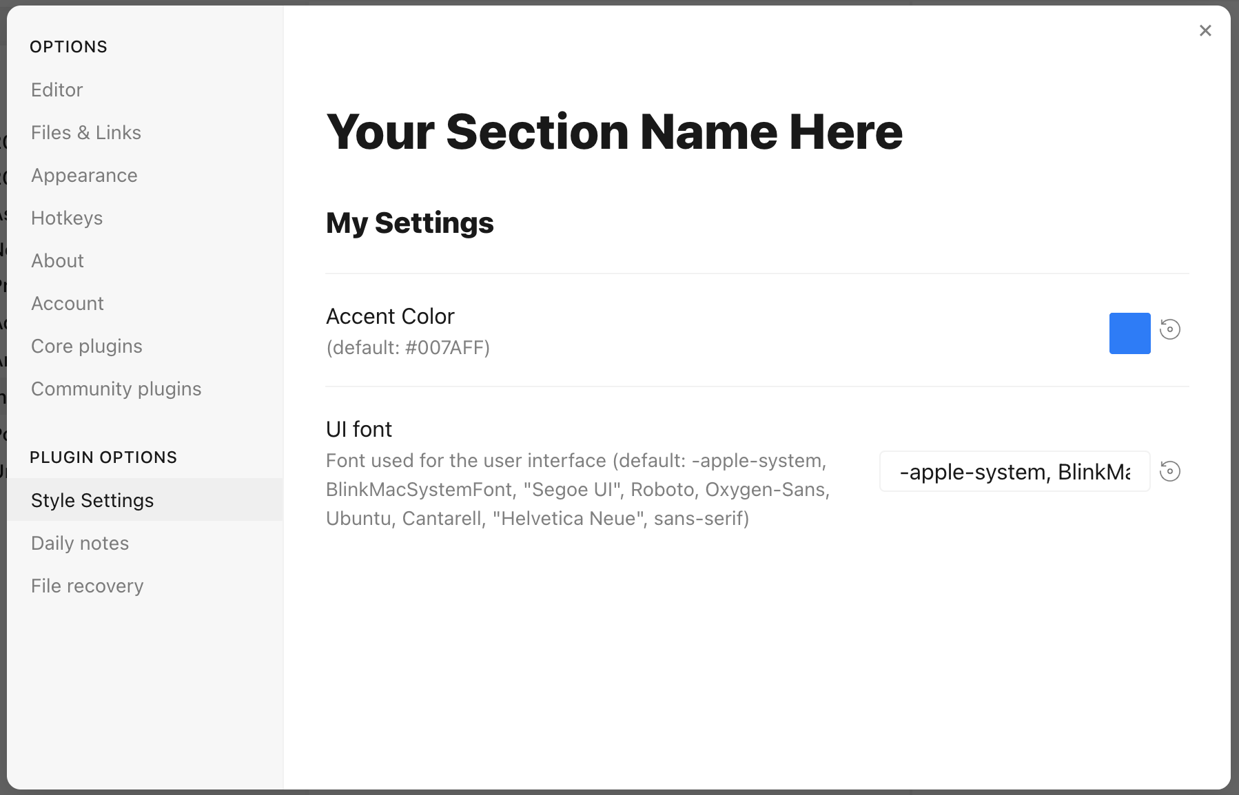
Each setting definition must be separated by a dash (`-`). There are 7 setting types.
All settings definitions must have these parameters:
- `id`: A unique id for the setting parameter
- `title`: The name of the setting
- `description` (optional): a description of the setting
- `type`: The type of setting. Can be one of:
- `heading`: a heading element for organizing settings
- `class-toggle`: a switch to toggle classes on the `body` element
- `class-select`: a dropdown menu of predefined options to add classes on the `body` element
- `variable-text`: a text-based CSS variable
- `variable-number`: a numeric CSS variable
- `variable-number-slider`: a numeric CSS variable represented by a slider
- `variable-select`: a text-based CSS variable displayed as a dropdown menu of predefined options
- `variable-color`: a color CSS variable with corresponding color picker
## `heading`
`heading`s can be used to organize and group settings into collapsable nested sections. Along with the required attributes, `heading`s must contain a `level` attribute between `1` and `6`, and can optionally contain a `collapsed` attribute:
```css
/* @settings
name: Your Section Name Here
id: a-unique-id
settings:
-
id: this-is-a-heading
title: My Heading
type: heading
level: 2
collapsed: true
*/
```
## `info-text`
`info-text` displays arbitrary informational text to users. The `description` may contain markdown if `markdown` is set to `true`.
```css
/* @settings
name: Your Section Name Here
id: a-unique-id
settings:
-
id: my-info-text
title: Information
description: "This is *informational* text"
type: info-text
markdown: true
*/
```
## `class-toggle`
`class-toggle`s will toggle a css class on and off of the `body` element, allowing CSS themes and snippets to toggle features on and off. The `id` of the setting will be used as the class name. The `default` parameter can optionally be set to `true`. `class-toggle` also supports the `addCommand` property. When set to `true` a command will be added to obsidian to toggle the class via a hotkey or the command palette.
```css
/* @settings
name: Your Section Name Here
id: a-unique-id
settings:
-
id: my-css-class
title: My Toggle
description: Adds my-css-class to the body element
type: class-toggle
*/
```
## `class-select`
`class-select` creates a dropdown of predefined options for a CSS variable. The `id` of the setting will be used as the variable name.
- When `allowEmpty` is `false`, a `default` option **must** be specified.
- When `allowEmpty` is `true`, the `default` attribute is optional, and may be set to `none`.
```css
/* @settings
name: Your Section Name Here
id: a-unique-id
settings:
-
id: theme-variant
title: Theme variant
description: Variations on a theme
type: class-select
allowEmpty: false
default: my-class
options:
- my-class
- my-other-class
- and-yet-another
*/
```
Options may also be given a label:
```css
/* @settings
name: Your Section Name Here
id: a-unique-id
settings:
-
id: theme-variant
title: Theme variant
description: Variations on a theme
type: class-select
allowEmpty: false
default: my-class
options:
-
label: My Class
value: my-class
-
label: My Other Class
value: my-other-class
*/
```
## `variable-text`
`variable-text` represents any text based CSS value. The `id` of the setting will be used as the variable name. The output will be wrapped in quotes if `quotes` is set to true. `variable-text` settings require a `default` attribute.
```css
/* @settings
name: Your Section Name Here
id: a-unique-id
settings:
-
id: text
title: UI font
description: Font used for the user interface
type: variable-text
default: -apple-system, BlinkMacSystemFont, "Segoe UI", Roboto, Oxygen-Sans, Ubuntu, Cantarell, "Helvetica Neue", sans-serif
*/
```
This will output the variable:
```
--text: -apple-system, BlinkMacSystemFont, "Segoe UI", Roboto, Oxygen-Sans, Ubuntu, Cantarell, "Helvetica Neue", sans-serif;
```
Using `quotes`:
```css
/* @settings
name: Your Section Name Here
id: a-unique-id
settings:
-
id: icon
title: Bullet Icon
description: Text used in bullet points
type: variable-text
default: •
quotes: true
*/
```
This will output the variable:
```
--icon: '•'
```
## `variable-number`
`variable-number` represents any numeric CSS value. The `id` of the setting will be used as the variable name. `variable-number` settings require a `default` attribute. Optionally, a `format` attribute can be set. This value will be appended to the number. Eg `format: px` will result in `42px`
```css
/* @settings
name: Your Section Name Here
id: a-unique-id
settings:
-
id: line-width
title: Line width
description: The maximum line width in rem units
type: variable-number
default: 42
format: rem
*/
```
This will output the variable:
```
--line-width: 42rem;
```
## `variable-number-slider`
`variable-number-slider` represents any numeric CSS value. The `id` of the setting will be used as the variable name. `variable-number-slider` settings require a `default` attribute, as well as these three attributes:
- `min`: The minimum possible value of the slider
- `max`: The maximum possible value of the slider
- `step`: The size of each "tick" of the slider. For example, a step of 100 will only allow the slider to move in increments of 100.
Optionally, a `format` attribute can be set. This value will be appended to the number. Eg `format: px` will result in `42px`
```css
/* @settings
name: Your Section Name Here
id: a-unique-id
settings:
-
id: line-width
title: Line width
description: The maximum line width in rem units
type: variable-number-slider
default: 42
min: 10
max: 100
step: 1
*/
```
This will output the variable:
```
--line-width: 42;
```
## `variable-select`
`variable-select` creates a dropdown of predefined options for a CSS variable. The `id` of the setting will be used as the variable name. `variable-select` settings require a `default` attribute as well as a list of `options`.
```css
/* @settings
name: Your Section Name Here
id: a-unique-id
settings:
-
id: text
title: UI font
description: Font used for the user interface
type: variable-select
default: Roboto
options:
- Roboto
- Helvetica Neue
- sans-serif
- Segoe UI
*/
```
Options can optionally be given a label:
```css
/* @settings
name: Your Section Name Here
id: a-unique-id
settings:
-
id: text
title: UI font
description: Font used for the user interface
type: variable-select
default: Roboto
options:
-
label: The best font
value: Roboto
-
label: The next best font
value: Helvetica Neue
*/
```
This will output the variable:
```
--text: Roboto;
```
## `variable-color`
`variable-color` creates a color picker with a variety of output format options. A `default` attribute is required in `hex` or `rgb` format. **Note: hex color values must be wrapped in quotes.** A `format` attribute is also required.
Optional parameters:
- Setting `opacity` to `true` will enable opacity support in all output formats.
- A list of alternate output formats can be supplied via the `alt-format` setting
```css
/* @settings
name: Your Section Name Here
id: a-unique-id
settings:
-
id: accent
title: Accent Color
type: variable-color
opacity: false
format: hex
alt-format:
-
id: accent-rgb
format: rgb
default: '#007AFF'
*/
```
This will output the variable:
```
--accent: #007AFF;
--accent-rgb: rgb(0, 123, 255);
```
## `variable-themed-color`
`variable-themed-color` is identical to `variable-color` except that it generates two color pickers for a light and dark variant.
```css
/* @settings
name: Your Section Name Here
id: a-unique-id
settings:
-
id: accent
title: Accent Color
type: variable-themed-color
format: hex
opacity: false
default-light: '#007AFF'
default-dark: '#2DB253'
*/
```
This will output the variables:
```
body.theme-light.css-settings-manager { --accent: #007AFF; }
body.theme-dark.css-settings-manager { --accent: #2DB253; }
```
### `variable-color` formatting options
There are 8 formatting options:
- `hex`
```
--accent: #007AFF;
```
When `opacity` is set to `true`:
```
--accent: #007AFFFF;
```
- `rgb`
```
--accent: rgb(0, 122, 255);
```
When `opacity` is set to `true`:
```
--accent: rgba(0, 122, 255, 1);
```
- `rgb-values`
```
--accent: 0, 122, 255;
```
When `opacity` is set to `true`:
```
--accent: 0, 122, 255, 1;
```
- `rgb-split`
```
--accent-r: 0;
--accent-g: 122;
--accent-b: 255;
```
When `opacity` is set to `true`:
```
--accent-r: 0;
--accent-g: 122;
--accent-b: 255;
--accent-a: 1;
```
- `hsl`
```
--accent: hsl(211, 100%, 50%);
```
When `opacity` is set to `true`:
```
--accent: hsla(211, 100%, 50%, 1);
```
- `hsl-values`
```
--accent: 211, 100%, 50%;
```
When `opacity` is set to `true`:
```
--accent: 211, 100%, 50%, 1;
```
- `hsl-split`
```
--accent-h: 211;
--accent-s: 100%;
--accent-l: 50%;
```
When `opacity` is set to `true`:
```
--accent-h: 211;
--accent-s: 100%;
--accent-l: 50%;
--accent-a: 1;
```
- `hsl-split-decimal`
```
--accent-h: 211;
--accent-s: 1;
--accent-l: 0.5;
```
When `opacity` is set to `true`:
```
--accent-h: 211;
--accent-s: 1;
--accent-l: 0.5;
--accent-a: 1;
```
## `color-gradient`
`color-gradient` outputs a fixed number of colors along a gradient between two existing color variables. A `format` attribute is also required. *Note: The `to` variable must be set in style settings for the gradient to be generated. Also, gradients will only be generated using colors defined under the current style settings `id`.*
Parameters:
- `from`: The starting color, or color that will be at step 0
- `to`: The ending color, or color that will be at step 100
- `step`: The increment at which to output a CSS variable. For example, setting `step` to `10` will output `--var-0`, `--var-10`, `--var-20`, etc...
- `format`: Can be one of: `hsl`, `rgb`, or `hex`;
- `pad`?: When set, the number section of the variable will be padded with `0`'s until it contains this number of digits. For example, setting `pad` to `3` and `step` to `10` will output `--var-000`, `--var-010`, `--var-020`
```css
/* @settings
name: Your Section Name Here
id: a-unique-id
settings:
-
id: color-base
type: color-gradient
from: color-base-00
to: color-base-100
step: 5
pad: 2
format: hex
*/
```
## Plugin Support
Plugins can specify a style setting config in the plugin's CSS. Plugins must call `app.workspace.trigger("parse-style-settings")` when the plugin loads in order for Style Settings to be notified of CSS changes.
## Localization Support
Translations for titles and descriptions can be supplied for each language Obsidian supports by using one of the following postfixes:
```
en: English
zh: 简体中文
zh-TW: 繁體中文
ru: Pусский
ko: 한국어
it: Italiano
id: Bahasa Indonesia
ro: Română
pt-BR: Portugues do Brasil
cz: čeština
de: Deutsch
es: Español
fr: Français
no: Norsk
pl: język polski
pt: Português
ja: 日本語
da: Dansk
uk: Український
sq: Shqip
tr: Türkçe (kısmi)
hi: हिन्दी (आंशिक)
nl: Nederlands (gedeeltelijk)
ar: العربية (جزئي)
```
For example:
```css
/* @settings
name: Your Section Name Here
id: a-unique-id
settings:
-
id: my-css-class
title: My Toggle
title.de: Mein Toggle
title.ko: 내 토글
description: Adds my-css-class to the body element
description.de: Fügt my-css-class zum body-Element hinzu
description.ko: my-css-class를 body 요소에 추가합니다.
type: class-toggle
*/
```