Ecosyste.ms: Awesome
An open API service indexing awesome lists of open source software.
https://github.com/GoogleChromeLabs/input-knob
A rotating, touch-sensitive knob web component that you can use like an <input type="range">.
https://github.com/GoogleChromeLabs/input-knob
customelement form ui webcomponent
Last synced: 4 months ago
JSON representation
A rotating, touch-sensitive knob web component that you can use like an <input type="range">.
- Host: GitHub
- URL: https://github.com/GoogleChromeLabs/input-knob
- Owner: GoogleChromeLabs
- License: apache-2.0
- Archived: true
- Created: 2019-07-24T20:19:11.000Z (almost 5 years ago)
- Default Branch: master
- Last Pushed: 2022-07-20T01:31:11.000Z (almost 2 years ago)
- Last Synced: 2024-02-22T18:31:27.020Z (4 months ago)
- Topics: customelement, form, ui, webcomponent
- Language: JavaScript
- Homepage:
- Size: 53.7 KB
- Stars: 71
- Watchers: 7
- Forks: 11
- Open Issues: 5
-
Metadata Files:
- Readme: README.md
- Contributing: CONTRIBUTING.md
- License: LICENSE
Lists
- awesome-standalones - `<input-knob>`
README
# `` ⟳ custom element
A rotating, touch-sensitive knob that you can use like an
``.
## Install
The `dist` directory contains the CommonJS module (`input-knob.cjs.js`), ES
module (`input-knob.esm.js`) and UMD (`input-knob.umd.js`) variants of the
element that you can use directly.
Install [via npm](https://www.npmjs.com/package/input-knob) and include via the
bundler of your choice:
```sh
npm install --save input-knob
```
Include via unpkg:
```html
```
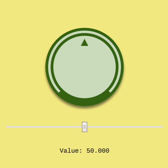
## Usage
This will create a knob with a minimum value of zero, a maximum of 100, a
current value of 50, and each full turn of the knob will change the value by 10.
```html
```
- `value`: Current value, this will update as the knob is turned. Optional,
defaults to `0`.
- `scale`: The change in the value for one full turn. Optional, defaults to `1`.
- `min`: Minimum allowed value. Optional, defaults to `null`.
- `max`: Maxium allowed value. Optional, defaults.to `null`.
If both `min` and `max` are set, then the knob can be turned multiple times to
reach a different `value`. If only one or none of `min` or `max` is set, then a
full turn of the knob will reset the value to `0`.
These are also exposed as properties on the object and can be set or observed in
JavaScript:
```javascript
const knob = document.querySelector('input-knob');
knob.value = 42;
```
### Events
Three event types are dispatched for each point in an interaction:
- `knob-move-start`: fired on initial touch or click.
- `knob-move-change`: fired repeatedly for each change in rotation.
- `knob-move-end`: fired when the touch or click is released.
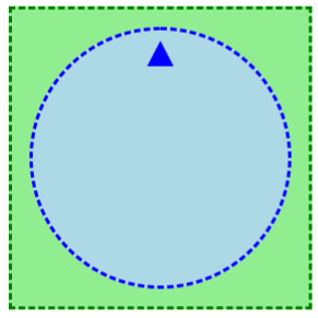
### Style and appearance
There are two key parts of the element that can be styled. The ``
element itself, which is the container for the inner `rotator` part. The
`rotator` is accessed using the `::part(rotator)` pseudo-element. The outer
element does not rotate, so can be used for general positioning or changing the
appearance of the outer container. The inner `rotator` represents the part of
the knob the user interacts with and will rotate as the `value` changes.
Content inside the `` tag will also rotate and can be used to do
things like provide a top marker for the knob.
```html
input-knob {
width: 150px;
padding: 10px;
border: 2px dashed green;
background: lightgreen;
}
input-knob::part(rotator) {
box-sizing: border-box;
background: lightblue;
border: 2px dashed blue;
border-radius: 100%;
width: 150px;
height: 150px;
}
.mark {
display: inline-block;
width: 100%;
text-align: center;
font: bold 200% monospace;
color: blue;
}
▲
```
## Demo
Try the demo at https://input-knob.glitch.me
## Backwards compatibility
For browsers that do not support custom elements, etc. you can use the
[`webcomponents.js` polyfills](https://github.com/webcomponents/polyfills/tree/master/packages/webcomponentsjs).
For browsers that do not support Shadow Parts, the element will add a fallback
class and `` that can by styled.
```css
input-knob {
width: 150px;
padding: 10px;
border: 2px dashed green;
background: lightgreen;
}
input-knob::part(rotator) {
box-sizing: border-box;
background: lightblue;
border: 2px dashed blue;
border-radius: 100%;
width: 150px;
height: 150px;
}
input-knob.fallback > span.fallback {
display: block;
box-sizing: border-box;
background: lightblue;
border: 2px dashed blue;
border-radius: 100%;
width: 150px;
height: 150px;
}
```
# Contributing
Issues and pull requests happily received. Please see
[CONTRIBUTING.md](CONTRIBUTING.md).