Ecosyste.ms: Awesome
An open API service indexing awesome lists of open source software.
https://github.com/erichoracek/Motif
Lightweight and customizable stylesheets for iOS
https://github.com/erichoracek/Motif
objective-c style stylesheet stylesheets theme
Last synced: about 1 month ago
JSON representation
Lightweight and customizable stylesheets for iOS
- Host: GitHub
- URL: https://github.com/erichoracek/Motif
- Owner: erichoracek
- License: mit
- Archived: true
- Created: 2014-12-27T09:32:59.000Z (over 9 years ago)
- Default Branch: master
- Last Pushed: 2020-09-18T21:26:47.000Z (about 4 years ago)
- Last Synced: 2024-08-06T23:06:31.249Z (about 2 months ago)
- Topics: objective-c, style, stylesheet, stylesheets, theme
- Language: Objective-C
- Homepage:
- Size: 8.44 MB
- Stars: 879
- Watchers: 18
- Forks: 64
- Open Issues: 0
-
Metadata Files:
- Readme: README.md
- Changelog: CHANGELOG.md
- License: LICENSE
Awesome Lists containing this project
- awesome-ios-star - Motif - A lightweight and customizable JSON stylesheet framework for iOS. (UI / Font)
- awesome-ios - Motif - A lightweight and customizable JSON stylesheet framework for iOS. (UI / Font)
README
# Motif
[](https://travis-ci.org/erichoracek/Motif) [](https://github.com/Carthage/Carthage) [](https://coveralls.io/r/erichoracek/Motif?branch=master)
_Lightweight and customizable stylesheets for iOS_
## What can it do?
- Declare rules defining your app's visual appearance separately from your UI component implementations to promote separation of concerns in your codebase
- Dynamically change your app's appearance at runtime from a user setting, as an premium feature, or even from the screen's brightness like [Tweetbot](http://www.cnet.com/how-to/how-to-adjust-tweetbots-new-night-theme-for-ios/):

- Reload your app's appearance when you edit your theme files **(without rebuilding)**, saving loads of time when styling your interface:

## Why should I use it?
You have an app. Maybe even a family of apps. You know about CSS, and how it enables web developers to write a set of declarative classes to style elements throughout their site, creating composable interface definitions that are entirely divorced from page content. You'll admit that you're a little jealous that things aren't quite the same on iOS.
To style your app today, maybe you have a `MyAppStyle` singleton that vends styled interface components that's a dependency of nearly every view controller in your app. Maybe you use Apple's `UIAppearance` APIs, but you're limited to a frustratingly small subset of the appearance APIs. Maybe you've started to subclass some UIKit classes just to set a few defaults to create some styled components. You know this sucks, but there just isn't a better way to do things in iOS.
Well, things are about to change. Take a look at the example below to see what `Motif` can do for you:
## An example
The following is a simple example of how you'd create a pair of styled buttons with Motif. To follow along, you can either continue reading below or clone this repo and run the `ButtonsExample` target within `Motif.xcworkspace`.
### The design
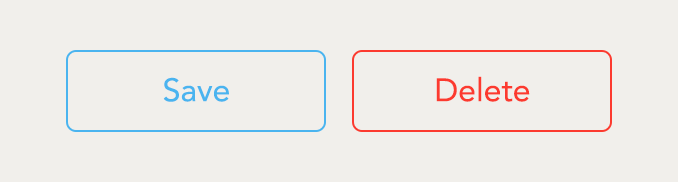
Your designer just sent over a spec outlining the style of a couple buttons in your app. Since you'll be using Motif to create these components, that means it's time to create a theme file.
### Theme files
A theme file in Motif is just a simple dictionary encoded in a markup file (YAML or JSON). This dictionary can have two types of key/value pairs: _classes_ or _constants_:
- Classes: denoted by a leading period (e.g. `.Button`) and encoded as a key with a value of a nested dictionary, a class is a collection of named properties corresponding to values that together define the style of an element in your interface. Class property values can be of any type, or alternatively a reference to another class or constant.
```yaml
.Class:
property: value
```
- Constants: denoted by a leading dollar sign (e.g. `$RedColor`) and encoded as a key-value pair, a constant is a named reference to a value. Constant values can be of any type, or alternatively a reference to another class or constant.
```yaml
$Constant: value
```
To create the buttons from the design spec, we've written the following theme file:
#### `Theme.yaml`
```yaml
$RedColor: '#f93d38'
$BlueColor: '#50b5ed'
$FontName: AvenirNext-Regular
.ButtonText:
fontName: $FontName
fontSize: 16
.Button:
borderWidth: 1
cornerRadius: 5
contentEdgeInsets: [10, 20]
tintColor: $BlueColor
borderColor: $BlueColor
titleText: .ButtonText
.WarningButton:
_superclass: .Button
tintColor: $RedColor
borderColor: $RedColor
```
We've started by defining three constants: our button colors as `$RedColor` and `$BlueColor`, and our font name as `$FontName`. We choose to define these values as constants because we want to be able to reference them later in our theme file by their names—just like variables in [Less](http://lesscss.org) or [Sass](http://sass-lang.com).
We now declare our first class: `.ButtonText`. This class describes the attributes of the text within the button—both its font and size. From now on, we'll use this class to declare that we want text to have this specific style.
You'll notice that the value of the `fontName` property on the `.ButtonText` class is a *reference* to the `$FontName` constant we declared above. As you can probably guess, when we use this class, its font name will have the same value as the `$FontName` constant. This way, we're able to have one definitive place that our font name exists so we don't end up repeating ourselves.
The last class we declare is our `.WarningButton` class. This class is exactly like our previous classes except for one key difference: it inherits its properties from the `.Button` class via the `_superclass` directive. As such, when the `.WarningButton` class is applied to an interface component, it will have identical styling to that of `.Button` for all attributes except `tintColor` and `borderColor`, which it overrides to be `$RedColor` instead.
### Property appliers
Next, we'll create the _property appliers_ necessary to apply this theme to our interface elements. Most of the time, Motif is able to figure out how to apply your theme automatically by matching Motif property names to Objective-C property names. However, in the case of some properties, we have to declare how its value should be applied ourselves. To do this, we'll register our necessary theme property appliers in the `load` method of a few categories.
The first set of property appliers we've created is on `UIView`:
#### `UIView+Theming.m`
```objective-c
+ (void)load {
[self
mtf_registerThemeProperty:@"borderWidth"
requiringValueOfClass:NSNumber.class
applierBlock:^(NSNumber *width, UIView *view, NSError **error) {
view.layer.borderWidth = width.floatValue;
return YES;
}];
[self
mtf_registerThemeProperty:@"borderColor"
requiringValueOfClass:UIColor.class
applierBlock:^(UIColor *color, UIView *view, NSError **error) {
view.layer.borderColor = color.CGColor;
return YES;
}];
}
```
Here we've added two property appliers to `UIView`: one for `borderWidth` and another for `borderColor`. Since `UIView` doesn't have properties for these attributes, we need property appliers to teach Motif how to apply them to the underlying `CALayer`.
#### Applier type safety
If we want to ensure that we always apply property values a of specific type, we can specify that an applier requires a value of a certain class by using `requiringValueOfClass:` when registering an applier. In the case of the `borderWidth` property above, we require that its value is of class `NSNumber`. This way, if we ever accidentally provide a non-number value for a `borderWidth` property, a runtime exception will be thrown so that we can easily identify and fix our mistake.
Now that we've defined these two properties on `UIView`, they will be available to apply any other themes with the same properties in the future. As such, whenever we have another class wants to specify a `borderColor` or `borderWidth` to a `UIView` or any of its descendants, these appliers will be able to apply those values as well.
Next up, we're going to add an applier to `UILabel` to style our text:
### `UILabel+Theming.m`
```objective-c
+ (void)load {
[self
mtf_registerThemeProperties:@[
@"fontName",
@"fontSize"
]
requiringValuesOfType:@[
NSString.class,
NSNumber.class
]
applierBlock:^(NSDictionary *properties, UILabel *label, NSError **error) {
NSString *name = properties[ThemeProperties.fontName];
CGFloat size = [properties[ThemeProperties.fontSize] floatValue];
UIFont *font = [UIFont fontWithName:name size:size];
if (font != nil) {
label.font = font;
return YES;
}
return [self
mtf_populateApplierError:error
withDescriptionFormat:@"Unable to create a font named %@ of size %@", name, @(size)];
}];
}
```
#### Compound property appliers
The above applier is a _compound property applier_. This means that it's a property applier that requires multiple property values from the theme class for it to be applied. In this case, we need this because we can not create a `UIFont` object without having both the size and name of the font beforehand.
The final applier that we'll need is on `UIButton` to style its `titleLabel`:
### `UIButton+Theming.m`
```objective-c
+ (void)load {
[self
mtf_registerThemeProperty:@"titleText"
requiringValueOfClass:MTFThemeClass.class
applierBlock:^(MTFThemeClass *class, UIButton *button, NSError **error) {
return [class applyTo:button.titleLabel error:error];
}];
}
```
#### Properties with `MTFThemeClass` values
Previously, we created a style applier on `UILabel` that allows us specify a custom font from a theme class. Thankfully, we're able to use this applier to style our `UIButton`'s `titleTabel` as well. Since the `titleText` property on the `.Button` class is a reference to the `.ButtonText` class, we know that the value that comes through this applier will be of class `MTFThemeClass`. `MTFThemeClass` objects are used to represent classes like `.TitleText` from theme files, and are able to apply their properties to an object directly. As such, to apply the `fontName` and `fontSize` from the `.TitleText` class to our button's label, we simply invoke `applyToObject:` on `titleLabel` with the passed `MTFThemeClass`.
### Putting it all together
```objective-c
NSError *error;
MTFTheme *theme = [MTFTheme themeFromFileNamed:@"Theme" error:&error];
NSAssert(theme != nil, @"Error loading theme %@", error);
[theme applyClassWithName:@"Button" to:saveButton error:NULL];
[theme applyClassWithName:@"WarningButton" to:deleteButton error:NULL];
```
We now have everything we need to style our buttons to match the spec. To do so, we must instantiate a `MTFTheme` object from our theme file to access our theme from our code. The best way to do this is to use `themeFromFileNamed:`, which works just like `imageNamed:`, but for `MTFTheme` instead of `UIImage`.
When we have our `MTFTheme`, we want to make sure that there were no errors parsing it. We can do so by asserting that our pass-by-reference `error` is still non-nil. By using `NSAssert`, we'll get a runtime crash when debugging informing us of our errors (if there were any).
To apply the classes from `Theme.yaml` to our buttons, all we have to do is invoke the application methods on `MTFTheme` on our buttons. When we do so, all of the properties from the theme classes are applied to our buttons in just one simple method invocation. This is the power of Motif.
## Using Motif in your project
The best way to use Motif in your project is with either [Carthage](https://github.com/Carthage/Carthage) or [CocoaPods](https://github.com/CocoaPods/CocoaPods).
### Carthage
Add the following to your `Cartfile`:
```
github "EricHoracek/Motif"
```
### CocoaPods
Add the following to your `Podfile`:
```
pod 'Motif'
```
## Dynamic theming
One of Motif's most powerful features is its ability to dynamically theme your application's interface at runtime. While adopting dynamic theming is simple, it does require you to use Motif in a slightly different way from the above example.
For an example of dynamic theming in practice, clone this repo and run the `DynamicThemingExample` target within `Motif.xcworkspace`.
### Dynamic theme appliers
To enable dynamic theming, where you would normally use the theme class application methods on `MTFTheme` for a single theme, you should instead use the identically-named methods on `MTFDynamicThemeApplier` when you wish to have more than one theme. This enables you to easily re-apply a new theme to your entire interface just by changing the `theme` property on your `MTFDynamicThemeApplier`.
```objective-c
// We're going to default to the light theme
MTFTheme *lightTheme = [MTFTheme themeFromFileNamed:@"LightTheme" error:NULL];
// Create a dynamic theme applier, which we will use to style all of our
// interface elements
MTFDynamicThemeApplier *applier = [[MTFDynamicThemeApplier alloc] initWithTheme:lightTheme];
// Style objects the same way as we did with an MTFTheme instance
[applier applyClassWithName:@"InterfaceElement" to:anInterfaceElement error:NULL];
```
Later on...
```objective-c
// It's time to switch to the dark theme
MTFTheme *darkTheme = [MTFTheme themeFromFileNamed:@"DarkTheme" error:NULL];
// We now change the applier's theme to the dark theme, which will automatically
// re-apply this new theme to all interface elements that previously had the
// light theme applied to them
[applier setTheme:darkTheme error:NULL];
```
### "Mapping" themes
While you could maintain multiple sets of divergent theme files to create different themes for your app's interface, the preferred (and easiest) way to accomplish dynamic theming is to largely share the same set of theme files across your entire app. An easy way to do this is to create a set of "mapping" theme files that _map_ your root constants from named values describing their _appearance_ to named values describing their _function_. For example:
#### `Colors.yaml`
```yaml
$RedDarkColor: '#fc3b2f'
$RedLightColor: '#fc8078'
```
#### `DarkMappings.yaml`
```yaml
$WarningColor: $RedLightColor
```
#### `LightMappings.yaml`
```yaml
$WarningColor: $RedDarkColor
```
#### `Buttons.yaml`
```yaml
.Button:
tintColor: $WarningColor
```
We've created a single constant, `$WarningColor`, that will change its value depending on the mapping theme file that we create our `MTFTheme` instances with. As discussed above, the constant name `$WarningColor` describes the _function_ of the color, rather than the appearance (e.g. `$RedColor`). This redefinition of the same constant allows us to us to conditionally redefine what `$WarningColor` means depending on the theme we're using. As such, we don't have to worry about maintaining multiple definitions of the same `.Button` class, ensuring that we don't repeat ourselves and keep things clean.
With this pattern, creating our light and dark themes is as simple as:
```objective-c
MTFTheme *lightTheme = *theme = [MTFTheme
themeFromFileNamed:@[
@"Colors",
@"LightMappings",
@"Buttons"
] error:NULL];
MTFTheme *darkTheme = *theme = [MTFTheme
themeFromFileNamed:@[
@"Colors",
@"DarkMappings",
@"Buttons"
] error:NULL];
```
This way, we only have to create our theme classes one time, rather than once for each theme that we want to add to our app. For a more in-depth look at this pattern, clone this repo and read the source of the `DynamicThemingExample` target within `Motif.xcworkspace`.
## Generating theme symbols
In the above examples, you might have noticed that Motif uses a lot of [stringly types](http://blog.codinghorror.com/new-programming-jargon/) to bridge class and constant names from your theme files into your application code. If you've dealt with a system like this before (Core Data's entity and attribute names come to mind as an example), you know that over time, stringly-typed interfaces can become tedious to maintain. Thankfully, just as there exists [Mogenerator](https://github.com/rentzsch/mogenerator) to alleviate this problem when using Core Data, there also exists a similar solution for Motif to address this same problem: the Motif CLI.
### Motif CLI
Motif ships with a command line interface that makes it easy to ensure that your code is always in sync with your theme files. Let's look at an example of how to use it in your app:
You have a simple YAML theme file, named `Buttons.yaml`:
```yaml
$RedColor: '#f93d38'
$BlueColor: '#50b5ed'
$FontName: AvenirNext-Regular
.ButtonText:
fontName: $FontName
fontSize: 16
.Button:
borderWidth: 1
cornerRadius: 5
contentEdgeInsets: [10, 20]
tintColor: $BlueColor
borderColor: $BlueColor
titleText: .ButtonText
.WarningButton:
_superclass: .Button
tintColor: $RedColor
borderColor: $RedColor
```
To generate theme symbols from this theme file, just run:
```
motif --theme Buttons.yaml
```
This will generate the a pair of files named `ButtonSymbols.{h,m}`. `ButtonSymbols.h` looks like this:
```objective-c
extern NSString * const ButtonsThemeName;
extern const struct ButtonsThemeConstantNames {
__unsafe_unretained NSString *BlueColor;
__unsafe_unretained NSString *FontName;
__unsafe_unretained NSString *RedColor;
} ButtonsThemeConstantNames;
extern const struct ButtonsThemeClassNames {
__unsafe_unretained NSString *Button;
__unsafe_unretained NSString *ButtonText;
__unsafe_unretained NSString *WarningButton;
} ButtonsThemeClassNames;
extern const struct ButtonsThemeProperties {
__unsafe_unretained NSString *borderColor;
__unsafe_unretained NSString *borderWidth;
__unsafe_unretained NSString *contentEdgeInsets;
__unsafe_unretained NSString *cornerRadius;
__unsafe_unretained NSString *fontName;
__unsafe_unretained NSString *fontSize;
__unsafe_unretained NSString *tintColor;
__unsafe_unretained NSString *titleText;
} ButtonsThemeProperties;
```
Now, when you add the above pair of files to your project, you can create and apply themes using these symbols instead:
```objective-c
#import "ButtonSymbols.h"
NSError *error;
MTFTheme *theme = [MTFTheme themeFromFileNamed:ButtonsThemeName error:&error];
NSAssert(theme != nil, @"Error loading theme %@", error);
[theme applyClassWithName:ButtonsThemeClassNames.Button to:saveButton error:NULL];
[theme applyClassWithName:ButtonsThemeClassNames.WarningButton to:deleteButton error:NULL];
```
As you can see, there's now no more stringly-typing in your application code. To delve further into an example of how to use the Motif CLI, check out any of the examples in `Motif.xcworkspace`.
### Installation
To install the Motif CLI, simply build and run the `MotifCLI` target within `Motif.xcworkspace`. This will install the `motif` CLI to your `/usr/local/bin` directory.
### As a "Run Script" build phase
To automate the symbols generation, just add the following to a run script build phase to your application. This script assumes that all of your theme files end in `Theme.yaml`, but you can modify this to your liking.
```bash
export PATH="$PATH:/usr/local/bin/"
export CLI_TOOL='motif'
which "${CLI_TOOL}"
if [ $? -ne 0 ]; then exit 0; fi
export THEMES_DIR="${SRCROOT}/${PRODUCT_NAME}"
find "${THEMES_DIR}" -name '*Theme.yaml' | sed 's/^/-t /' | xargs "${CLI_TOOL}" -o "${THEMES_DIR}"
```
This will ensure that your symbols files are always up to date with your theme files. Just make sure the this run script build phase is before your "Compile Sources" build phase in your project. For an example of this in practice, check out any of the example projects within `Motif.xcworkspace`.
## Live Reload
To enable live reloading, simply replace your `MTFDynamicThemeApplier` with an `MTFLiveReloadThemeApplier` when debugging on the iOS Simulator:
```objective-c
#if TARGET_IPHONE_SIMULATOR && defined(DEBUG)
self.themeApplier = [[MTFLiveReloadThemeApplier alloc]
initWithTheme:theme
sourceFile:__FILE__];
#else
self.themeApplier = [[MTFDynamicThemeApplier alloc]
initWithTheme:theme];
#endif
```
Live reloading will only work on the iOS Simulator, as editable theme source files do not exist on your iOS Device. For a more in-depth look at how to implement live reloading, clone this repo and read the source of the `DynamicThemingExample` target within `Motif.xcworkspace`.