Ecosyste.ms: Awesome
An open API service indexing awesome lists of open source software.
https://github.com/wrobstory/vincent
A Python to Vega translator
https://github.com/wrobstory/vincent
Last synced: 3 months ago
JSON representation
A Python to Vega translator
- Host: GitHub
- URL: https://github.com/wrobstory/vincent
- Owner: wrobstory
- License: mit
- Archived: true
- Created: 2013-04-11T02:44:53.000Z (about 11 years ago)
- Default Branch: master
- Last Pushed: 2016-10-25T18:56:07.000Z (over 7 years ago)
- Last Synced: 2024-01-18T13:43:00.922Z (5 months ago)
- Language: Python
- Size: 6.75 MB
- Stars: 2,044
- Watchers: 92
- Forks: 266
- Open Issues: 42
-
Metadata Files:
- Readme: README.md
- License: LICENSE.txt
Lists
- awesome-machine-learning-cn - 官网
- awesome-python-cn - vincent
- awesome-pysci - vincent - A Python to Vega translator. (可視化 / 金融工学・BI)
- awesome-python - vincent - A Python to Vega translator. (Data Visualization)
- awesome-python - vincent - A Python to Vega translator. (Data Visualization)
- awesome-machine-learning - vincent - A Python to Vega translator. (Python / General-Purpose Machine Learning)
- awesome-machine-learning - vincent - A Python to Vega translator. (Python / General-Purpose Machine Learning)
- awesome-python-cn - vincent
- awesome-python - vincent - A Python to Vega translator. (Data Visualization)
- awesome-machine-learning - vincent - A Python to Vega translator. (Python / General-Purpose Machine Learning)
- awesome-stars - vincent
- awesome-python-cn - 官网
- awesome-python4 - vincent - A Python to Vega translator. (Data Visualization)
- awesome-python - vincent - A Python to Vega translator. (Data Visualization)
- awesome-machine-learning - vincent - A Python to Vega translator. (Python / General-Purpose Machine Learning)
- awesome-machine-learning-library - vincent - A Python to Vega translator. (Python / General-Purpose Machine Learning)
- awesome-machine-learning - vincent - A Python to Vega translator. (Python / General-Purpose Machine Learning)
- awesome-stars - wrobstory/vincent - A Python to Vega translator (Python)
- alex-mikhalev-awesome-stars - vincent - A Python to Vega translator (Python)
- awesome-python - vincent - A Python to Vega translator. (Data Visualization)
- awesome-machine-learning - vincent - A Python to Vega translator. (Python / General-Purpose Machine Learning)
- awesome-python-cn - 官网
- awesome-machine-learning - vincent - A Python to Vega translator. (Python / General-Purpose Machine Learning)
- awesome-stars - wrobstory/vincent - A Python to Vega translator (Python)
- fucking_awesome_python - vincent - A Python to Vega translator. (Data Visualization)
- awesome-advanced-metering-infrastructure - vincent - A Python to Vega translator. (Python / General-Purpose Machine Learning)
- awesome-machine-learning - vincent - A Python to Vega translator. (Python / General-Purpose Machine Learning)
- awesome-machine-master - vincent - A Python to Vega translator. (Python / General-Purpose Machine Learning)
- awesome-stars - vincent
- starred-awesome - vincent - A Python to Vega translator (Python)
- awesome-starred - wrobstory/vincent - A Python to Vega translator (others)
- awesome-machine-learning - vincent - A Python to Vega translator. (Python / General-Purpose Machine Learning)
- awesome-machine-learning - vincent - A Python to Vega translator. (Python / General-Purpose Machine Learning)
- awesome-python - vincent - A Python to Vega translator. (Data Visualization)
- awesome-machine-learning - vincent - A Python to Vega translator. (Python / General-Purpose Machine Learning)
- my-awesome-stars - wrobstory/vincent - A Python to Vega translator (Python)
README
# Status
#### 2016-06-18 Update
If you are interested in this library, I would direct you to the Altair project: https://github.com/altair-viz/altair It supports the latest version of vega, is fully-featured, has a great development team, and has been developed with the support of the Vega team at UW.
There will be no more updates, closed issues, or PR merges for the Vincent project. Thanks so much to everyone who tried it or used it along the way.
#Vincent
[](https://travis-ci.org/wrobstory/vincent)

###A Python to Vega translator
The folks at Trifacta are making it easy to build visualizations on top of D3 with Vega. Vincent makes it easy to build Vega with Python.
Concept
-------
The data capabilities of Python. The visualization capabilities of JavaScript.
Vincent takes Python data structures and translates them into [Vega](https://github.com/trifacta/vega) visualization grammar. It allows for quick iteration of visualization designs via getters and setters on grammar elements, and outputs the final visualization to JSON.
Perhaps most importantly, Vincent groks Pandas DataFrames and Series in an intuitive way.
Installation
------------
```$pip install vincent```
Warning: requires Pandas, which isn't a simple pip install if you don't already have Numpy installed. If you want to go all-pip, I recommend ```$pip install numpy``` then ```$pip install pandas```. Or just use [Anaconda](http://www.continuum.io/downloads).
Docs
----
[Here.](https://vincent.readthedocs.org/en/latest/)
Quickstart
---------------
Let's start with some varying [data](https://vincent.readthedocs.org/en/latest/quickstart.html#data), and then show some different ways to visualize them with Vincent.
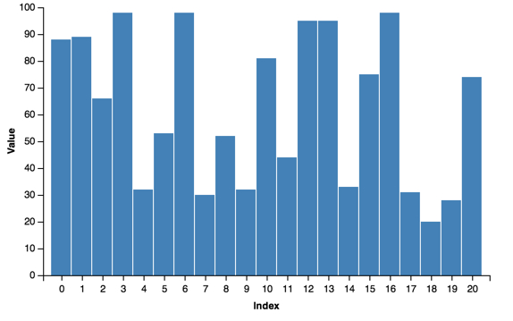
Starting with a simple bar chart:
```python
import vincent
bar = vincent.Bar(multi_iter1['y1'])
bar.axis_titles(x='Index', y='Value')
bar.to_json('vega.json')
```
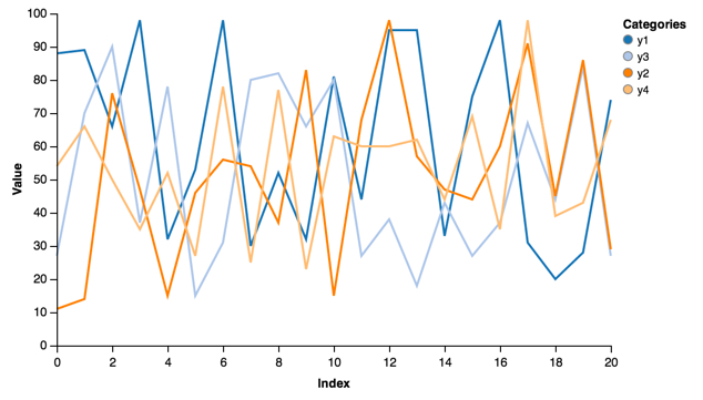
Plotting a number of lines:
```python
line = vincent.Line(multi_iter1, iter_idx='index')
line.axis_titles(x='Index', y='Value')
line.legend(title='Categories')
```
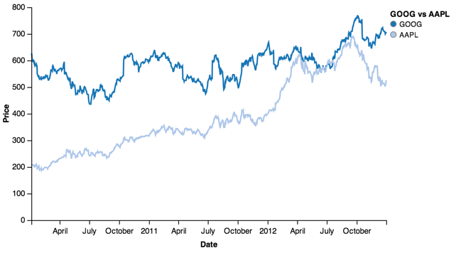
Or a real use case, plotting stock data:
```python
line = vincent.Line(price[['GOOG', 'AAPL']])
line.axis_titles(x='Date', y='Price')
line.legend(title='GOOG vs AAPL')
```
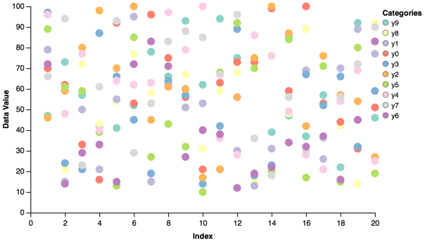
Color brewer scales are built-in. For example, plotting a scatter plot with the ```Set3``` colors:
```python
scatter = vincent.Scatter(multi_iter2, iter_idx='index')
scatter.axis_titles(x='Index', y='Data Value')
scatter.legend(title='Categories')
scatter.colors(brew='Set3')
```
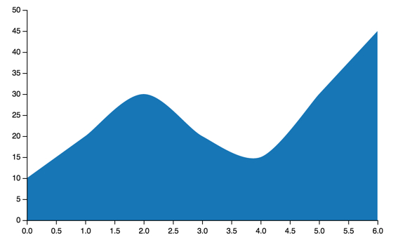
Area charts:
```python
area = vincent.Area(list_data)
```
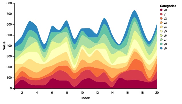
Stacked Area Charts from a DataFrame:
```python
stacked = vincent.StackedArea(df_1)
stacked.axis_titles(x='Index', y='Value')
stacked.legend(title='Categories')
stacked.colors(brew='Spectral')
```
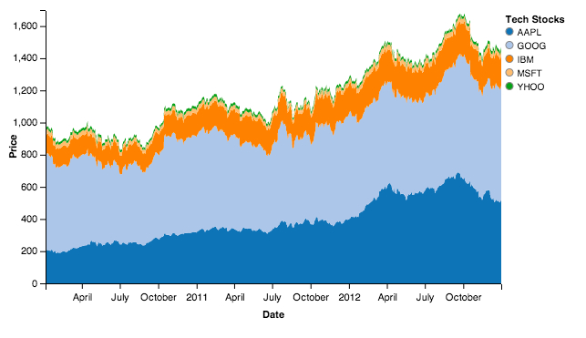
```python
stacked = vincent.StackedArea(price)
stacked.axis_titles(x='Date', y='Price')
stacked.legend(title='Tech Stocks')
```
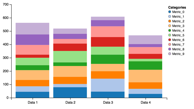
Stacked Bar Charts from a DataFrame:
```python
stack = vincent.StackedBar(df_2)
stack.legend(title='Categories')
stack.scales['x'].padding = 0.1
```
```python
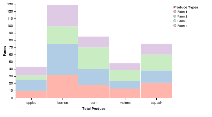
stack = vincent.StackedBar(df_farm.T)
stack.axis_titles(x='Total Produce', y='Farms')
stack.legend(title='Produce Types')
stack.colors(brew='Pastel1')
```
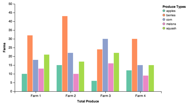
Grouped Bars from a DataFrame:
```python
group = vincent.GroupedBar(df_2)
group.legend(title='Categories')
group.colors(brew='Spectral')
group.width=750
```
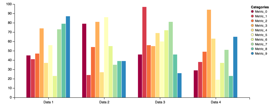
```python
group = vincent.GroupedBar(df_farm)
group.axis_titles(x='Total Produce', y='Farms')
group.legend(title='Produce Types')
group.colors(brew='Set2')
```
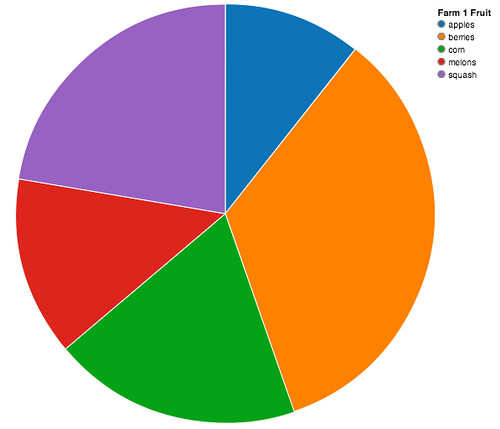
Pie charts:
```python
vis = vincent.Pie(farm_1)
vis.legend('Farm 1 Fruit')
```
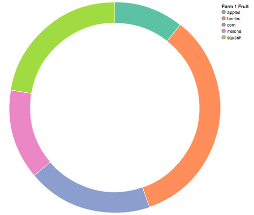
Donut charts:
```
vis = vincent.Pie(farm_1, inner_radius=200)
vis.colors(brew="Set2")
vis.legend('Farm 1 Fruit')
```
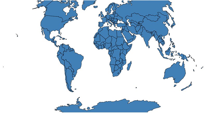
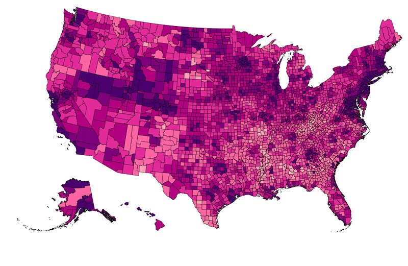
Simple maps can be built quickly (all data can be found in the [vincent_map_data](https://github.com/wrobstory/vincent_map_data) repo):
```python
world_topo = r'world-countries.topo.json'
geo_data = [{'name': 'countries',
'url': world_topo,
'feature': 'world-countries'}]
vis = vincent.Map(geo_data=geo_data, scale=200)
```
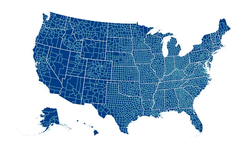
Also with multiple map layers:
```python
geo_data = [{'name': 'counties',
'url': county_topo,
'feature': 'us_counties.geo'},
{'name': 'states',
'url': state_topo,
'feature': 'us_states.geo'}]
vis = vincent.Map(geo_data=geo_data, scale=1000, projection='albersUsa')
del vis.marks[1].properties.update
vis.marks[0].properties.update.fill.value = '#084081'
vis.marks[1].properties.enter.stroke.value = '#fff'
vis.marks[0].properties.enter.stroke.value = '#7bccc4'
```
Maps can be bound with data to Pandas DataFrames for choropleth visualizations (see [here](https://vincent.readthedocs.org/en/latest/quickstart.html#data) for map data munging):
```python
geo_data = [{'name': 'counties',
'url': county_topo,
'feature': 'us_counties.geo'}]
vis = vincent.Map(data=merged, geo_data=geo_data, scale=1100, projection='albersUsa',
data_bind='Unemployment_rate_2011', data_key='FIPS',
map_key={'counties': 'properties.FIPS'})
vis.marks[0].properties.enter.stroke_opacity = ValueRef(value=0.5)
vis.to_json('vega.json')
```
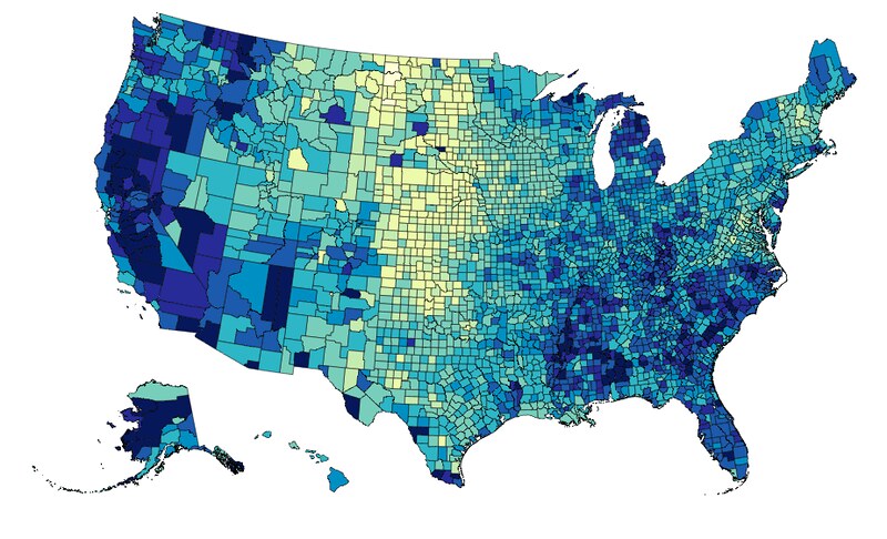
It can be rebound on the fly with new data and color brewer scales:
```python
vis.rebind(column='Median_Household_Income_2011', brew='YlGnBu')
```
For more examples, including how to build these from scratch, see the [examples](https://github.com/wrobstory/vincent) directory, or the [docs](https://vincent.readthedocs.org/en/latest/index.html).
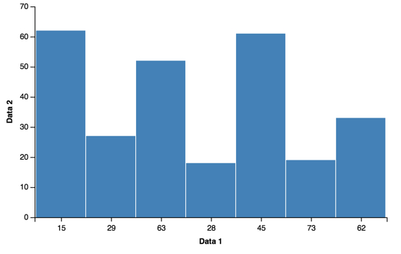
Built from Scratch
------------------
To see how the charts are being built with Vincent -> Vega grammar, see the ```charts.py``` module.
Building the bar chart from scratch will provide a quick example of building with Vincent:
```python
import pandas as pd
from vincent import (Visualization, Scale, DataRef, Data, PropertySet,
Axis, ValueRef, MarkRef, MarkProperties, Mark)
df = pd.DataFrame({'Data 1': [15, 29, 63, 28, 45, 73, 15, 62],
'Data 2': [42, 27, 52, 18, 61, 19, 62, 33]})
#Top level Visualization
vis = Visualization(width=500, height=300)
vis.padding = {'top': 10, 'left': 50, 'bottom': 50, 'right': 100}
#Data. We're going to key Data 2 on Data 1
vis.data.append(Data.from_pandas(df, columns=['Data 2'], key_on='Data 1', name='table'))
#Scales
vis.scales.append(Scale(name='x', type='ordinal', range='width',
domain=DataRef(data='table', field="data.idx")))
vis.scales.append(Scale(name='y', range='height', nice=True,
domain=DataRef(data='table', field="data.val")))
#Axes
vis.axes.extend([Axis(type='x', scale='x'), Axis(type='y', scale='y')])
#Marks
enter_props = PropertySet(x=ValueRef(scale='x', field="data.idx"),
y=ValueRef(scale='y', field="data.val"),
width=ValueRef(scale='x', band=True, offset=-1),
y2=ValueRef(scale='y', value=0))
update_props = PropertySet(fill=ValueRef(value='steelblue'))
mark = Mark(type='rect', from_=MarkRef(data='table'),
properties=MarkProperties(enter=enter_props,
update=update_props))
vis.marks.append(mark)
vis.axis_titles(x='Data 1', y='Data 2')
vis.to_json('vega.json')
```
Because the Vega elements are represented by Python classes, it can be difficult to get a good idea of what the Vega grammar looks like:
```python
In [5]: vis.marks[0]
```
However, at almost any point in the Vincent stack, you can call the ```grammar()``` method to output the Vega grammar as Python data structures:
```python
>>>vis.marks[0].grammar()
{u'from': {u'data': u'table'},
u'properties': {u'enter': {u'width': {u'band': True,
u'offset': -1,
u'scale': u'x'},
u'x': {u'field': u'data.idx', u'scale': u'x'},
u'y': {u'field': u'data.val', u'scale': u'y'},
u'y2': {u'scale': u'y', u'value': 0}},
u'update': {u'fill': {u'value': u'steelblue'}}},
u'type': u'rect'}
>>>vis.marks[0].properties.enter.x.grammar()
{u'field': u'data.idx', u'scale': u'x'}
```
or you can simply output it to a string of JSON:
```python
>>>print(vis.marks[0].to_json())
{
"type": "rect",
"from": {
"data": "table"
},
"properties": {
"update": {
"fill": {
"value": "steelblue"
}
},
"enter": {
"y": {
"field": "data.val",
"scale": "y"
},
"width": {
"band": true,
"scale": "x",
"offset": -1
},
"y2": {
"scale": "y",
"value": 0
},
"x": {
"field": "data.idx",
"scale": "x"
}
}
}
}
```
Vincent is built around classes and attributes that map 1:1 to Vega grammar, for easy getting, setting,
and deleting of grammar elements:
```python
>>>vis.marks[0].properties.enter.grammar()
{u'width': {u'band': True, u'offset': -1, u'scale': u'x'},
u'x': {u'field': u'data.idx', u'scale': u'x'},
u'y': {u'field': u'data.val', u'scale': u'y'},
u'y2': {u'scale': u'y', u'value': 0}}
>>> del vis.marks[0].properties.enter.width
>>> vis.marks[0].properties.enter.y2.scale = 'y2'
>>> vis.marks[0].properties.enter.grammar()
{u'x': {u'field': u'data.idx', u'scale': u'x'},
u'y': {u'field': u'data.val', u'scale': u'y'},
u'y2': {u'scale': u'y2', u'value': 0}}
```
Contributors
------------
Huge thanks to all who have contributed to Vincent development:
* Rob Story (wrobstory)
* Dan Miller (dnmiller)
* Peter Lubell-Doughtie (pld)
* Lx Yu (lxyu)
* Damien Garaud (garaud)
* Abraham Flaxman (aflaxman)
* Mahdi Yusuf (myusuf3)
* Richard Maisano (maisano)
* Julian Berman (Julian)
* Chris Rebert (cvrebert)
* Wojciech Bederski (wuub)
* Min RK (minrk)
* Drazen Lucanin (kermit666)
* tlukasiak
Dependencies
------------
* pandas
* pkgtools
Testing:
* mock
* nose
PSA: you can use pieces of Vincent without Pandas, but its tricky. Besides, Pandas is awesome- try it!