Ecosyste.ms: Awesome
An open API service indexing awesome lists of open source software.
https://github.com/itsmeichigo/DateTimePicker
A nicer iOS UI component for picking date and time
https://github.com/itsmeichigo/DateTimePicker
Last synced: about 2 months ago
JSON representation
A nicer iOS UI component for picking date and time
- Host: GitHub
- URL: https://github.com/itsmeichigo/DateTimePicker
- Owner: itsmeichigo
- License: mit
- Created: 2016-09-15T09:58:13.000Z (almost 8 years ago)
- Default Branch: master
- Last Pushed: 2021-12-16T11:04:34.000Z (over 2 years ago)
- Last Synced: 2024-04-24T08:26:35.946Z (about 2 months ago)
- Language: Swift
- Homepage:
- Size: 6.78 MB
- Stars: 1,874
- Watchers: 34
- Forks: 214
- Open Issues: 10
-
Metadata Files:
- Readme: README.md
- License: LICENSE
Lists
- awesome-ios - DateTimePicker - A nicer iOS UI component for picking date and time (UI / Calendar)
- awesome-swift - DateTimePicker - A nicer iOS UI component for picking date and time. (Libs / UI)
- awesome-cocoa - DateTimePicker
- awesome-swift - DateTimePicker - A nicer iOS UI component for picking date and time. (Libs / UI)
- awesome-stars - DateTimePicker
- awesome-swifty - DateTimePicker - A nicer iOS UI component for picking date and time. (Libs / UI)
- awesome-swift4 - DateTimePicker - A nicer iOS UI component for picking date and time. (Libs / UI)
- awesome-ios-ui - DateTimePicker - A nicer iOS UI component for picking date and time :large_orange_diamond: (UI)
- awesome-ios2 - DateTimePicker - A nicer iOS UI component for picking date and time (UI / Other free courses)
- awesome-ios - DateTimePicker - A nicer iOS UI component for picking date and time (UI / Other free courses)
- awesome-ios-star - DateTimePicker - A nicer iOS UI component for picking date and time (UI / Calendar)
- awesome-swiftxx - DateTimePicker - A nicer iOS UI component for picking date and time. (Libs / UI)
- awesome-ios - DateTimePicker - A nicer iOS UI component for picking date and time. [•](https://raw.githubusercontent.com/itsmeichigo/DateTimePicker/master/screenshot.png) (Content / Calendar)
- awesome-vietnamese - DateTimePicker - square) (Podcast)
- awesome-ios - DateTimePicker - A nicer iOS UI component for picking date and time (UI / Other free courses)
- fucking-awesome-swift - DateTimePicker - A nicer iOS UI component for picking date and time. (Libs / UI)
- awesome-swifte - DateTimePicker - A nicer iOS UI component for picking date and time. (Libs / UI)
- awesome-swiftqq - DateTimePicker - A nicer iOS UI component for picking date and time. (Libs / UI)
- awesome-swift - DateTimePicker - A nicer iOS UI component for picking date and time. (Libs / UI)
- awesome-xamarin-forms - DateTimePicker - A nicer iOS UI component for picking date and time :large_orange_diamond: (UI)
- awesome-ios - DateTimePicker - A nicer iOS UI component for picking date and time (UI / Calendar)
- awesome-stars - itsmeichigo/DateTimePicker - A nicer iOS UI component for picking date and time (Swift)
- awesome-ios - DateTimePicker - A nicer iOS UI component for picking date and time (UI / Calendar)
- awesome-ios - DateTimePicker - A nicer iOS UI component for picking date and time :large_orange_diamond: (UI / Other free courses)
- awesome-iosx - DateTimePicker - A nicer iOS UI component for picking date and time (UI / Calendar)
- awesome-ios - DateTimePicker - A nicer iOS UI component for picking date and time (UI / Calendar)
- awesome-iosr - DateTimePicker - A nicer iOS UI component for picking date and time (UI / Calendar)
- learn.awesome-iOS - DateTimePicker - A nicer iOS UI component for picking date and time :large_orange_diamond: (UI)
- awesome-ios - DateTimePicker - A nicer iOS UI component for picking date and time (UI / Calendar)
- learn.awesome.ios - DateTimePicker - A nicer iOS UI component for picking date and time (UI / Calendar)
- awesome-swift - DateTimePicker - A nicer iOS UI component for picking date and time ` 📝 a month ago` (UI [🔝](#readme))
README
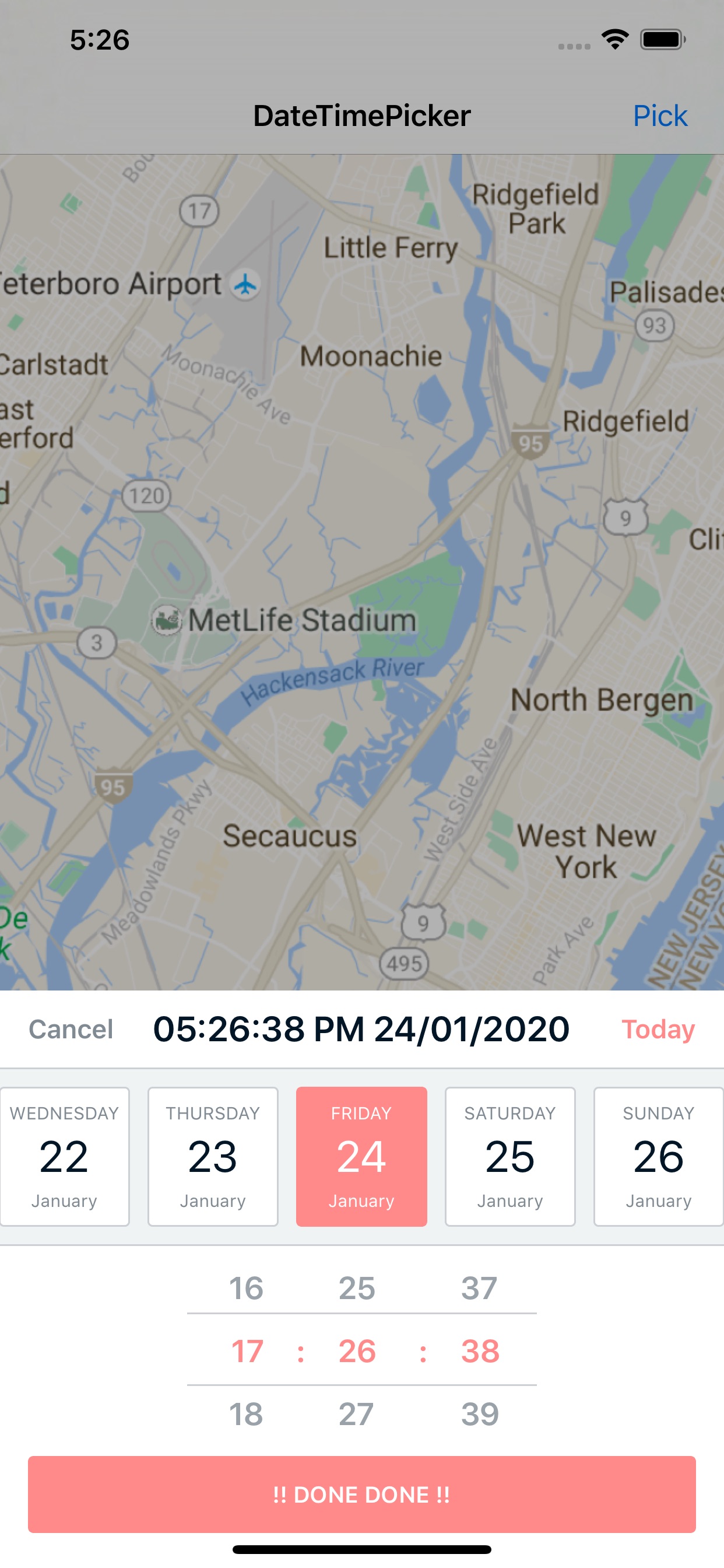
# DateTimePicker
A nicer iOS UI component for picking date and time.
## Features
- Date and Time Picker / Date Picker only / Time Picker only - your choice!
- Limit selected date within a defined range of time
- Show or hide month on date cell
- Infinite scrolling for time
- Customize colors and date format
- (v1.3) Constraint-based UI
- (v2.0) Now you can create picker view as a separate view!
- (v2.1.0) Carthage is now supported (a bit late - sorry)
- (v2.3.0) Options to select custom font and colors
- (v2.4.0) Option to show seconds column
- (v2.5.0) SPM support
- Custom TimeZone and Calendar
## To-dos (HELP NEEDED! 🎯)
- Option to select month / year (UI idea needed)
## Requirements
- Swift 5 & Xcode 12
- For Swift 4.2 please use branch `swift4.2`
- For Swift 4.1 please use branch `swift4.1`
- For Swift 3.0 please use version 1.1.4
- iOS 10 and later
## Installation
#### Using Cocoapod
Just add the following to your `podfile`
> pod 'DateTimePicker'
#### Using Carthage
From v2.1.0 onward, you can integrate DateTimePicker into your Xcode project using Carthage by specifying it in your `Cartfile`:
```ogdl
github "itsmeichigo/DateTimePicker" ~> 2.1.0
```
Run `carthage update` to build the framework and drag the built `DateTimePicker.framework` into your Xcode project.
#### Using Swift Package Manager
From v2.5.0 you can add DateTimePicker to your project via SPM. Paste link to this repo in SPM configuration window and you're good to go.
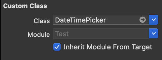
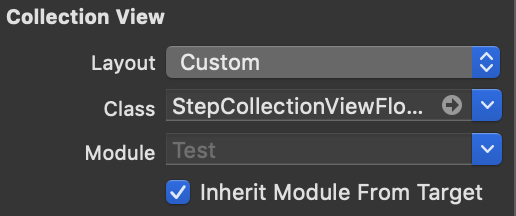
#### Manual install
Drag and drop folder `Source` to your project.
Please make sure to update the nib files custom class module to inherit from your current target so that the custom files can be found:

## Demo
Navigation to folder named `DateTimePickerDemo`, run `pod install` and open the workspace file to play around with `DateTimePicker`.
## Usage
### v2.0
Since v2.0 onward, picker view can be created separately and used to add to any view you want.
Note: the picker view is built with fixed width and height, so you're not encouraged to manually update it or you will get corrupted UI for the view. If necessary, please only change the y position of the view.
```Swift
let min = Date().addingTimeInterval(-60 * 60 * 24 * 4)
let max = Date().addingTimeInterval(60 * 60 * 24 * 4)
let picker = DateTimePicker.create(minimumDate: min, maximumDate: max)
picker.frame = CGRect(x: 0, y: 100, width: picker.frame.size.width, height: picker.frame.size.height)
self.view.addSubview(picker)
```
If you still want the old behavior (show the picker like a modal), you can call `show` method:
```Swift
let picker = DateTimePicker()
picker.show()
```
### v1.3 and below
For older versions, the only option is to use the built in `show` method, which returns an instance of `DateTimePicker` and also show the picker like a modal on top window. The picker can be dismissed when Cancel button is tapped.
```Swift
let picker = DateTimePicker.show()
```
### Customization
There are many options to customize picker for your own desire:
- `minimumDate` and `maximumDate`: date and time limit for the picker. You can only set these when creating the picker, default value is last 10 days for minimum date and next 10 days for maximum date. If you set these dates yourself, make sure that minimum date is an earlier time than maximum date.
- `selectedDate`: date to be selected when picker is first created, default is current date. Selected date has to be later than `minimumDate` and earlier than `maximumDate`.
- `locale`: locale for the language displayed. default is device's locale.
- `dateFormat`: format for the date shown in picker view. default is HH:mm dd/MM/YYYY.
- `cancelButtonTitle`: title for dismiss button, default is Cancel.
- `todayButtonTitle`: title for reset time button, default to Today.
- `doneButtonTitle`: title for done button, default to DONE.
- `is12HourFormat`: whether to display time in 12 hour format, default to false.
- `isDatePickerOnly`: whether to only show date in picker view, default to false.
- `isTimePickerOnly`: whether to show only time in picker view, default to false.
- `includesMonth`: whether to include month in date cells, default to false.
- `includesSecond`: whether to show second in time selection, default to false.
- `timeInterval`: time interval, in minutes, default to 1. If not default, infinite scrolling is off.
- `timeZone`: timezone used in picker, default is device timezone.
- `dismissHandler`: callback block when cancel button of picker view is tapped.
- `delegate`: object to be notified when a new date or time is selected.
- `highlightColor`: custom highlight color, default to cyan.
- `darkColor`: custom dark color, default to grey.
- `doneBackgroundColor`: custom DONE button color, default to darkColor.
- `daysBackgroundColor`: custom background color for date cells.
- `customFontSetting`: custom font settings for all labels in the component.
## Contributing
Contributions for bug fixing or improvements are welcome. Feel free to submit a pull request.
## Licence
DateTimePicker is available under the MIT license. See the LICENSE file for more info.