Ecosyste.ms: Awesome
An open API service indexing awesome lists of open source software.
https://github.com/IronLad85/flutter_calendar_strip
A Flutter Calendar Strip Widget
https://github.com/IronLad85/flutter_calendar_strip
Last synced: 3 months ago
JSON representation
A Flutter Calendar Strip Widget
- Host: GitHub
- URL: https://github.com/IronLad85/flutter_calendar_strip
- Owner: IronLad85
- License: bsd-3-clause
- Created: 2019-11-09T09:15:56.000Z (over 4 years ago)
- Default Branch: master
- Last Pushed: 2021-12-17T18:20:40.000Z (over 2 years ago)
- Last Synced: 2024-01-21T03:39:34.052Z (5 months ago)
- Language: Dart
- Size: 229 KB
- Stars: 179
- Watchers: 3
- Forks: 61
- Open Issues: 14
-
Metadata Files:
- Readme: README.md
- Changelog: CHANGELOG.md
- License: LICENSE
Lists
- awesome-stars - IronLad85/flutter_calendar_strip - A Flutter Calendar Strip Widget (Dart)
- awesome-flutter-mobile - calendar_strip - Flutter Calendar strip widget with custom date and custom styling. Date range can also be set between 2 date to disable selection of irrevelant dates (Packages)
README
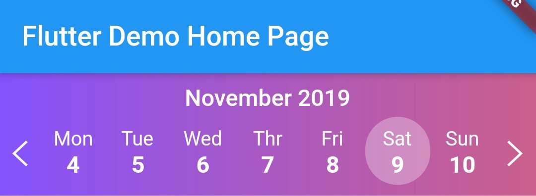
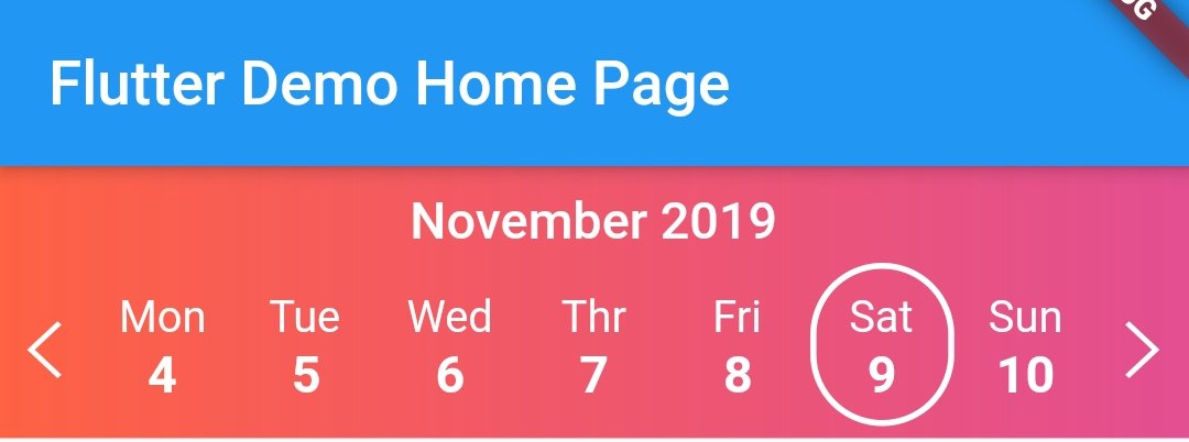
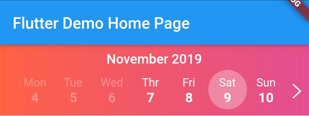
         Flutter Calendar Strip


   Easy to use and beautiful calendar strip component for Flutter.

   Awesome celender widget


### If this project has helped you out, please support us with a star. :star2:


## Install

```text

dependencies:

          ...

          calendar_strip: ^1.0.6

```

## Usage Example

```dart

Container(

  child: CalendarStrip(

    startDate: startDate,

    endDate: endDate,

    onDateSelected: onSelect,

    onWeekSelected: onWeekSelect,

    dateTileBuilder: dateTileBuilder,

    iconColor: Colors.black87,

    monthNameWidget: _monthNameWidget,

    markedDates: markedDates,

    containerDecoration: BoxDecoration(color: Colors.black12),

  ))

```

### DateBuilder Widget Method Usage

```dart

  dateTileBuilder(date, selectedDate, rowIndex, dayName, isDateMarked, isDateOutOfRange) {

    bool isSelectedDate = date.compareTo(selectedDate) == 0;

    Color fontColor = isDateOutOfRange ? Colors.black26 : Colors.black87;

    TextStyle normalStyle = TextStyle(fontSize: 17, fontWeight: FontWeight.w800, color: fontColor);

    TextStyle selectedStyle = TextStyle(fontSize: 17, fontWeight: FontWeight.w800, color: Colors.black87);

    TextStyle dayNameStyle = TextStyle(fontSize: 14.5, color: fontColor);

    List _children = [

      Text(dayName, style: dayNameStyle),

      Text(date.day.toString(), style: !isSelectedDate ? normalStyle : selectedStyle),

    ];

    if (isDateMarked == true) {

      _children.add(getMarkedIndicatorWidget());

    }

    return AnimatedContainer(

      duration: Duration(milliseconds: 150),

      alignment: Alignment.center,

      padding: EdgeInsets.only(top: 8, left: 5, right: 5, bottom: 5),

      decoration: BoxDecoration(

        color: !isSelectedDate ? Colors.transparent : Colors.white70,

        borderRadius: BorderRadius.all(Radius.circular(60)),

      ),

      child: Column(

        children: _children,

      ),

    );

  }

```

### MonthName Widget Method Usage

```dart

    monthNameWidget(monthName) {

    return Container(

      child: Text(

        monthName,

        style: TextStyle(

          fontSize: 17,

          fontWeight: FontWeight.w600,

          color: Colors.black87,

          fontStyle: FontStyle.italic,

        ),

      ),

      padding: EdgeInsets.only(top: 8, bottom: 4),

    );

  }

```

## Full Example

```dart

import 'package:flutter/material.dart';

import 'package:calendar_strip/calendar_strip.dart';

void main() => runApp(MyApp());

class MyApp extends StatelessWidget {

  // This widget is the root of your application.

  @override

  Widget build(BuildContext context) {

    return MaterialApp(

      title: 'Flutter Demo',

      theme: ThemeData(primarySwatch: Colors.blue),

      home: MyHomePage(title: 'Flutter Demo Home Page'),

    );

  }

}

class MyHomePage extends StatefulWidget {

  MyHomePage({Key key, this.title}) : super(key: key);

  final String title;

  @override

  _MyHomePageState createState() => _MyHomePageState();

}

class _MyHomePageState extends State {

  DateTime startDate = DateTime.now().subtract(Duration(days: 2));

  DateTime endDate = DateTime.now().add(Duration(days: 2));

  DateTime selectedDate = DateTime.now().subtract(Duration(days: 2));

  List markedDates = [

    DateTime.now().subtract(Duration(days: 1)),

    DateTime.now().subtract(Duration(days: 2)),

    DateTime.now().add(Duration(days: 4))

  ];

  onSelect(data) {

    print("Selected Date -> $data");

  }

  onWeekSelect(data) {

    print("Selected week starting at -> $data");

  }

  _monthNameWidget(monthName) {

    return Container(

      child: Text(monthName,

          style:

              TextStyle(fontSize: 17, fontWeight: FontWeight.w600, color: Colors.black87, fontStyle: FontStyle.italic)),

      padding: EdgeInsets.only(top: 8, bottom: 4),

    );

  }

  getMarkedIndicatorWidget() {

    return Row(mainAxisAlignment: MainAxisAlignment.center, children: [

      Container(

        margin: EdgeInsets.only(left: 1, right: 1),

        width: 7,

        height: 7,

        decoration: BoxDecoration(shape: BoxShape.circle, color: Colors.red),

      ),

      Container(

        width: 7,

        height: 7,

        decoration: BoxDecoration(shape: BoxShape.circle, color: Colors.blue),

      )

    ]);

  }

  dateTileBuilder(date, selectedDate, rowIndex, dayName, isDateMarked, isDateOutOfRange) {

    bool isSelectedDate = date.compareTo(selectedDate) == 0;

    Color fontColor = isDateOutOfRange ? Colors.black26 : Colors.black87;

    TextStyle normalStyle = TextStyle(fontSize: 17, fontWeight: FontWeight.w800, color: fontColor);

    TextStyle selectedStyle = TextStyle(fontSize: 17, fontWeight: FontWeight.w800, color: Colors.black87);

    TextStyle dayNameStyle = TextStyle(fontSize: 14.5, color: fontColor);

    List _children = [

      Text(dayName, style: dayNameStyle),

      Text(date.day.toString(), style: !isSelectedDate ? normalStyle : selectedStyle),

    ];

    if (isDateMarked == true) {

      _children.add(getMarkedIndicatorWidget());

    }

    return AnimatedContainer(

      duration: Duration(milliseconds: 150),

      alignment: Alignment.center,

      padding: EdgeInsets.only(top: 8, left: 5, right: 5, bottom: 5),

      decoration: BoxDecoration(

        color: !isSelectedDate ? Colors.transparent : Colors.white70,

        borderRadius: BorderRadius.all(Radius.circular(60)),

      ),

      child: Column(

        children: _children,

      ),

    );

  }

  @override

  Widget build(BuildContext context) {

    return Scaffold(

      appBar: AppBar(

        title: Text(widget.title),

      ),

      body: Container(

          child: CalendarStrip(

        startDate: startDate,

        endDate: endDate,

        onDateSelected: onSelect,

        onWeekSelected: onWeekSelect,

        dateTileBuilder: dateTileBuilder,

        iconColor: Colors.black87,

        monthNameWidget: _monthNameWidget,

        markedDates: markedDates,

        containerDecoration: BoxDecoration(color: Colors.black12),

        //locale = 'en_US', //Default

      )),

    );

  }

}

```

## Widget Properties

### Initial data and onDateSelected handler

| Prop                      | Description                                                                                          | Type             | Default              |

| ------------------------- | ---------------------------------------------------------------------------------------------------- | ---------------- | -------------------- |

| **`startDate`**           | Date to be used for setting starting date in a date range.                                           | `DateTime`       | -                    |

| **`endDate`**             | Date to be used for setting ending date in a date range.                                             | `DateTime`       | -                    |

| **`selectedDate`**        | Date to be used for setting a date as pre-selected instead of current Date.                          | `DateTime`       | -                    |

| **`markedDates`**         | List of `DateTime`s to be marked in UI. It is also passed as parameter in `dateTileBuilder` method, | `List` | -                    |

| **`iconColor`**           | Icon colors of both Left and Right Chevron Icons.                                                    | `Color`          | **`Colors.black87`** |

| **`containerHeight`**     | The Height of the calendar strip.                                                                    | `int`            | **`90`**             |

| **`containerDecoration`** | Box Decoration object styling the container for more custom styling.                                 | `BoxDecoration`  | -                    |

| **`monthNameWidget`**     | Function that returns a custom widget for rendering the name of the current month.                   | `Function`       | -                    |

| **`dateTileBuilder`**     | Function that returns a custom widget for rendering the name of the current month                    | `Function`       | -                    |

| **`onDateSelected`**      | Function that is called on selection of a date. (Required)                                           | `Function`       | **`Required`**       |

| **`addSwipeControl`**     | Boolean that is used to turn on or off swipe control on the calendar strip                           | `Boolean`        | -                    |

| **`locale`**     | To specify a language, simply pass it as a String code to locale property.                          | `String`        | **`en_US`**                    |