Ecosyste.ms: Awesome
An open API service indexing awesome lists of open source software.
https://github.com/matthewfx/sleek_circular_slider
Sleek circular slider for Flutter
https://github.com/matthewfx/sleek_circular_slider
android circular-progress customizable dart flutter flutter-package ios slider
Last synced: 3 months ago
JSON representation
Sleek circular slider for Flutter
- Host: GitHub
- URL: https://github.com/matthewfx/sleek_circular_slider
- Owner: matthewfx
- License: mit
- Created: 2019-10-07T04:53:08.000Z (over 4 years ago)
- Default Branch: master
- Last Pushed: 2023-01-30T02:20:33.000Z (over 1 year ago)
- Last Synced: 2024-01-21T04:03:37.854Z (5 months ago)
- Topics: android, circular-progress, customizable, dart, flutter, flutter-package, ios, slider
- Language: Dart
- Size: 5 MB
- Stars: 505
- Watchers: 6
- Forks: 93
- Open Issues: 54
-
Metadata Files:
- Readme: README.md
- Changelog: CHANGELOG.md
- License: LICENSE
Lists
- awesome-flutter-mobile - sleek_circular_slider - A highly customizable circular slider/progress bar & spinner for Flutter. (Packages)
- awesome-stars - sleek_circular_slider
README
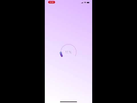
# Sleek circular slider/progress bar & spinner for Flutter
[](https://opensource.org/licenses/MIT)[](https://nuckowski.com)
A highly customizable circular slider/progress bar & spinner for Flutter.


## Getting Started
- [Installation](#installation)
- [Basic Usage](#basic-usage)
- [SleekCircularSlider parameters](#sleekcircularslider-parameters)
- [CircularSliderAppearance parameters](#circularsliderappearance-parameters)
- [CustomSliderWidths parameters](#customsliderwidths-parameters)
- [CustomSliderColors parameters](#customslidercolors-parameters)
- [InfoProperties parameters](#infoproperties-parameters)
- [YouTube video](#youtube-video)
### Installation
Add
```bash
sleek_circular_slider : ^lastest_version
```
to your pubspec.yaml, and run
```bash
flutter packages get
```
in your project's root directory.
### Basic Usage
Import it to your project file
```dart
import 'package:sleek_circular_slider/sleek_circular_slider.dart';
```
And add it in its most basic form like it:
```dart
final slider = SleekCircularSlider(
appearance: CircularSliderAppearance(),
onChange: (double value) {
print(value);
});
```
There are additional optional parameters one can initialize the slider with.
```dart
final slider = SleekCircularSlider(
min: 0,
max: 1000,
initialValue: 426,
onChange: (double value) {
// callback providing a value while its being changed (with a pan gesture)
},
onChangeStart: (double startValue) {
// callback providing a starting value (when a pan gesture starts)
},
onChangeEnd: (double endValue) {
// ucallback providing an ending value (when a pan gesture ends)
},
innerWidget: (double value) {
// use your custom widget inside the slider (gets a slider value from the callback)
},
);
```
### Use as a progress bar
Slider user's interaction will be disabled if there is either no [onChange] or [onChangeEnd] provided. That way one can use the widget not as a slider but as a progress bar.
```dart
final slider = SleekCircularSlider(
appearance: CircularSliderAppearance(
customWidths: CustomSliderWidths(progressBarWidth: 10)),
min: 10,
max: 28,
initialValue: 14,
);
```
### Use as a spinner
There is one more use case for the library. It's a spinner which can be shown to users while loading etc. In this mode the widget is not interactive and ignores all angles so there is no need to provide them.
```dart
final slider = SleekCircularSlider(
appearance: CircularSliderAppearance(
spinnerMode: true,
));
```
### SleekCircularSlider parameters
| Parameter | Default | Description |
| :------------------------ | :-------------------------------------------------: | :---------------------------------------------------------------------------------------------------------------------- |
| **appearance** *CircularSliderAppearance* | | A set of objects describing the slider look and feel. |
| **min** *double* | 0 | The minimum value the user can select. Must be less than or equal to max. |
| **max** *double* | 100 | The maximum value the user can select. Must be greater than or equal to min. |
| **initialValue** *double* | 50 | The initial value for this slider. |
| **onChange** *OnChange(double value)*| | Called during a drag when the user is selecting a new value for the slider by dragging. |
| **onChangeStart** *OnChange(double value)* | | Called when the user starts selecting a new value for the slider. |
| **onChangeEnd** *OnChange(double value)* | | Called when the user is done selecting a new value for the slider. |
| **innerWidget** *Widget InnerWidget(double value)* | | A custom widget to replace the build in text labels which can capture a slider value from the callback. |
### CircularSliderAppearance parameters
| Parameter | Default | Description |
| :------------------------ | :-------------------------------------------------: | :---------------------------------------------------------------------------------------------------------------------- |
| **size** *double* | 150 | The width & height value for the slider. |
| **startAngle** *double* | 150 | The angle (in degrees) the slider begins with. |
| **angleRange** *double* | 240 | The angle range (in degrees) the slider reaches when maximum value set. |
| **counterClockwise** *bool* | false | The setting indicating direction of the widget. |
| **customWidths** *CustomSliderWidths*| | The object with a set of widths for the track, bar, shadow etc. |
| **customColors** *CustomSliderColors*| | The object with a set of colors for the track, bar, shadow etc. |
| **infoProperties** *InfoProperties* | | The object with a set of properties for internal labels displaying a current slider value. |
| **animationEnabled** *bool* | true | The setting indicating whether external changes of a slider value should be animated. |
| **spinnerMode** *bool* | false | The setting turning the widget into a spinner. |
| **spinnerDuration** *int* | 1500 | The spinner animation duration in miliseconds |
| **animDurationMultiplier** *double* | 1.0 | The multiplier of duration for the animation when value changed |
### CustomSliderWidths parameters
| Parameter | Default | Description |
| :------------------------ | :-------------------------------------------------: | :---------------------------------------------------------------------------------------------------------------------- |
| **trackWidth** *double* | progressBarWidth / 4 | The width of the slider's track. |
| **progressBarWidth** *double* | slider's size / 10 | The width of the slider's progress bar. |
| **shadowWidth** *double* | progressBarWidth * 1.4 | The width of the slider's shadow. |
| **handlerSize** *double* | progressBarWidth / 5 | The size of the slider's handler. |
### CustomSliderColors parameters
| Parameter | Default | Description |
| :------------------------ | :-------------------------------------------------: | :---------------------------------------------------------------------------------------------------------------------- |
| **trackColor** *Color* | #DCBEFB | The color of the slider's track. |
| **trackColors** *List* | null | The list of colors for the track's gradient. |
| **trackGradientStartAngle** *double* | 0 | The start angle for the track's gradient. |
| **trackGradientEndAngle** *double* | 180 | The end angle for the track's gradient. |
| **progressBarColor** *Color* | | The color of the slider's progress bar. Won't be used if the slider uses gradient **progressBarColors != null** |
| **progressBarColors** *List* | [#1E003B, #EC008A, #6285DA] | The list of colors for the progress bar's gradient. |
| **gradientStartAngle** *double* | 0 | The start angle for the progress bar's gradient. |
| **gradientEndAngle** *double* | 180 | The end angle for the progress bar's gradient. |
| **dynamicGradient** *bool* | false | The gradient angles will change dynamically with value changing. If true it will ignore both the grandientStartAngle and gradientEndAngle |
| **dotColor** *Color* | #FFFFFF | The color of the slider's handle. |
| **hideShadow** *bool* | false | The setting indicating whether the shadow should be showed. |
| **shadowColor** *Color* | #2C57C0 | The color of the shadow. |
| **shadowMaxOpacity** *double* | 0.2 | The opacity of the shadow in its darker part. |
| **shadowStep** *double* | | The shadow is being painted with a number of steps. This value determines how big is a width of each step. The more steps are painted the softer the shadow is. For a flat shadow use a difference between the **shadowWidth** and the **progressWidth** for the **shadowStep**.|
### InfoProperties parameters
| Parameter | Default | Description |
| :------------------------ | :-------------------------------------------------: | :---------------------------------------------------------------------------------------------------------------------- |
| **mainLabelStyle** *TextStyle* | | The text style of the main text widget displaying a slider's current value. |
| **topLabelStyle** *TextStyle* | | The text style of the top text widget. |
| **bottomLabelStyle** *TextStyle* | | The text style of the bottom text widget. |
| **topLabelText** *String* | | The text for the top text widget. |
| **bottomLabelText** *String* | | The text for the bottom text widget. |
| **modifier** *String PercentageModifier(double percentage)* | closure adding the **%** character | The closure allowing to modify how a current value of the slider is displayed. |
**Example of the modifier**
```dart
String percentageModifier(double value) {
final roundedValue = value.ceil().toInt().toString();
return '$roundedValue %';
}
```
It will convert a current value to *int* and add the **%** sufix to it.
### YouTube video
[](https://youtu.be/ECXdRYs89QY)
## Todo
- [ ] add divisions
- [ ] add more comments to document the code
- [x] add the counterclockwise direction
- [x] add the spinner mode
- [ ] add the second handle (interval selection)
- [ ] add text labels on a curved path
## Acknowledgments
* Hat tip to David Anaya for his awesome [blog post](https://www.davidanaya.io/flutter/circular-slider.html) about building a circular slider in Flutter and radian to degrees conversions which helped me a lot!