Ecosyste.ms: Awesome
An open API service indexing awesome lists of open source software.
https://github.com/soft4ti/vue-select-sides
A component for Vue.js to select double-sided data.
https://github.com/soft4ti/vue-select-sides
Last synced: about 2 months ago
JSON representation
A component for Vue.js to select double-sided data.
- Host: GitHub
- URL: https://github.com/soft4ti/vue-select-sides
- Owner: soft4ti
- Created: 2019-12-24T15:13:00.000Z (over 4 years ago)
- Default Branch: master
- Last Pushed: 2022-12-15T00:33:47.000Z (over 1 year ago)
- Last Synced: 2024-04-09T16:21:58.459Z (about 2 months ago)
- Language: Vue
- Homepage: https://juliorosseti.github.io/vue-select-sides/demo.html?v=20201113113940
- Size: 2.84 MB
- Stars: 71
- Watchers: 6
- Forks: 19
- Open Issues: 20
-
Metadata Files:
- Readme: README.md
Lists
- awesome-vue - vue-select-sides - A component for Vue.js to select double-sided data (2-sides). (Components & Libraries / UI Components)
README

Vue Select Sides


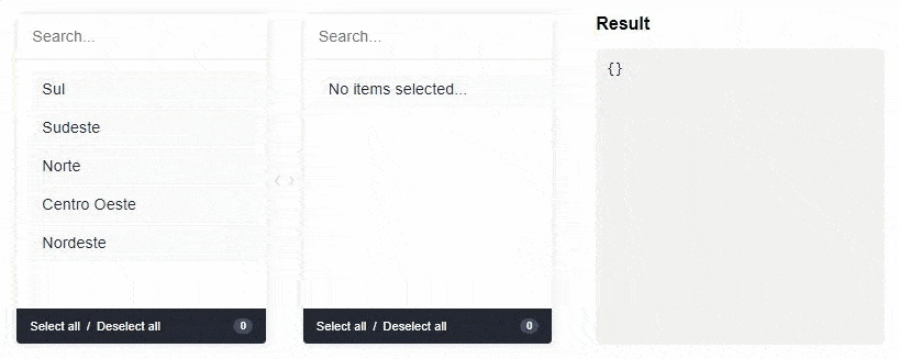
A component for Vue.js to select double-sided data. The customer can select one or more items and ship them from side to side. Values can be displayed grouped or ungrouped.
## [Live DEMO](https://juliorosseti.github.io/vue-select-sides/demo.html?v=20201113113940)
## Installation
First install it using:
```bash
npm install --save vue-select-sides
```
or
```bash
yarn add vue-select-sides
```
Then you can either use it as a component:
```js
import vueSelectSides from "vue-select-sides";
export default {
components: {
vueSelectSides
}
};
```
Global component:
```javascript
import vueSelectSides from "vue-select-sides";
Vue.use(VueSelectSides);
Vue.component("vue-select-sides", VueSelectSides);
```
Or if you wish to include it in a `script` tag, just include the `vueSelectSides.umd.min.js` file located in the `dist` folder as so:
```html
```
## Usage
The component has support for two types: `mirror` and `grouped`.
#### Import a theme
```scss
// modern
@import "/node_modules/vue-select-sides/styles/themes/soft.scss";
// or dark
@import "/node_modules/vue-select-sides/styles/themes/dark.scss";
// or light
@import "/node_modules/vue-select-sides/styles/themes/light.scss";
```
#### Grouped
Warning: `v-model` must be of type `Object`
```html
```
```javascript
import vueSelectSides from "vue-select-sides";
export default {
components: {
vueSelectSides
},
data() {
return {
selected: {},
list: [
{
value: "sul",
label: "Sul",
disabled: false,
children: [
{
value: "santa-catarina",
label: "Santa Catarina",
disabled: false
},
{
...
}
]
},
{
value: "sudeste",
label: "Sudeste",
disabled: false,
children: [
{
value: "minas-gerais",
label: "Minas Gerais",
disabled: false
},
{
...
}
]
}
]
};
}
};
```
#### Mirror
Warning: `v-model` must be of type `Array`
```html
```
```javascript
import vueSelectSides from "vue-select-sides";
export default {
components: {
vueSelectSides
},
data() {
return {
selected: [],
list: [
{
value: "afghanistan",
label: "Afghanistan",
disabled: true
},
{
value: "brazil",
label: "Brazil"
},
{
value: "fiji",
label: "Fiji",
disabled: true
},
{
value: "ghana",
label: "Ghana"
},
{
...
}
];
}
};
```
## Language/locales
List of locales available for the plugin:
- `en_US` - [English] - Default
- `pt_BR` - [Portuguese] - Contributed by @juliorosseti
- `es_ES` - [Spanish] - Contributed by @etrepat
- `fr_FR` - [French] - Contributed by @MajuTo
- `tr_TR` - [Turkey] - Contributed by @Abdulsametileri
- `pl_PL` - [Polish] - Contributed by @jzapal
### Use global locale
```javascript
import vueSelectSides from "vue-select-sides";
Vue.use(vueSelectSides, {
locale: "pt_BR"
});
Vue.component("vue-select-sides", vueSelectSides);
```
## Props
These are all the props you can pass to the component:
| name | type | example | notes |
| ----------------------------- | ------------------- | ----------------------------------------------------------------- | -------------------------------------------------------------------------------------------- |
| v-model | `Array` or `Object` | `["xyz"]` or `{xyz: ["abc", "def"]}` | Use **Object** if type is grouped else uses **Array** |
| type | `String` | `grouped` or `mirror` | |
| list | `Array` | `[{ value: "xyz", label: "Label xyz 01", disabled: true/false }]` | You can add the `children` key to type `grouped` |
| search | `Boolean` | `true` or `false` | To show/hide search input. Default is visible (true) |
| total | `Boolean` | `true` or `false` | To show/hide total selected in footer. Default is visible (true) |
| toggle-all | `Boolean` | `true` or `false` | To show/hide toggle in footer. Default is visible (true) |
| sort-selected-up | `Boolean` | `true` or `false` | Show first the pre-selected. Default does not visible (false). _Available only grouped type_ |
| order-by | `String` | `asc` or `desc` | Show first the pre-selected. Default is natural order |
| ~~lang~~ (deprecated in v1.1) | ~~`String`~~ | ~~`en_US`, `pt_BR`, `es_ES` or `fr_FR`~~ | ~~Language default. Default is en_US~~
Use `Use global locale` |
| placeholder-search-left | `String` | "Yay! Search items..." | Placeholder on the left search field. Default is "" |
| placeholder-search-right | `String` | "Or search children items..." | Placeholder on the right search field. Default is "" |
## Bugs and feature requests
If your problem or idea is not addressed yet, please open a new issue.
## Sponsor / Creator

## Contribution / Development
#### Install dependencies
```
yarn install
```
#### Devserver
```
yarn run serve
```
#### Bundling
```
yarn run build
```
## Donate
You can help with a donation on Paypal
## License
Vue select sides is open-sourced software licensed under the the MIT license.