Ecosyste.ms: Awesome
An open API service indexing awesome lists of open source software.
https://github.com/code-mc/material-icon-lib
Library containing over 2000 material vector icons that can be easily used as Drawable or as a standalone View.
https://github.com/code-mc/material-icon-lib
Last synced: 20 days ago
JSON representation
Library containing over 2000 material vector icons that can be easily used as Drawable or as a standalone View.
- Host: GitHub
- URL: https://github.com/code-mc/material-icon-lib
- Owner: code-mc
- License: other
- Created: 2015-07-19T12:10:11.000Z (almost 9 years ago)
- Default Branch: master
- Last Pushed: 2019-12-15T20:49:51.000Z (over 4 years ago)
- Last Synced: 2024-01-10T05:57:50.078Z (4 months ago)
- Language: Java
- Homepage:
- Size: 1.29 MB
- Stars: 2,280
- Watchers: 63
- Forks: 219
- Open Issues: 11
-
Metadata Files:
- Readme: README.md
- License: license.md
Lists
- awesome-android-ui - Material Icon Library - 2.0) | <img src="/art/material-icon-lib.gif" width="100%"> (Index)
- awesome-android-ui - Material Icon Library - 2.0) | <img src="/art/material-icon-lib.gif" width="100%"> (Index `(light-weight pages)`)
- awesome-android-ui - Material Icon Library - 2.0) | <img src="/art/material-icon-lib.gif" width="100%"> (Index `(light-weight pages)`)
- awesome-android - Material Icon Library - 2.0) | <img src="/art/material-icon-lib.gif" width="100%"> (Index `(light-weight pages)`)
- awesome-github-android-ui - material-icon-lib - 1500个MD风格矢量图标 (图标)
- awesome-stars - code-mc/material-icon-lib - Library containing over 2000 material vector icons that can be easily used as Drawable or as a standalone View. (Java)
- awesome-stars - code-mc/material-icon-lib - Library containing over 2000 material vector icons that can be easily used as Drawable or as a standalone View. (Java)
- awesome-stars - code-mc/material-icon-lib - Library containing over 2000 material vector icons that can be easily used as Drawable or as a standalone View. (Java)
- awesome-android-ui - Material Icon Library - 2.0) | <img src="/art/material-icon-lib.gif" width="100%"> (Index `(light-weight pages)`)
- -awesome-android-ui - Material Icon Library - 2.0) | <img src="/art/material-icon-lib.gif" width="100%"> (Index `(light-weight pages)`)
- awesome-android-ui - Material Icon Library - 2.0) | <img src="/art/material-icon-lib.gif" width="100%"> (Index `(light-weight pages)`)
- awesome-android-ui - Material Icon Library - 2.0) | <img src="/art/material-icon-lib.gif" width="100%"> (Index `(light-weight pages)`)
- awesome-android-ui - Material Icon Library - 2.0) | <img src="/art/material-icon-lib.gif" width="100%"> (Index `(light-weight pages)`)
- awesome-android-ui - Material Icon Library - 2.0) | <img src="/art/material-icon-lib.gif" width="100%"> (Index `(light-weight pages)`)
- awesome-android-ui - Material Icon Library - 2.0) | <img src="/art/material-icon-lib.gif" width="100%"> (Index)
- awesome-android-ui - Material Icon Library - 2.0) | <img src="/art/material-icon-lib.gif" width="100%"> (Index `(light-weight pages)`)
- awesome-android-ui - Material Icon Library - 2.0) | <img src="/art/material-icon-lib.gif" width="100%"> (Index `(light-weight pages)`)
- awesome-android-ui - Material Icon Library - 2.0) | <img src="/art/material-icon-lib.gif" width="100%"> (Index `(light-weight pages)`)
- awesome-android-ui - Material Icon Library - 2.0) | <img src="/art/material-icon-lib.gif" width="100%"> (Index `(light-weight pages)`)
- awesome-github-android-ui - material-icon-lib - 1500个MD风格矢量图标 (图标)
README
# Material Icon Library
A library containing over 2000 material vector icons that can be easily used as Drawable, a standalone View or inside menu resource files. Tired of having to search for and generate png resources every time you want to test something? This library puts an end to that burden and makes swapping icons a breeze, check out the usage below and you'll see why.
# Demo
# Stats
- MinSdk 4
- LIVE previews and code completion in the Android Studio Designer (Does NOT work out of the box, see step 0 below!)
- Currently contains 2354 icons, you can look at them here: https://materialdesignicons.com
- Configured in less than a minute
- Adds about 257kb to your apk (so a whopping average of __109 bytes per icon__)
- Includes a custom Drawable, IconView and a MenuInflater for all different icon use cases
# Usage
## Step 0
Now I still have your attention, to get the previews to work in Android Studio you'll have to put the font file inside the assets of your project yourself. Due to a bug it does not think about looking inside the library's assets for some odd reason.
Get the font file [__here__](https://github.com/code-mc/material-icon-lib/blob/master/materialiconlib/src/main/assets/materialdesignicons-webfont.ttf?raw=true).
You don't have to worry about android including the file twice in your apk. Android Studio recognizes the duplicate file name and only keeps one copy in your apk!
Previews work inside layout files, menu resource files sadly do not support previews (more on those below).
## Step 1
#### Gradle
```groovy
dependencies {
compile 'net.steamcrafted:materialiconlib:1.1.5'
}
```
## Step 2
There's a total of 3 different use cases (click the links to jump to their section). You can use the provided [`MaterialIconView`](#materialiconview) which mostly is just a more advanced `ImageView` or use your preferred `ImageView` and use the [`MaterialDrawable`](#materialdrawable) as Drawable resource. If you want to spice up your `Toolbar` with icons from this library there is a custom [`MaterialMenuInflater`](#materialmenuinflater) that does just that in a single line of code.
### MaterialIconView
Add the view to your XML:
```xml
android:layout_width="48dp"
android:layout_height="48dp"
app:materialIcon="clipboard_arrow_down"
app:materialIconColor="#fff"
app:materialIconSize="24dp"
android:scaleType="center"
android:background="@android:color/darker_gray"
android:id="@+id/icon"
/>
```
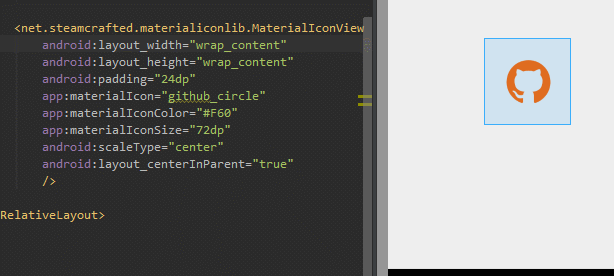
You can also use the other route: the "wrap_content" way:
```xml
android:layout_width="wrap_content"
android:layout_height="wrap_content"
android:padding="12dp"
app:materialIcon="clipboard_arrow_down"
app:materialIconColor="#fff"
app:materialIconSize="24dp"
android:background="@android:color/darker_gray"
android:id="@+id/icon"
/>
```
The view is inherited from `ImageView`. This means that you can use any and all features of the very flexible `ImageView` BUT be reminded that this view does not cache any of the drawables it creates, so every time you change something about the icon, it's going to regenerate the drawable. Using this view inside listviews is highly discouraged, if you want to use these icons in a `ListView`, cache the drawables and use the `MaterialDrawableBuilder` in combination with an `ImageView`!
As mentioned before this extends the android `ImageView` class, there's a few methods unique to this particular view:
```java
// Sets the icon, all 1000+ icons are available inside the MaterialDrawableBuilder.IconValue enum
yourMaterialIconView.setIcon(IconValue iconValue);
// Sets the size of the icon to the default action bar icon size
yourMaterialIconView.setToActionbarSize();
// Provide a dimension resource to use as icon size
yourMaterialIconView.setSizeResource(int dimenRes);
// Set the icon size using a value in dp units
yourMaterialIconView.setSizeDp(int size);
// Set the icon size using a pixel value
yourMaterialIconView.setSizePx(int size);
// Set the icon color
yourMaterialIconView.setColor(int color);
// Set the icon color using a color resource
yourMaterialIconView.setColorResource(int colorRes);
// Set the icon's alpha value (0-255) 0 for completely transparent
yourMaterialIconView.setAlpha(int alpha);
// Sets a custom colorfilter to the drawing paint (for the more advanced devs)
yourMaterialIconView.setColorFilter(ColorFilter cf);
// Clear the color filter set using above method
yourMaterialIconView.clearColorFilter();
// Sets a custom paint style (for the more advanced devs)
yourMaterialIconView.setStyle(Paint.Style style);
// You can use any of the ImageView methods as well:
yourMaterialIconView.setBackgroundColor(Color.WHITE)
yourMaterialIconView.setScaleType(ScaleType.CENTER)
// etc...
```
### MaterialDrawable
That was easy, right? Next up the custom drawables, they are internally used by the `MaterialIconView` so you'll see that they share many of the same methods.
The initialisation happens using the `MaterialDrawableBuilder`, which you can use to set all the properties of the drawable:
```java
// The method returns a MaterialDrawable, but as it is private to the builder you'll have to store it as a regular Drawable ;)
Drawable yourDrawable = MaterialDrawableBuilder.with(context) // provide a context
.setIcon(MaterialDrawableBuilder.IconValue.WEATHER_RAINY) // provide an icon
.setColor(Color.WHITE) // set the icon color
.setToActionbarSize() // set the icon size
.build(); // Finally call build
```
This will throw an `IconNotSetException` if you forget to provide an icon.
Once you call build, your Drawable will be spit out and you are ready to use it everywhere you please! Setting it to a view is just as easy as with any other `Drawable` (e.g. for `ImageView`):
```java
yourImageView.setImageDrawable(yourDrawable);
```
And that's all there is to it. Below are all the methods you can use with the `MaterialDrawableBuilder` for reference.
```java
// Sets the icon, all 1000+ icons are available inside the MaterialDrawableBuilder.IconValue enum
builder.setIcon(IconValue iconValue);
// Builds the drawable, this method always comes last ofcourse
builder.build();
// Sets the size of the icon to the default action bar icon size
builder.setToActionbarSize();
// Provide a dimension resource to use as icon size
builder.setSizeResource(int dimenRes);
// Set the icon size using a value in dp units
builder.setSizeDp(int size);
// Set the icon size using a pixel value
builder.setSizePx(int size);
// Set the icon color
builder.setColor(int color);
// Set the icon color using a color resource
builder.setColorResource(int colorRes);
// Set the icon's alpha value (0-255) 0 for completely transparent
builder.setAlpha(int alpha);
// Sets a custom colorfilter to the drawing paint (for the more advanced devs)
builder.setColorFilter(ColorFilter cf);
// Clear the color filter set using above method
builder.clearColorFilter();
// Returns the alpha value
builder.getOpacity();
// Sets a custom paint style (for the more advanced devs)
builder.setStyle(Paint.Style style);
```
### MaterialMenuInflater
With the `MaterialMenuInflater` you can use any of the icons available in this library *inside* your menu resource files. In XML you'd have to do the following:
```xml
xmlns:tools="http://schemas.android.com/tools" >
app:materialIconColor="#FE0000"
/>
```
To actually inflate this menu you'll now have to use the `MaterialMenuInflater` instead of the default one. For the AppCompatActivity do the following in your `onCreateOptionsMenu`:
```java
@Override
public boolean onCreateOptionsMenu(Menu menu) {
MaterialMenuInflater
.with(this) // Provide the activity context
// Set the fall-back color for all the icons. Colors set inside the XML will always have higher priority
.setDefaultColor(Color.BLUE)
// Inflate the menu
.inflate(R.menu.your_menu_resource, menu);
return true;
}
```
Since the release of the Appcompat-v7 library you can also use the `Toolbar` view inside your XML layouts. Inflating a menu for a toolbar is a bit different from the usual way, but it is just as easy:
```java
// Get the toolbar from layout
Toolbar toolbar = (Toolbar) findViewById(R.id.your_toolbar);
MaterialMenuInflater
.with(this) // Provide a context, activity context will do just fine
// Set the fall-back color for all the icons. Colors set inside the XML will always have higher priority
.setDefaultColor(Color.BLUE)
// Inflate the menu
.inflate(R.menu.your_menu_resource, toolbar.getMenu());
```
And that's all there is to it.
# License
Released under the [Apache 2.0 License](https://github.com/code-mc/material-icon-lib/blob/master/license.md)
* __MaterialDesignicons__ Released under the [SIL Open Font License 1.1](http://opensource.org/licenses/OFL-1.1)
* __Google Material Design Icons__ Released under the [Apache 2.0 License](https://github.com/google/material-design-icons/blob/master/LICENSE)