Ecosyste.ms: Awesome
An open API service indexing awesome lists of open source software.
https://github.com/skydoves/Balloon
:balloon: Modernized and sophisticated tooltips, fully customizable with an arrow and animations for Android.
https://github.com/skydoves/Balloon
android android-library android-ui animation balloon compose dsl jetpack-compose kotlin popup skydoves tooltip tooltips
Last synced: about 1 month ago
JSON representation
:balloon: Modernized and sophisticated tooltips, fully customizable with an arrow and animations for Android.
- Host: GitHub
- URL: https://github.com/skydoves/Balloon
- Owner: skydoves
- License: apache-2.0
- Created: 2019-07-14T07:14:32.000Z (almost 5 years ago)
- Default Branch: main
- Last Pushed: 2024-01-31T11:34:08.000Z (4 months ago)
- Last Synced: 2024-01-31T12:40:49.503Z (4 months ago)
- Topics: android, android-library, android-ui, animation, balloon, compose, dsl, jetpack-compose, kotlin, popup, skydoves, tooltip, tooltips
- Language: Kotlin
- Homepage: https://skydoves.github.io/libraries/balloon/html/balloon/com.skydoves.balloon/index.html
- Size: 2.52 MB
- Stars: 3,493
- Watchers: 27
- Forks: 278
- Open Issues: 17
-
Metadata Files:
- Readme: README.md
- Contributing: CONTRIBUTING.md
- Funding: .github/FUNDING.yml
- License: LICENSE
- Code of conduct: CODE_OF_CONDUCT.md
- Codeowners: .github/CODEOWNERS
Lists
- awesome-android-ui - Balloon(tooltips) - 2.0) | <img src="https://user-images.githubusercontent.com/24237865/61194943-f9d70380-a6ff-11e9-807f-ba1ca8126f8a.gif" width="49%"> <img src="https://user-images.githubusercontent.com/24237865/61225579-d346b600-a75b-11e9-84f8-3c06047b5003.gif" width="49%"> (Index)
- awesome-kotlin - Balloon - :balloon: A lightweight popup like tooltips, fully customizable with an arrow and animations. (Libraries)
- my-awesome-stars - skydoves/Balloon - :balloon: Modernized and sophisticated tooltips, fully customizable with an arrow and animations for Android. (Kotlin)
- awesome-list - skydoves/Balloon - :balloon: Modernized and sophisticated tooltips, fully customizable with an arrow and animations for Android. (Kotlin)
- awesome-kotlin - Balloon - :balloon: A lightweight popup like tooltips, fully customizable with an arrow and animations. (Libraries)
- awesome-android-ui - Balloon(tooltips) - 2.0) | <img src="https://user-images.githubusercontent.com/24237865/61194943-f9d70380-a6ff-11e9-807f-ba1ca8126f8a.gif" width="49%"> <img src="https://user-images.githubusercontent.com/24237865/61225579-d346b600-a75b-11e9-84f8-3c06047b5003.gif" width="49%"> (Index)
README
Balloon
:balloon: Modernized and sophisticated tooltips, fully customizable with an arrow and animations on Android.


## Who's using Balloon?
**👉 [Check out who's using Balloon](/usecases.md)**
Balloon hits **+500,000 downloads every month** around the globe! :balloon:


## Balloon in Jetpack Compose
If you want to use Balloon in your Jetpack Compose project, check out the **[Balloon in Jetpack Compose](https://github.com/skydoves/Balloon#balloon-in-jetpack-compose-1)** guidelines. You can also check out the blog post **[Tooltips for Jetpack Compose: Improve User Experience to the Next Level](https://medium.com/@skydoves/tooltips-for-jetpack-compose-improve-user-experience-to-the-next-level-68791ab8e07f)** for more details.
## Including in your project
[](https://search.maven.org/search?q=g:%22com.github.skydoves%22%20AND%20a:%22balloon%22)
### Gradle
Add the dependency below to your **module**'s `build.gradle` file:
```kotlin
dependencies {
implementation("com.github.skydoves:balloon:1.6.4")
}
```
## SNAPSHOT
[](https://oss.sonatype.org/content/repositories/snapshots/com/github/skydoves/balloon/)
See how to import the snapshot
### Including the SNAPSHOT
Snapshots of the current development version of Balloon are available, which track [the latest versions](https://oss.sonatype.org/content/repositories/snapshots/com/github/skydoves/balloon/).
To import snapshot versions on your project, add the code snippet below on your gradle file.
```kotlin
repositories {
maven(url = "https://oss.sonatype.org/content/repositories/snapshots/")
}
```
Next, add the below dependency to your **module**'s `build.gradle` file.
```kotlin
dependencies {
implementation("com.github.skydoves:balloon:1.6.5-SNAPSHOT")
}
```
## How to Use
Balloon supports both Kotlin and Java projects, so you can reference it by your language.
### Create Balloon with Kotlin
We can create an instance of the Balloon with the `Balloon.Builder` class.
```kotlin
val balloon = Balloon.Builder(context)
.setWidthRatio(1.0f)
.setHeight(BalloonSizeSpec.WRAP)
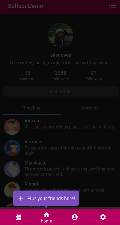
.setText("Edit your profile here!")
.setTextColorResource(R.color.white_87)
.setTextSize(15f)
.setIconDrawableResource(R.drawable.ic_edit)
.setArrowPositionRules(ArrowPositionRules.ALIGN_ANCHOR)
.setArrowSize(10)
.setArrowPosition(0.5f)
.setPadding(12)
.setCornerRadius(8f)
.setBackgroundColorResource(R.color.skyBlue)
.setBalloonAnimation(BalloonAnimation.ELASTIC)
.setLifecycleOwner(lifecycle)
.build()
```
### Create Balloon with Kotlin DSL
We can also create an instance of the Balloon with the Kotlin DSL.
Keep reading for more details
You can create an instance of the Balloon with `createBalloon` as the example below:
```kotlin
val balloon = createBalloon(context) {
setWidthRatio(1.0f)
setHeight(BalloonSizeSpec.WRAP)
setText("Edit your profile here!")
setTextColorResource(R.color.white_87)
setTextSize(15f)
setIconDrawableResource(R.drawable.ic_edit)
setArrowPositionRules(ArrowPositionRules.ALIGN_ANCHOR)
setArrowSize(10)
setArrowPosition(0.5f)
setPadding(12)
setCornerRadius(8f)
setBackgroundColorResource(R.color.skyBlue)
setBalloonAnimation(BalloonAnimation.ELASTIC)
setLifecycleOwner(lifecycle)
build()
}
```
### Create Balloon with Java
You can create an instance of the Balloon with Java by using the `Balloon.Builder` class.
Keep reading for more details
You can create an instance of the Balloon as the following example below:
```java
Balloon balloon = new Balloon.Builder(context)
.setArrowSize(10)
.setArrowOrientation(ArrowOrientation.TOP)
.setArrowPositionRules(ArrowPositionRules.ALIGN_ANCHOR)
.setArrowPosition(0.5f)
.setWidth(BalloonSizeSpec.WRAP)
.setHeight(65)
.setTextSize(15f)
.setCornerRadius(4f)
.setAlpha(0.9f)
.setText("You can access your profile from now on.")
.setTextColor(ContextCompat.getColor(context, R.color.white_93))
.setTextIsHtml(true)
.setIconDrawable(ContextCompat.getDrawable(context, R.drawable.ic_profile))
.setBackgroundColor(ContextCompat.getColor(context, R.color.colorPrimary))
.setOnBalloonClickListener(onBalloonClickListener)
.setBalloonAnimation(BalloonAnimation.FADE)
.setLifecycleOwner(lifecycleOwner)
.build();
```
### Show up Balloon
We can show up the Balloon using the functions below. If we use `showAlign__` method, we can show up the Balloon based on alignments (**top, bottom, right, left**). Also, we can adjust specific positions of the Balloon by using `x-Offset` and `y-Offset` parameters.
```kotlin
balloon.showAlignTop(anchor: View) // shows the balloon on an anchor view as the top alignment.
balloon.showAlignTop(anchor: View, xOff: Int, yOff: Int) // shows top alignment with x-off and y-off.
balloon.showAlignBottom(anchor: View) // shows the balloon on an anchor view as the bottom alignment.
balloon.showAlignBottom(anchor: View, xOff: Int, yOff: Int) // shows bottom alignment with x-off and y-off.
balloon.showAlignEnd(anchor: View) // shows the balloon on an anchor view as the end alignment.
balloon.showAlignEnd(anchor: View, xOff: Int, yOff: Int) // shows end alignment with x-off and y-off.
balloon.showAlignStart(anchor: View) // shows the balloon on an anchor view as the start alignment.
balloon.showAlignStart(anchor: View, xOff: Int, yOff: Int) // shows start alignment with x-off and y-off.
balloon.showAsDropDown(anchor: View) // shows the balloon as a dropdown without any alignments.
balloon.showAsDropDown(anchor: View, xOff: Int, yOff: Int) // shows no alignments with x-off and y-off.
balloon.showAtCenter(anchor: View, xOff: Int, yOff: Int, centerAlign: BalloonCenterAlign.TOP)
// shows the balloon over the anchor view (overlap) as the center aligns.
```
Also, We can show up the Balloon with Kotlin extensions.
```kotlin
myButton.showAlignTop(balloon)
```
### Dismiss Balloon
We can dismiss the Balloon by using the `Balloon.dismiss()` method.
```kotlin
balloon.dismiss()
balloon.dismissWithDelay(1000L) // dismisses 1000 milliseconds later when the popup is shown
```
We can dismiss automatically with delay after the Balloon is showing up with the `setAutoDismissDuration` method..
```kotlin
Balloon.Builder(context)
// dismisses automatically 1000 milliseconds later when the popup is shown.
.setAutoDismissDuration(1000L)
...
```
### Show up Balloon Sequentially
We can show up a couple of Balloons sequentially with the `relayShow__` and `await__` methods.
```kotlin
customListBalloon
.relayShowAlignBottom(customProfileBalloon, circleImageView) // relay to customListBalloon
.relayShowAlignTop(customTagBalloon, bottomNavigationView, 130, 0) // relay to customProfileBalloon
// show sequentially customListBalloon-customProfileBalloon-customTagBalloon
customListBalloon.showAlignBottom(anchorView)
```
```kotlin
coroutineScope.launch {
customListBalloon.awaitAlignBottom(anchorView)
customProfileBalloon.awaitAlignBottom(circleImageView, 0, 0)
customTagBalloon.awaitAlignTop(bottomNavigationView, 130, 0)
}
```
> Note: The `relayShow__` and `await__` methods overwrite the `setOnDismissListener` internally, so you can't use the `setOnDismissListener` at the same time.
#### Parallel Displaying
We can show multiple balloons at the same with sequential behaviour.
```kotlin
lifecycleScope.launch {
// shows balloons at the same time
awaitBalloons {
// dismissing of any balloon dismisses all of them. Default behaviour
dismissSequentially = false
textView.alignTop(balloonAlignTop)
textView.alignStart(balloonAlignStart)
textView.alignEnd(balloonAlignEnd)
textView.alignBottom(balloonAlignBottom)
}
// shows another group after dismissing the previous group.
awaitBalloons {
dismissSequentially = true // balloons dismissed individually
imageView.alignTop(balloonAlignTop)
imageView.alignStart(balloonAlignStart)
imageView.alignEnd(balloonAlignEnd)
imageView.alignBottom(balloonAlignBottom)
}
}
```
> Note: The methods inside `awaitBalloons` are `atCenter`, `asDropdown`, `alignTop` and etc. Don't confuse with `show__` and `await__` methods.
### Width and height
We can adjust specific width and height sizes of Balloon with the below builder methods. If we don't set any specific sizes of the width and height of the Balloon, the size of the Balloon will be decided by the content.
#### Specific size
We can set specific sizes of the Balloon regardless size of the contents.
```kotlin
balloon.setWidth(220) // sets 220dp width size.
balloon.setHeight(160) // sets 160dp height size.
```
#### Wrap Content Sizes
We can set dynamic sizes of Balloon, which depends on sizes of the internal content.
```kotlin
balloon.setWidth(BalloonSizeSpec.WRAP) // sets width size depending on the content's size.
balloon.setHeight(BalloonSizeSpec.WRAP) // sets height size depending on the content's size.
```
#### Depending on Screen Size
Also, we can set the width size depending on the ratio of the screen's size (horizontal).
```kotlin
balloon.setWidthRatio(0.5f) // sets width as 50% of the horizontal screen's size.
```
### Padding
Balloon wraps contents. We can adjust the content size of the Balloon by adding paddings on the content like.
```kotlin
balloon.setPadding(6) // sets 6dp padding to all directions (left-top-right-bottom)
balloon.setPaddingLeft(8) // sets 8dp padding to content's left.
balloon.setPaddingTop(12) // sets 12dp padding to content's top.
```
### Margin
If the location of the balloon according to the anchor would be located at the boundaries on the screen,
the balloon will be stick to the end of the screen. In this case, we can give horizontal margins to the balloon.
```kotlin
.setMargin(12) // sets the margin on the balloon all directions.
.setMarginLeft(14) // sets the left margin on the balloon.
.setMarginRight(14) // sets the right margin on the balloon.
```
### Arrow Composition
We can customize the arrow on the Balloon with various methods. For more details, check out the [Balloon.Builder](https://skydoves.github.io/libraries/balloon/html/balloon/com.skydoves.balloon/-balloon/-builder/index.html).
```kotlin
.setIsVisibleArrow(true) // sets the visibility of the arrow.
.setArrowSize(10) // sets the arrow size.
.setArrowSize(BalloonSizeSpec.WRAP) // sets arrow size depending on the original resources' size.
.setArrowPosition(0.8f) // sets the arrow position using the popup size's ratio (0 ~ 1.0)
.setArrowOrientation(ArrowOrientation.TOP) // sets the arrow orientation. top, bottom, left, right
.setArrowDrawable(ContextCompat.getDrawable(context, R.drawable.arrow)) // sets the arrow drawable.
```
#### ArrowPositionRules
We can decide the position of the arrow depending on the aligning rules with the `ArrowPositionRules`.
```kotlin
// Align the arrow position depending on an anchor.
// if `arrowPosition` is 0.5, the arrow will be located in the middle of an anchor.
.setArrowPositionRules(ArrowPositionRules.ALIGN_ANCHOR) // default
// Align the arrow position depending on the balloon popup body.
// if `arrowPosition` is 0.5, he arrow will be located in the middle of the tooltip.
.setArrowPositionRules(ArrowPositionRules.ALIGN_BALLOON)
```
#### ArrowOrientationRules
We can decide the orientation of the arrow depending on the aligning rules with the `ArrowOrientationRules`.
```kotlin
// Align depending on the position of an anchor.
// For example, `arrowOrientation` is ArrowOrientation.TOP and
// we want to show up the balloon under an anchor using the `Balloon.showAlignBottom`.
// However, if there is not enough free space to place the tooltip at the bottom of the anchor,
// tooltips will be placed top of the anchor and the orientation of the arrow will be `ArrowOrientation.BOTTOM`.
.setArrowOrientationRules(ArrowOrientationRules.ALIGN_ANCHOR) // default
// Align to fixed ArrowOrientation value.
.setArrowOrientationRules(ArrowOrientationRules.ALIGN_FIXED)
```
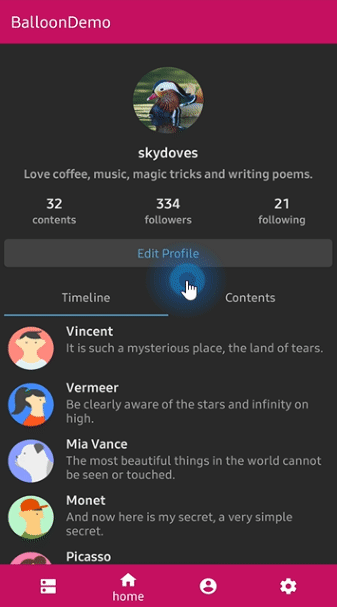
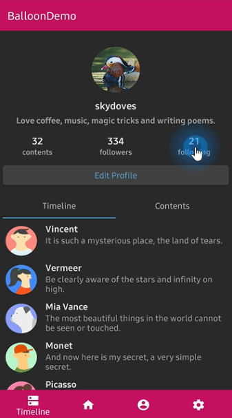
Below previews are shows examples of `setArrowOrientation` and `setArrowPosition` methods.
The `setArrowPosition` measures the Balloon's size and sets the arrow's position with the ratio value.
Orientation: BOTTOM
Position: 0.62
showAlignTop | Orientation: TOP
Position : 0.5
showAlignBottom | Orientation: START
Position: 0.5
showAlignStart | Orientation: END
Position: 0.5
showAlignEnd |
| :---------------: | :---------------: | :---------------: | :---------------: |
|  |
|  |
|  |
|  |
|
### Text Composition
We can customize the text on the Balloon.
```kotlin
.setText("You can edit your profile now!")
.setTextSize(15f)
.setTextTypeface(Typeface.BOLD)
.setTextColorResource(R.color.colorAccent))
.setTextGravity(Gravity.START)
```
If your text includes HTML tags, you can render the text by enabling HTML option with `setTextIsHtml` method.
```java
.setTextIsHtml(true)
```
This method will parse the text with the `Html.fromHtml(text)` internally.
### TextForm
`TextForm` has some attributes for `TextView` to customize the text of the Balloon. You can create the `TextForm` instance and reuse it on multiple Balloons.
```kotlin
val textForm = TextForm.Builder(context)
.setText("Edit you profile here!")
.setTextColorResource(R.color.white_87)
.setTextSize(14f)
.setTextTypeface(Typeface.BOLD)
.build()
val balloon = Balloon.Builder(context)
.setTextForm(textForm)
...
```
Create TextForm with Kotlin DSL
You can create an instance of the `TextForm` with Kotlin DSL as the example below:
```kotlin
val textForm = textForm(context) {
setText("Edit you profile here!")
setTextColorResource(R.color.white_87)
setTextSize(14f)
setTextTypeface(Typeface.BOLD)
}
val balloon = Balloon.Builder(context)
.setTextForm(textForm)
...
```
Create TextForm with Java
You can create an instance of the `TextForm` with Java as the example below:
```java
TextForm textForm = new TextForm.Builder(context)
.setText("Edit you profile here!")
.setTextColorResource(R.color.white_87)
.setTextSize(14f)
.setTextTypeface(Typeface.BOLD)
.build();
Balloon balloon = new Balloon.Builder(context)
.setTextForm(textForm)
...
```
### Icon Composition
We can customize the icon on the balloon.
```java
.setIconSpace(10) // sets right margin of the icon.
.setIconSize(20) // sets size of the icon.
.setIconDrawable(ContextCompat.getDrawable(context, R.drawable.ic_edit)) // sets a drawable resource.
```
### IconForm
`IconForm` has some attributes for `ImageView` to customize the icon of the Balloon. You can create the `IconForm` instance and reuse it on multiple Balloons.
```kotlin
val iconForm = IconForm.Builder(context)
.setDrawable(ContextCompat.getDrawable(context, R.drawable.arrow))
.setIconColor(ContextCompat.getColor(context, R.color.skyblue))
.setIconSize(20)
.setIconSize(12)
.build()
val balloon = Balloon.Builder(context)
.setIconForm(iconForm)
...
```
Create IconForm with Kotlin DSL
You can create an instance of the `IconForm` with Kotlin DSL as the example below:
```kotlin
val iconForm = iconForm(context) {
setDrawable(ContextCompat.getDrawable(context, R.drawable.arrow))
setIconColor(ContextCompat.getColor(context, R.color.skyblue))
setIconSize(20)
setIconSize(12)
}
val balloon = Balloon.Builder(context)
.setIconForm(iconForm)
...
```
Create IconForm with Java
You can create an instance of the `IconForm` with Java as the example below:
```java
IconForm iconForm = new IconForm.Builder(context)
.setDrawable(ContextCompat.getDrawable(context, R.drawable.arrow))
.setIconColor(ContextCompat.getColor(context, R.color.skyblue))
.setIconSize(20)
.setIconSize(12)
.build();
Balloon balloon = new Balloon.Builder(context)
.setIconForm(iconForm)
...
```
### OnBalloonClickListener, OnBalloonDismissListener, OnBalloonOutsideTouchListener
We can listen to if the Balloon is clicked, dismissed, and touched outside with the below listeners.
```kotlin
.setOnBalloonClickListener { Toast.makeText(context, "clicked", Toast.LENGTH_SHORT).show() }
.setOnBalloonDismissListener { Toast.makeText(context, "dismissed", Toast.LENGTH_SHORT).show() }
.setOnBalloonOutsideTouchListener { Toast.makeText(context, "touched outside", Toast.LENGTH_SHORT).show() }
```
Set Listeners with Java
You can set listeners with Java as the example below:
```java
balloon.setOnBalloonClickListener(new OnBalloonClickListener() {
@Override
public void onBalloonClick() {
// doSomething;
}
});
balloon.setOnBalloonDismissListener(new OnBalloonDismissListener() {
@Override
public void onBalloonDismiss() {
// doSomething;
}
});
balloon.setOnBalloonOutsideTouchListener(new OnBalloonOutsideTouchListener() {
@Override
public void onBalloonOutsideTouch() {
// doSomething;
}
});
```
### Custom Balloon Layout
You can fully customize the layout of the Balloon with the method below:
```kotlin
.setLayout(R.layout.my_balloon_layout)
```
You can build the Balloon with your own layout as the following example:
First, create your XML layout file like `layout_custom_profile` on your taste and set it on the with `setLayout` method.
```kotlin
val balloon = Balloon.Builder(context)
.setLayout(R.layout.layout_custom_profile)
.setArrowSize(10)
.setArrowOrientation(ArrowOrientation.TOP)
.setArrowPosition(0.5f)
.setWidthRatio(0.55f)
.setHeight(250)
.setCornerRadius(4f)
.setBackgroundColor(ContextCompat.getColor(this, R.color.black))
.setBalloonAnimation(BalloonAnimation.CIRCULAR)
.setLifecycleOwner(lifecycleOwner)
.build()
```
That's all. If you need to get Views or need some interactions, you can get your custom layout with the `getContentView()` method from your instance of the Balloon.
```kotlin
val button: Button =
balloon.getContentView().findViewById(R.id.button_edit)
button.setOnClickListener {
Toast.makeText(context, "Edit", Toast.LENGTH_SHORT).show()
balloon.dismiss()
}
```
### Persistence
If you want to show up the Balloon only once or a specific number of times, you can implement it as the following example:
```kotlin
balloon.setPreferenceName("MyBalloon") // sets preference name of the Balloon.
balloon.setShowCounts(3) // show-up three of times the popup. the default value is 1.
balloon.runIfReachedShowCounts {
// do something after the preference showing counts is reached the goal.
}
```
Also, you can clear all persisted preferences with the method below:
```kotlin
balloon.clearAllPreferences()
```
### Avoid Memory leak
Dialog, PopupWindow etc, can have memory leak issues if not dismissed before the activity or fragment is destroyed.
But Lifecycles are now integrated with the Support Library since Architecture Components 1.0 Stable was released.
So we can solve the memory leak issue very easily like the below.
Just use `setLifecycleOwner` method. Then the `dismiss()` method will be called automatically before your activity or fragment would be destroyed.
```kotlin
.setLifecycleOwner(lifecycleOwner)
```
### Lazy initialization
You can initialize a property of the Balloon lazily with the `balloon()` extension and `Balloon.Factory` abstract class.
The `balloon()` extension keyword can be used on your `Activity`, `Fragment`, and `View`.
__Before__
`CustomActivity.kt`
```kotlin
class CustomActivity : AppCompatActivity() {
private val profileBalloon by lazy { BalloonUtils.getProfileBalloon(context = this, lifecycleOwner = this) }
// ...
}
```
__After__
`CustomActivity.kt`
```kotlin
class CustomActivity : AppCompatActivity() {
private val profileBalloon by balloon()
// ...
}
```
We should create a class which extends `Balloon.Factory`.
An implementation class of the factory must have a default(non-argument) constructor.
`ProfileBalloonFactory.kt`
```kotlin
class ProfileBalloonFactory : Balloon.Factory() {
override fun create(context: Context, lifecycle: LifecycleOwner): Balloon {
return createBalloon(context) {
setLayout(R.layout.layout_custom_profile)
setArrowSize(10)
setArrowOrientation(ArrowOrientation.TOP)
setArrowPosition(0.5f)
setWidthRatio(0.55f)
setHeight(250)
setCornerRadius(4f)
setBackgroundColor(ContextCompat.getColor(context, R.color.background900))
setBalloonAnimation(BalloonAnimation.CIRCULAR)
setLifecycleOwner(lifecycle)
}
}
}
```
### BalloonOverlay
We can show up an overlay over the whole screen except an anchor view.
```kotlin
balloon.setIsVisibleOverlay(true) // sets the visibility of the overlay for highlighting an anchor.
balloon.setOverlayColorResource(R.color.overlay) // background color of the overlay using a color resource.
balloon.setOverlayPadding(6f) // sets a padding value of the overlay shape internally.
balloon.setOverlayPaddingColorResource(R.color.colorPrimary) // sets color of the overlay padding using a color resource.
balloon.setBalloonOverlayAnimation(BalloonOverlayAnimation.FADE) // default is fade.
balloon.setDismissWhenOverlayClicked(false) // disable dismissing the balloon when the overlay is clicked.
```
We can change the shape of the highlighting using the `.setOverlayShape` method.
```kotlin
balloon.setOverlayShape(BalloonOverlayOval) // default shape
balloon.setOverlayShape(BalloonOverlayRect)
balloon.setOverlayShape(BalloonOverlayCircle(radius = 36f))
balloon.setOverlayShape(BalloonOverlayRoundRect(12f, 12f))
```
OVAL | CIRCLE | RECT | ROUNDRECT |
| :---------------: | :---------------: | :---------------: | :---------------: |
|  |
|  |
|  |
|  |
|
Also, we can set the specific position of the overlay shape with the method below:
```kotlin
balloon.setOverlayPosition(Point(x, y)) // sets a specific position of the overlay shape.
```
### BalloonAnimation
We can implement popup animations while showing and dismissing.
```kotlin
BalloonAnimation.NONE
BalloonAnimation.FADE
BalloonAnimation.OVERSHOOT
BalloonAnimation.ELASTIC
BalloonAnimation.CIRCULAR
```
FADE | OVERSHOOT | ELASTIC | CIRCULAR |
| :---------------: | :---------------: | :---------------: | :---------------: |
|  |
|  |
|  |
|  |
|
### BalloonHighlightAnimation
We can give a repeated dynamic animations to the Balloon while it's showing up. The animation would work differently by the position of the arrow.
HEARTBEAT | SHAKE | BREATH | ROTATE |
| :---------------: | :---------------: | :---------------: | :---------------: |
|  |
|  |
|  |
|  |
|
```kotlin
BalloonHighlightAnimation.NONE
BalloonHighlightAnimation.HEARTBEAT
BalloonHighlightAnimation.SHAKE
BalloonHighlightAnimation.BREATH
BalloonHighlightAnimation.ROTATE
.setBalloonHighlightAnimation(BalloonHighlightAnimation.SHAKE)
```
We can implement the rotate animation like the example below:
```kotlin
.setBalloonHighlightAnimation(BalloonHighlightAnimation.ROTATE)
.setBalloonRotationAnimation(
BalloonRotateAnimation.Builder().setLoops(2).setSpeeds(2500).setTurns(INFINITE).build())
```
## Balloon builder methods
For more details, you can check out the documentations below:
- [Balloon documentations](https://skydoves.github.io/libraries/balloon/html/balloon/com.skydoves.balloon/-balloon/index.html)
- [Builder documentations](https://skydoves.github.io/libraries/balloon/html/balloon/com.skydoves.balloon/-balloon/-builder/index.html)
## Balloon in Jetpack Compose
Balloon allows you to display tooltips in Jetpack Compose easily.
[](https://search.maven.org/search?q=g:%22com.github.skydoves%22%20AND%20a:%22balloon%22)
Add the dependency below to your **module**'s `build.gradle` file:
```gradle
dependencies {
implementation("com.github.skydoves:balloon-compose:$version")
}
```
### Balloon Composable
You can create and display tooltips using the `Balloon` composable function along with the `rememberBalloonBuilder`, as demonstrated in the following example:
```kotlin
// create and remember a builder of Balloon.
val builder = rememberBalloonBuilder {
setArrowSize(10)
setArrowPosition(0.5f)
setArrowPositionRules(ArrowPositionRules.ALIGN_ANCHOR)
setWidth(BalloonSizeSpec.WRAP)
setHeight(BalloonSizeSpec.WRAP)
setPadding(12)
setMarginHorizontal(12)
setCornerRadius(8f)
setBackgroundColorResource(R.color.skyBlue)
setBalloonAnimation(BalloonAnimation.ELASTIC)
}
Balloon(
modifier = Modifier.align(Alignment.Center),
builder = builder,
balloonContent = {
Text(text = "Now you can edit your profile!")
}
) { balloonWindow ->
Button(
modifier = Modifier.size(120.dp, 75.dp),
onClick = {
balloonWindow.showAlignTop() // display your balloon.
}
) {
Text(text = "showAlignTop")
}
}
```
### BalloonWindow
`BalloonWindow` is an interface defining all executable behaviors for a balloon's window, including showing, dismissing, updating, and setting up listeners. You can obtain an instance of `BalloonWindow` within the `content` parameter of the `Balloon` composable function, as illustrated in the example below:
```kotlin
Balloon(
..
) { balloonWindow ->
Button(
modifier = Modifier.size(120.dp, 75.dp),
onClick = {
balloonWindow.showAtCenter() // display your balloon.
}
) {
Text(text = "showAtCenter")
}
}
Balloon(
builder = builder,
balloonContent = null
) { balloonWindow ->
..
}
```
You can also acquire the `BalloonWindow` by utilizing the `onBalloonWindowInitialized` lambda parameter in the `Balloon` composable. This parameter will be invoked just once when the `BalloonWindow` is fully prepared and ready for use:
```kotlin
var balloonWindow: BalloonWindow? by remember { mutableStateOf(null) }
Balloon(
builder = builder,
onBalloonWindowInitialized = { balloonWindow = it },
balloonContent = {
Text(text = "Now you can edit your profile!")
},
) {
Button(
modifier = Modifier.size(160.dp, 60.dp),
onClick = { balloonWindow?.showAlignTop() },
) {
Text(text = "showAlignTop")
}
}
```
The `onBalloonWindowInitialized` lambda paramter is useful when you need to hold an instance of the `BalloonWindow` as a state, and utilize it out of the `Balloon` composable function.
### Auto-Display Balloon on Layout Ready
To automatically show a Balloon when your layout is drawn, a common requirement in numerous applications, you can use the `onComposedAnchor` parameter within the `Balloon` composable function.
```kotlin
var balloonWindow: BalloonWindow? by remember { mutableStateOf(null) }
Balloon(
builder = builder,
onBalloonWindowInitialized = { balloonWindow = it },
onComposedAnchor = { balloonWindow?.showAlignTop() },
balloonContent = {
Text(text = "Now you can edit your profile!")
},
) {
Button(
modifier = Modifier.size(160.dp, 60.dp),
onClick = { balloonWindow?.showAlignTop() },
) {
Text(text = "showAlignTop")
}
}
```
As you can see in the example above, you can use `onComposedAnchor` with the `onBalloonWindowInitialized` lambda to obtain the `BalloonWindow` and display your balloon sequentially after rendering your composable layout.
### Compose Extensions
The `balloon-compose` package provides useful compose extensions, such as setting a color with `androidx.compose.ui.graphics.Color` like the below:
```kotlin
val builder = rememberBalloonBuilder {
setText("Now you can edit your profile!")
setArrowSize(10)
setWidthRatio(1.0f)
setHeight(BalloonSizeSpec.WRAP)
setArrowOrientation(ArrowOrientation.BOTTOM)
setArrowPosition(0.5f)
setPadding(12)
setMarginHorizontal(12)
setTextSize(15f)
setCornerRadius(8f)
setTextColor(Color.White) // set text color with compose color.
setBackgroundColor(Color.White) // set background color with compose color.
setIconDrawableResource(R.drawable.ic_edit)
}
```
> **Note**: If you want to use the default form of balloon (icon + text), you should pass a null value to the `balloonContent` parameter of your Balloon composable.
## Find this library useful? :heart:
Support it by joining __[stargazers](https://github.com/skydoves/balloon/stargazers)__ for this repository. :star:
Also, __[follow me](https://github.com/skydoves)__ on GitHub for my next creations! 🤩
# License
```xml
Copyright 2019 skydoves (Jaewoong Eum)
Licensed under the Apache License, Version 2.0 (the "License");
you may not use this file except in compliance with the License.
You may obtain a copy of the License at
http://www.apache.org/licenses/LICENSE-2.0
Unless required by applicable law or agreed to in writing, software
distributed under the License is distributed on an "AS IS" BASIS,
WITHOUT WARRANTIES OR CONDITIONS OF ANY KIND, either express or implied.
See the License for the specific language governing permissions and
limitations under the License.
```