Ecosyste.ms: Awesome
An open API service indexing awesome lists of open source software.
https://github.com/FuYaoDe/react-native-app-intro
react-native-app-intro is a react native component implementing a parallax effect welcome page using base on react-native-swiper , similar to the one found in Google's app like Sheet, Drive, Docs...
https://github.com/FuYaoDe/react-native-app-intro
android intro introduction ios parallax react-native
Last synced: 2 months ago
JSON representation
react-native-app-intro is a react native component implementing a parallax effect welcome page using base on react-native-swiper , similar to the one found in Google's app like Sheet, Drive, Docs...
- Host: GitHub
- URL: https://github.com/FuYaoDe/react-native-app-intro
- Owner: FuYaoDe
- License: mit
- Created: 2016-04-26T08:49:57.000Z (about 8 years ago)
- Default Branch: master
- Last Pushed: 2021-11-02T02:35:55.000Z (over 2 years ago)
- Last Synced: 2024-01-06T20:27:52.397Z (6 months ago)
- Topics: android, intro, introduction, ios, parallax, react-native
- Language: JavaScript
- Homepage:
- Size: 10.2 MB
- Stars: 3,244
- Watchers: 54
- Forks: 524
- Open Issues: 82
-
Metadata Files:
- Readme: README.md
- License: LICENSE
Lists
- awesome-react-native - react-native-app-intro ★2433 - A React Native parallax effect app intro (Components / UI)
- awesome-react-native - react-native-app-intro ★2433 - A React Native parallax effect app intro (Components / UI)
- awesome-reactnative-ui - react-native-app-intro - native-app-intro is a react native component implementing a parallax effect welcome page using base on react-native-swiper , similar to the one found in Google's app like Sheet, Drive, Docs...|<ul><li>Last updated : This week</li><li>Stars : 2617</li><li>Open issues : 87</li></ul>|| (Others)
- awesome-stars - react-native-app-intro - react-native-app-intro is a react native component implementing a parallax effect welcome page using base on react-native-swiper , similar to the one found in Google's app like Sheet, Drive, Docs... (JavaScript)
- awesome - react-native-app-intro ★2433 - A React Native parallax effect app intro (Components / UI)
- awesome-react-native - react-native-app-intro ★1680 - A React Native parallax effect app intro (Components / UI)
- awesome-reactnative-ui - react-native-app-intro - native-app-intro is a react native component implementing a parallax effect welcome page using base on react-native-swiper , similar to the one found in Google's app like Sheet, Drive, Docs...|<ul><li>Last updated : This week</li><li>Stars : 2617</li><li>Open issues : 87</li></ul>|| (Others)
- awesome-react-native - react-native-app-intro
- awesome-react-native - react-native-app-intro ★1680 - A React Native parallax effect app intro (Components / UI)
- awesome-react-native - react-native-app-intro ★2433 - A React Native parallax effect app intro (Components / UI)
- awesome-react-native-ui - react-native-app-intro ★886 - A React Native parallax effect app intro (Components / UI)
- awesome-react-native - react-native-app-intro ★237 - A React Native parallax effect app intro (Components / UI)
- awesome-react-native - react-native-app-intro ★2433 - A React Native parallax effect app intro (Components / UI)
- awesome-react-native - react-native-app-intro ★2433 - A React Native parallax effect app intro (Components / UI)
README
# react-native-app-intro
react-native-app-intro is a react native component implementing a parallax effect welcome page using base on [react-native-swiper](https://github.com/leecade/react-native-swiper) , similar to the one found in Google's app like Sheet, Drive, Docs...
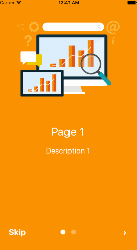
# react-native-app-intro Screen Capture
[Example code](https://github.com/FuYaoDe/react-native-app-intro/tree/master/Example)
### Support ios、android


### Installation
```bash
$ npm i react-native-app-intro --save
```
### Basic Usage
You can use pageArray quick generation your app intro with parallax effect. With the basic usage, the Android status bar will be updated to match your slide background color.

```javascript
import React, { Component } from 'react';
import { AppRegistry, Alert } from 'react-native';
import AppIntro from 'react-native-app-intro';
class Example extends Component {
onSkipBtnHandle = (index) => {
Alert.alert('Skip');
console.log(index);
}
doneBtnHandle = () => {
Alert.alert('Done');
}
nextBtnHandle = (index) => {
Alert.alert('Next');
console.log(index);
}
onSlideChangeHandle = (index, total) => {
console.log(index, total);
}
render() {
const pageArray = [{
title: 'Page 1',
description: 'Description 1',
img: 'https://goo.gl/Bnc3XP',
imgStyle: {
height: 80 * 2.5,
width: 109 * 2.5,
},
backgroundColor: '#fa931d',
fontColor: '#fff',
level: 10,
}, {
title: 'Page 2',
description: 'Description 2',
img: require('../assets/some_image.png'),
imgStyle: {
height: 93 * 2.5,
width: 103 * 2.5,
},
backgroundColor: '#a4b602',
fontColor: '#fff',
level: 10,
}];
return (
);
}
}
AppRegistry.registerComponent('Example', () => Example);
```
### Advanced Usage
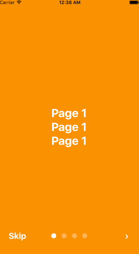
If you need customized page like my Example, you can pass in `View` component into AppIntro component and set level. Remember any need use parallax effect component, Need to be `` inside.
```javascript
import React, { Component } from 'react';
import {
AppRegistry,
StyleSheet,
Text,
View,
} from 'react-native';
import AppIntro from 'react-native-app-intro';
const styles = StyleSheet.create({
slide: {
flex: 1,
justifyContent: 'center',
alignItems: 'center',
backgroundColor: '#9DD6EB',
padding: 15,
},
text: {
color: '#fff',
fontSize: 30,
fontWeight: 'bold',
},
});
class Example extends Component {
render() {
return (
Page 1
Page 1
Page 1
Page 2
Page 2
Page 2
Page 3
Page 3
Page 3
Page 4
Page 4
Page 4
);
}
}
AppRegistry.registerComponent('Example', () => Example);
```
And in Android, image inside view component, view need width、height.
```javascript
```
## **Properties**
| Prop | PropType | Default Value | Description |
|----------------|----------|-------------------------|------------------------------------------------------------------------------------------------------------------------------------------------------------------------------------------------------------------------------------------------------------------------------------------------------------------------------------------------------------------|
| dotColor | string | 'rgba(255,255,255,0.3)' | Bottom of the page dot color |
| activeDotColor | string | '#fff' | Active page index dot color |
| rightTextColor | string | '#fff' | The bottom right Text `Done、>` color |
| leftTextColor | string | '#fff' | The bottom left Text `Skip` color |
| onSlideChange | (index, total) => {} | | function to call when the pages change |
| onSkipBtnClick | (index) => {} | | function to call when the Skip button click |
| onDoneBtnClick | func | | function to call when the Done button click |
| onNextBtnClick | (index) => {} | | function to call when the Next '>' button click |
| doneBtnLabel | string、Text element | Done | The bottom right custom Text label |
| skipBtnLabel | string、Text element | Skip | The bottom left custom Text label |
| nextBtnLabel | string、Text element | › | The bottom left custom Text label |
| pageArray | array | | In the basic usage, you can input object array to render basic view example: ```[[{title: 'Page 1', description: 'Description 1', img: 'https://goo.gl/uwzs0C', imgStyle: {height: 80 * 2.5, width: 109 * 2.5 }, backgroundColor: '#fa931d', fontColor: '#fff', level: 10 }]``` , level is parallax effect level ,if you use pageArray you can't use custom view |
| defaultIndex | number | 0 | number of the index of the initial index |
| showSkipButton | bool | true | a boolean defining if we should render the skip button |
| showDoneButton | bool | true | a boolean that defines if we should render the done button |
| showDots | bool | true | a boolean that defines if we should render the bottom dots |
##### **Children View Properties**
| Prop | PropType | Default Value | Description |
|-------|----------|---------------|-----------------------|
| level | number | | parallax effect level |