Ecosyste.ms: Awesome
An open API service indexing awesome lists of open source software.
https://github.com/APSL/react-native-button
A React Native button component customizable via props
https://github.com/APSL/react-native-button
button react react-native
Last synced: 2 months ago
JSON representation
A React Native button component customizable via props
- Host: GitHub
- URL: https://github.com/APSL/react-native-button
- Owner: APSL
- License: mit
- Created: 2015-08-27T15:28:01.000Z (almost 9 years ago)
- Default Branch: master
- Last Pushed: 2022-12-03T15:36:22.000Z (over 1 year ago)
- Last Synced: 2024-04-15T00:26:48.673Z (2 months ago)
- Topics: button, react, react-native
- Language: JavaScript
- Homepage:
- Size: 942 KB
- Stars: 751
- Watchers: 24
- Forks: 129
- Open Issues: 32
-
Metadata Files:
- Readme: README.md
- License: LICENSE
Lists
- awesome-react-native - apsl-react-native-button ★653 - React Native button component with rounded corners. (Components / UI)
- awesome-reactnative-ui - react-native-button - native-button/button.png)| (Others)
- awesome - apsl-react-native-button ★653 - React Native button component with rounded corners. (Components / UI)
- awesome-react-native - apsl-react-native-button ★653 - React Native button component with rounded corners. (Components / UI)
- awesome-react-native-master - apsl-react-native-button ★120 - React Native button component with rounded corners. (Components / UI)
- awesome-react-native - apsl-react-native-button ★538 - React Native button component with rounded corners. (Components / UI)
- awesome-reactnative-ui - react-native-button - native-button/button.png)| (Others)
- awesome-react-native - apsl-react-native-button - React Native button component with rounded corners.  (Components / Button)
- awesome-react-native - APSL/react-native-button
- awesome-react-native - apsl-react-native-button ★538 - React Native button component with rounded corners. (Components / UI)
- awesome-react-native - apsl-react-native-button ★653 - React Native button component with rounded corners. (Components / UI)
- awesome-react-native-ui - apsl-react-native-button ★372 - React Native button component with rounded corners. (Components / UI)
- awesome-react-native - apsl-react-native-button ★173 - React Native button component with rounded corners. (Components / UI)
- awesome-react-native - apsl-react-native-button ★653 - React Native button component with rounded corners. (Components / UI)
- awesome-react-native - apsl-react-native-button ★653 - React Native button component with rounded corners. (Components / UI)
README
# apsl-react-native-button


A React Native button component customizable via ``style`` props.
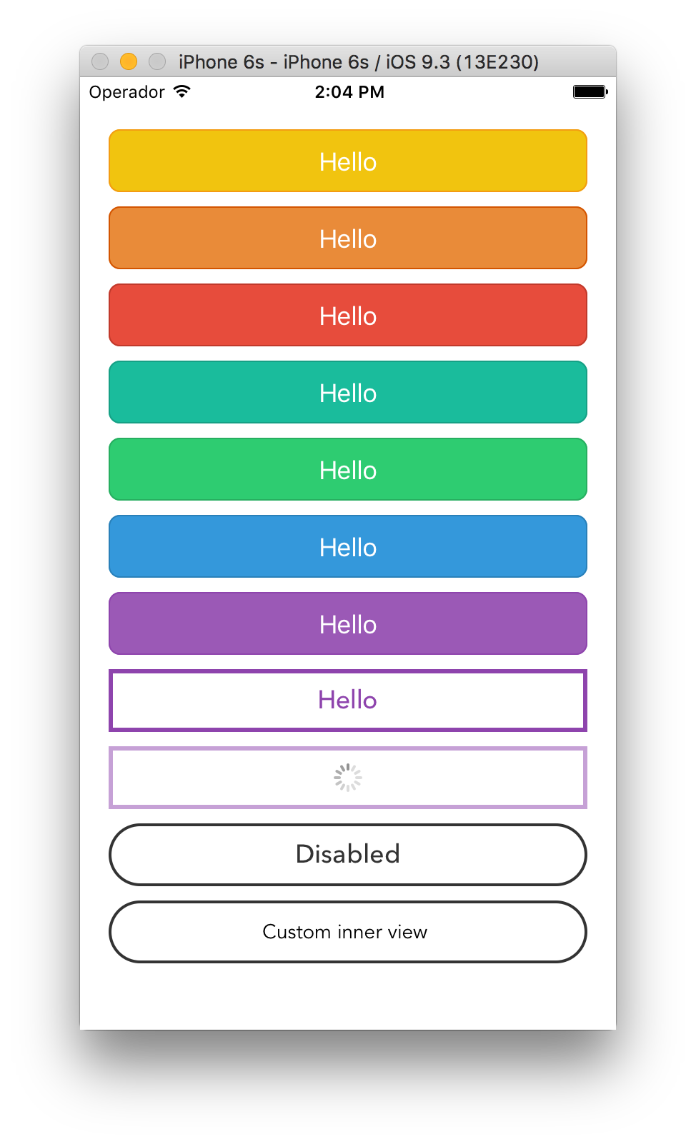
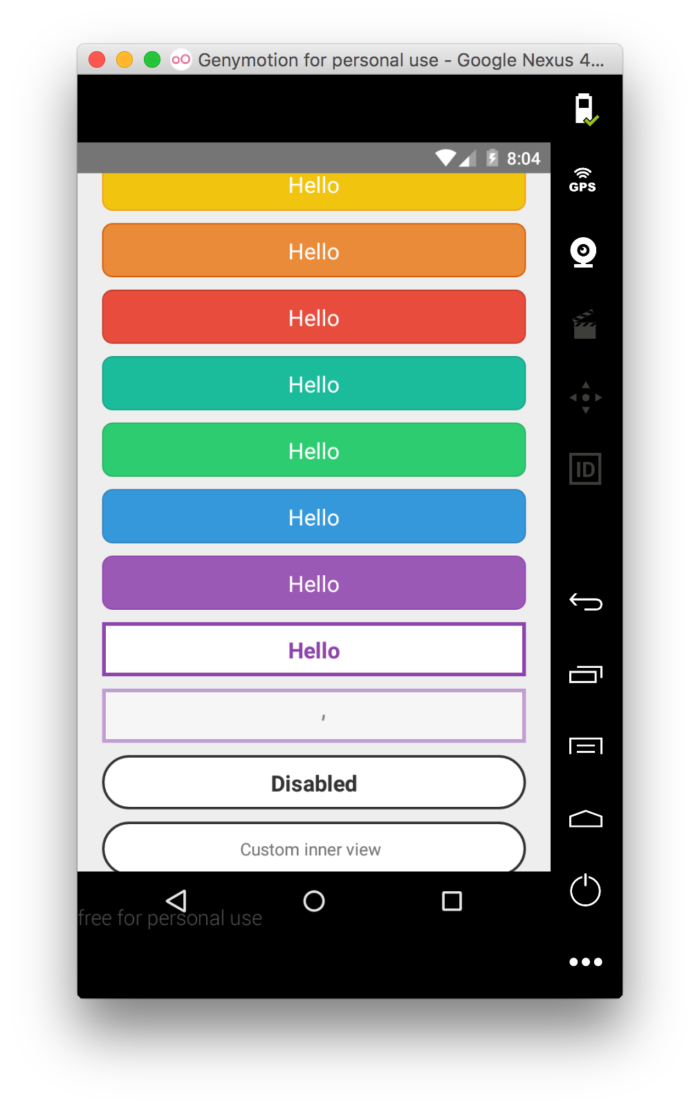
Renders a ``TouchableOpacity`` under iOS and a ``TouchableNativeFeedback`` under Android.
## Install
`apsl-react-native-button>=2.6.0` needs React Native 0.28 or higher.
`apsl-react-native-button>=2.5.0` needs React Native 0.25 or higher.
`apsl-react-native-button<=2.4.2` needs React Native 0.16 or higher.
Install the package:
```bash
$ npm i apsl-react-native-button --save
```
Import the ``Button`` component:
```javascript
import Button from 'apsl-react-native-button'
```
## Usage
Provide ``TouchableWithoutFeedback``' props to the component (including ``style``),
``textStyle``'s ``StyleSheet`` to customize the inner text and a children node
to render. You can also provide the ``isLoading`` prop that will dim the button
and disable it to prevent accidental taps.
```javascript
Hello!
```
You can also provide a `` element with nested children that are not strings
or `` elements as long as they are valid React elements or numbers. This helps
if your project is using another library that provides easy icon integration
utilizing the `` tag, for instance, as well as various other cases where you are
creating visually complex buttons. You may omit the `textStyle` property and apply
your own styles to your child elements as you see fit. Multiple children are allowed.
```javascript
Nested views!
```
## API
| Prop | Type | Description |
|------|------|-------------|
| ``onPress`` | ``func`` | Function to execute when the ``onPress`` event is triggered. |
| ``onPressIn`` | ``func`` | Function to execute when the ``onPressIn`` event is triggered. |
| ``onPressOut`` | ``func`` | Function to execute when the ``onPressOut`` event is triggered. |
| ``onLongPress`` | ``func`` | Function to execute when the ``onLongPress`` event is triggered. |
| ``textStyle`` | ``TextStylePropTypes`` | The StyleSheet to apply to the inner button text. |
| ``disabledStyle`` | ``TextStylePropTypes`` | The StyleSheet to apply when disabled. |
| ``children`` | ``string``, ``number``, ``React.Element``,or ``array`` | The child nodes to render inside the button. If child is ``string`` or ``number``, it will be rendered inside of a ```` element with ``textStyle`` applied if present. Multiple children are allowed (``array``).|
| ``isLoading`` | ``bool`` | Renders an inactive state dimmed button with a spinner if ``true``. |
| ``isDisabled`` | ``bool`` | Renders an inactive state dimmed button if ``true``. |
| ``activeOpacity`` | ``Number`` | The button onpressing transparency (Usually with a point value between 0 and 1). |
| ``activityIndicatorColor`` | ``string`` | Sets the button of the ``ActivityIndicatorIOS`` or ``ProgressBarAndroid`` in the loading state. |
| ``background`` | ``TouchableNativeFeedback.propTypes.background`` | **Android only**. The background prop of ``TouchableNativeFeedback``. |
Check the included example for more options.
## Similar projects
[James Ide](https://github.com/ide/)'s ``react-native-button`` https://github.com/ide/react-native-button/
## License
MIT.