Ecosyste.ms: Awesome
An open API service indexing awesome lists of open source software.
https://github.com/alinz/react-native-dropdown
This is simple implementation of drop down menu
https://github.com/alinz/react-native-dropdown
Last synced: about 1 month ago
JSON representation
This is simple implementation of drop down menu
- Host: GitHub
- URL: https://github.com/alinz/react-native-dropdown
- Owner: alinz
- License: mit
- Created: 2015-08-10T15:23:48.000Z (almost 9 years ago)
- Default Branch: master
- Last Pushed: 2020-04-12T16:53:02.000Z (about 4 years ago)
- Last Synced: 2024-03-25T21:44:06.598Z (2 months ago)
- Language: JavaScript
- Size: 250 KB
- Stars: 657
- Watchers: 16
- Forks: 162
- Open Issues: 5
-
Metadata Files:
- Readme: README.md
- License: LICENSE
Lists
- awesome-react-native - react-native-dropdown ★507 - A better Select dropdown menu for react-native (Components / UI)
- awesome-reactnative-ui - react-native-dropdown
- awesome-react-native - react-native-dropdown ★507 - A better Select dropdown menu for react-native (Components / UI)
- awesome - react-native-dropdown ★507 - A better Select dropdown menu for react-native (Components / UI)
- awesome-react-native - react-native-dropdown ★507 - A better Select dropdown menu for react-native (Components / UI)
- awesome-react-native-master - react-native-dropdown ★114 - A better Select dropdown menu for react-native (Components / UI)
- awesome-react-native - react-native-dropdown ★404 - A better Select dropdown menu for react-native (Components / UI)
- awesome-reactnative-ui - react-native-dropdown
- awesome-react-native - react-native-dropdown
- awesome-react-native - react-native-dropdown ★507 - A better Select dropdown menu for react-native (Components / UI)
- awesome-react-native - react-native-dropdown ★404 - A better Select dropdown menu for react-native (Components / UI)
- awesome-react-native - react-native-dropdown ★507 - A better Select dropdown menu for react-native (Components / UI)
- awesome-react-native-ui - react-native-dropdown ★283 - A better Select dropdown menu for react-native (Components / UI)
- awesome-react-native - react-native-dropdown ★150 - A better Select dropdown menu for react-native (Components / UI)
README
# React Native Dropdown
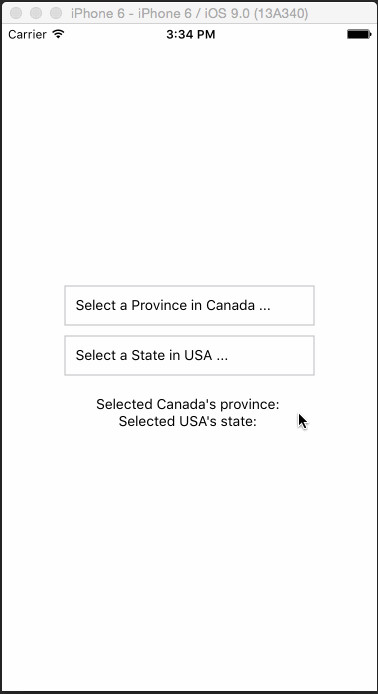
Simple DropDown menu for React Native App!
## Introduction
React Native Dropdown is simple, customizable and easy to use dropdown in React Native. Works with both Android and IOS.
## Installation
```
npm i react-native-dropdown --save
```
## Usage
Require it inside your Javascript files. Also supporting components using object-deconstructing.
```Select``` ```Option``` ```OptionList```, Also a positioning utility method ```updatePosition```.
updatePosition should be called in ```componentDidMount``` with refs to the `````` component and ``````.
This calculates component's PositionX and PositionY and sets it back into the component. The component uses it to position the `````` using this co-ordinates.
## Example
```js
var React = require('react-native');
var {
Component,
AppRegistry,
Text,
View,
} = React;
const DropDown = require('react-native-dropdown');
const {
Select,
Option,
OptionList,
updatePosition
} = DropDown;
class App extends Component {
constructor(props) {
super(props);
this.state = {
canada: ''
};
}
componentDidMount() {
updatePosition(this.refs['SELECT1']);
updatePosition(this.refs['OPTIONLIST']);
}
_getOptionList() {
return this.refs['OPTIONLIST'];
}
_canada(province) {
this.setState({
...this.state,
canada: province
});
}
render() {
return (
Alberta
British Columbia
Manitoba
New Brunswick
Newfoundland and Labrador
Northwest Territories
Nova Scotia
Nunavut
Ontario
Prince Edward Island
Quebec
Saskatchewan
Yukon
Selected province of Canada: {this.state.canada}
);
}
}
AppRegistry.registerComponent('App', () => App);
```
For complete implementation checkout example folder.
### Configuration
##### Select:
| Property | Type | Default | Description |
|---------------|----------|--------------|----------------------------------------------------------------|
| width | number | 400 | Width of the selection |
| height | number | 50 | Height of the selection |
| optionListRef | function | required | Reference to `````` to display the selection menu |
| style | object | null | Custom styles to be applied if supplied |
| defaultValue | string | first option | The value to be displayed if none of the options are selected. |
##### Option:
| Property | Type | Default | Description |
|-----------|--------|---------|--------------------------------------------|
| style | object | null | Styles to be applied on 'Option' component |
| styleText | object | null | Styles to be applied on text inside of 'Option' |
## Demo