Ecosyste.ms: Awesome
An open API service indexing awesome lists of open source software.
https://github.com/ArnaudRinquin/react-native-radio-buttons
[DEPRECATED] A Radio-button like logic wrapper for React Native
https://github.com/ArnaudRinquin/react-native-radio-buttons
radio-buttons react-native
Last synced: about 1 month ago
JSON representation
[DEPRECATED] A Radio-button like logic wrapper for React Native
- Host: GitHub
- URL: https://github.com/ArnaudRinquin/react-native-radio-buttons
- Owner: ArnaudRinquin
- License: mit
- Created: 2015-07-29T14:35:27.000Z (almost 9 years ago)
- Default Branch: master
- Last Pushed: 2018-04-19T07:09:56.000Z (about 6 years ago)
- Last Synced: 2024-04-14T09:07:24.913Z (about 2 months ago)
- Topics: radio-buttons, react-native
- Language: JavaScript
- Homepage: https://www.npmjs.com/package/react-native-radio-buttons
- Size: 53 MB
- Stars: 416
- Watchers: 11
- Forks: 98
- Open Issues: 18
-
Metadata Files:
- Readme: README.md
Lists
- awesome-react-native - react-native-radio-buttons ★399 - A react component to implement custom radio buttons-like behaviors: multiple options, only on can be selected at once. (Components / UI)
- awesome-reactnative-ui - react-native-radio-buttons - button like logic wrapper for React Native|<ul><li>Last updated : This week</li><li>Stars : 404</li><li>Open issues : 17</li></ul>|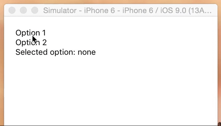| (Others)
- awesome-react-native - react-native-radio-buttons ★399 - A react component to implement custom radio buttons-like behaviors: multiple options, only on can be selected at once. (Components / UI)
- awesome-react-native - react-native-radio-buttons ★399 - A react component to implement custom radio buttons-like behaviors: multiple options, only on can be selected at once. (Components / UI)
- awesome - react-native-radio-buttons ★399 - A react component to implement custom radio buttons-like behaviors: multiple options, only on can be selected at once. (Components / UI)
- awesome-react-native-master - react-native-radio-buttons ★63 - A react component to implement custom radio buttons-like behaviors: multiple options, only on can be selected at once. (Components / UI)
- awesome-react-native - react-native-radio-buttons ★343 - A react component to implement custom radio buttons-like behaviors: multiple options, only on can be selected at once. (Components / UI)
- awesome-reactnative-ui - react-native-radio-buttons - button like logic wrapper for React Native|<ul><li>Last updated : This week</li><li>Stars : 404</li><li>Open issues : 17</li></ul>|| (Others)
- awesome-react-native - react-native-radio-buttons ★343 - A react component to implement custom radio buttons-like behaviors: multiple options, only on can be selected at once. (Components / UI)
- awesome-react-native - react-native-radio-buttons ★399 - A react component to implement custom radio buttons-like behaviors: multiple options, only on can be selected at once. (Components / UI)
- awesome-react-native - react-native-radio-buttons ★399 - A react component to implement custom radio buttons-like behaviors: multiple options, only on can be selected at once. (Components / UI)
- awesome-react-native-ui - react-native-radio-buttons ★214 - A react component to implement custom radio buttons-like behaviors: multiple options, only on can be selected at once. (Components / UI)
- awesome-react-native - react-native-radio-buttons ★90 - A react component to implement custom radio buttons-like behaviors: multiple options, only on can be selected at once. (Components / UI)
README
# react-native-radio-buttons
*IMPORTANT* this package is deprecated and no longer maintained in favor of the official [SegmentedControlIOS](https://facebook.github.io/react-native/docs/segmentedcontrolios.html) component.
A react component to implement _radio buttons_-like behaviors: multiple options, only one option can be selected at a given time.
Both the container and option nodes are customizable. Comes with SegmentedControls clone, only more customizable (see below, animations to come).

## Install
```sh
npm i -S react-native-radio-buttons
```
## Demo app
```sh
git clone https://github.com/ArnaudRinquin/react-native-radio-buttons.git
cd react-native-radio-buttons
npm run demo
```
## Usage
Here is an extensive overview of the component usage.
```jsx
import { RadioButtons } from 'react-native-radio-buttons'
// ...
render() {
const options = [
"Option 1",
"Option 2"
];
function setSelectedOption(selectedOption){
this.setState({
selectedOption
});
}
function renderOption(option, selected, onSelect, index){
const style = selected ? { fontWeight: 'bold'} : {};
return (
{option}
);
}
function renderContainer(optionNodes){
return {optionNodes};
}
return (
Selected option: {this.state.selectedOption || 'none'}
);
}
```
Will render this

## Props
* `options - []` mandatory array of anything, will be passed to `renderOption`
* `onSelection - function(selectedOption, selectedIndex){}` option selection callback
* `selectedIndex - index` the initially selected index, optional.
* `selectedOption - option` the initially selected option, optional
* `renderOption - function(option, selected, onSelect, index)` should return an option node, default generate `` nodes and adds `{fontWeight:'bold'}` to the selected option.
* `renderContainer - function(optionsNodes)` must render the container, default is RadioButtons.renderVerticalContainer (see below)
* `optionStyle` - optional styles to be applied to the `` elements of the options themselves.
* `optionContainerStyle` - optional styles to be applied to the the `` that contain the options.
* `testOptionEqual- function(selectedOption, currentOption){}` optional compares and returns bool.
### Full JavaScript SegmentedControls clone
This library comes with a clone of the native `SegmentedControls`, based on `RadioButtons`.
```jsx
import { SegmentedControls } from 'react-native-radio-buttons'
// ...
```
You override all the defaults through the props.
```jsx
```
Here is the list of the props you might override:
```jsx
const IOS_BLUE = '#007AFF';
const IOS_WHITE = '#ffffff';
const DEFAULTS = {
direction: 'row',
tint: IOS_BLUE,
backTint: IOS_WHITE,
paddingTop: 5,
paddingBottom: 5,
textAlign: 'center',
selectedTint: IOS_WHITE,
selectedBackgroundColor: IOS_WHITE,
separatorTint: IOS_BLUE,
separatorWidth: 1,
containerBorderTint: IOS_BLUE,
containerBorderWidth: 1,
containerBorderRadius: 5,
}
```
You can also specify `containerStyle`, `optionContainerStyle`, and `optionStyle` to use any style you want:
* `containerStyle` - optional styles to be applied to the outermost `` component.
* `optionStyle` - optional styles to be applied to the `` elements of the options themselves.
* `optionContainerStyle` - optional styles to be applied to the the `` that contain the options.
You can also specify how to extract the labels from the options through the extractText prop.
```jsx
options = [
{
label: 'Option 1',
value: 'opt1'
},
{
label: 'Option 2',
value: 'opt2'
}
]
option.label }
/>
```
If you decide to declare `options` as an array of objects, do also include a `testOptionEqual` prop for customized equality checking, otherwise changing `selectedOption` programmatically would not update the UI correctly.
With the above `options`, you'll need `testOptionEqual` to be as follows in order for `selectedOption` to display correctly.
```jsx
option.label }
testOptionEqual={(selectedValue, option) => selectedValue === option.value}
/>
```
Moreover, you can even specify the whole `renderOption()` function:
```jsx
{
return (
// ...render stuff
)
}}
}}
```
## Helpers
**RadioButtons.renderVerticalContainer;**
A super simple `renderContainer` function that generates a with `{flexDirection: "column"}`. It is used as default `renderContainer` if you don't specify it.
Usage:
```jsx
```
**RadioButtons.renderHorizontalContainer;**
Another super simple `renderContainer` function that generates a with `{flexDirection: "row"}`
Usage:
```jsx
```
**RadioButtons.getViewContainerRenderer(viewContainerStyle);**
An helper that generates a simple `` with the provided style.
Usage:
```jsx
```
**RadioButtons.getTextOptionRenderer(normalStyle, selectedStyle, extractText);**
An helper that generates `` options wrapped in ``.
`normalStyle` and `selectedStyle` will be applied to the nodes, depending on state. `extractText(options)` can be specified.
Usage:
```jsx
const normalStyle = {
color: 'white'
};
const selectedStyle = {
color: '#f80046',
fontWeight: 'bold'
};
const extractText = (option) => option.label;
```