Ecosyste.ms: Awesome
An open API service indexing awesome lists of open source software.
https://github.com/rcaferati/react-native-really-awesome-button
React Native button component. Awesome Button is a 3D at 60fps, progress enabled, social ready, extendable, production ready component that renders an awesome animated set of UI buttons. 📱
https://github.com/rcaferati/react-native-really-awesome-button
List: react-native-really-awesome-button
animated button component progress react react-native share social
Last synced: 4 days ago
JSON representation
React Native button component. Awesome Button is a 3D at 60fps, progress enabled, social ready, extendable, production ready component that renders an awesome animated set of UI buttons. 📱
- Host: GitHub
- URL: https://github.com/rcaferati/react-native-really-awesome-button
- Owner: rcaferati
- License: mit
- Created: 2018-03-02T23:11:39.000Z (over 6 years ago)
- Default Branch: master
- Last Pushed: 2023-08-18T13:40:29.000Z (about 1 year ago)
- Last Synced: 2024-05-18T19:45:33.119Z (4 months ago)
- Topics: animated, button, component, progress, react, react-native, share, social
- Language: TypeScript
- Homepage: https://expo.io/@rcaferati/react-native-really-awesome-button
- Size: 7.81 MB
- Stars: 1,218
- Watchers: 15
- Forks: 125
- Open Issues: 15
-
Metadata Files:
- Readme: README.md
- License: LICENSE
Awesome Lists containing this project
- awesome-react-native - react-native-really-awesome-button ★370 - RNRAB is a 3D at 60fps, progress enabled, extendable, production ready component that renders an awesome animated set of UI buttons. (Components / UI)
- awesome-list - react-native-really-awesome-button
- awesome-react-native - react-native-really-awesome-button ★370 - RNRAB is a 3D at 60fps, progress enabled, extendable, production ready component that renders an awesome animated set of UI buttons. (Components / UI)
- awesome-react-native - react-native-really-awesome-button - RNRAB is a 3D at 60fps, progress enabled, extendable, production ready component that renders an awesome animated set of UI buttons.  (Components / Button)
- awesome-react-native - react-native-really-awesome-button ★370 - RNRAB is a 3D at 60fps, progress enabled, extendable, production ready component that renders an awesome animated set of UI buttons. (Components / UI)
- Algorithms-Cheatsheet-Resources - React Native Awesome Button
README
# React Native <AwesomeButton />
[](https://travis-ci.org/rcaferati/react-native-really-awesome-button) 
`react-native-really-awesome-button` is a performant, extendable, production ready React Native component that renders an animated set of 3D UI buttons.
|  |
|  |
|  |
|
|---|---|---|
## Snack on Expo
Access the snack at [expo.dev](https://snack.expo.dev/@rcaferati/react-native-awesome-button).
[ ](https://snack.expo.dev/@rcaferati/react-native-awesome-button)
## Figma File
Import it directly into your [Figma](https://www.figma.com/file/Ug8sNPzmevU3ZQus9Klu5aHq/react-awesome-button-theme-blue) project.
[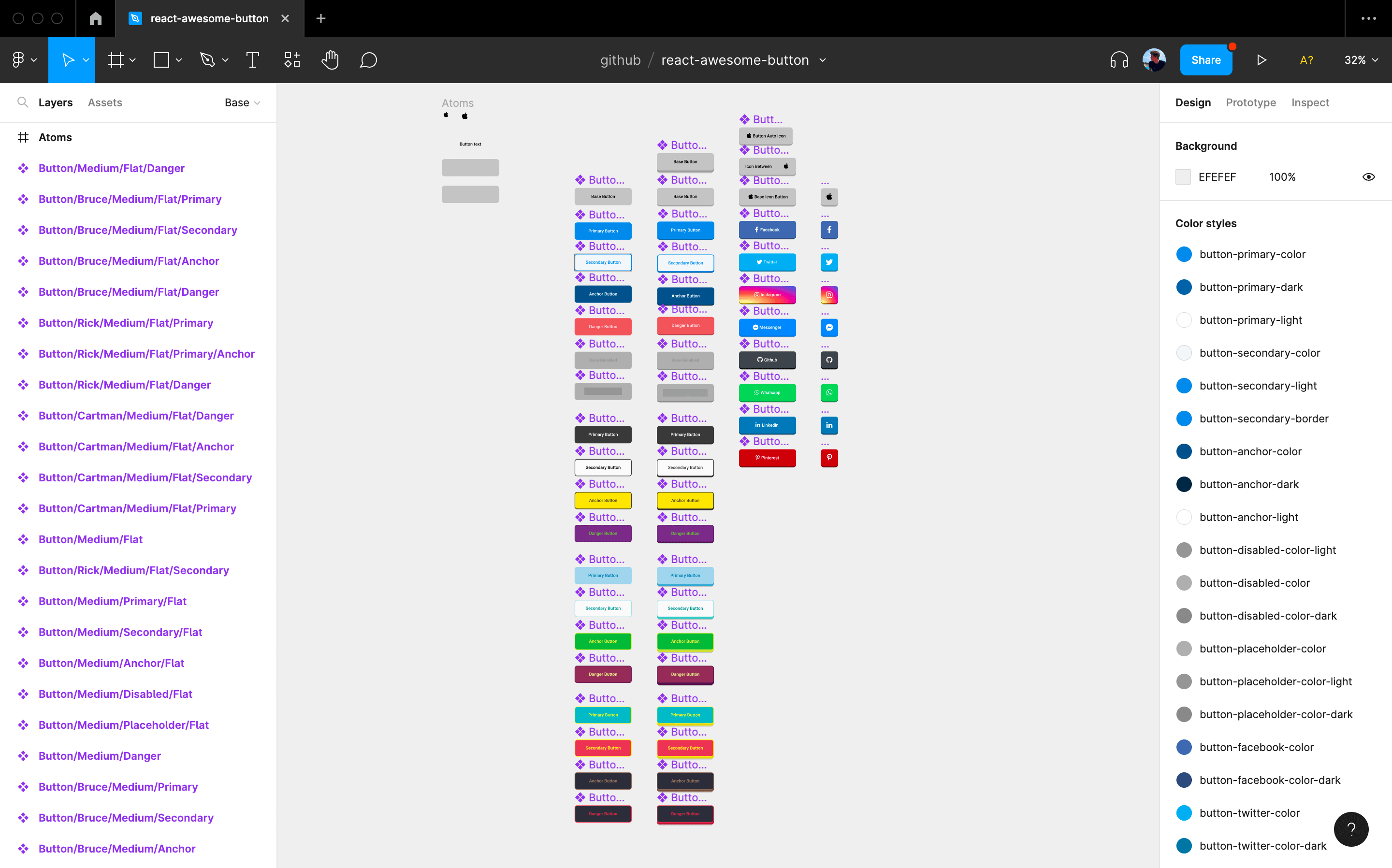 ](https://www.figma.com/file/Ug8sNPzmevU3ZQus9Klu5aHq/react-awesome-button-theme-blue)
### Installation
```
npm install --save react-native-really-awesome-button
```
## Usage
### Basic
```jsx
import AwesomeButton from "react-native-really-awesome-button";
function Button() {
return Text;
}
```
### Progress
```jsx
import AwesomeButton from "react-native-really-awesome-button";
function Button() {
return (
{
/** await for something; then: **/
next();
}}
>
Text
);
}
```
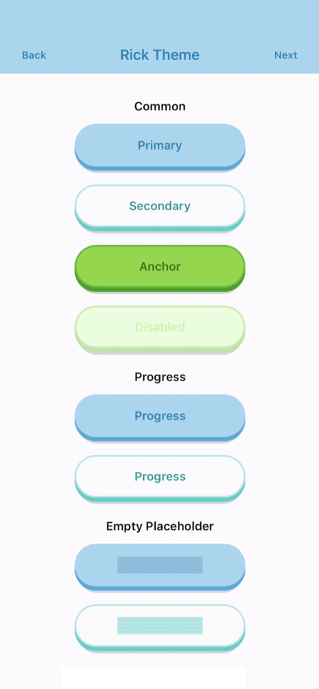
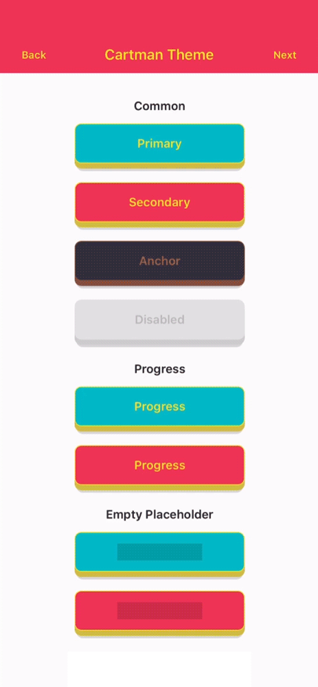
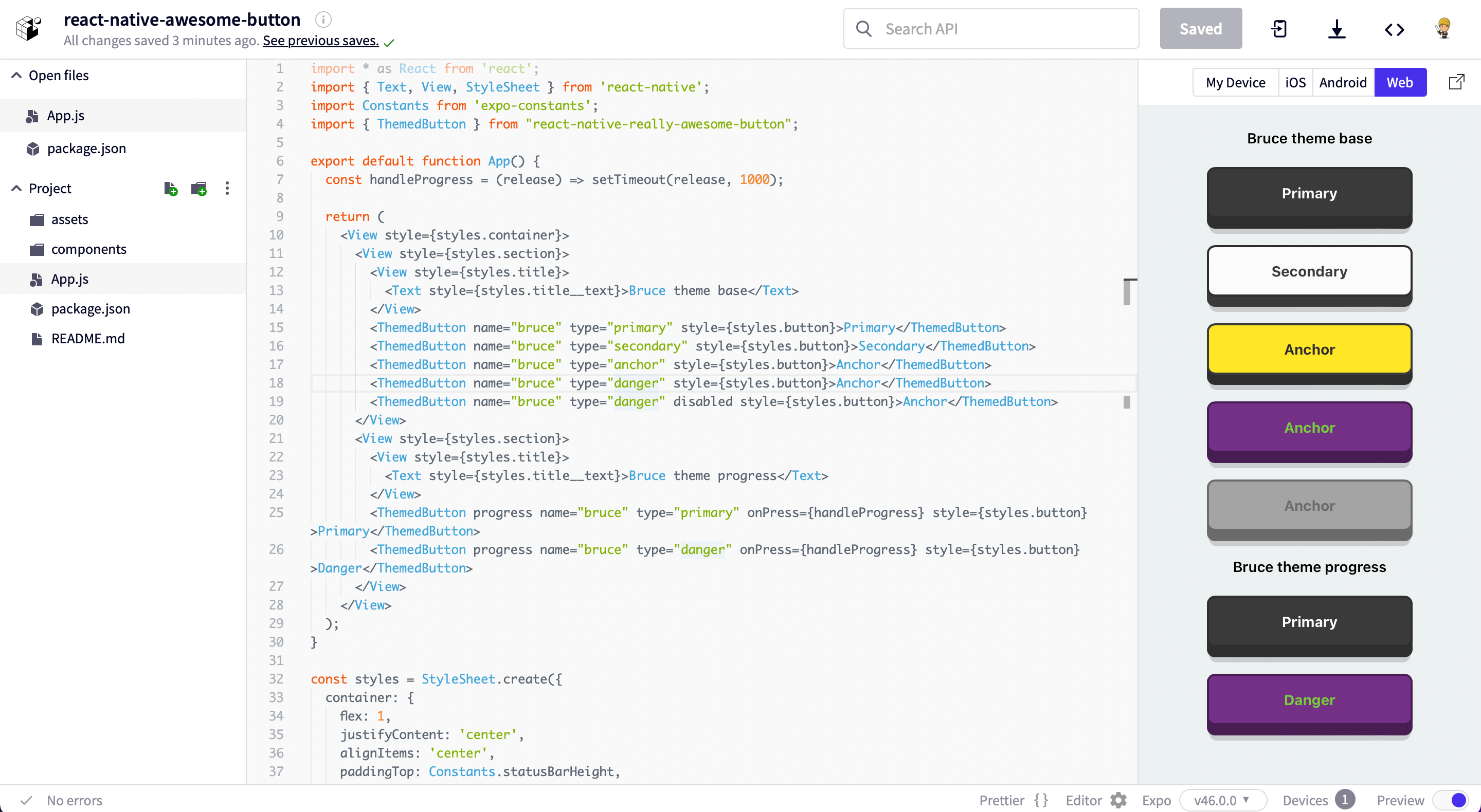
### Importing a specific theme
```jsx
import { ThemedButton } from 'react-native-really-awesome-button';
function ButtonWithTheme() {
return (
<>
Rick's Primary Button
Rick's Secondary Button
>
);
}
```
### Custom Children
```jsx
import AwesomeButton from "react-native-really-awesome-button";
function ButtonWithCustomChildren() {
return (
Send it
);
}
```
### Adding content before and after the button label
Useful for handling icons or any other inlined content which animates together with the button text.
```jsx
import { ThemedButton } from 'react-native-really-awesome-button';
import { FontAwesome } from "@expo/icons";
function ButtonWithIcon() {
return (
}>
Rick's Primary Button
);
}
```
### Extra content placement
You can use the `extra` prop to render a component inside the button content body; this should be useful to render an image or gradient background
```jsx
import { StyleSheet } from "react-native";
import AwesomeButton from "react-native-really-awesome-button";
import LinearGradient from "react-native-linear-gradient";
function ButtonWithExtraContent() {
return (
}
>
Instagram
);
}
```
### Full event control
Added a set of controlling events on `v2`, giving control of every animation stage like `onPressedIn` and `onPressedOut` which are triggered on the `Animated` callback.
```jsx
import { StyleSheet } from "react-native";
import AwesomeButton from "react-native-really-awesome-button";
import LinearGradient from "react-native-linear-gradient";
function ButtonWithExtraEvents() {
return (
<>
Label
Label
>
);
}
```
## Props
| Attributes | Type | Default | Description |
| :-------------------- | :-----------: | :-------: | :-------------------------------------------------------- |
| activityColor | `String` | `#FFFFFF` | Button activity indicator color |
| activeOpacity | `Number` | `1` | Button active state opacity |
| animatedPlaceholder | `Boolean` | `true` | When set to `false` removes the placeholder animation loop |
| backgroundActive | `String` | `#C0C0C0` | Button active state background-color |
| backgroundColor | `String` | `#C0C0C0` | Button content background-color |
| backgroundDarker | `String` | `#9F9F9F` | Button bottom-front-face background-color |
| backgroundShadow | `String` | `#C0C0C0` | Button bottom shadow background-color |
| backgroundPlaceholder | `String` | `#C0C0C0` | Button placeholder background-color |
| backgroundProgress | `String` | `#C0C0C0` | Button progress bar background-color |
| borderColor | `String` | `null` | Button border-color |
| borderRadius | `Number` | `4` | Button border-radius |
| borderWidth | `Number` | `0` | Button border-width |
| dangerouslySetPressableProps | `PressableProps` | `null` | Exposes the `PressableProps` of the `Pressable` wrapper; it can overwrite all props except `onPressIn` and `onPressOut` |
| debouncedPressTime | `Number` | `0` | Configure onPress function debounce time |
| disabled | `Boolean` | `true` | Button disabled state: cancels animation and onPress func |
| height | `Number` | `50` | Button height |
| width | `Number` | `null` | Setting width to `null` mirrors an `auto` behaviour |
| paddingHorizontal | `Number` | `12` | Sets the button horizontal padding |
| paddingTop | `Number` | `0` | Sets the button padding top |
| paddingBottom | `Number` | `0` | Sets the button padding bottom |
| stretch | `Boolean` | `false` | When set to `true` together with width set to `null` the button fills it's parent component width |
| raiseLevel | `Number` | `4` | Button 3D raise level |
| before | `ReactNode` | `null` | Renders a custom component before the button content Text |
| after | `ReactNode` | `null` | Renders a custom component after the button content Text |
| extra | `ReactNode` | `null` | Renders a custom component inside the button content body |
| springRelease | `Boolean` | `true` | Button uses elastic spring on the release animation |
| progress | `Boolean` | `false` | When set to `true` enables progress animation |
| progressLoadingTime | `Number` | `3000` | Number in `ms` for the maximum progress bar animation time |
| textColor | `String` | `#FFFFFF` | Button default label text color |
| textLineHeight | `Number` | `20` | Button default label text line height |
| textSize | `Number` | `16` | Button default label text font size |
| textFontFamily | `String` | `null` | Button default label text font family |
| style | `Style` | `null` | Button container custom styles |
| onPress | `Function` | `null` | Button onPress function. It receives a `next` argument when the `progress` prop is set to `true` |
| onPressIn | `Function` | `null` | Triggered with the `onPressIn` native event |
| onPressedIn | `Function` | `null` | Triggered once the press animation has finished |
| onPressOut | `Function` | `null` | Triggered with the `onPressOut` native event |
| onPressedOut | `Function` | `null` | Triggered once the release animation has finished |
| onProgressStart | `Function` | `null` | Triggered before the progress animation has started |
| onProgressEnd | `Function` | `null` | Triggered after the progress animation has finished |
## Web version
Checkout the web version of the `Awesome Button UI Component` at [rcaferati/react-awesome-button](https://github.com/rcaferati/react-awesome-button)
[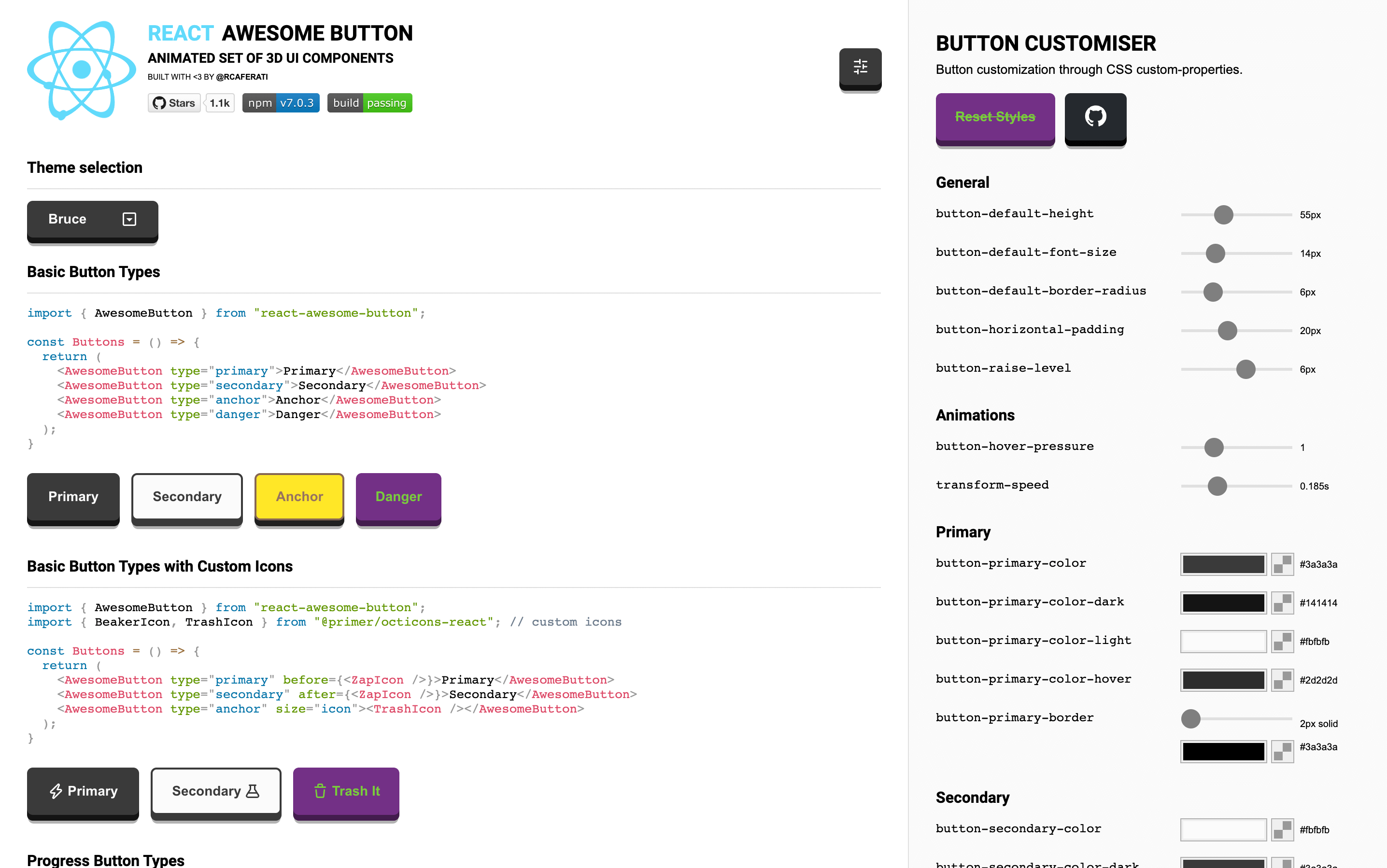 ](https://awesome-button.caferati.me)
## About the Author
#### Rafael Caferati
- Checkout my Portfolio Website
- Connect with me on `LinkedIn` @rcaferati
## License
MIT. Copyright (c) 2022 Rafael Caferati.