Ecosyste.ms: Awesome
An open API service indexing awesome lists of open source software.
https://github.com/gs-akhan/react-native-select
A simple dropdown for react native - IOS and Android
https://github.com/gs-akhan/react-native-select
android chooser ios react-native select-tag
Last synced: about 1 month ago
JSON representation
A simple dropdown for react native - IOS and Android
- Host: GitHub
- URL: https://github.com/gs-akhan/react-native-select
- Owner: gs-akhan
- License: mit
- Created: 2015-12-13T10:15:48.000Z (almost 9 years ago)
- Default Branch: master
- Last Pushed: 2018-08-12T13:46:32.000Z (about 6 years ago)
- Last Synced: 2024-08-07T11:43:58.028Z (about 2 months ago)
- Topics: android, chooser, ios, react-native, select-tag
- Language: JavaScript
- Homepage: https://www.npmjs.com/package/react-native-selectme
- Size: 604 KB
- Stars: 189
- Watchers: 6
- Forks: 30
- Open Issues: 3
-
Metadata Files:
- Readme: README.md
- License: LICENSE
Awesome Lists containing this project
- awesome-react-native - react-native-selectme ★178 - A better Select dropdown menu for react-native (Components / UI)
- awesome-reactnative-ui - react-native-select - IOS and Android |<ul><li>Last updated : 1 month ago</li><li>Stars : 180</li><li>Open issues : 3</li></ul>|![]()| (Others)
- awesome-react-native - react-native-selectme ★178 - A better Select dropdown menu for react-native (Components / UI)
- awesome-reactnative-ui - react-native-select - IOS and Android |<ul><li>Last updated : 1 month ago</li><li>Stars : 180</li><li>Open issues : 3</li></ul>|![]()| (Others)
- awesome-react-native - react-native-selectme ★178 - A better Select dropdown menu for react-native (Components / UI)
- awesome-react-native-ui - react-native-selectme ★98 - A better Select dropdown menu for react-native (Components / UI)
- awesome-react-native - react-native-selectme ★178 - A better Select dropdown menu for react-native (Components / UI)
README
# React Native Selectme
Simple DropDown menu for React Native App! Your Select Tag for React Native.
## Alternatives :
[react-native-chooser](https://github.com/gs-akhan/react-native-chooser) : This is an upgraded and simple-to-use API. You can customize it to fullest.
## Introduction
React Native Selectme is simple, customizable and easy to use dropdown in React Native. It has been tested on both Android and IOS and works like a charm.
## Installation
```
npm i react-native-selectme --save
```
## Usage
Require it inside your Javascript files. Also supporting components using object-deconstructing.
```Select``` ```Option``` ```OptionList```.
`````` Is to be used to append the options. This has to be placed as a last component so that it take the highest Z-Index.
## Example
```jsx
import React, {
Component,
AppRegistry,
Text,
View,
} from 'react-native';
import DropDown, {
Select,
Option,
OptionList,
} from 'react-native-selectme';
class App extends Component {
constructor(props) {
super(props);
this.state = {
canada: ''
};
}
_getOptionList() {
return this.refs['OPTIONLIST'];
}
_canada(province) {
this.setState({
...this.state,
canada: province
});
}
render() {
return (
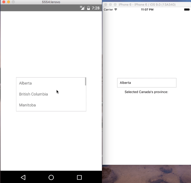
Alberta
British Columbia
Manitoba
New Brunswick
Newfoundland and Labrador
Northwest Territories
Nova Scotia
Nunavut
Ontario
Prince Edward Island
Quebec
Saskatchewan
Yukon
Selected Canada's province: {this.state.canada}
);
}
}
AppRegistry.registerComponent('App', () => App);
```
### Configuration
##### Select:
| Property | Type | Default | Description |
|---------------|----------|--------------|----------------------------------------------------------------|
| width | number | 400 | Width of the selection |
| onSelect | function(text, value) | null | function to be invoked when option is selected |
| height | number | 50 | Height of the selection |
| optionListRef | function | required | Reference to `````` to display the selection menu |
| style | object | null | Custom styles to be applied if supplied |
| defaultValue | string | first option | The value to be displayed if none of the options are selected. |
```blur()``` : close the select by calling blur ```this.refs.SELECT1.blur();```
##### Option:
| Property | Type | Default | Description |
|-----------|--------|---------|--------------------------------------------|
| value | any | null | value will be passed on callback `onSelect` as second argument |
| style | object | null | Styles to be applied on 'Option' component |
| styleText | object | null | Styles to be applied on text inside of 'Option' |
##### OptionList:
| Property | Type | Default | Description |
|-----------|--------|---------|--------------------------------------------|
| overlayStyles | object | null | Styles to be applied on 'overlay' backdrop |
| itemsStyles | object | null | Styles to be applied on 'items' dropdown |
## Demo
##### IOS and Android:
## Contributions
Your contributions and suggestions are heartily♡ welcome. (✿◠‿◠)