Ecosyste.ms: Awesome
An open API service indexing awesome lists of open source software.
https://github.com/adbayb/react-native-android-kit
:package: Android Native Kit for React-Native
https://github.com/adbayb/react-native-android-kit
library
Last synced: 2 months ago
JSON representation
:package: Android Native Kit for React-Native
- Host: GitHub
- URL: https://github.com/adbayb/react-native-android-kit
- Owner: adbayb
- License: mit
- Created: 2016-01-01T13:28:31.000Z (over 8 years ago)
- Default Branch: master
- Last Pushed: 2023-12-15T17:50:30.000Z (7 months ago)
- Last Synced: 2024-04-15T10:08:28.571Z (2 months ago)
- Topics: library
- Language: Java
- Homepage:
- Size: 250 KB
- Stars: 110
- Watchers: 9
- Forks: 20
- Open Issues: 8
-
Metadata Files:
- Readme: README.md
- License: LICENSE
Lists
- awesome-react-native - react-native-android-kit ★104 - A set of native Android UI components and modules for React Native framework (Android Design Support Library, TabLayout, Floating Action Button and more...). (Components / UI)
- awesome-ui-component-library - React Native Android Kit - native-android-kit.svg?label=&style=social)](https://github.com/adbayb/react-native-android-kit) - A set of native Android UI components and modules for React Native framework that are currently not implemented by React Native core team (React Native / Related community list)
- awesome-react-native-native-modules - react-native-android-kit ★94
- awesome-ui-components - React Native Android Kit - native-android-kit.svg?label=&style=social)](https://github.com/adbayb/react-native-android-kit) - A set of native Android UI components and modules for React Native framework that are currently not implemented by React Native core team (React Native / Related community list)
README
# React Native Android Kit
[](https://www.npmjs.com/package/react-native-android-kit) [](https://github.com/facebook/react-native)
A set of native Android UI components and modules for React Native framework.
The purpose of this kit is to offer to React Native developers some new Android native components that are currently not implemented by React Native core team.
For example, some components from Android Design Support Library are now available through this kit.
## Table of Contents
- [Installation](#installation)
* [Automatic](#automatic)
* [Manual](#manual)
- [Components](#components)
* [TabLayoutAndroid](#tablayoutandroid)
* [Introduction](#introduction)
* [Props](#props)
* [Example](#example)
* [ButtonAndroid](#buttonandroid)
* [Introduction](#introduction-1)
* [Props](#props-1)
* [Example](#example-1)
* [FloatingButtonAndroid](#floatingbuttonandroid)
* [Introduction](#introduction-2)
* [Props](#props-2)
* [Example](#example-2)
- [Misc](#misc)
* [Color](#color)
* [Drawable](#drawable)
* [Demo](#demo)
* [Todo](#todo)
- [License](#license)
## Installation
### Automatic
- [x] Go to your root project folder
- [x] Install react-native-android-kit from npm repository:
```
npm install react-native-android-kit --save
```
- [x] Link native dependencies to your project:
```
node node_modules/react-native/local-cli/cli.js link react-native-android-kit
```
Or, via react-native-cli if installed globally:
```
react-native link react-native-android-kit
```
### Manual
To use this kit inside your react native project, you must follow these steps:
- [x] Go to your root project folder
- [x] Install react-native-android-kit from npm repository:
```
npm install react-native-android-kit --save
```
- [x] Add the following lines to your `android/settings.gradle`:
```gradle
include ':ReactNativeAndroidKit'
project(':ReactNativeAndroidKit').projectDir = file('../node_modules/react-native-android-kit/android')
```
- [x] Inside `android/app/build.gradle` file, add compilation instruction for ReactNativeAndroidKit like that:
```gradle
dependencies {
...
compile project(':ReactNativeAndroidKit')
}
```
- [x] Finally, edit `MainApplication` class (generally located at `android/app/src/main/java//MainApplication.java`):
```java
...
import com.facebook.react.ReactPackage;
import com.facebook.react.shell.MainReactPackage;
import fr.aybadb.rnak.RNAKPackage; //<------------------------- Add this import statement
...
public class MainApplication extends Application implements ReactApplication {
...
@Override
protected List getPackages() {
return Arrays.asList(
new MainReactPackage(),
new RNAKPackage() //<-------------------------- Add this statement
);
}
};
...
```
## Components
### TabLayoutAndroid
#### Introduction
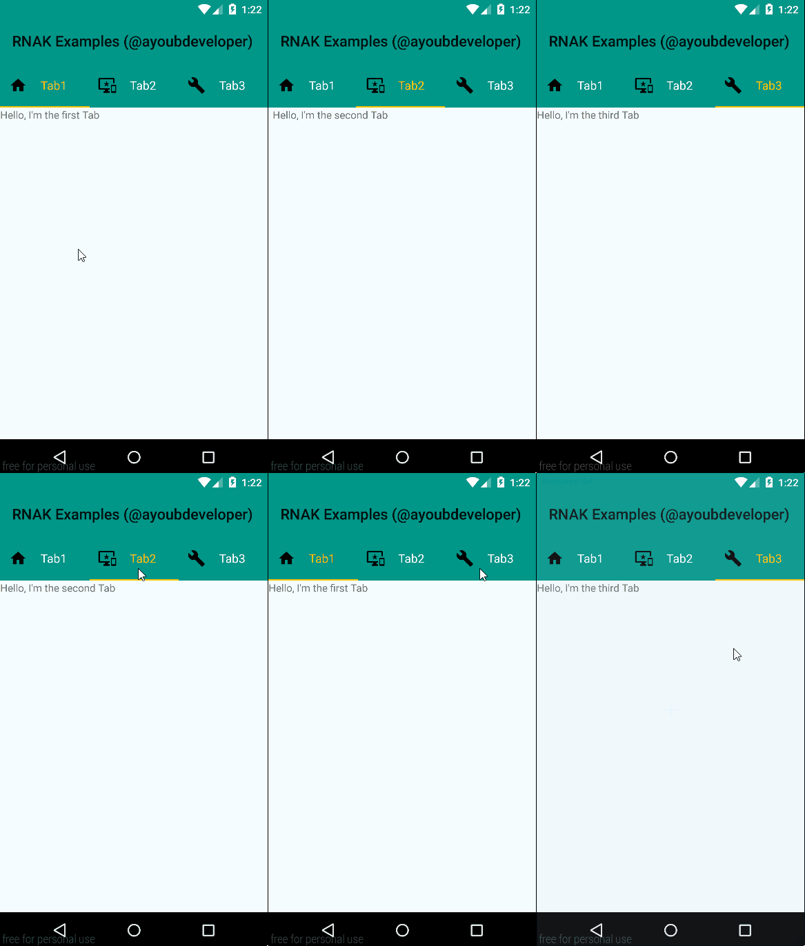
TabLayoutAndroid component provides a horizontal layout to display tabs.
Population of the tabs to display is done through TabLayoutAndroid.Item component.
Transition between tabs are managed by a ViewPager instance (you don't need to care about it: all is managed by TabLayoutAndroid component).
For more details, see: [Native TabLayout documentation](http://developer.android.com/reference/android/support/design/widget/TabLayout.html "TabLayout Android Developers")
#### Props:
##### TabLayoutAndroid props:
It is important all children of TabLayoutAndroid are TabLayoutAndroid.Item component(s) and not composite components:
> [View props...](https://facebook.github.io/react-native/docs/view.html#props)
> [ViewPagerAndroid props...](https://facebook.github.io/react-native/docs/viewpagerandroid.html#props)
> **backgroundColor** [color](#color) *optional*
Sets the background color for TabLayout container.
> **indicatorTabColor** [color](#color) *optional*
Sets the tab indicator's color for the currently selected tab.
> **indicatorTabHeight** number *optional*
Sets the tab indicator's height for the currently selected tab.
> **scrollable** boolean *optional, default = true*
Set the behavior mode for the Tabs in this layout:
true = SCROLLABLE tabs mode.
false = FIXED tabs mode.
> **backgroundImage** string *optional*
Set the background's TabLayout to a given Drawable (see [Drawable](#drawable)).
> **center** boolean *optional, default = true*
Set the gravity to use when laying out the tabs:
true = CENTER tabs gravity (only takes effect if you are on FIXED tabs Mode).
false = FILL tabs gravity.
*By default, 60 is the height value for tabs container.*
##### TabLayoutAndroid.Item props:
TabLayoutAndroid.Item represents a child for TabLayoutAndroid (i.e a tab instance). Especially, it's a container that allows you to store child view(s) for current tab instance. In a nutshell, it works like a container but for TabLayoutAndroid.
Besides, each TabLayoutAndroid.Item can be customized by several properties:
> [View props...](https://facebook.github.io/react-native/docs/view.html#props)
> **text** string *optional*
Sets the tab label.
> **icon** string *optional*
Sets the tab icon (see [Drawable](#drawable)).
> **iconPosition** string *optional, default = 'top' [only, if customView prop === true]*
Sets the Drawables (if any) to appear to the left of, above, to the right of, and below the text.
Allowed values: left, top, right, bottom (if wrong string, top value is set by default).
> **textSize** number *optional [only, if customView prop === true]*
Set the default text size to the given value, interpreted as "scaled pixel" unit (sp unit).
> **textColor** [color](#color) *optional [only, if customView prop === true]*
Sets the text color for the normal state.
> **selectedTextColor** [color](#color) *optional [only, if customView prop === true]*
Sets the text color for the selected state.
> **customView** boolean *optional, default = true*
Sets custom view behavior for current tab.
true = Custom View enabled.
false = Custom View disabled: only, text and icon properties take effect.
#### Example
###### Basic Usage:
```jsx
import React, { AppRegistry, StyleSheet, Text, View } from "react-native";
import { TabLayoutAndroid } from "react-native-android-kit";
class TabLayoutExample extends React.Component {
render() {
return (
I'm the first Tab content!
I'm the second Tab content!
);
}
}
```
###### Demonstration:

*For corresponding code, see [Code from demonstration application](example/src/index.js)*
### ButtonAndroid
**Important Note:** Since 0.37 react-native release, you can use `````` as a cross native component between Android and iOS. I recommend you to use it instead of this `````` component.
#### Introduction
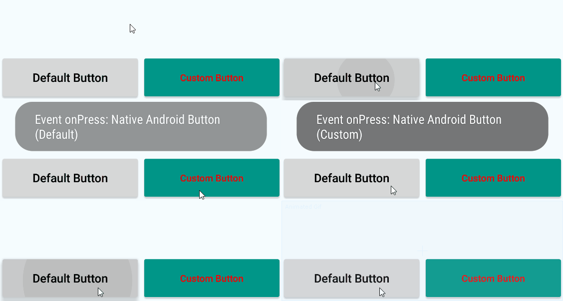
Represents a push-button widget. Push-buttons can be pressed, or clicked, by the user to perform an action.
For more details, see: [Native Button documentation](http://developer.android.com/reference/android/widget/Button.html "Button Android Developers")
#### Props:
> [View props...](https://facebook.github.io/react-native/docs/view.html#props)
> [TouchableWithoutFeedback props...](https://facebook.github.io/react-native/docs/touchablewithoutfeedback.html#props)
> **text** string *optional*
Sets the button label.
> **textSize** number *optional, default = 15*
Set the default text size to the given value, interpreted as "scaled pixel" unit (sp unit).
> **textColor** [color](#color) *optional, default = 'black'*
Sets the text color.
> **backgroundColor** [color](#color) *optional*
Sets the background color.
#### Example
###### Basic Usage:
```jsx
import React, { StyleSheet, View, ToastAndroid } from "react-native";
import { ButtonAndroid } from "react-native-android-kit";
class ButtonExample extends React.Component {
render() {
return (
{
ToastAndroid.show("Event onPress", ToastAndroid.SHORT);
}
}
/>
);
}
}
```
###### Demonstration:

*For corresponding code, see [Code from demonstration application](example/src/components/button.js)*
### FloatingButtonAndroid
#### Introduction
Floating action buttons are used for a special type of promoted action. They are distinguished by a circled icon floating above the UI.
For more details, see: [Native FloatingActionButton documentation](http://developer.android.com/reference/android/support/design/widget/FloatingActionButton.html "FloatingActionButton Android Developers")
#### Props:
> [View props...](https://facebook.github.io/react-native/docs/view.html#props)
> [TouchableWithoutFeedback props...](https://facebook.github.io/react-native/docs/touchablewithoutfeedback.html#props)
> **icon** string *optional*
Sets the button icon (see [Drawable](#drawable)).
> **backgroundColor** [color](#color) *optional*
Sets the background color.
> **rippleColor** [color](#color) *optional*
Sets the ripple color.
> **hidden** boolean *optional, default = false*
Hides/Shows the button:
true = Hides the button.
false = Shows the button.
> **rippleEffect** boolean *optional, default = true*
Defines whether this view reacts to click by a ripple effect or not:
true = Ripple effect enabled.
false = Ripple effect disabled.
#### Example:
###### Basic Usage:
```jsx
import React, { StyleSheet, View, ToastAndroid } from "react-native";
import { FloatingButtonAndroid } from "react-native-android-kit";
class FloatingButtonExample extends React.Component {
render() {
return (
{
ToastAndroid.show("Event onPress", ToastAndroid.SHORT);
}
}
/>
);
}
}
```
###### Demonstration:

*For corresponding code, see [Code from demonstration application](example/src/components/floatingButton.js)*
## Misc
### Color
Color value property is set via a string input.
Supported formats are: `'#RRGGBB' , '#AARRGGBB'` or one of the following names: `'red', 'blue', 'green', 'black', 'white', 'gray', 'cyan', 'magenta', 'yellow', 'lightgray', 'darkgray', 'grey', 'lightgrey', 'darkgrey', 'aqua', 'fuchsia', 'lime', 'maroon', 'navy', 'olive', 'purple', 'silver', 'teal'`.
### Drawable
For now, only static images resources are supported. They must be located inside one of drawable folders (usually located at `android/app/src/main/res/drawable` or `android/app/src/main/res/drawable-XXXXXX` if you want to manage icon size according to display format).
To target a resource, you only need to specify string basename (i.e. without extension) and it must respect underscored name. For example, if you have an image called toto-tata.png, you must specify 'toto_tata' as a property value.
### Demo
If you want an overview of RNAK, it's interesting to try the demonstration code located inside `./example` folder.
To build and test this demo, just follow these steps:
- [x] Connect your device or launch your Android emulator
- [x] Clone this repository
- [x] Go to the example folder: `cd ./example`
- [x] Install npm dependencies, build and deploy the demonstration application by running: `npm install`
- [x] Enjoy RNAK demo on your device/emulator !
### Todo
- [x] **TabLayoutAndroid:** Homogenize component props and naming with TabBarIOS react-native implementation
- [x] **TabLayoutAndroid:** Programmatically set the current active tab
## License
[MIT](./LICENSE "License MIT")