Ecosyste.ms: Awesome
An open API service indexing awesome lists of open source software.
https://github.com/rafaelmotta/react-native-scl-alert
📢 A react native implementation of the package SCLAlertView-Swift
https://github.com/rafaelmotta/react-native-scl-alert
Last synced: 2 months ago
JSON representation
📢 A react native implementation of the package SCLAlertView-Swift
- Host: GitHub
- URL: https://github.com/rafaelmotta/react-native-scl-alert
- Owner: rafaelmotta
- Archived: true
- Created: 2018-03-20T23:10:20.000Z (over 6 years ago)
- Default Branch: master
- Last Pushed: 2020-11-05T04:17:21.000Z (over 3 years ago)
- Last Synced: 2024-03-29T04:46:16.231Z (3 months ago)
- Language: JavaScript
- Homepage: https://github.com/rafaelmotta/react-native-scl-alert
- Size: 406 KB
- Stars: 215
- Watchers: 10
- Forks: 54
- Open Issues: 10
-
Metadata Files:
- Readme: README.md
Lists
- awesome-react-native - react-native-scl-alert ★102 - React Native implementation of the package SCLAlertView-Swift (Components / UI)
- awesome-reactnative-ui - react-native-scl-alert - Swift|<ul><li>Last updated : This week</li><li>Stars : 132</li><li>Open issues : 3</li></ul>|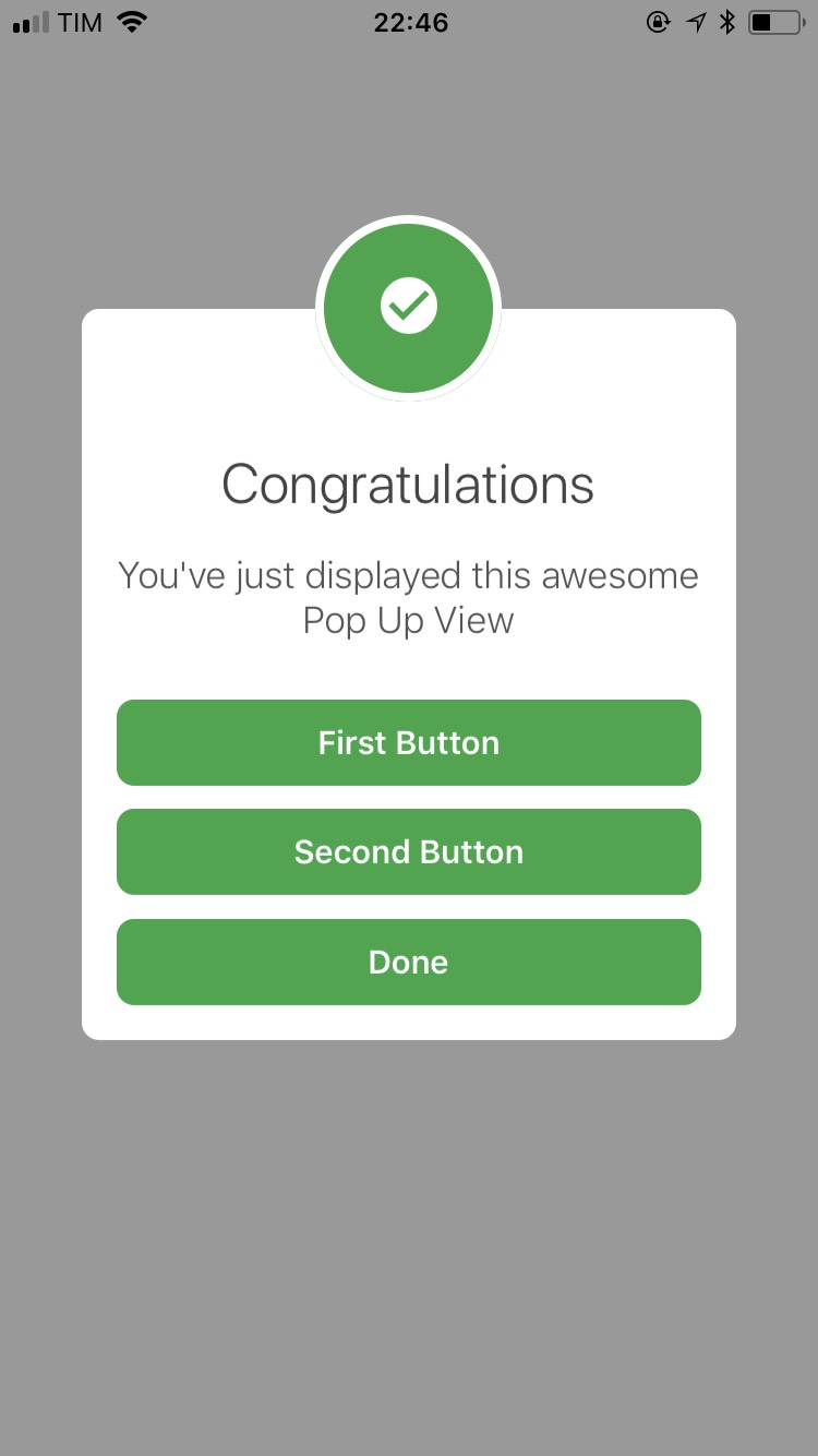| (Others)
- awesome - react-native-scl-alert ★102 - React Native implementation of the package SCLAlertView-Swift (Components / UI)
- awesome-react-native - react-native-scl-alert ★102 - React Native implementation of the package SCLAlertView-Swift (Components / UI)
- awesome-reactnative-ui - react-native-scl-alert - Swift|<ul><li>Last updated : This week</li><li>Stars : 132</li><li>Open issues : 3</li></ul>|| (Others)
- awesome-react-native - react-native-scl-alert ★102 - React Native implementation of the package SCLAlertView-Swift (Components / UI)
- awesome-react-native - react-native-scl-alert ★102 - React Native implementation of the package SCLAlertView-Swift (Components / UI)
- awesome-react-native - react-native-scl-alert ★102 - React Native implementation of the package SCLAlertView-Swift (Components / UI)
- awesome-react-native - react-native-scl-alert ★61 - React Native implementation of the package SCLAlertView-Swift (Components / UI)
README
# react-native-scl-alert
[](https://badge.fury.io/js/react-native-scl-alert)
A pure react native javascript implementation of the package https://github.com/vikmeup/SCLAlertView-Swift
## Road Map
- [x] Documentation to customize styles
- [ ] Handle orientation
- [x] Default images for header
- [ ] Text Field Component
- [ ] More transitions
## Features
- Declarative API
- High customizable UI
- Built in themes inspired on bootstrap
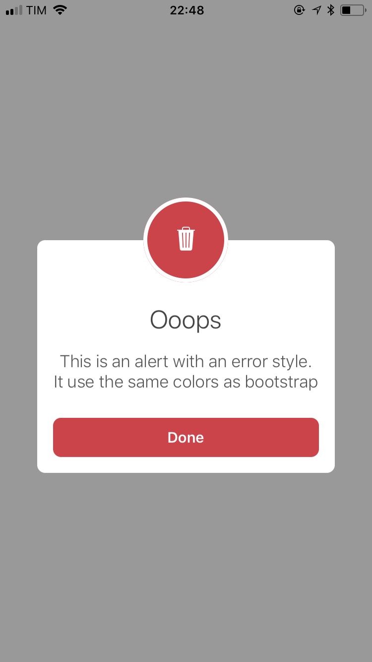
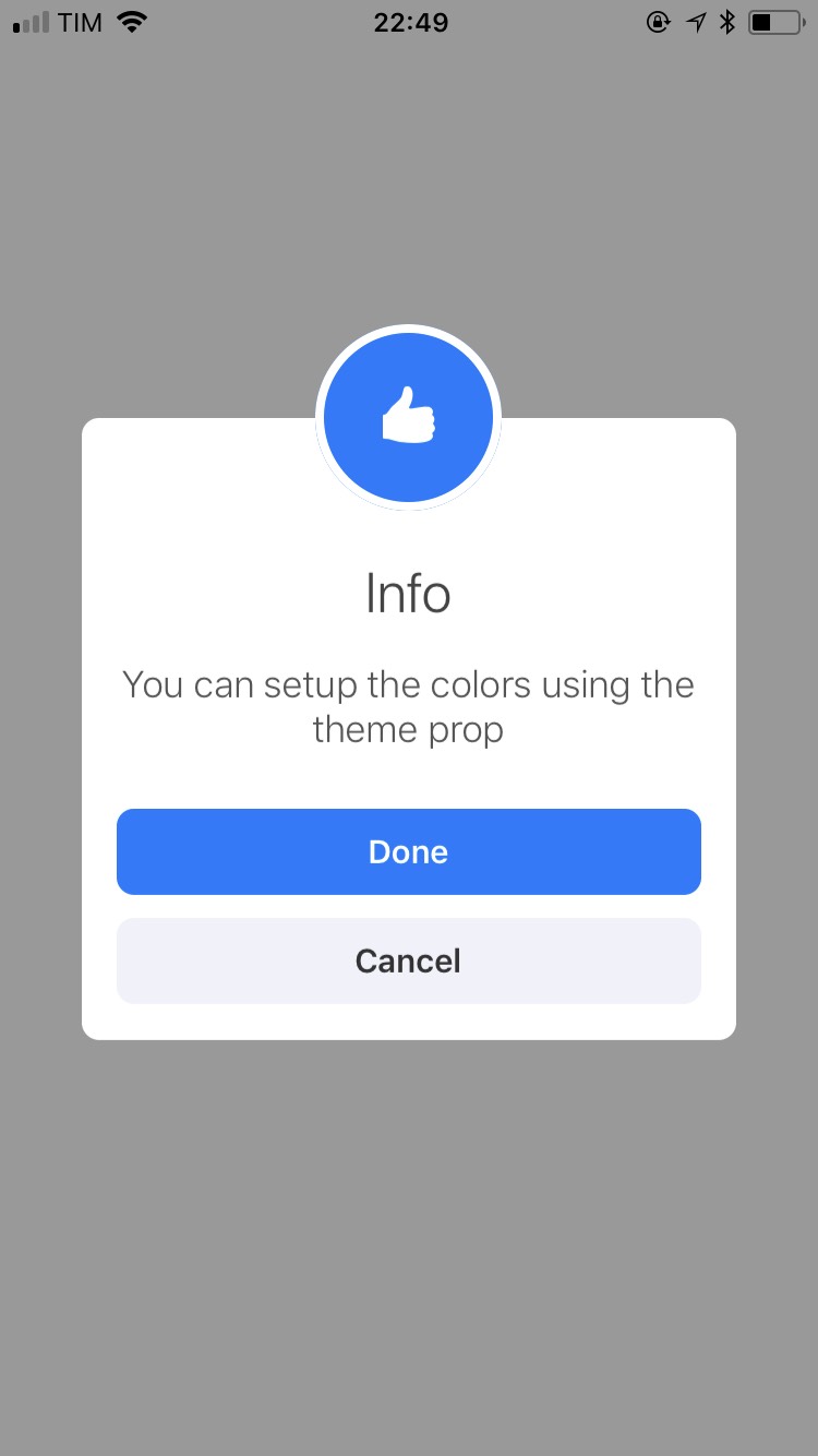
## Demo
You can try on expo: https://exp.host/@rafaelmotta021/react-native-scl-alert-demo
or just check the images bellow:

## Setup
`yarn add react-native-scl-alert`
or
`npm install --save react-native-scl-alert`
## Usage
```javascript
import React from 'react'
import {
View,
Button,
StyleSheet
} from 'react-native'
import {
SCLAlert,
SCLAlertButton
} from 'react-native-scl-alert'
export default class App extends React.Component {
state = {
show: false
}
handleOpen = () => {
this.setState({ show: true })
}
handleClose = () => {
this.setState({ show: false })
}
render() {
return (
Done
)
}
}
const styles = StyleSheet.create({
container: {
flex: 1,
backgroundColor: '#fff',
alignItems: 'center',
justifyContent: 'center'
}
})
```
## Demo
You can customized the look and feel of this library the way you want, but, if you prefer, we ship 6 themes for you:
- ```default```
- ```inverse```
- ```success```
- ```info```
- ```danger```
- ```warning```
## SCLAlert
| Name | Type| Default | Description |
| --- | --- | --- | --- |
| show | PropTypes.bool | false | Show the alert |
| cancellable | PropTypes.bool | true | If user press in the overlay, will trigger onRequestClose func|
| onRequestClose | PropTypes.func | null | Trigger a function asking to close the alert |
| slideAnimationDuration | PropTypes.number | 250 | Duration in ms of the alert animation |
| overlayStyle | ViewPropTypes.style | {} | Extends the overlay view style |
| title | PropTypes.string | REQUIRED | A string to render in the modal title |
| titleContainerStyle | ViewPropTypes.style | {} | Extends the title container view style |
| titleStyle | Text.propTypes.style | {} | Extends the title text style |
| subtitle | PropTypes.string | REQUIRED | A string to render in the modal subtitle |
| subtitleContainerStyle | ViewPropTypes.style | {} | Extends the subtitle container view style |
| subtitleStyle | Text.propTypes.style | {} | Extends the subtitle text style |
| headerContainerStyles | ViewPropTypes.style | {} | Extends the title headerContainer view style |
| headerInnerStyles | ViewPropTypes.style | {} | Extends the title headerInner view style |
| headerIconComponent | PropTypes.node | null | A component to render inside the header |
| children | PropTypes.node | null | Custom content. Put here buttons and text inputs |
## SCLAlertButton
| Name | Type| Default | Description |
| --- | --- | --- | --- |
| children | PropTypes.string or PropTypes.node | REQUIRED | String or react node |
| containerStyle | ViewPropTypes.style | {} | | custom style object to customize container view |
| textStyle | Text.propTypes.style | {} | | custom style object to customize the text |
| theme | PropTypes.string | 'default' | Check options above |
| onPress | PropTypes.func | REQUIRED | Callback after user press in the button |