Ecosyste.ms: Awesome
An open API service indexing awesome lists of open source software.
https://github.com/vlad-doru/react-native-calendar-datepicker
React-Native cross-platform, calendar component.
https://github.com/vlad-doru/react-native-calendar-datepicker
react-component react-native react-native-component react-native-ui
Last synced: about 1 month ago
JSON representation
React-Native cross-platform, calendar component.
- Host: GitHub
- URL: https://github.com/vlad-doru/react-native-calendar-datepicker
- Owner: vlad-doru
- License: apache-2.0
- Created: 2016-07-06T11:47:51.000Z (about 8 years ago)
- Default Branch: master
- Last Pushed: 2018-01-31T12:49:38.000Z (over 6 years ago)
- Last Synced: 2024-08-10T10:38:50.105Z (about 2 months ago)
- Topics: react-component, react-native, react-native-component, react-native-ui
- Language: JavaScript
- Homepage:
- Size: 2.44 MB
- Stars: 85
- Watchers: 2
- Forks: 37
- Open Issues: 10
-
Metadata Files:
- Readme: README.md
- License: LICENSE
Awesome Lists containing this project
- awesome-react-native - react-native-calendar-datepicker ★75 - A cross-platform calendar datepicker (Components / UI)
- awesome-react-native - react-native-calendar-datepicker ★75 - A cross-platform calendar datepicker (Components / UI)
- awesome-reactnative-ui - react-native-calendar-datepicker - Native cross-platform, calendar component.|<ul><li>Last updated : This week</li><li>Stars : 81</li><li>Open issues : 11</li></ul>|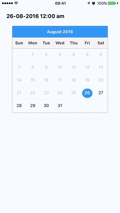| (Others)
- awesome-reactnative-ui - react-native-calendar-datepicker - Native cross-platform, calendar component.|<ul><li>Last updated : This week</li><li>Stars : 81</li><li>Open issues : 11</li></ul>|| (Others)
- awesome-react-native - react-native-calendar-datepicker ★75 - A cross-platform calendar datepicker (Components / UI)
- awesome-react-native-ui - react-native-calendar-datepicker ★30 - A cross-platform calendar datepicker (Components / UI)
- awesome-react-native - react-native-calendar-datepicker ★75 - A cross-platform calendar datepicker (Components / UI)
README
# React Native Calendar Datepicker
## Description
This project aims at providing developers with a *cross-platform, highly customizable*, **calendar date picker** component for React Native.
Here is a quick example of how it works, with custom appearance:

## Installation
`npm install --save react-native-calendar-datepicker`
__Minimum react-native: "^0.33.0"__
## Basic Usage
Getting started with this component is very very easy. However, the initial appearance is minimalistic, but the library offers the developer the ability to easily customize it.
In its most basic form, the usage of this component looks like this:
```javascript
import Calendar from 'react-native-calendar-datepicker';
import Moment from 'moment';
...
this.setState({date})}
selected={this.state.date}
// We use Moment.js to give the minimum and maximum dates.
minDate={Moment().startOf('day')}
maxDate={Moment().add(10, 'years').startOf('day')}
/>
```
## API Reference
**Note**: Each date provided will be a Moment.js object.
### Basic properties
| Property | Type | Explanation
| --- | --- | ---
| *selected* | Moment | The currently selected date
| *onChange* | (date: Moment) => void | Callback for selecting a date
| *minDate* | Moment | **[Mandatory]** Minimum selectable date
| *maxDate* | Moment | **[Mandatory]** Maximum selectable date
| *startStage* | "day"/"month"/"year" | **[Default: "day"]** Whether you would like to select the day, month or year first.
| *finalStage* | "day"/"month"/"year" | **[Default: "day"]** The last level of selection you want.
| *slideThreshold* | number | **[Default: min([width / 3, 250])]** The number of pixels after which the slide event will be triggered.
| *showArrows* | boolean | **[Default: false]** Whether you would like to show arrow buttons for moving between months.
### Locale specific calendar
In order to change the locale of the calendar, just change the locale of Moment.js. Please make sure to do so before using the calendar component.
### Styling properties
In its initial form the component has a minimalistic appearance, shown in the picture below, but it can easily be customized.

Styled example with arrows:

Below is the list of properties that can be used for styling. For a concrete example, check out the [demo app link](https://github.com/vlad-doru/react-native-calendar-datepicker/blob/master/demo/index.ios.js)
| Property | Type | Explanation
| --- | --- | ---
| style | View.propTypes.style | View wrapper of the calendar
| barView | View.propTypes.style | Styling the view wrapper for the bar at the top of the component
| barText | Text.propTypes.style | Styling the text in the top bar
| stageView | View.propTypes.style | Styling the view wrapper of the current stage
| dayHeaderView | View.propTypes.style | Styling the view wrapper of day names
| dayHeaderText | Text.propTypes.style | Styling the text of day names
| dayRowView | View.propTypes.style | Styling each row view of days
| dayView | View.propTypes.style | View wrapper of each day
| dayText | Text.propTypes.style | Styling the text of each day number
| dayTodayText | Text.propTypes.style | Highlighting today in the calendar
| daySelectedText | Text.propTypes.style | Highlighting the selected day in the calendar
| dayDisabledText | Text.propTypes.style | Styling unavailable dates in the calendar
| monthText | Text.propTypes.style | Styling the text for each month in the month selector
| monthDisabledText | Text.propTypes.style | Styling unavailable months
| monthSelectedText | Text.propTypes.style | Styling selected month
| yearMinTintColor | string | Styling left side of year slider
| yearMaxTintColor | string | Styling right side of year slider
| yearSlider | Slider.propTypes.style | Styling the year slider
| yearText | Text.propTypes.style | Styling the year text
## TODO
- [ ] Add unit tests
- [ ] Add integration test
- [ ] Set up continous integration
- [ ] Hook to codeclimate.com
## Contributing
1. Fork it!
2. Create your feature branch: `git checkout -b my-new-feature`
3. Commit your changes: `git commit -am 'Add some feature'`
4. Push to the branch: `git push origin my-new-feature`
5. Submit a pull request :D
## Credits
Main Developer: [Vlad-Doru Ion](http://github.com/vlad-doru)
Pull requests by:
* [Jason Gaare](http://github.com/jasongaare)
* [Igor Kurr](http://github.com/igorrKurr)
## License
Apache License 2.0