Ecosyste.ms: Awesome
An open API service indexing awesome lists of open source software.
https://github.com/NesChaiyapon/react-native-simple-slider
This is a simple javascript slider component for react native.
https://github.com/NesChaiyapon/react-native-simple-slider
Last synced: about 1 month ago
JSON representation
This is a simple javascript slider component for react native.
- Host: GitHub
- URL: https://github.com/NesChaiyapon/react-native-simple-slider
- Owner: NesChaiyapon
- License: mit
- Created: 2018-09-04T13:56:56.000Z (about 6 years ago)
- Default Branch: master
- Last Pushed: 2019-02-08T09:00:41.000Z (over 5 years ago)
- Last Synced: 2024-07-23T03:15:34.498Z (2 months ago)
- Language: JavaScript
- Size: 215 KB
- Stars: 16
- Watchers: 0
- Forks: 3
- Open Issues: 0
-
Metadata Files:
- Readme: README.md
- License: LICENSE
Awesome Lists containing this project
- awesome-react-native - react-native-simple-slider ★3 - This is a simple javascript slider component for react native (Components / Navigation)
- awesome-reactnative-ui - react-native-simple-slider - native-simple-slider/master/images/slider-preview.png)| (Others)
- awesome-react-native - react-native-simple-slider ★3 - This is a simple javascript slider component for react native (Components / Navigation)
- awesome-react-native - react-native-simple-slider ★3 - This is a simple javascript slider component for react native (Components / Navigation)
- awesome-reactnative-ui - react-native-simple-slider - native-simple-slider/master/images/slider-preview.png)| (Others)
- awesome-react-native - react-native-simple-slider ★3 - This is a simple javascript slider component for react native (Components / Navigation)
README
# React Native Simple Slider
This is a simple javascript slider component for react native.
This package is compatible both **Android** and **iOS**.
## Installation
`$ yarn add react-native-simple-slider`
or
`$ npm install react-native-simple-slider --save`
## Usage
```jsx
state = { value: 0 }
this.setState({ value })}
disabledHoverEffect={false}
/>
```
### How to use in ScrollView
```jsx
state = { isScrollEnable: true}
this.setState({ isScrollEnable: false })}
onSlidingComplete={() => this.setState({ isScrollEnable: true })}
/>
```
## Props
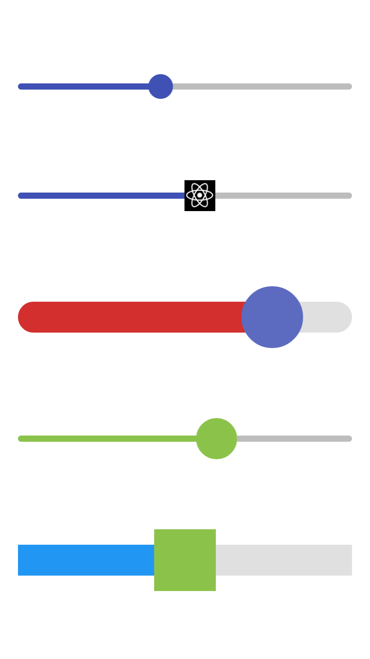
| Attributes | Type | Default | Description |
| :--------- | :--: | :-----: | :----------- |
| value | `number` | `0` | Value of the slider. |
| minimumValue | `number` | `0` | Minimum value of the slider. |
| maximumValue | `number` | `1` | Maximum value of the slider. |
| onSlidingStart | `func` | `() => {}` | Callback function that is called when the user begin touch the slider. |
| onValueChange | `func` | `() => {}` | Callback fucntion that is called while the user is dragging the slider. |
| onSlidingComplete | `func` | `() => {}` | Callback function that is called when the user releases the slider. |
| disabled | `boolean` | `false` | If true the user won't be able to move the slider. |
| disabledHoverEffect | `boolean` | `true` | If true the slider do not show hover effect. |
| step | `number` | `0` | Step value of the slider. The value should be between minimumValue to maximumValue. |
| minimumTrackTintColor | `string` | `#3F51B5` | The color used for the track on the left side of thumb button. |
| maximumTrackTintColor | `string` | `#BDBDBD` | The color used for the track on the right side of thumb button. |
| thumbTintColor | `string` | `#3F51B5` | Foreground color of thumb button. |
| thumbButtonSize | `number` | `24` | Size of thumb button. |
| sliderWidth | `number` | `325` | Width of slider component. |
| sliderHeight | `number` | `6` | Height of slider component. |
| sliderBorderRadius | `number` | `3` | Border radius of slider component. |
| thumbImage | `image(string/number)` | `null` | Sets an image for the thumb button. Only static images are supported. |
| thumbButton | `element` | `null` | Sets an react component for override the thumb button. |
## Contributing
Contributions are welcome. Should run `npm run test` before push.
## License
MIT License
Copyright (c) 2018 Chaiyapon