https://gfazioli.github.io/mantine-rings-progress/
Rings Progress component for Mantine
https://gfazioli.github.io/mantine-rings-progress/
Last synced: 5 months ago
JSON representation
Rings Progress component for Mantine
- Host: GitHub
- URL: https://gfazioli.github.io/mantine-rings-progress/
- Owner: gfazioli
- License: mit
- Created: 2024-02-09T12:35:04.000Z (over 1 year ago)
- Default Branch: master
- Last Pushed: 2024-10-24T10:08:04.000Z (7 months ago)
- Last Synced: 2024-10-25T05:08:39.027Z (7 months ago)
- Language: TypeScript
- Homepage: https://gfazioli.github.io/mantine-rings-progress/
- Size: 4.65 MB
- Stars: 2
- Watchers: 1
- Forks: 0
- Open Issues: 0
-
Metadata Files:
- Readme: README.md
- Changelog: CHANGELOG.md
- Contributing: CONTRIBUTING.md
- Funding: .github/FUNDING.yml
- License: LICENSE
- Code of conduct: CODE_OF_CONDUCT.md
Awesome Lists containing this project
- awesome-mantine - Mantine Rings Progress - A Mantine component that replicates the progress rings of Apple Watch. (Libraries)
README
# Mantine Rings Progress Component
---
[](https://www.npmjs.com/package/@gfazioli/mantine-rings-progress)
[](https://www.npmjs.com/package/@gfazioli/mantine-rings-progress)

## Overview
This component is created on top of the [Mantine](https://mantine.dev/) library.
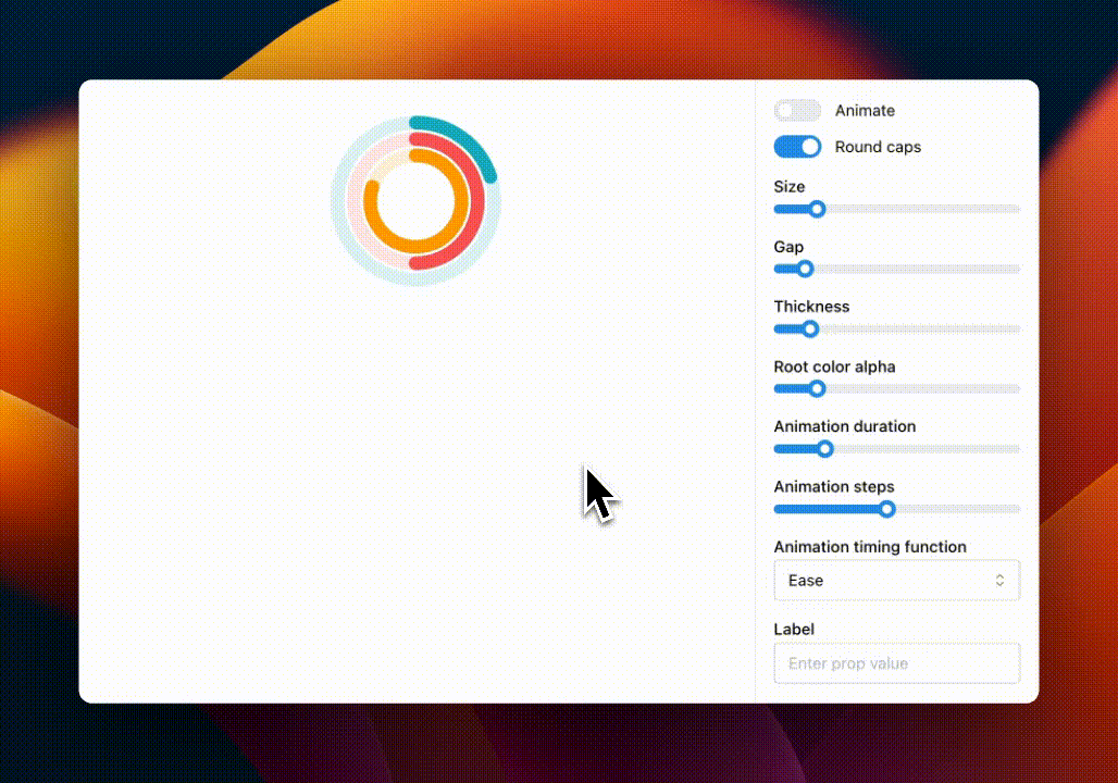
Display progress with animated rings like the Apple Watch activity app.
You can find more components on the [Mantine Extensions Hub](https://mantine-extensions.vercel.app/) library.
## Installation
```sh
npm install @gfazioli/mantine-rings-progress
```
or
```sh
yarn add @gfazioli/mantine-rings-progress
```
After installation import package styles at the root of your application:
```tsx
import '@gfazioli/mantine-rings-progress/styles.css';
```
## Usage
```tsx
import { RingsProgress } from '@gfazioli/mantine-rings-progress';
function Demo() {
const rings = [
{ value: 20, color: 'green' },
{ value: 80, color: 'blue' },
];
return (
}
/>
);
}
```
## Props
| Name | Type | Description |
|---------------------------|--------------------------------------|-------------------------------------------------------------------------|
| animate | boolean | Animate |
| animationDuration | number | Animation duration in ms |
| animationSteps | number | Animation steps |
| animationTimingFunction | linear \| ease \| ease-in \| ease-out \| ease-in-out \| ease-in-cubic \| ease-out-cubic \| ease-in-out-cubic | Animation timing function |
| gap | number | Gap between rings |
| label | React.ReactNode | Label displayed in the center of the ring |
| rings * | RingProgressSection[] | List of the rings |
| rootColor | MantineColor | Color of the root section, key of theme.colors or CSS color value |
| rootColorAlpha | number | Root color alpha |
| roundCaps | boolean | Sets whether the edges of the progress circle are rounded |
| size | number | Width and height of the progress ring |
| thickness | number | Ring thickness |