https://github.com/05bmckay/hs-uix
Production-ready UI components for HubSpot UI Extensions — DataTable, FormBuilder, and more
https://github.com/05bmckay/hs-uix
crm datatable formbuilder hubspot hubspot-crm react ui-extensions
Last synced: about 2 months ago
JSON representation
Production-ready UI components for HubSpot UI Extensions — DataTable, FormBuilder, and more
- Host: GitHub
- URL: https://github.com/05bmckay/hs-uix
- Owner: 05bmckay
- Created: 2026-03-31T00:42:04.000Z (4 months ago)
- Default Branch: main
- Last Pushed: 2026-05-28T22:40:58.000Z (about 2 months ago)
- Last Synced: 2026-05-29T00:19:51.249Z (about 2 months ago)
- Topics: crm, datatable, formbuilder, hubspot, hubspot-crm, react, ui-extensions
- Language: JavaScript
- Homepage: https://www.npmjs.com/org/hs-uix
- Size: 12.5 MB
- Stars: 22
- Watchers: 4
- Forks: 3
- Open Issues: 3
-
Metadata Files:
- Readme: README.md
- Changelog: CHANGELOG.md
- Roadmap: ROADMAP.md
Awesome Lists containing this project
README
# hs-uix
[](https://www.npmjs.com/package/hs-uix)
[](./LICENSE)
Production-ready UI components for [HubSpot UI Extensions](https://developers.hubspot.com/docs/apps/developer-platform/add-features/ui-extensions/overview). Built entirely on HubSpot's native primitives — no custom HTML, no CSS, no iframes.
## Install
```bash
npm install hs-uix
```
```jsx
import { DataTable } from "hs-uix/datatable";
import { FormBuilder } from "hs-uix/form";
import { Feed } from "hs-uix/feed";
import { Icon, AutoStatusTag, AutoTag, CrmLookupSelect, KeyValueList, SectionHeader } from "hs-uix/common-components";
import { CrmDataTable, CrmKanban, formatCurrency, formatDate } from "hs-uix/utils";
// or import everything from the root
import { DataTable, FormBuilder, Icon, AutoStatusTag, AutoTag } from "hs-uix";
```
Requires `react` >= 18.0.0 and `@hubspot/ui-extensions` >= 0.12.0 as peer dependencies (already present in any HubSpot UI Extensions project).
## Components
| Component | Description | Docs |
|-----------|-------------|------|
| **DataTable** | Filterable, sortable, paginated table with auto-sized columns, inline editing, row grouping, and more | [Full documentation](https://github.com/05bmckay/hs-uix/blob/main/packages/datatable/README.md) |
| **FormBuilder** | Declarative, config-driven form with validation, multi-step wizards, and 20+ field types | [Full documentation](https://github.com/05bmckay/hs-uix/blob/main/packages/form/README.md) |
| **Kanban** | Stage-based board with filters, sort, headline metrics, card action bars, and DataTable-parity card field config | [Full documentation](https://github.com/05bmckay/hs-uix/blob/main/packages/kanban/README.md) |
| **Feed** | Activity feed / timeline with a standard item shape, date grouping, load-more pagination, and HubSpot-native item regions | [Full documentation](https://github.com/05bmckay/hs-uix/blob/main/packages/feed/README.md) |
| **Common Components** | Thin visual wrappers over HubSpot primitives — `Icon`, `AutoTag`, `AutoStatusTag`, `AvatarStack`, `CrmLookupSelect`, `SectionHeader`, `KeyValueList`, `StyledText` | [Full documentation](https://github.com/05bmckay/hs-uix/blob/main/src/common-components/README.md) |
| **CRM data** | `CrmDataTable` / `CrmKanban` — batch-fetching, client-side-paginating CRM table & board, plus the `useCrmSearch*` hooks behind them | [Full documentation](https://github.com/05bmckay/hs-uix/blob/main/src/utils/README.md) |
| **Utils** | Pure helpers for formatting, options, HubSpot value guards, and tag-variant inference | [Full documentation](https://github.com/05bmckay/hs-uix/blob/main/src/utils/README.md) |
---
# DataTable
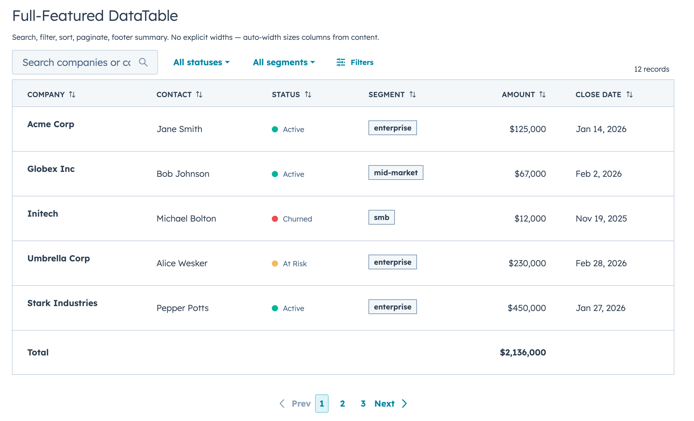
A drop-in table component for HubSpot UI Extensions. Define your columns, pass your data, and you get search, filtering, sorting, pagination, inline editing, row grouping, and auto-sized columns out of the box.
## Quick Start
```jsx
import { DataTable } from "hs-uix/datatable";
import { AutoStatusTag, AutoTag, KeyValueList, SectionHeader } from "hs-uix/common-components";
import { formatCurrency, formatDate } from "hs-uix/utils";
const COLUMNS = [
{ field: "name", label: "Company", sortable: true, renderCell: (val) => val },
{ field: "status", label: "Status", renderCell: (val) => },
{ field: "segment", label: "Segment", renderCell: (val) => },
{ field: "amount", label: "Amount", sortable: true, renderCell: (val) => formatCurrency(val) },
{ field: "closeDate", label: "Close Date", renderCell: (val) => formatDate(val) },
];
```
That's a searchable, sortable, paginated table with auto-sized columns in 5 lines of config.
## Features
- Full-text search with optional fuzzy matching via Fuse.js
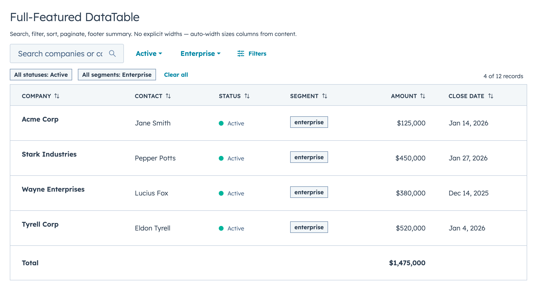
- Select, multi-select, and date range filters with active badges and clear/reset controls
- Click-to-sort headers with three-state cycling
- Client-side or server-side pagination
- Collapsible row groups with per-column aggregation
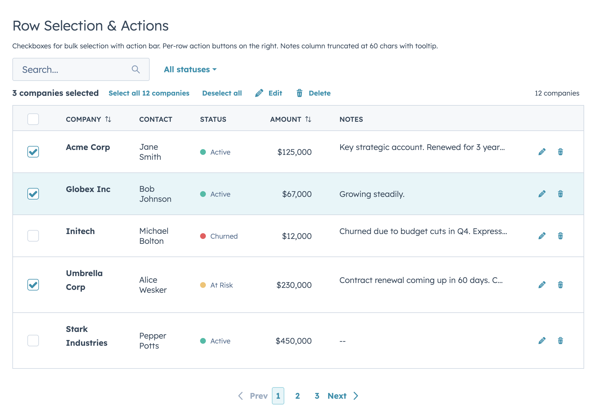
- Row selection with bulk action bar
- Per-row actions via `rowActions`
- Two edit modes (discrete click-to-edit and inline always-visible) supporting 12 input types with validation
- Auto-width column sizing based on data analysis
- Column-level footer for totals rows
- Works with `useAssociations` for live CRM data
- Server-side mode with loading/error states, search debounce, and unified `onParamsChange` callback
## Highlights
### Filters & Footer Totals
### Row Selection & Bulk Actions
### Inline Editing
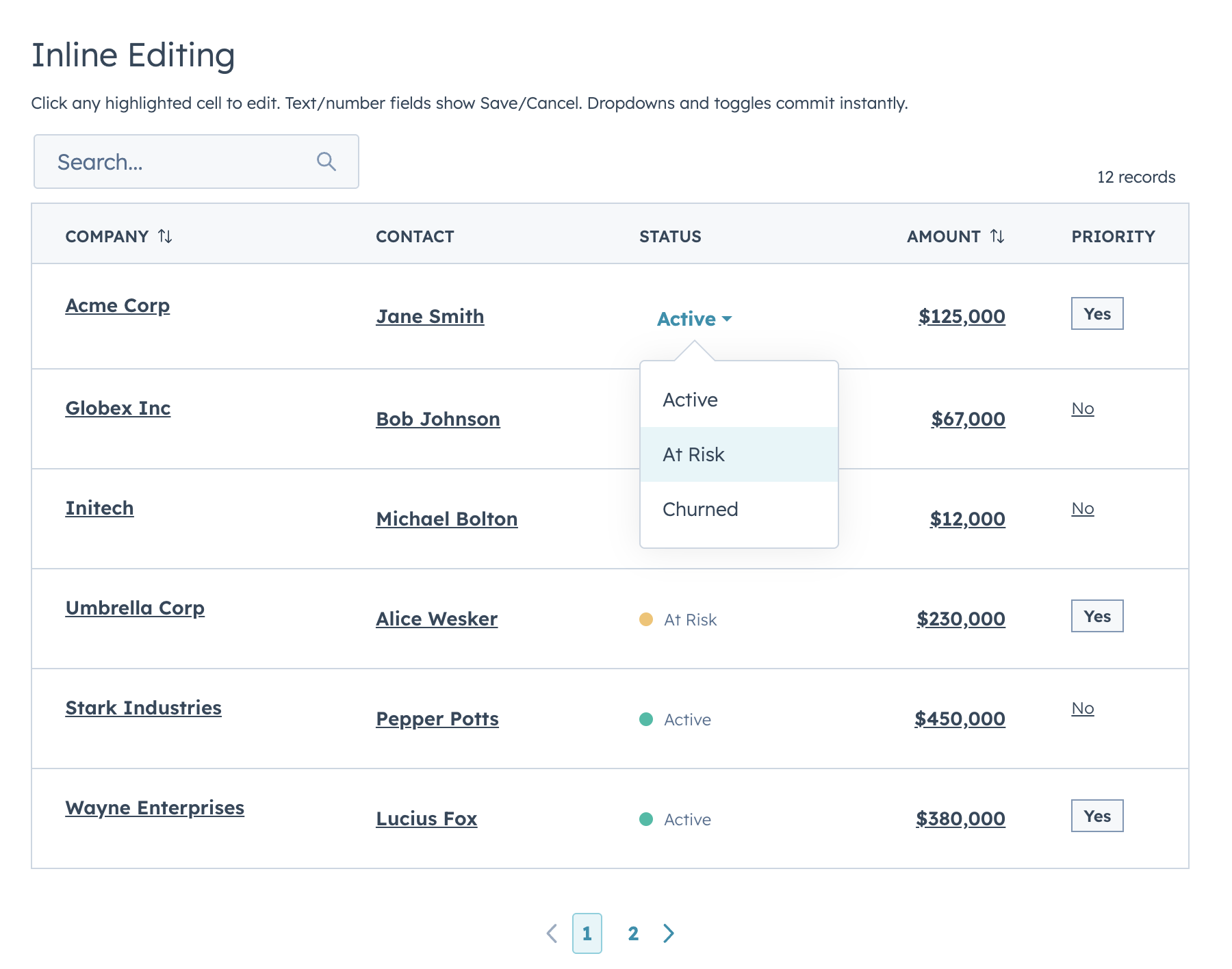
Two edit modes: **discrete** (click-to-edit, default) and **inline** (always-visible inputs). Supports `text`, `textarea`, `number`, `currency`, `stepper`, `select`, `multiselect`, `date`, `time`, `datetime`, `toggle`, and `checkbox`.
### Row Grouping
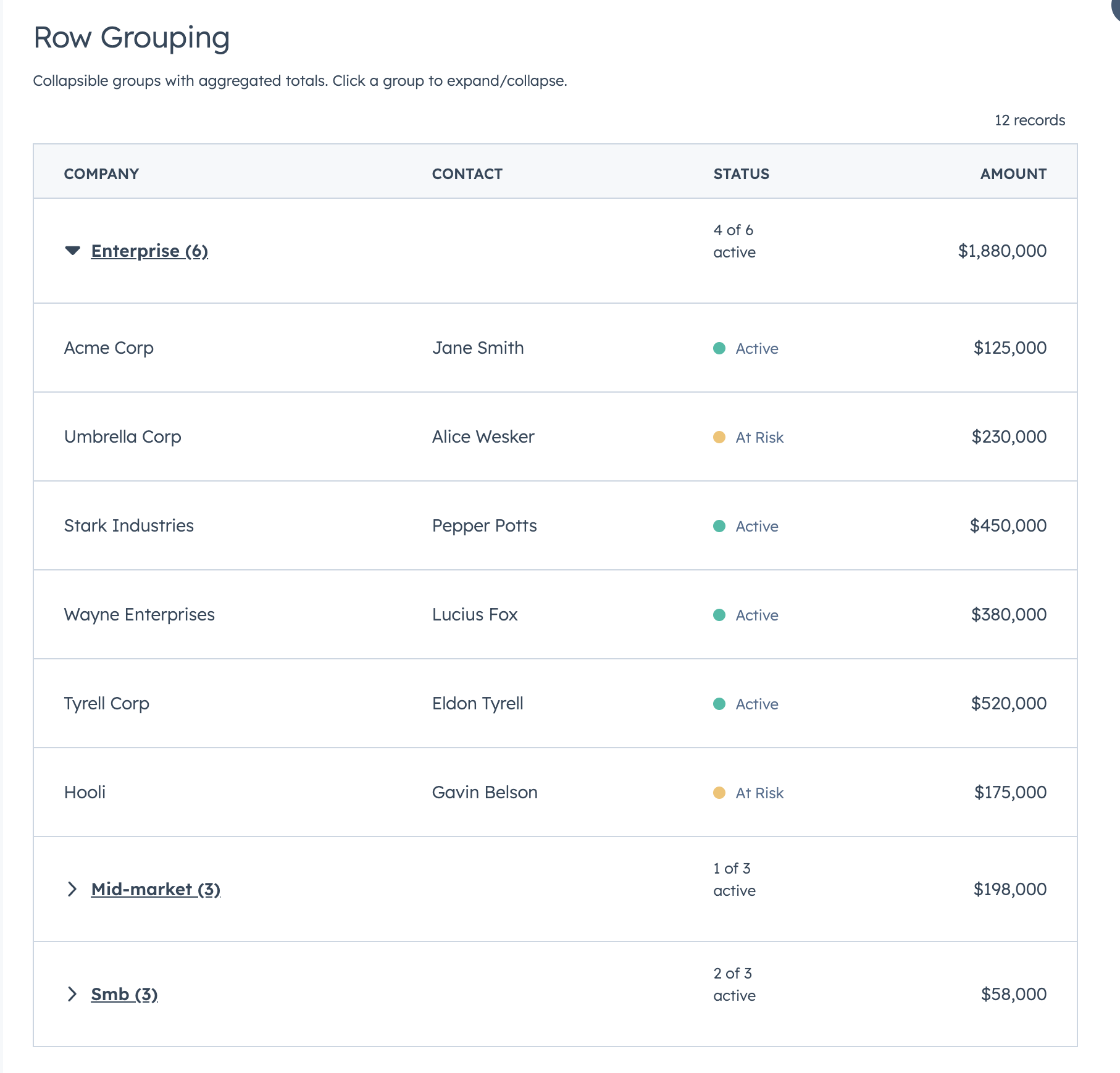
### Full-Row Editing
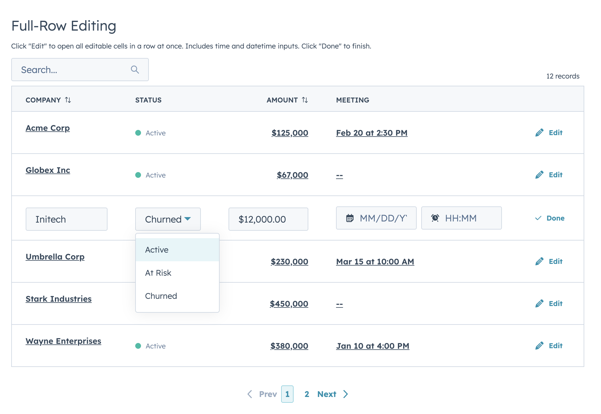
### useAssociations
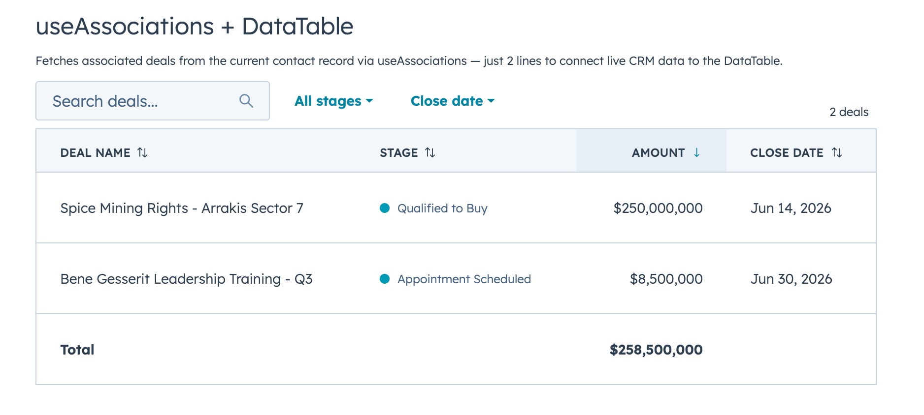
Connect live CRM data (contacts, deals, tickets, etc.) to a DataTable with `useAssociations` from `@hubspot/ui-extensions/crm`.
---
# FormBuilder
Declarative, config-driven forms for HubSpot UI Extensions. Define fields as data, get a complete form with validation, layout, multi-step wizards, and full HubSpot component integration.
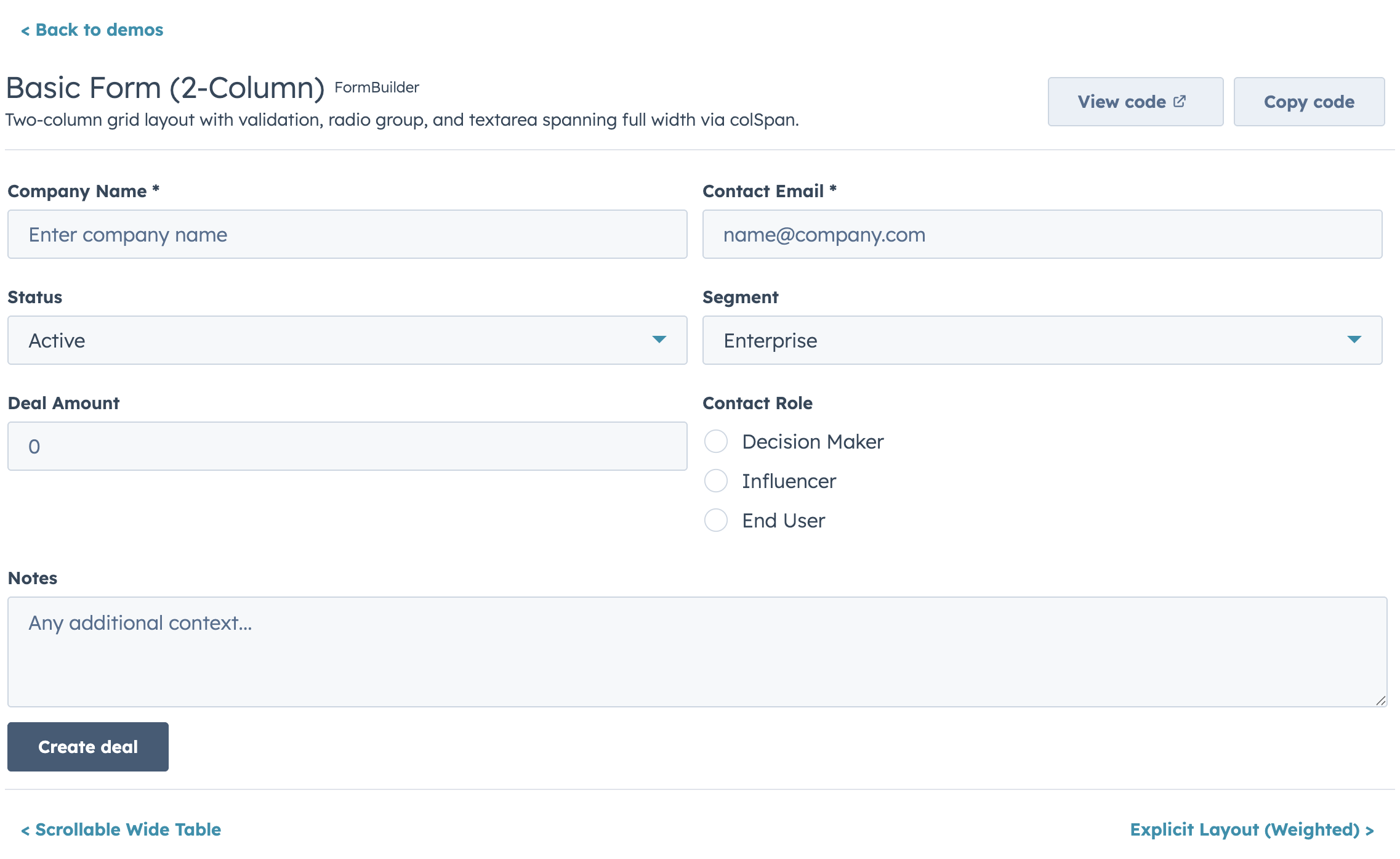
## Quick Start
```jsx
import { FormBuilder } from "hs-uix/form";
const fields = [
{ name: "firstName", type: "text", label: "First name", required: true },
{ name: "lastName", type: "text", label: "Last name", required: true },
{ name: "email", type: "text", label: "Email", pattern: /^[^\s@]+@[^\s@]+$/, patternMessage: "Enter a valid email" },
];
console.log(values)}
/>
```
## Features
- 20+ field types mapping to native HubSpot components (`text`, `number`, `select`, `date`, `toggle`, `repeater`, `crmPropertyList`, and more)
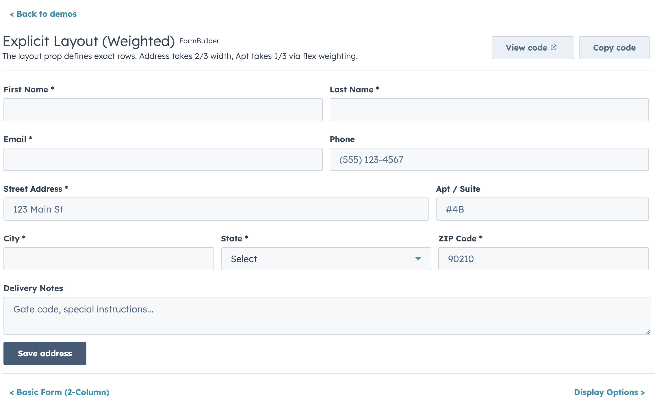
- Four layout modes: fixed columns, responsive AutoGrid, explicit row layout, and legacy half-width
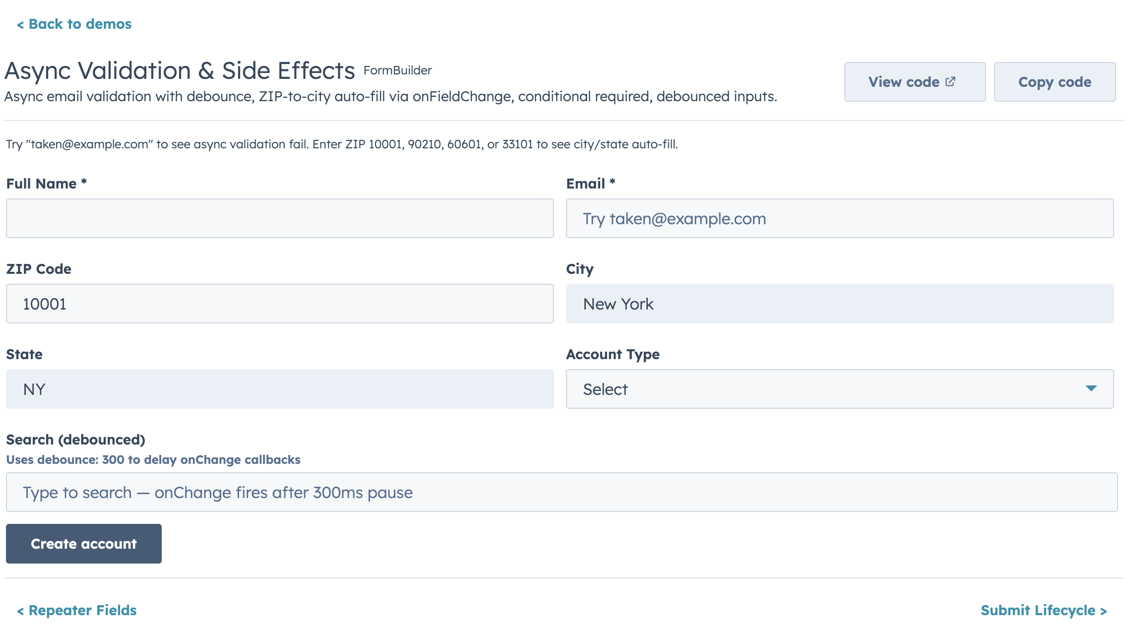
- Built-in validation chain: required, pattern, length/range, custom sync, and custom async with loading indicators
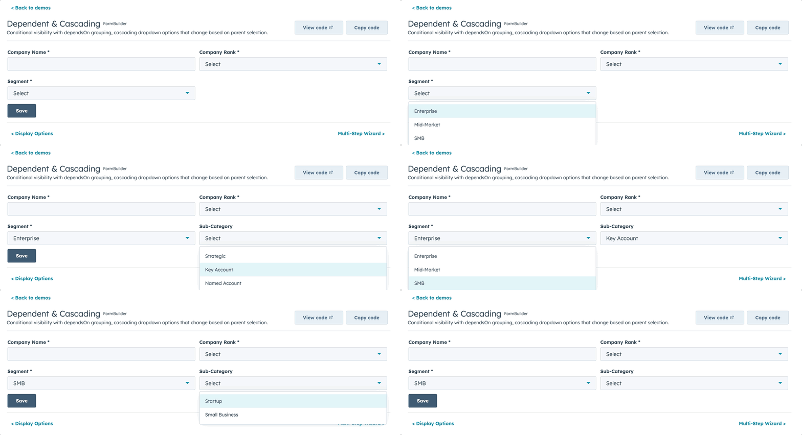
- Conditional visibility and dependent property grouping
- Multi-step wizards with per-step validation
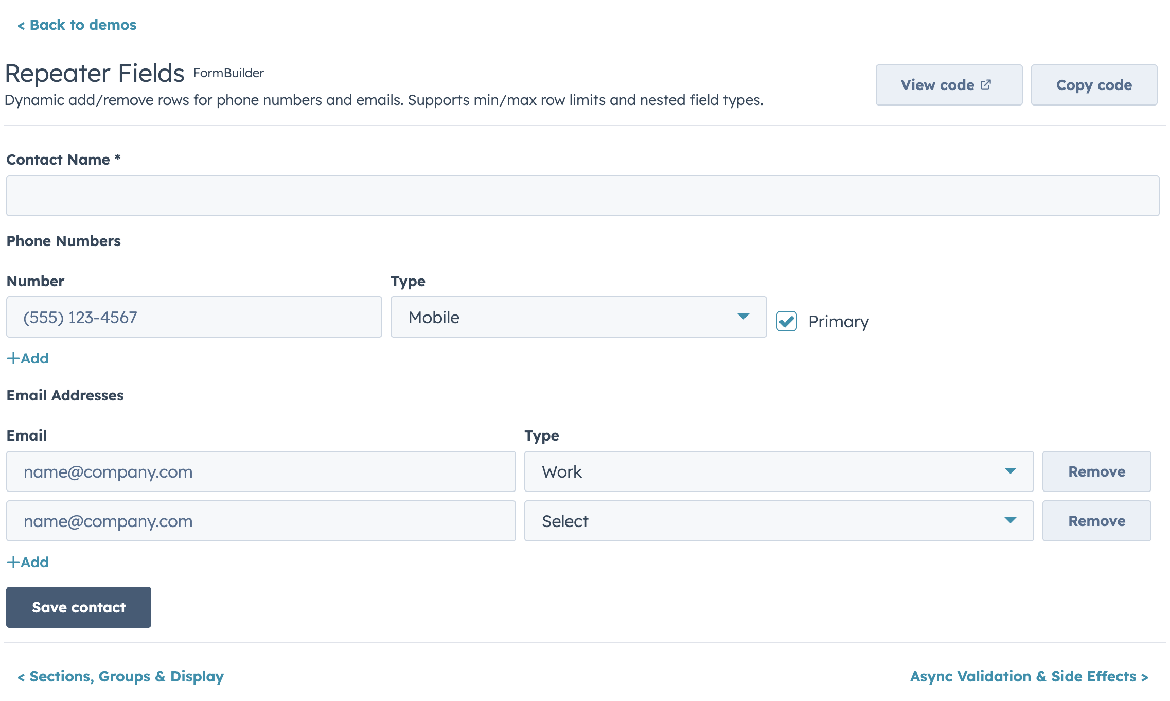
- Repeater fields for dynamic add/remove rows
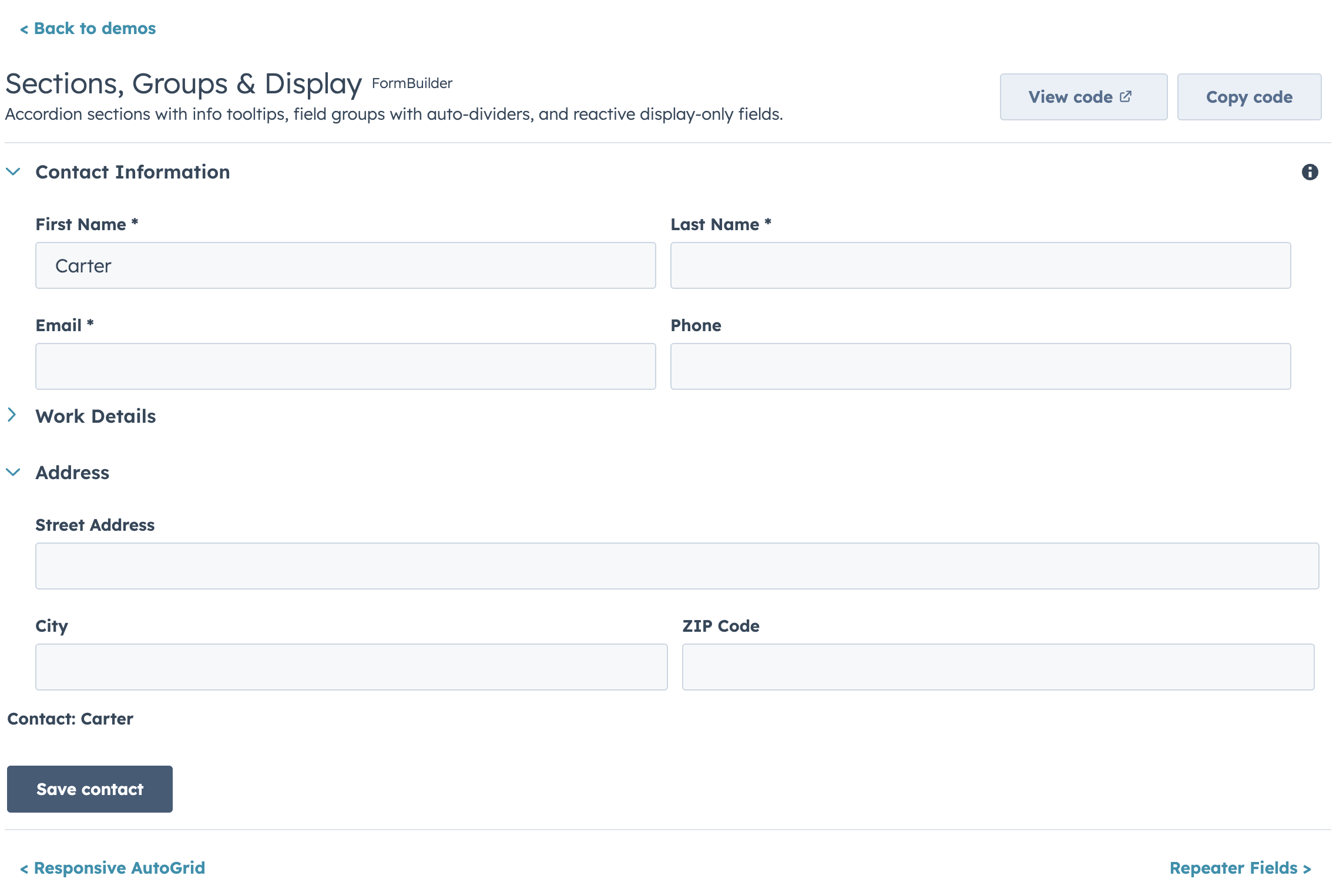
- Accordion sections and field group dividers
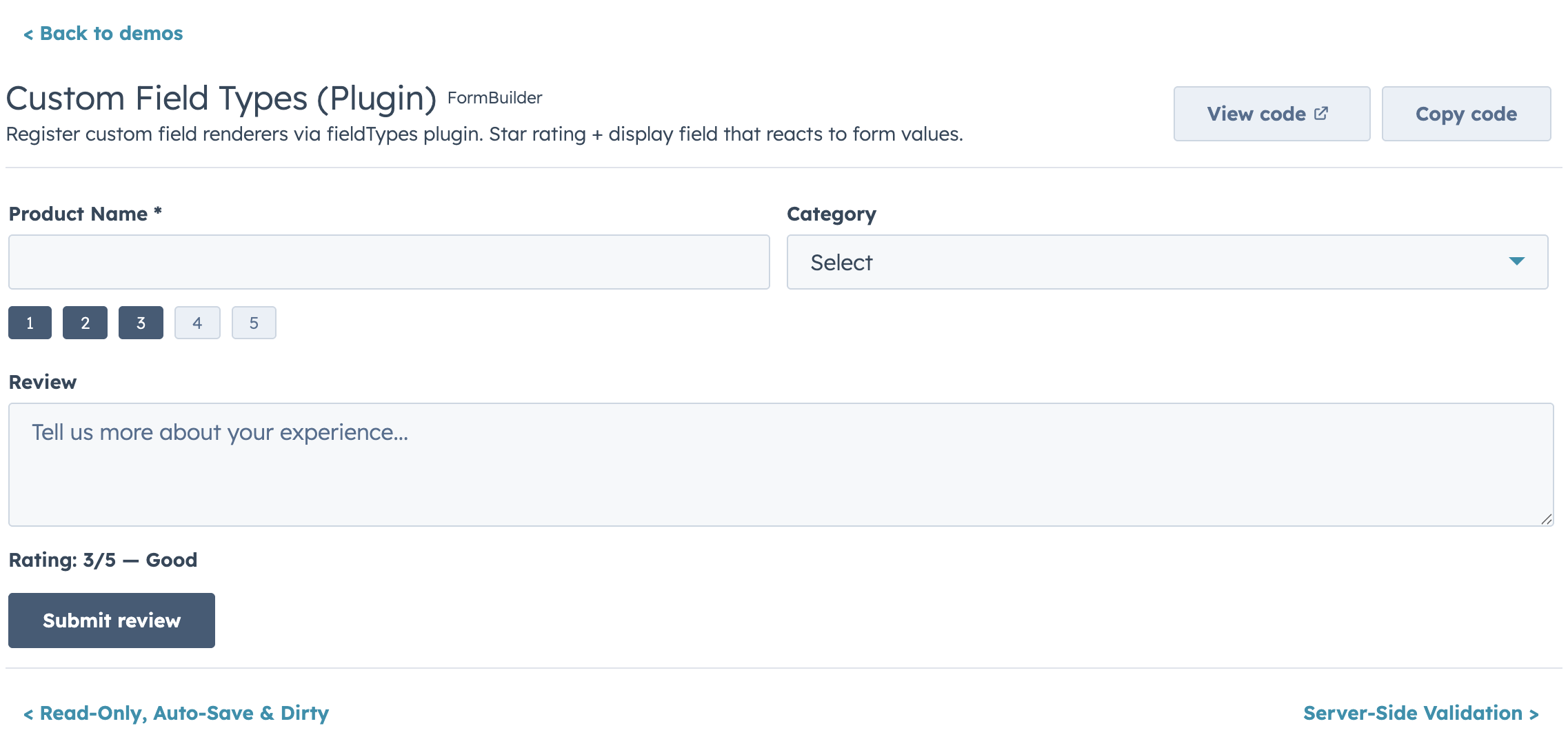
- Custom field type plugin registry
- Controlled and uncontrolled modes
- Ref API for imperative access (`submit`, `validate`, `reset`, `getValues`, `setFieldValue`, etc.)
- Submit lifecycle hooks (`transformValues`, `onBeforeSubmit`, `onSubmitSuccess`, `onSubmitError`)
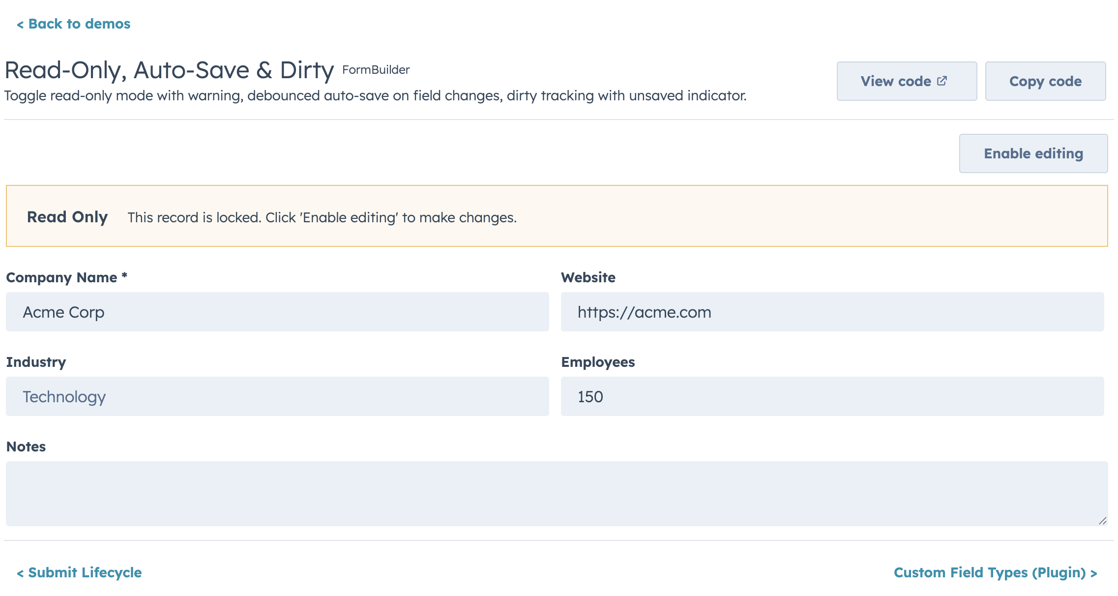
- Auto-save, dirty tracking, read-only mode, and form-level alerts
## Highlights
### Layout
### Conditional Visibility & Dependent Properties
### Async Validation
### Repeater Fields
### Sections & Groups
### Custom Field Types
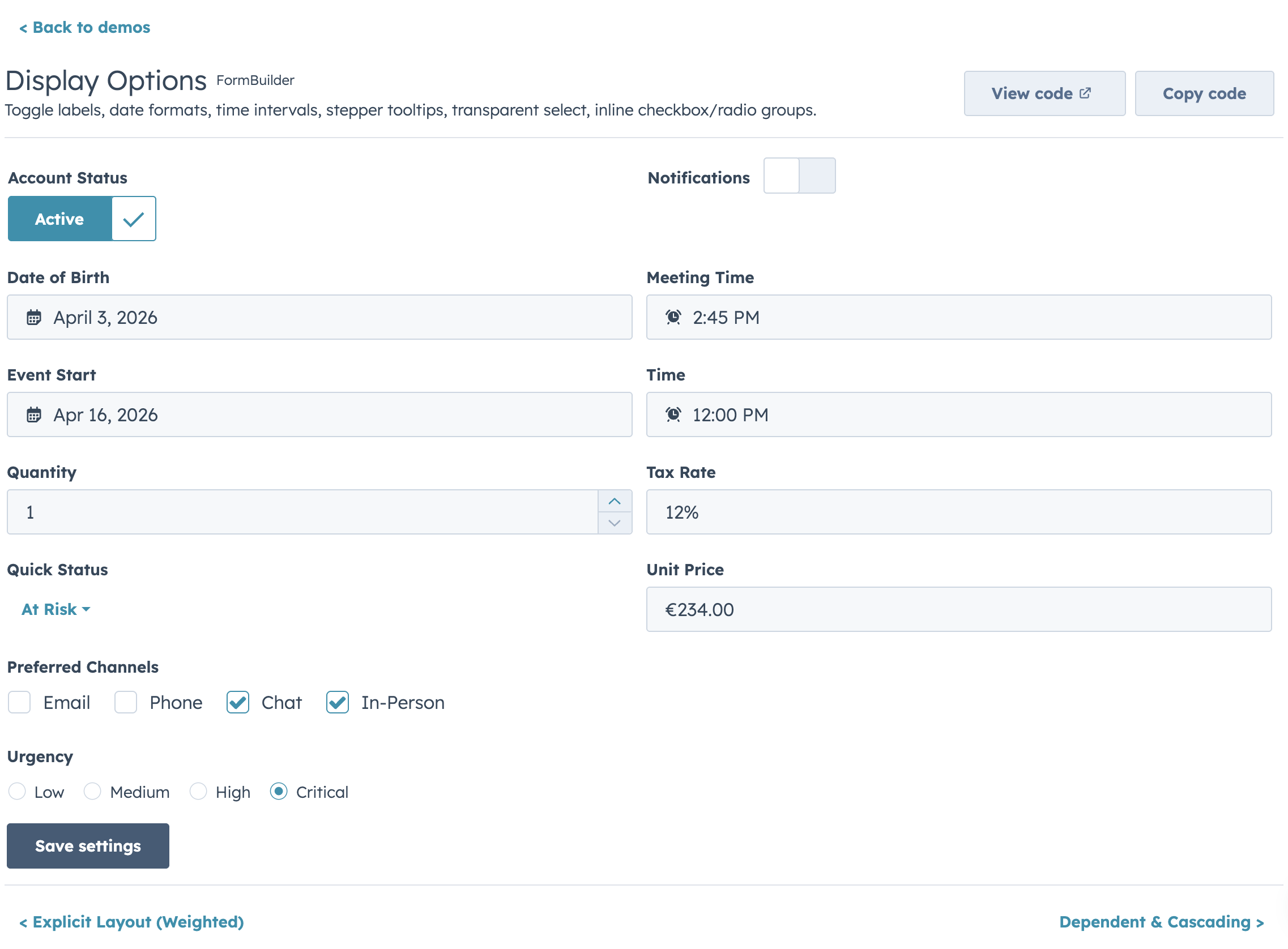
### Display Options
### Read-Only Mode
---
# Kanban
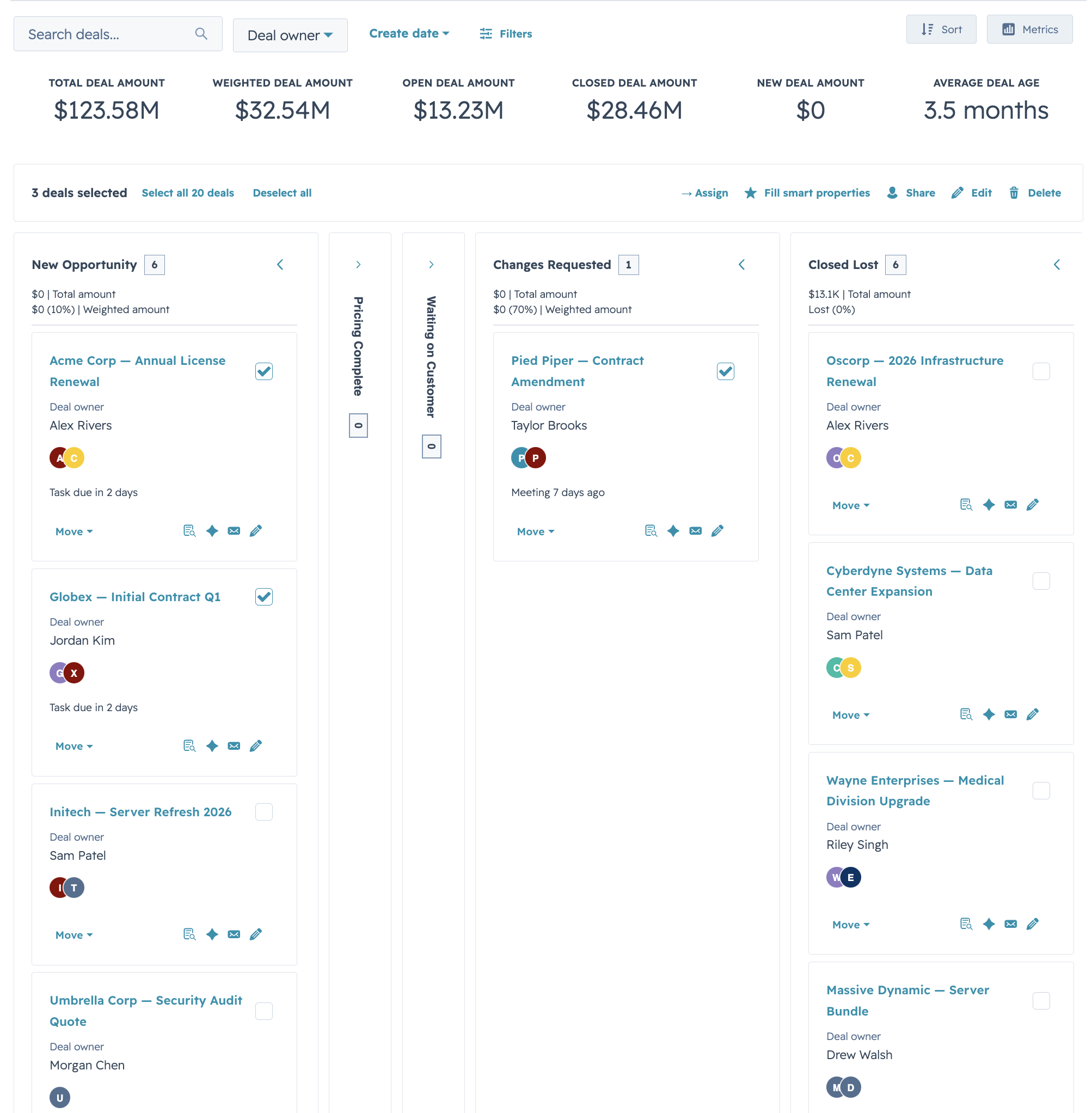
A stage-based board view that shares DataTable's config vocabulary (`cardFields` ≈ `columns`, filters, sort, selection) so you can offer users a table-or-board toggle without rewriting the data layer. Drag-and-drop isn't available inside HubSpot UI Extensions, so stage changes happen through an inline `Select` (or menu) on each card.
## Quick Start
```jsx
import { Kanban } from "hs-uix/kanban";
import { AutoTag } from "hs-uix/common-components";
import { formatCurrencyCompact, formatDate } from "hs-uix/utils";
const STAGES = [
{ value: "qualified", label: "Qualified", variant: "info" },
{ value: "proposal", label: "Proposal", variant: "info" },
{ value: "negotiation", label: "Negotiation", variant: "warning" },
{ value: "closed_won", label: "Closed Won", variant: "success", terminal: true },
{ value: "closed_lost", label: "Closed Lost", variant: "default", terminal: true },
];
const CARD_FIELDS = [
{ field: "name", placement: "title" },
{ field: "company", placement: "subtitle" },
{ field: "amount", placement: "meta", render: (val) => formatCurrencyCompact(val) },
{ field: "segment", placement: "body", render: (val) => },
{ field: "closeDate", placement: "footer", render: (val) => formatDate(val) },
];
updateDealStage(row.id, newStage)}
/>
```
## Features
- **Stage-based columns** with variant-colored headers (`success` / `warning` / `info` / `default`), collapse-to-rail, and stage-level count badges
- **`cardFields` with placement** (`title` / `subtitle` / `meta` / `body` / `footer`) — same render/truncate/visible hooks as DataTable columns
- **Filters and sort** with the same config shape as DataTable (`select`, `multiselect`, `dateRange`)
- **Headline metrics** rendered above the board (deal totals, weighted pipeline, win rate) via a `metrics` prop
- **Stage transition prompts** — async confirmation or extra-property capture before committing a stage change, declared per-stage via `stage.onEnterRequired.render`
- **Selection bar + card actions** for bulk moves, deletes, or custom handlers (`KanbanCardActions`)
- **Empty / loading / error render slots** that mirror DataTable's override API
- **Paired view adapters** — use `deriveCardFieldsFromColumns` from `hs-uix/utils` to project a DataTable `columns` config into Kanban `cardFields` with a single function call
## Highlights
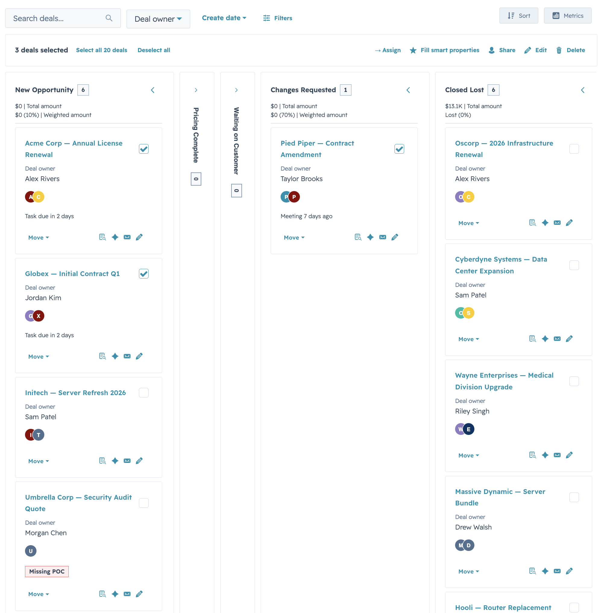
### HubSpot Deals preset

Drop-in preset shaped like HubSpot's native deals pipeline: stage-variant headers, per-stage amount totals in the header metric, and an avatar-stack footer row. Hide the summary row with `showMetrics={false}` for dashboards that already surface totals elsewhere.
### Compact lead board
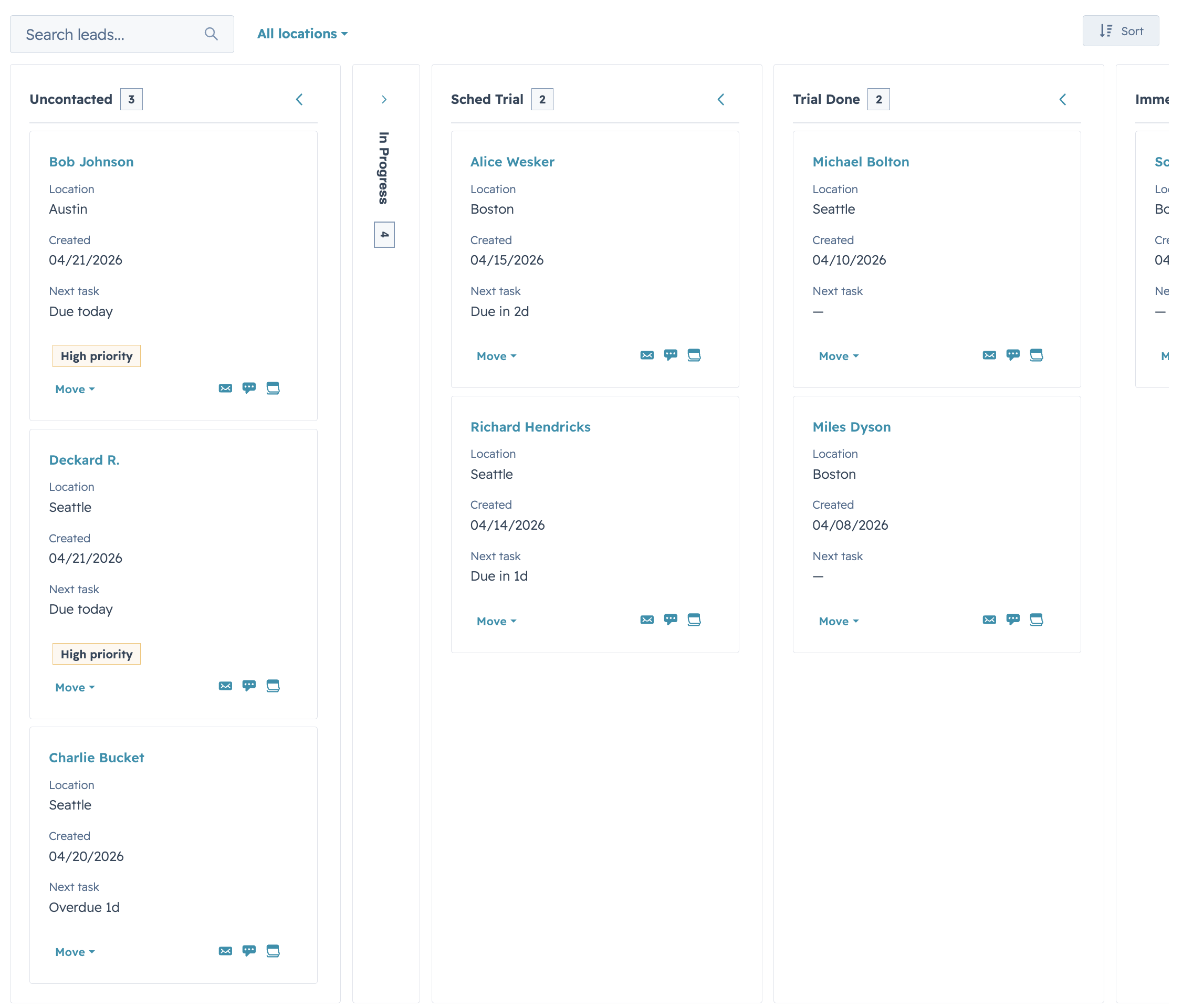
`cardDensity="compact"` with trimmed `cardFields` for high-volume boards (leads, tickets, tasks) where you want to fit 8-12 cards per column on a typical viewport without horizontal scrolling.
### Load-more & stage controls
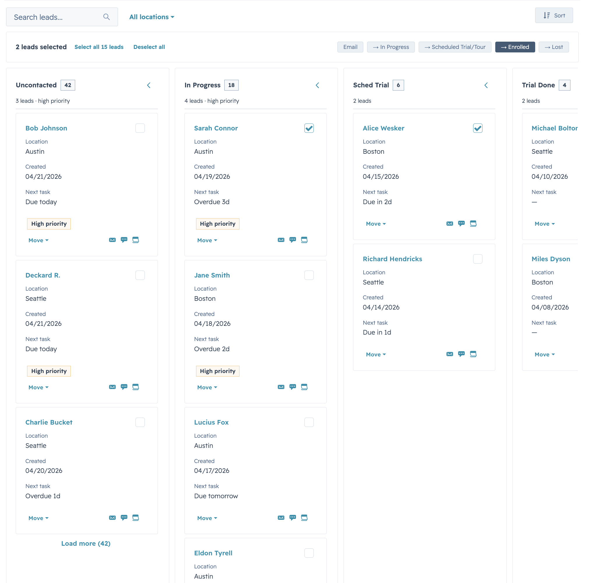
Per-stage pagination via an `onLoadMore` handler and `stageMeta.hasMore`, plus inline `Select` stage controls on each card (`stageControl="select"`). Switch to `"menu"` for action-menu style transitions, or `"none"` for read-only boards.
---
# Common Components
Thin, composable visual wrappers built on HubSpot's native primitives — the reusable pieces that show up across DataTable rows, FormBuilder cells, and Kanban cards. Use them to skip rewriting the same status-tag / avatar-stack / label-value block on every surface.
## Quick Start
```jsx
import {
AutoStatusTag,
AutoTag,
AvatarStack,
SectionHeader,
KeyValueList,
StyledText,
HS_DATE_PRESETS,
} from "hs-uix/common-components";
import { formatCurrency } from "hs-uix/utils";
},
{ label: "Segment", value: },
{ label: "Owners", value: },
{ label: "Pipeline", value: formatCurrency(245000) },
]}
/>
```
## What's inside
- `Icon` — a superset of HubSpot's native ``: custom glyphs, any CSS color, and pixel sizes, delegating to the native component whenever the request is natively expressible
- `AutoStatusTag` — `StatusTag` with variant inferred from the value (`Active` → success, `At risk` → warning, `Failed` → danger, etc.)
- `AutoTag` — `Tag` with the same inference, for non-status labels
- `AvatarStack` — overlapping circular avatars as a single SVG (letters, image URLs, or mixed); `+N` overflow chip past `maxVisible`
- `CrmLookupSelect` — CRM-backed `Select` / `MultiSelect` with live, debounced search
- `SectionHeader` — title + optional description + actions slot
- `KeyValueList` — vertical list of label/value rows via `DescriptionList`
- `StyledText` — SVG-rendered text with rotation, custom color, and pill backgrounds for cases native `` can't express
Plus low-level builders (`makeAvatarStackDataUri`, `makeStyledTextDataUri`) that return `{ src, width, height }` for composing into larger SVGs, and style constants (`HS_FONT_FAMILY`, `HS_TEXT_COLOR`, `HS_SUBTLE_BG`, `HS_MUTED_TEXT`, `HS_NEUTRAL_CHIP`) that mirror HubSpot's native CSS — so custom SVGs sit alongside the rest of the UI without a color mismatch.
## Highlights
### AutoTag & AutoStatusTag
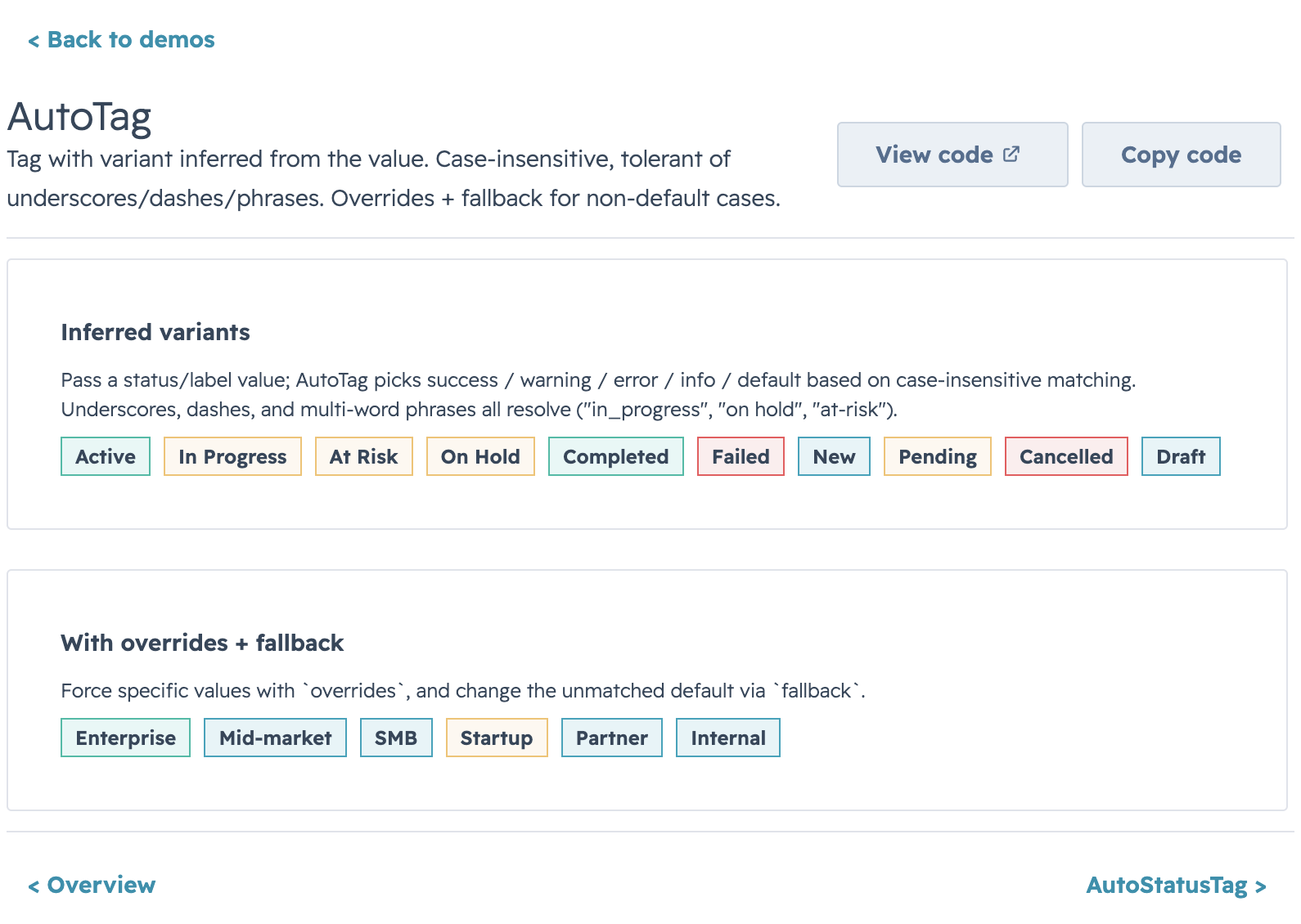
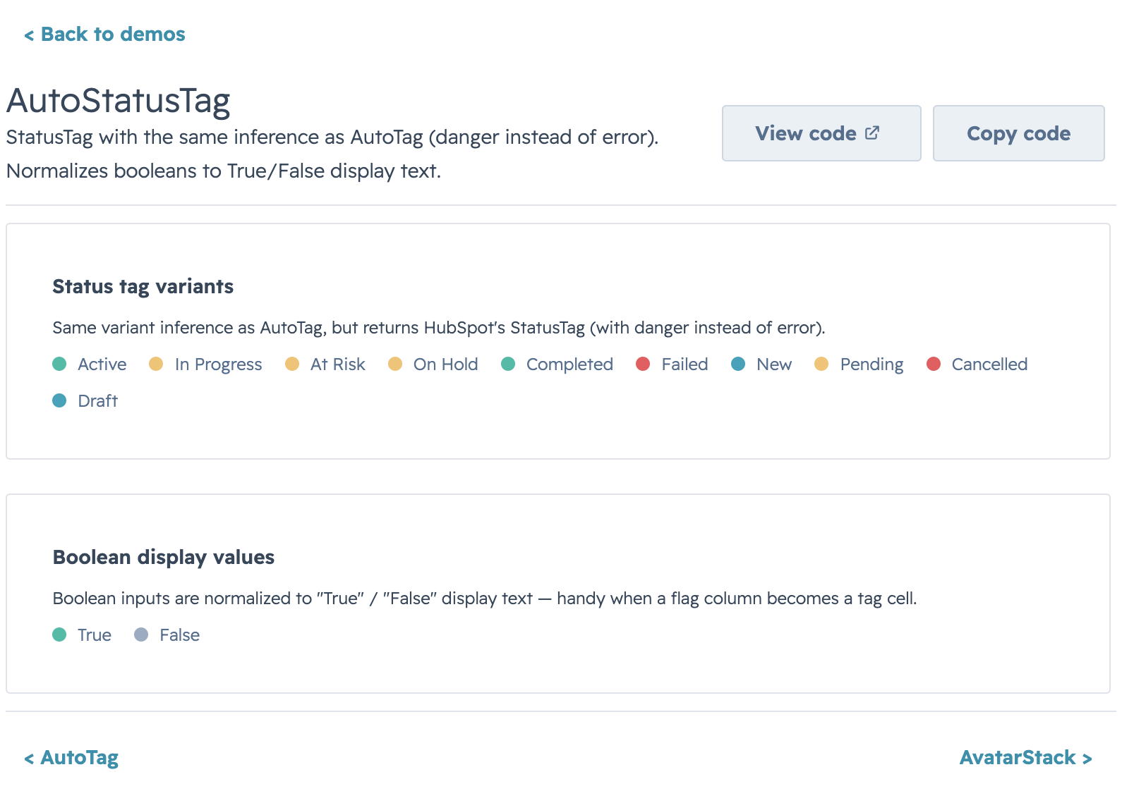
Pass a free-form status string and get a properly-colored tag back. Matching is case-insensitive and tolerates underscores / dashes / phrases (`"in_progress"`, `"on hold"`, `"at-risk"` all resolve). Override via `overrides={{ "Processing": "warning" }}` and `fallback="info"` for values that don't match built-in heuristics.
### AvatarStack
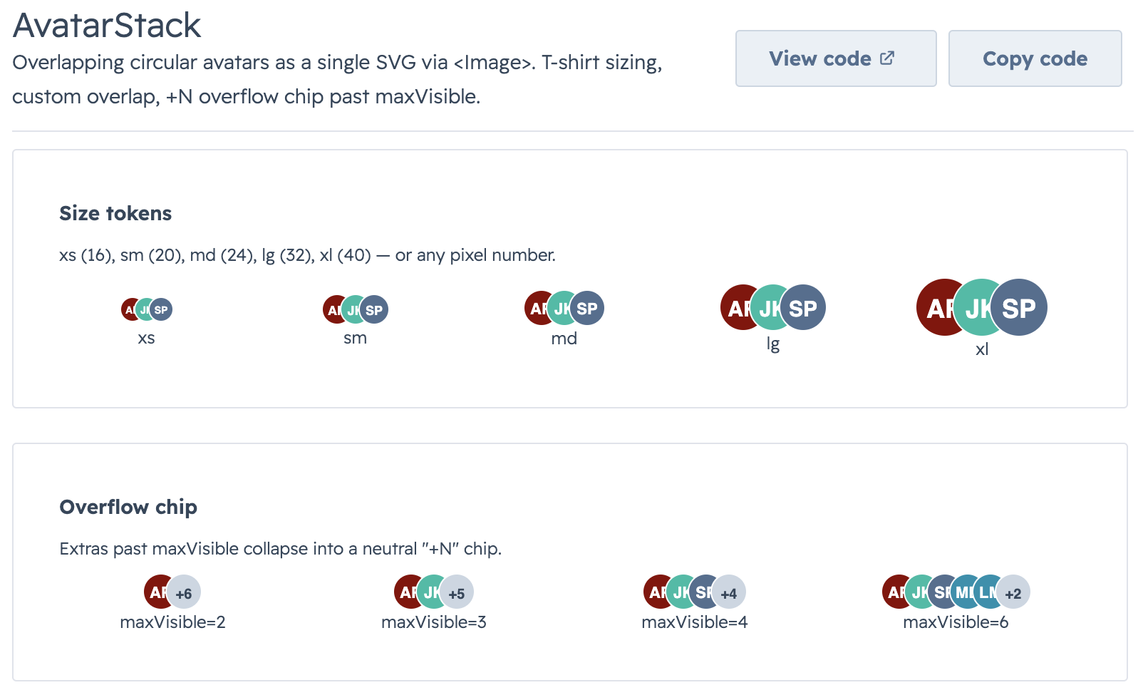
Overlapping avatars rendered as a single SVG via ``. T-shirt sizing (`xs` → `xl`) or a raw pixel number. Letters auto-color from the built-in palette; image URLs get circular-clipped. Extras past `maxVisible` collapse into a neutral `+N` chip.
### Icon
A superset of HubSpot's native ``. When the request is natively expressible (a whitelisted `name`, a semantic `color`, an `sm`/`md`/`lg` `size`) it **delegates to the real ``** — keeping auto-sizing, `color="inherit"`, and screen-reader semantics. Otherwise it renders a registered SVG glyph as a data-URI ``, lifting all three native limits: custom/unregistered glyphs (~248 bundled in `ICONS`), any CSS color, and `xs`–`xl` tokens or a pixel size. Add your own glyphs via `svgToIconEntry`, or build a data URI directly with `makeIconDataUri`.
### CrmLookupSelect
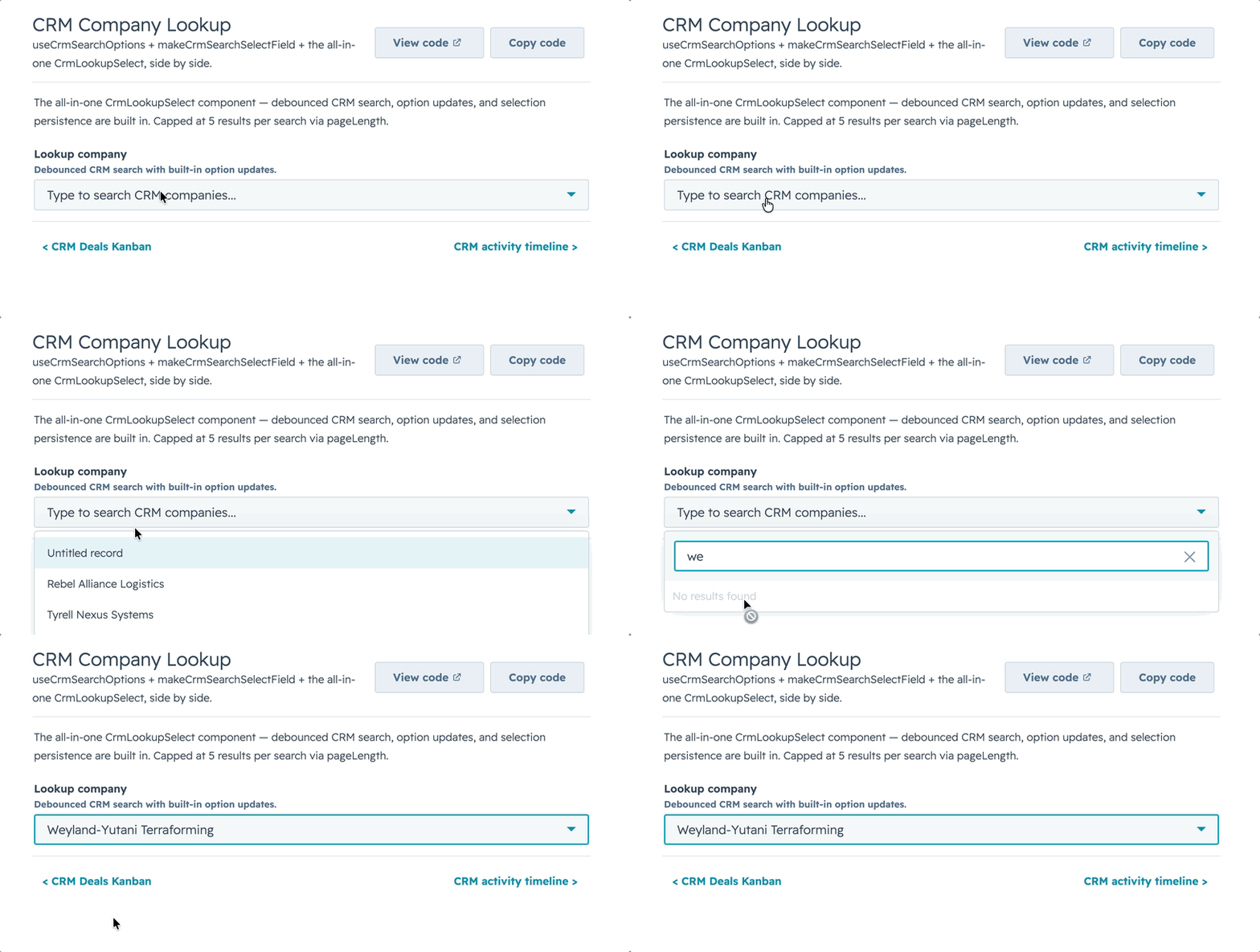
Point it at a CRM `objectType` + `properties` and get a debounced, paginated `Select` / `MultiSelect` that searches live as the user types. Picked options stay valid after results change, `loadingOption` shows during the debounce window, and `noResultsOption` only appears once a query settles — no "no results" flash mid-type.
### SectionHeader & KeyValueList
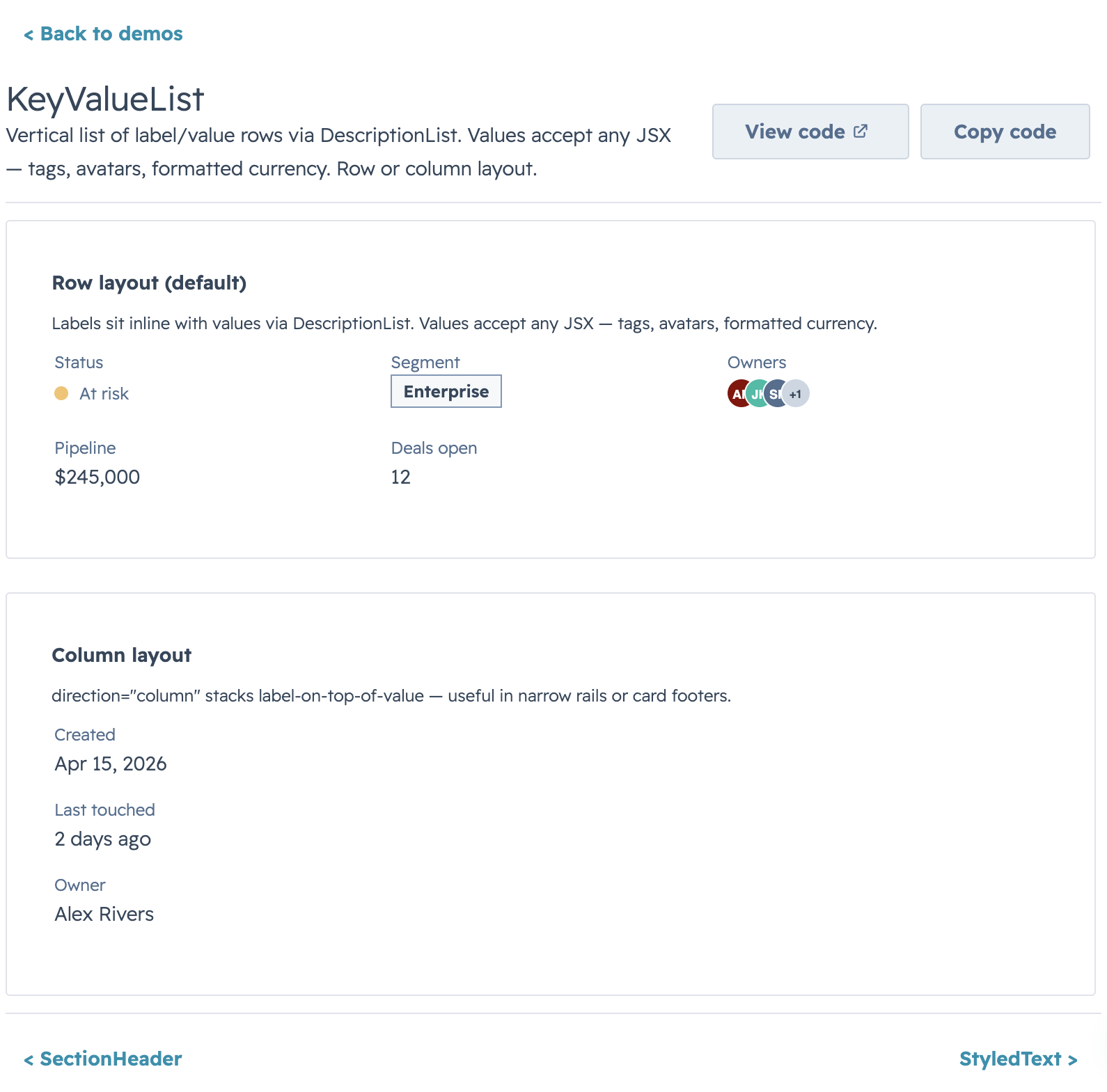
Pair `SectionHeader` (title / description / action slot) with `KeyValueList` (`DescriptionList` rows) for compact summary panels. `direction="column"` on the list switches to stacked label-on-top rows.
### StyledText
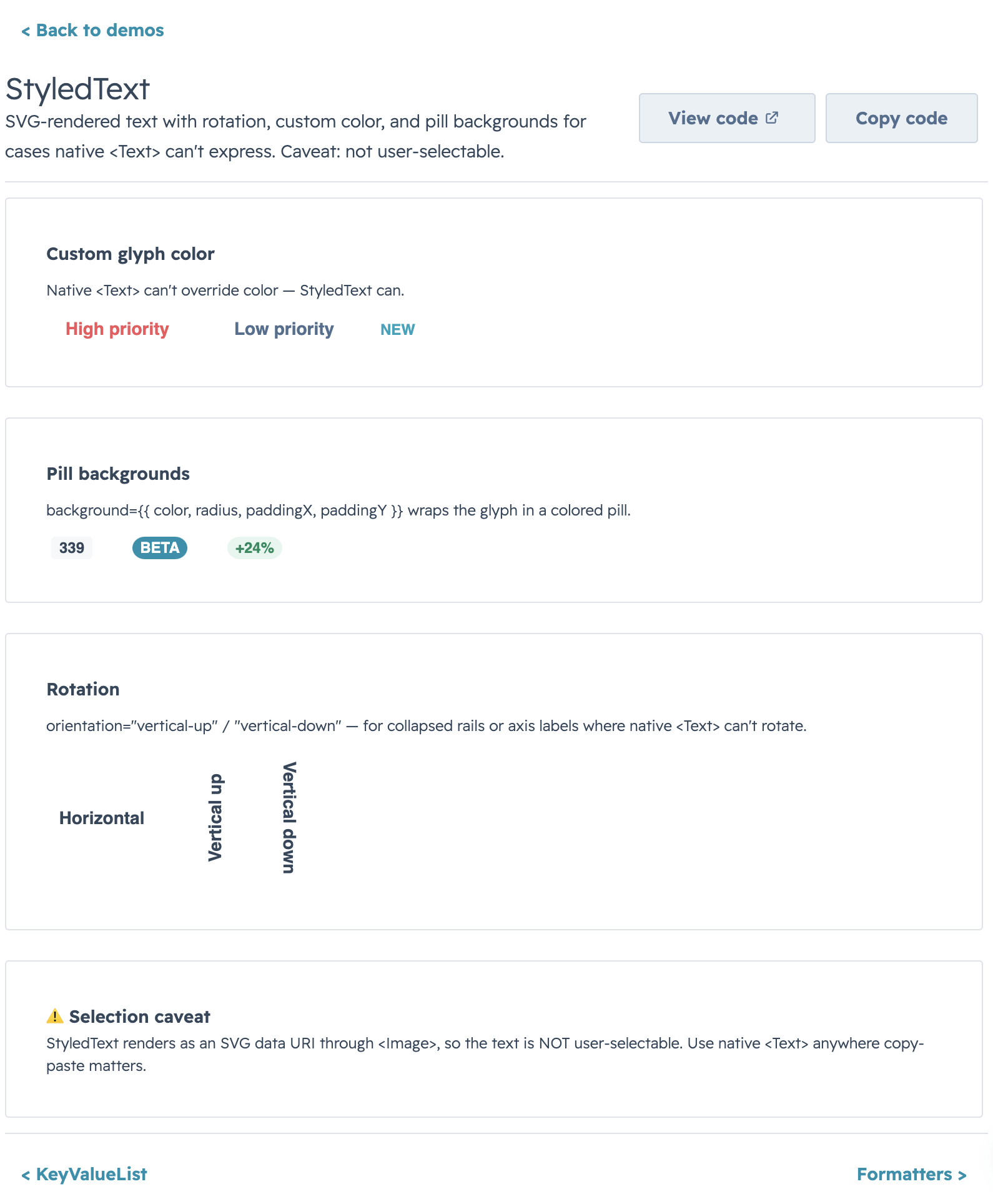
Reach for `StyledText` when native `` can't do what you need: vertical rail labels (`orientation="vertical-down"`), HubSpot-style pill badges (`background={{ preset: "tag" }}`), or a specific glyph color. Plain horizontal `preset: "tag"` usage renders through native HubSpot `Tag`; rotated/custom tag cases still use the SVG fallback. Use native `` anywhere copy-paste matters.
### HS_DATE_PRESETS
HubSpot's native quick-date preset list (`Today`, `Last 7 days`, `This quarter`, …) as a ready-to-use `options` array for `DataTable` / `Kanban` select filters. Values are stable identifiers (`"today"`, `"7d"`, `"this_quarter"`) — translate to date bounds via `filterFn` or server-side in `onFilterChange`.
---
# Utils
Pure helper functions for formatting values, building option arrays, detecting HubSpot-shaped date/time objects, and inferring tag variants from raw data. Zero side effects, no JSX — drop them into `renderCell`, `sortComparator`, or a server handler.
## Quick Start
```jsx
import {
formatCurrency,
formatCurrencyCompact,
formatDate,
formatDateTime,
formatPercentage,
buildOptions,
findOptionLabel,
getAutoTagVariant,
createStatusTagSortComparator,
sumBy,
} from "hs-uix/utils";
formatCurrency(1234.56); // → "$1,235"
formatCurrencyCompact(123_580_000); // → "$123.6M"
formatDate("2026-04-15"); // → "Apr 15, 2026"
formatPercentage(0.1567); // → "16%"
const statusOptions = buildOptions(
[{ name: "Open", id: "o" }, { name: "Closed", id: "c" }],
{ labelKey: "name", valueKey: "id" },
);
findOptionLabel(statusOptions, "o"); // → "Open"
getAutoTagVariant("At risk"); // → "warning"
sumBy(deals, "amount"); // → total
```
## What's inside
- **`formatters.js`** — locale-aware `Intl`-based number / currency / date / percentage formatters. Every formatter accepts a trailing options object that spreads into the underlying `Intl` call, so anything `Intl.NumberFormat` supports (narrow symbol, specific fraction digits, grouping) is reachable without a new helper.
- **`options.js`** — `buildOptions(items, opts?)` to shape raw arrays into `{ label, value }` for HubSpot `Select` / `MultiSelect`; `findOptionLabel(options, value, fallback?)` for the reverse lookup.
- **`hubspotValues.js`** — type guards for HubSpot's `DateInput` / `TimeInput` / `DateTimeInput` value shapes (`isDateValueObject`, `isTimeValueObject`, `isDateTimeValueObject`). Use in `filterFn` or `sortComparator` to distinguish a HubSpot date-object from a raw string/Date.
- **`tagVariants.js`** — heuristic mappers from free-form status strings to semantic tag variants (`getAutoTagVariant`, `getAutoStatusTagVariant`, `getAutoTagDisplayValue`) plus `createStatusTagSortComparator` for DataTable columns grouped by color, then alphabetical within each color.
- **`collections.js`** — `sumBy(items, keyOrFn)` for total / weighted-total rows, safe against `null` / missing values.
## Highlights
### Formatters
```js
formatCurrency(9500, { currency: "EUR" }); // → "€9,500"
formatCurrencyCompact(4160); // → "$4.2K"
formatDate(Date.now(), { month: "numeric" }); // → "4/15/2026"
formatDateTime("2026-04-15T14:30:00Z"); // → "Apr 15, 2026, 9:30 AM" (local)
formatPercentage(0.1567, { maximumFractionDigits: 1 });// → "15.6%"
```
Every formatter treats `null` / `undefined` as safe — `formatCurrency(null)` → `"$0"`, `formatDate(null)` → `""` — so they're safe to drop into cells rendering partially-loaded data.
### Tag Variants
The same inference that powers `AutoTag` / `AutoStatusTag`, exposed as plain functions for use in custom cells and sort comparators. Default ordering: `success → warning → danger/error → info → default`; override via `variantOrder` on `createStatusTagSortComparator`.
### Options & HubSpot Value Guards
Build select options from CRM records, resolve labels back to values, and detect HubSpot's structured date/time value objects in one import — no more ad-hoc `.map(r => ({ label: r.name, value: r.id }))` at every call site.
---
## Migrating from `@hs-uix/datatable` or `@hs-uix/form`
Both packages have been merged into `hs-uix`. Update your imports:
```diff
- import { DataTable } from "@hs-uix/datatable";
+ import { DataTable } from "hs-uix/datatable";
- import { FormBuilder } from "@hs-uix/form";
+ import { FormBuilder } from "hs-uix/form";
```
```bash
npm uninstall @hs-uix/datatable @hs-uix/form
npm install hs-uix
```
---
## License
MIT