https://github.com/0xch4z/styled-queries
💫 A simple interface for styled-component queries. Media queries for the component age.
https://github.com/0xch4z/styled-queries
css-in-js react styled-components
Last synced: 8 months ago
JSON representation
💫 A simple interface for styled-component queries. Media queries for the component age.
- Host: GitHub
- URL: https://github.com/0xch4z/styled-queries
- Owner: 0xch4z
- License: mit
- Created: 2017-08-29T19:07:52.000Z (about 8 years ago)
- Default Branch: master
- Last Pushed: 2019-05-29T06:04:04.000Z (over 6 years ago)
- Last Synced: 2025-03-26T13:50:37.406Z (8 months ago)
- Topics: css-in-js, react, styled-components
- Language: JavaScript
- Size: 4.63 MB
- Stars: 1
- Watchers: 0
- Forks: 0
- Open Issues: 0
-
Metadata Files:
- Readme: README.md
- License: LICENSE
Awesome Lists containing this project
README
 Styled Queries
A tool for use with styled-components! Media queries for the component age.

What's the point? 🤷♂️
This tool offers a simpler interface for writing out media queries in *styled* tagged templates. It comes with some simple [predifined breakpoints](#default-queries-), the ability to inject your own [configuration](#configuring-) and some convenient [query-helpers](#query-helpers-) to help you target specific breakpoints.
Getting started 🚀
First things first, install the npm package via the npm cli.
```bash
$ npm install --save styled-queries
```
Usage 📝
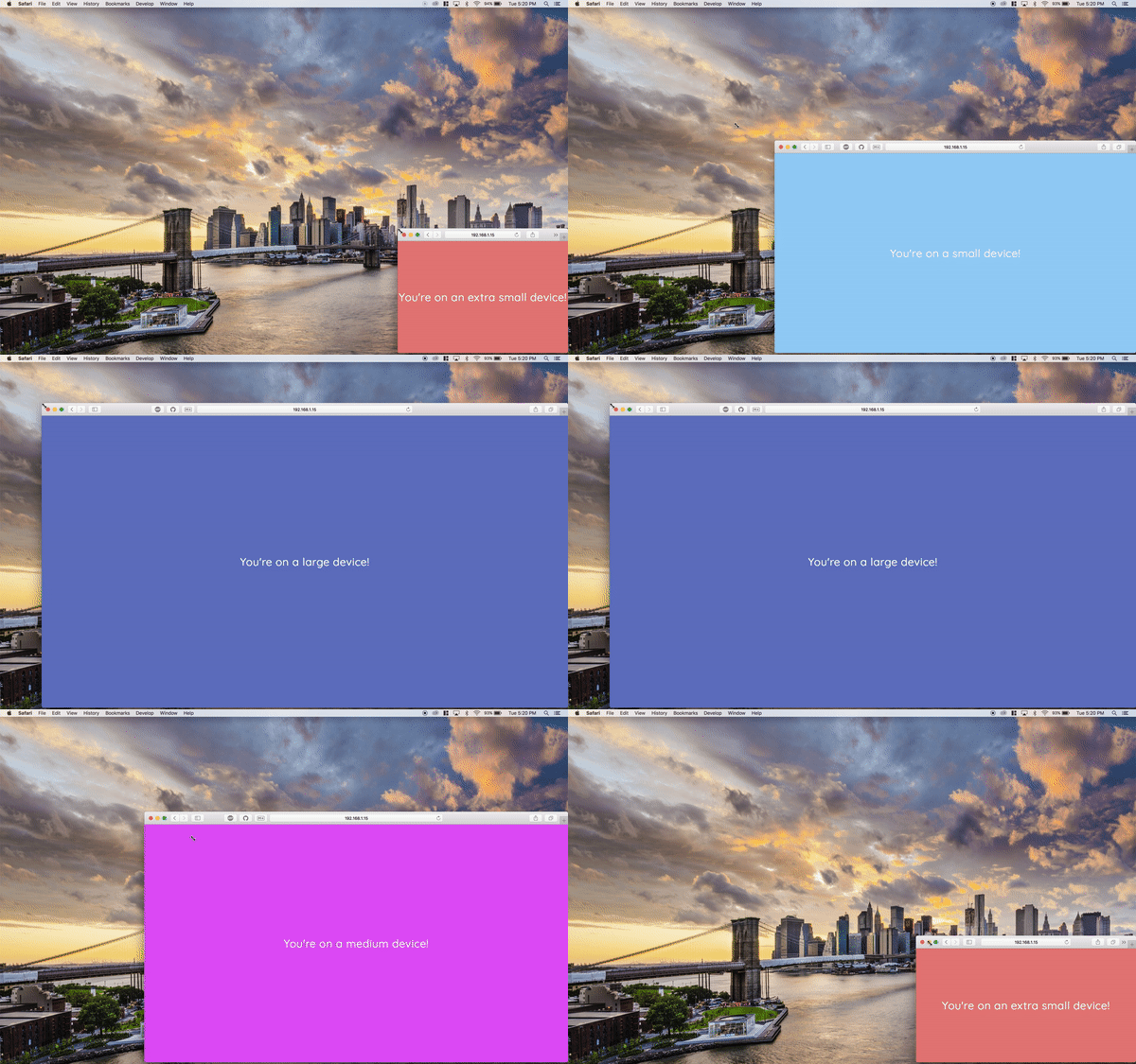
Using Style Queries with your React-Styled project is extremely easy. Simply, `import` the `styled-queries` package into your React component of choice and use interpolation inside of your *styled* tagged template to access the media query breakpoints via dot notation.
The default import is an object containing functions returning media query wrappers. This is what you will be interfacing with to make media queries simpler.
Here's an example:
```js
import React, { Component } from 'react';
import styled from 'styled-components';
import { media } from 'styled-queries';
const Div = styled.div`
color: #fff !important;
height: 100vh;
${media.sm`background: #90caf9;`}
${media.md`background: #e040fb;`}
${media.lg`background: #5c6bc0;`}
${media.xsOnly`font-family: comic-sans;`}
`;
export default () => (
Hello, World!
)
```
Query helpers ✅
As you can see, the API provides `[size]Only` query-helpers for all breakpoints automatically, even for ones you inject with your configuration. These are calculated dynamically by getting the difference of each breakpoint's respecitve width.
```js
const XxlOnlyBanner = styled`
display: none;
${media.xxlOnly`display: block;`}
`
```
Default queries ㉿
Styled Queries comes with some pretty useful breakpoints out of the box. Keep in mind, you can choose add your own and remove these (see the [configuring](#configuring-) section for more details).
```js
const defaultBreakpoints = {
xs: 320,
sm: 768,
md: 1224,
lg: 1400,
xl: 1824,
};
```
Configuring ⚒
It's very easy to add your own configuration to your project. To get started with configuring your own breakpoints, import the `makeQueries` function from `styled-queries`.
`makeQueries` takes two parameters:
1. `{boolean}` Describes whether or not to inject default breakpoints. [Default: `true`]
2. `{object}` Describes a breakpoint and its min-width (where its width is an `{integer}`). [Default: `null`]
To keep things neat, one might dedicate a file in the `utils` directory for exporting a custom config of Styled Queries globally throughout the project. Here's an example:
**./utils/media-queries.js**
```js
import { makeQueries } from 'styled-queries'
export default makeQueries(true, {
xxs: 200,
xxl: 2000,
})
```
**./pages/index.js**
```js
import media from '../utils/media-queries'
const Grid = styled`
display: flex;
flex-wrap: wrap;
background: #9e0;
width: 90%;
${media.md`width: 80%;`}
${media.lg`width: 60%;`}
`
```
Enjoy! ✌️
I hope you make awesome things with style-components and styled-queries!