Ecosyste.ms: Awesome
An open API service indexing awesome lists of open source software.
https://github.com/AdamJaggard/text-tip
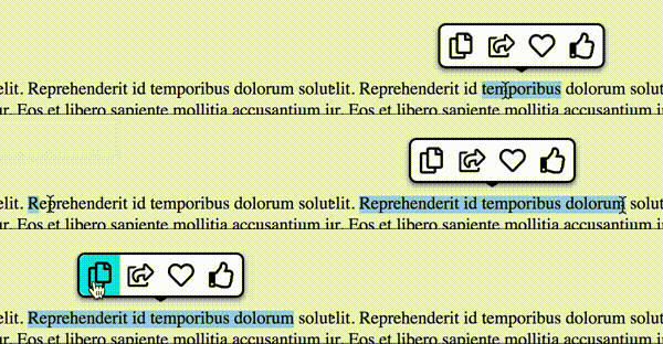
TextTip is a customisable JavaScript text selection tooltip library with zero dependencies.
https://github.com/AdamJaggard/text-tip
javascript javascript-library text-selection tooltip
Last synced: 3 months ago
JSON representation
TextTip is a customisable JavaScript text selection tooltip library with zero dependencies.
- Host: GitHub
- URL: https://github.com/AdamJaggard/text-tip
- Owner: AdamJaggard
- License: mit
- Created: 2019-07-14T12:56:44.000Z (over 5 years ago)
- Default Branch: master
- Last Pushed: 2023-01-07T08:12:05.000Z (almost 2 years ago)
- Last Synced: 2024-06-30T16:51:26.128Z (5 months ago)
- Topics: javascript, javascript-library, text-selection, tooltip
- Language: TypeScript
- Size: 1.67 MB
- Stars: 8
- Watchers: 0
- Forks: 3
- Open Issues: 18
-
Metadata Files:
- Readme: README.md
- License: LICENSE
Awesome Lists containing this project
README

# TextTip - Tooltips for selected text


## Currently in beta but usable. Testing needed.

TextTip is a JavaScript text selection tooltip library with no dependencies.

You can use TextTip to show a list of buttons when text is selected on a page. You can choose which blocks of text trigger the tooltip, how short or long the selection must be in order for it to show and other options. TextTip comes with no icons out of the box, these must be provided.

## Installing

Go to [releases](https://github.com/AdamJaggard/text-tip/releases) and download the files you need.

With a script tag

```javascript

```

Include the css too

```html

```

The library is built as a UMD module so should also work with CommonJS (Require) AMD, etc, just require 'TextTip'.

## How to use

### Minimum setup

Triggered by any text selection on the page. `buttons` are required. `icon` is a url to an image file by default.

```javascript

const tooltip = new TextTip({

	buttons: [

		{title: 'Button 1', icon: 'icon1.svg', callback: callbackFunction},

		{title: 'Button 2', icon: 'icon2.svg', callback: callbackFunction},

	]

});

```

### Scope

Scope lets you choose which blocks of text will trigger the tooltip. Selections beginning or ending outside of the scope will not trigger the tooltip. The selection must fall within the scope specified.

```javascript

const tooltip = new TextTip({

	scope: '.main-text',

	buttons: [

		{title: 'Button 1', icon: 'icon1.svg', callback: callbackFunction},

		{title: 'Button 2', icon: 'icon2.svg', callback: callbackFunction},

	]

});

```

### Icons

Icons can be provided in three different formats. Either as a `url`, `svgsprite` or `font` depending on what kind of icon system you are using. Use the `iconFormat` property to specify which format you plan to supply in the buttons array.

```javascript

const tooltip = new TextTip({

	iconFormat: 'url',

	buttons: [

		{title: 'Button 1', icon: 'icon1.svg', callback: callbackFunction},

	]

});

const tooltip2 = new TextTip({

	iconFormat: 'svgsprite',

	buttons: [

		{title: 'Button 1', icon: 'path/to/sprites.svg#icon-name', callback: callbackFunction},

	]

});

const tooltip3 = new TextTip({

	iconFormat: 'font',

	buttons: [

		{title: 'Button 1', icon: 'fa fa-heart', callback: callbackFunction},

	]

});

```

## All options

```javascript

{

	scope: HTMLElement | string,

	// Optional - A single Element or a selector string

	// Default - 'body'

	minLength: number,

	// Optional - Minimum length selection should be before triggering the tooltip

	// Default - 0

	maxLength: number,

	// Optional - Maximum length selection should be before triggering the tooltip

	// Default - Infinity

	iconFormat: 'url' | 'svgsprite' | 'font',

	// Optional - What format you will be supplying icons in

	buttons: [{title: string, icon: string, callback: Function},...],

	// Required - Array of button objects to show in the tooltip

	// icon is relative to iconFormat option

	// if iconFormat is 'url' - icon should be a path to an image file, png, svg, etc.

	// if iconFormat is 'svgsprite' - icon should be a path to an svg sprite file with an icon id

	//     e.g. 'path/to/sprites.svg#icon-name'

	// if iconFormat is 'font' - icon shoud be a string of class names that the icon font uses

	//     e.g. 'fa fa-heart'.

	theme: 'none' | 'default',

	// Optional - Use 'none' if you wish to style the tooltip yourself

	// Default - 'default'

	mobileOSBehaviour: 'hide' | 'normal',

	// Optional - Because of native tooltips, the default behaviour is not to show to avoid conflicts

	// Default - 'hide'

	on: {

		show: Function,

		hide: Function

	}

	// Optional - Callbacks for when the tooltip is shown and hidden

};

```