https://github.com/AtherEnergy/ggTimeSeries
Time series visualisation
https://github.com/AtherEnergy/ggTimeSeries
Last synced: 7 months ago
JSON representation
Time series visualisation
- Host: GitHub
- URL: https://github.com/AtherEnergy/ggTimeSeries
- Owner: AtherEnergy
- License: other
- Created: 2016-04-02T08:00:22.000Z (over 9 years ago)
- Default Branch: master
- Last Pushed: 2022-02-11T18:59:37.000Z (almost 4 years ago)
- Last Synced: 2024-11-13T22:35:29.018Z (about 1 year ago)
- Language: R
- Size: 2.8 MB
- Stars: 251
- Watchers: 17
- Forks: 39
- Open Issues: 7
-
Metadata Files:
- Readme: README.Rmd
- License: LICENSE
Awesome Lists containing this project
- awesome-ggplot2 - ggTimeSeries
README
---
output: github_document
---
```{r, echo = FALSE}
knitr::opts_chunk$set(
collapse = TRUE,
comment = "#>",
fig.path = "README-"
)
```
## About
This R package offers novel time series visualisations. It is based on
`ggplot2` and offers `geom`s and pre-packaged functions for easily
creating any of the offered charts. Some examples are listed below.
This package can be installed from github by installing `devtools`
library and then running the following command -
`devtools::install_github('Ather-Energy/ggTimeSeries')`.
## Line Charts Legacy
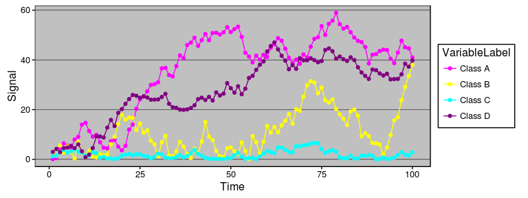
IoT devices generate a lot of sequential data over time, also called
time series data. Legacy portrayals of such data would centre around
line charts. Line charts have reportedly been around since the early
1700s (source: Wikipedia) and we have nothing against them. They
facilitate trend detection and comparison, are simple to draw, and easy
to understand; all in all a very well behaved visualisation. In modern
times, their use is widespread from the heartbeat monitor at a hospital
to the multiple-monitor display at a trader’s
desk.
## [1] "Excel 97 look recreated in R with the ggthemes package"
## Alternatives
However there are cases when the data scientist becomes more demanding
and specific. Five alternatives available to such a data scientist are
listed below. All of these options are available as `geom`s or packaged
functions in the `ggplot2` based `ggTimeSeries` package.
Before that, setting a minimal theme -
```r
minimalTheme = theme_set(theme_bw(12))
minimalTheme = theme_update(
axis.ticks = element_blank(),
legend.position = 'none',
strip.background = element_blank(),
panel.border = element_blank(),
panel.background = element_blank(),
panel.grid = element_blank()
)
```
### Calendar Heatmap
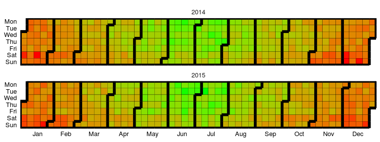
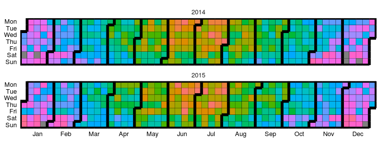
Available as `stat_calendar_heatmap` and `ggplot_calendar_heatmap`.
A calendar heatmap is a great way to visualise daily data. Its structure
makes it easy to detect weekly, monthly, or seasonal patterns.
```r
# creating some data
set.seed(1)
dtData = data.table(
DateCol = seq(
as.Date("1/01/2014", "%d/%m/%Y"),
as.Date("31/12/2015", "%d/%m/%Y"),
"days"
),
ValueCol = runif(730)
)
dtData[, ValueCol := ValueCol + (strftime(DateCol,"%u") %in% c(6,7) * runif(1) * 0.75), .I]
dtData[, ValueCol := ValueCol + (abs(as.numeric(strftime(DateCol,"%m")) - 6.5)) * runif(1) * 0.75, .I]
# base plot
p1 = ggplot_calendar_heatmap(
dtData,
'DateCol',
'ValueCol'
)
# adding some formatting
p1 +
xlab(NULL) +
ylab(NULL) +
scale_fill_continuous(low = 'green', high = 'red') +
facet_wrap(~Year, ncol = 1)
```
```r
# creating some categorical data
dtData[, CategCol := letters[1 + round(ValueCol * 7)]]
# base plot
p2 = ggplot_calendar_heatmap(
dtData,
'DateCol',
'CategCol'
)
# adding some formatting
p2 +
xlab(NULL) +
ylab(NULL) +
facet_wrap(~Year, ncol = 1)
```
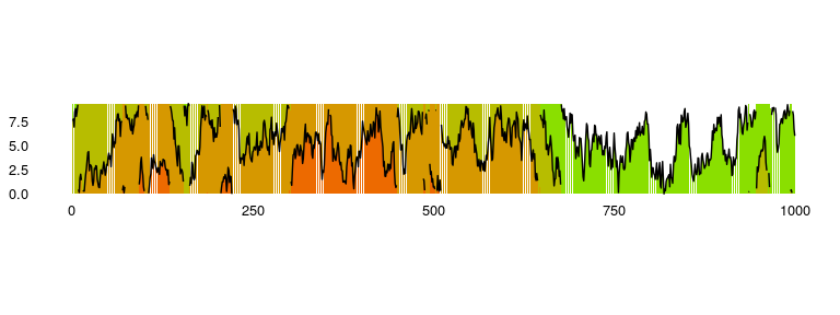
### Horizon Plots
Available as `stat_horizon` and `ggplot_horizon`.
Imagine an area chart which has been chopped into multiple chunks of
equal height. If you overlay these chunks one on top of the the other,
and colour them to indicate which chunk it is, you get a horizon plot.
Horizon plots are useful when visualising y values spanning a vast range
but with a skewed distribution, and / or trying to highlight outliers
without losing context of variation in the rest of the data.
```r
# creating some data
set.seed(1)
dfData = data.frame(x = 1:1000, y = cumsum(rnorm(1000)))
# base plot
p1 = ggplot_horizon(dfData, 'x', 'y')
print("If you're seeing any vertical white stripes, it's a display thing.")
```
## [1] "If you're seeing any vertical white stripes, it's a display thing."
```r
# adding some formatting
p1 +
xlab(NULL) +
ylab(NULL) +
scale_fill_continuous(low = 'green', high = 'red') +
coord_fixed( 0.5 * diff(range(dfData$x)) / diff(range(dfData$y)))
```
### Steamgraphs
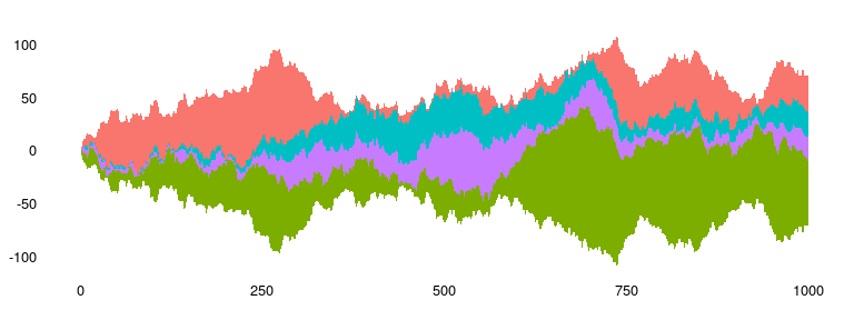
Available as `stat_steamgraph`.
A steamgraph is a more aesthetically appealing version of a stacked area
chart. It tries to highlight the changes in the data by placing the
groups with the most variance on the edges, and the groups with the
least variance towards the centre. This feature in conjunction with the
centred alignment of each of the contributing areas makes it easier for
the viewer to compare the contribution of any of the components across
time.
```r
# creating some data
set.seed(10)
dfData = data.frame(
Time = 1:1000,
Signal = abs(
c(
cumsum(rnorm(1000, 0, 3)),
cumsum(rnorm(1000, 0, 4)),
cumsum(rnorm(1000, 0, 1)),
cumsum(rnorm(1000, 0, 2))
)
),
VariableLabel = c(rep('Class A', 1000), rep('Class B', 1000), rep('Class C', 1000), rep('Class D', 1000))
)
# base plot
p1 = ggplot(dfData, aes(x = Time, y = Signal, group = VariableLabel, fill = VariableLabel)) +
stat_steamgraph()
# adding some formatting
p1 +
xlab(NULL) +
ylab(NULL) +
coord_fixed( 0.2 * diff(range(dfData$Time)) / diff(range(dfData$Signal)))
```
### Waterfall
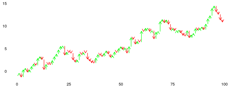
Available as `stat_waterfall` and `ggplot_waterfall`.
Rather than the values itself, a waterfall plot tries to bring out the
changes in the values.
```r
# creating some data
set.seed(1)
dfData = data.frame(x = 1:100, y = cumsum(rnorm(100)))
# base plot
p1 = ggplot_waterfall(
dtData = dfData,
'x',
'y'
)
# adding some formatting
p1 +
xlab(NULL) +
ylab(NULL)
```
### Occurrence Dot Plot
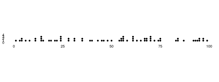
Available as `stat_occurrence`.
This one is a favourite in infographics. For rare events, the reader
would find it convenient to have the count of events encoded in the
chart itself instead of having to map the value back to the Y axis.
```r
# creating some data
set.seed(1)
dfData = data.table(x = 1:100, y = floor(4 * abs(rnorm(100, 0 , 0.4))))
# base plot
p1 = ggplot(dfData, aes(x =x, y = y) )+
stat_occurrence()
# adding some formatting
p1 +
xlab(NULL) +
ylab(NULL) +
coord_fixed(ylim = c(0,1 + max(dfData$y)))
```
### Marimekko or Mosaik
Available as `stat_marimekko`.
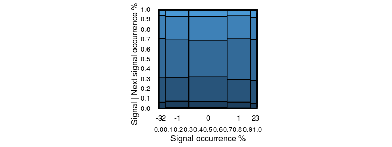
A marimekko plot, or a mosaic plot, visualises the co-occurrence of two
categorical / ordinal variables. In case of a time series, it could be
used to visualise the proportion of transitions from one state to
another by considering each state to be a category and plotting the
occurrence of current category vs. the next category. The span on the
horizontal represents the overall occurrence of the xbucket argument.
The span on the vertical represents the marginal occurrence of the
ybucket argument when xbucket was the previous state. The area of a
block indicates the proportion of occurrence of that pair in the entire
dataset.
```r
# creating some data
set.seed(1)
dfData = data.frame(Signal = pmax(pmin(rnorm(10000), 3), -3))
dfData2 = data.frame(
Signal = round(head(dfData$Signal, -1),0),
NextSignal = round(tail(dfData$Signal, -1),0),
Weight = 1
)
# base plot
p1 = ggplot(dfData2, aes(xbucket = Signal, ybucket = NextSignal, fill = NextSignal, weight = Weight) )+
stat_marimekko(color = 'black', xlabelyposition = -0.1)
# adding some formatting
p1 +
xlab('Signal occurrence %') +
ylab('Signal | Next signal occurrence %') +
scale_x_continuous(breaks = 0:10/10) +
scale_y_continuous(breaks = 0:10/10)
```
