Ecosyste.ms: Awesome
An open API service indexing awesome lists of open source software.
https://github.com/Bernardi23/expandable_card
A Sliding Card widget for flutter
https://github.com/Bernardi23/expandable_card
Last synced: 3 months ago
JSON representation
A Sliding Card widget for flutter
- Host: GitHub
- URL: https://github.com/Bernardi23/expandable_card
- Owner: Bernardi23
- License: mit
- Created: 2019-05-09T22:06:27.000Z (almost 6 years ago)
- Default Branch: master
- Last Pushed: 2019-11-27T01:27:51.000Z (about 5 years ago)
- Last Synced: 2024-08-03T14:09:59.215Z (7 months ago)
- Language: Dart
- Size: 61.5 KB
- Stars: 107
- Watchers: 4
- Forks: 17
- Open Issues: 1
-
Metadata Files:
- Readme: README.md
- License: LICENSE
Awesome Lists containing this project
README
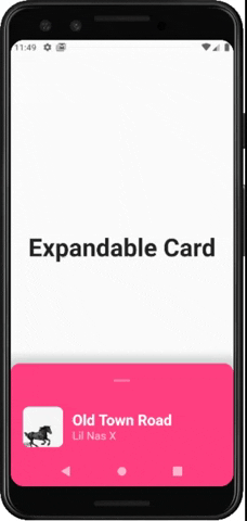
# Expandable Card
This is a Flutter Widget that makes it easy to build a page with a bottom Card that can be expanded on user drag.
## How to use it
Use `ExpandableCardPage` for the body of your `Scaffold`. This widget will take two attributes:
- `Widget page`: which is the default page in the background
- `ExpandableCard expandableCard`: which is the bottom card itself. You can call the `ExpandableCard` constructor to build one.
`ExpandableCard` constructor has a few attributes:
- `EdgeInsetsGeometry padding`: padding inside the card. Default value is `EdgeInsets.all(15)`
- `double minHeight`: default height of the card when it's not expanded. Default value is `200`
- `double maxHeight`: height of the card when it's fully expanded. Default value is `500`
- `bool hasShadow`: determines whether the card has box shadow or not. Default is `true`
- `Color backgroundColor`: background color of the card. Default is `Colors.blueGrey`
- `bool hasRoundedCorners`: determines whether the card has rounded corners or not. Default is `false`
- `bool hasHandle`: will add a little handle icon. Default is `true`
- `List Children`: Widgets that make the actual content of the card
## Future Implementations:
- `AnimatedExpandableCard`: will allow animation between closed state and expanded state.
- Add suport for scrolling card when its fully expanded