https://github.com/Cleveroad/cr_calendar
Highly customizable, feature-packed calendar widget for Flutter.
https://github.com/Cleveroad/cr_calendar
calendar dart flutter flutter-examples flutter-plugin flutter-plugins flutter-ui flutter-widget widget
Last synced: about 1 year ago
JSON representation
Highly customizable, feature-packed calendar widget for Flutter.
- Host: GitHub
- URL: https://github.com/Cleveroad/cr_calendar
- Owner: Cleveroad
- License: mit
- Created: 2021-04-06T13:12:25.000Z (over 5 years ago)
- Default Branch: main
- Last Pushed: 2023-08-01T12:19:33.000Z (almost 3 years ago)
- Last Synced: 2024-04-23T10:23:28.161Z (about 2 years ago)
- Topics: calendar, dart, flutter, flutter-examples, flutter-plugin, flutter-plugins, flutter-ui, flutter-widget, widget
- Language: Dart
- Homepage:
- Size: 1.43 MB
- Stars: 27
- Watchers: 4
- Forks: 24
- Open Issues: 7
-
Metadata Files:
- Readme: README.md
- Changelog: CHANGELOG.md
- License: LICENSE
Awesome Lists containing this project
README
# CrCalendar
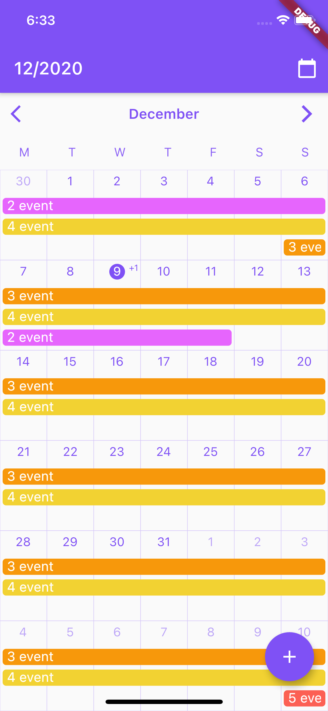
Customizable Flutter calendar inspired by Google Calendar app.
##### Features:
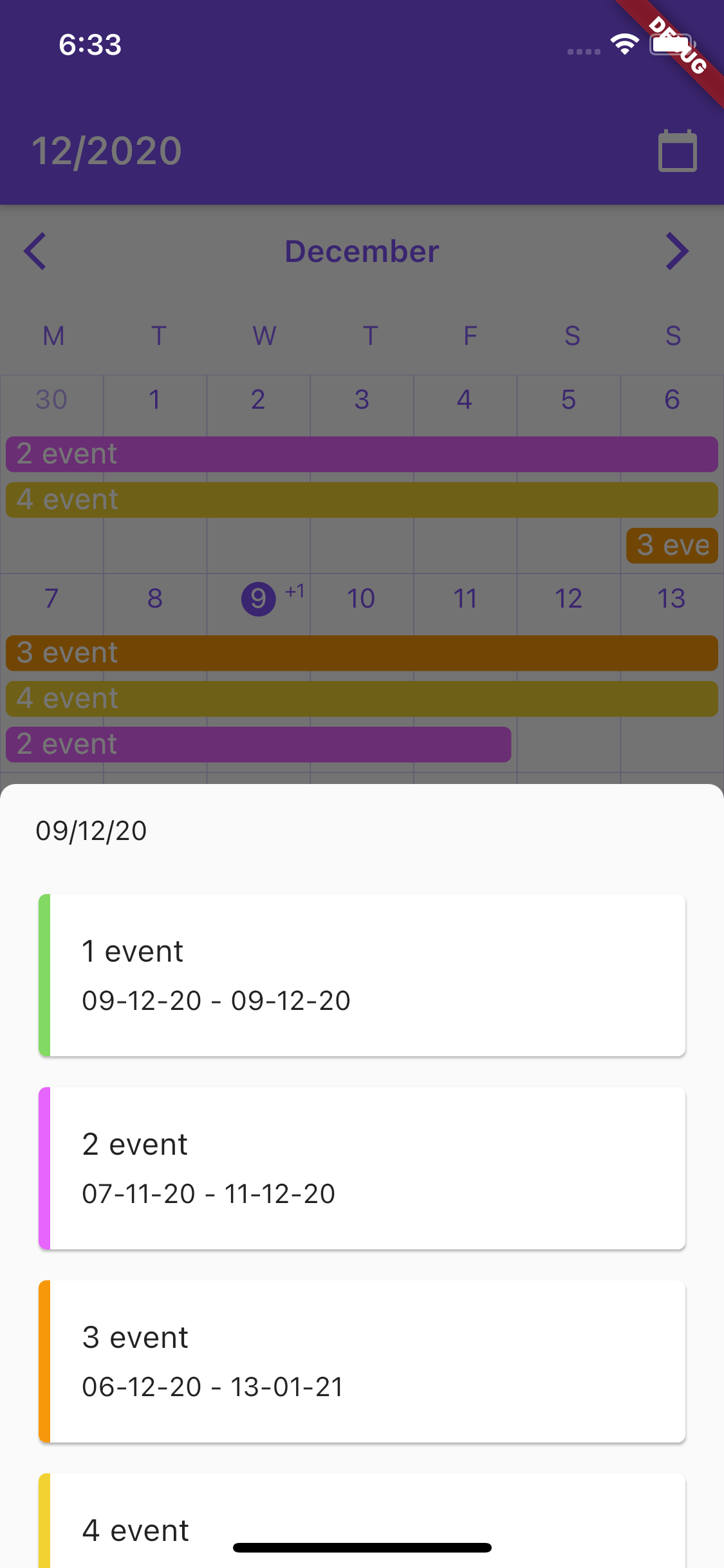
- CrCalendar widget for displaying horizontally scrollable month view, with events lines over days.
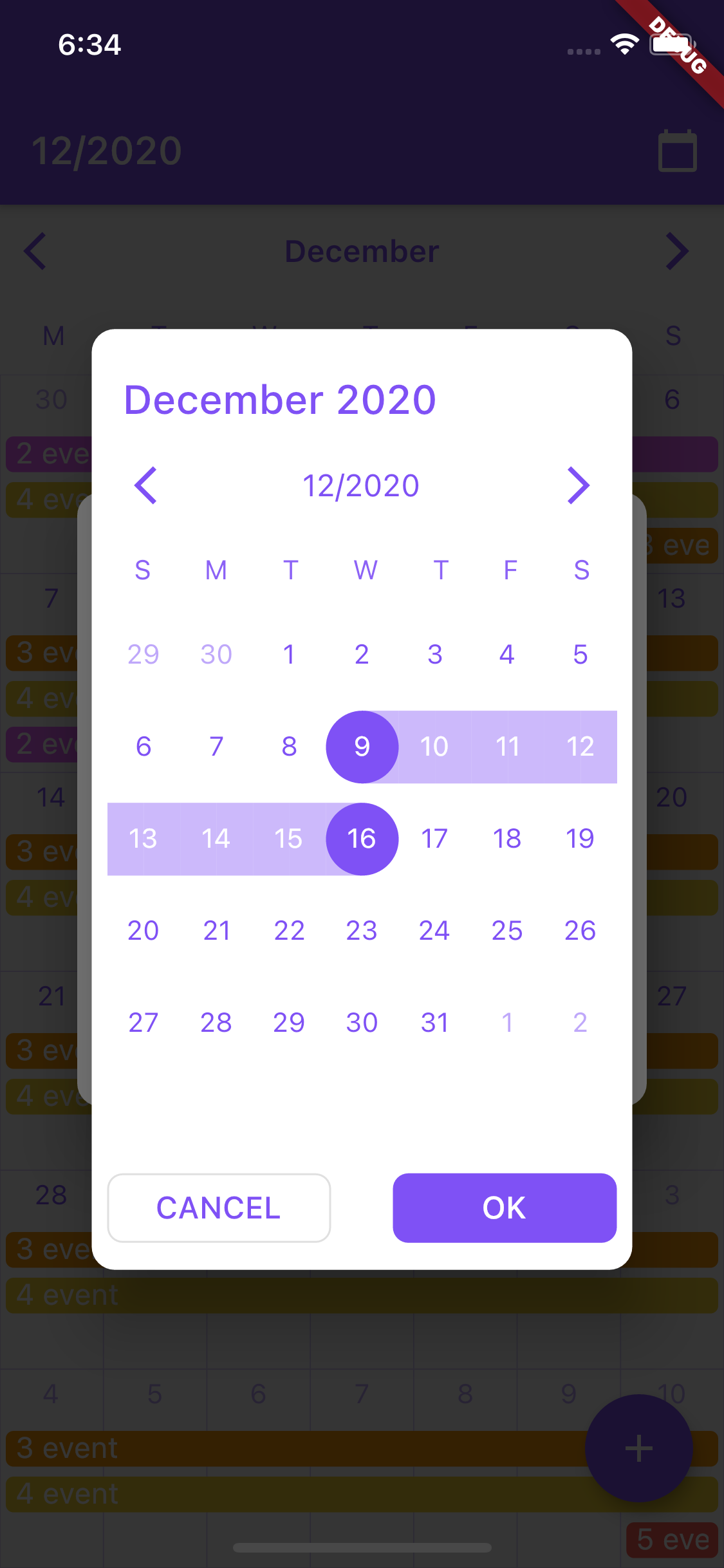
- date selection dialog (uses CrCalendar widget in range selection mode) with customization of buttons, texts and look of the CrCalendar widget.
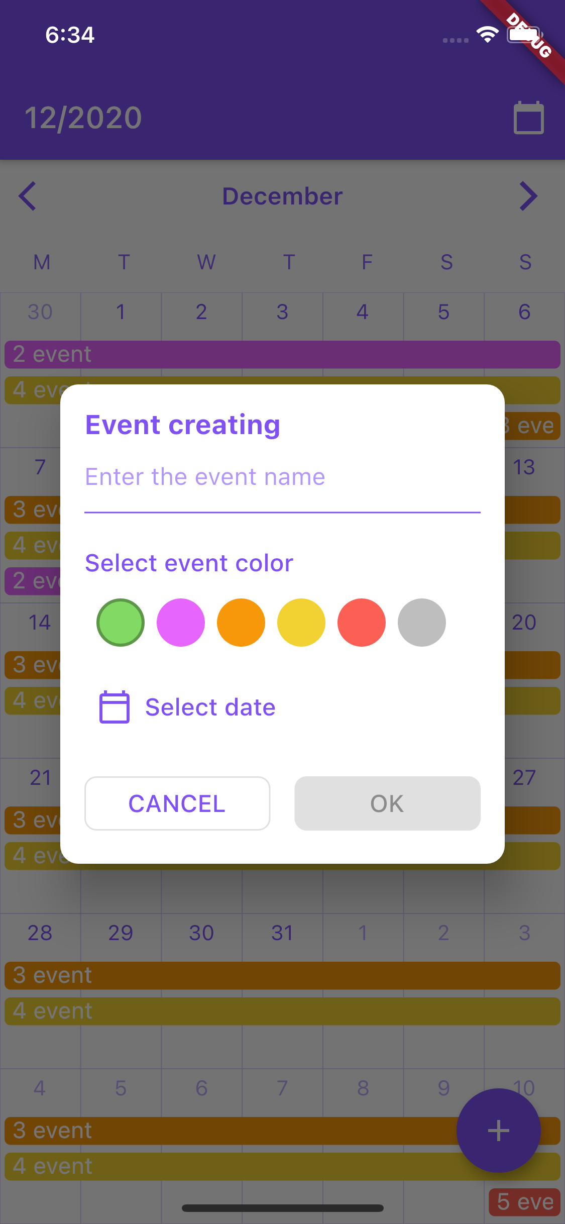
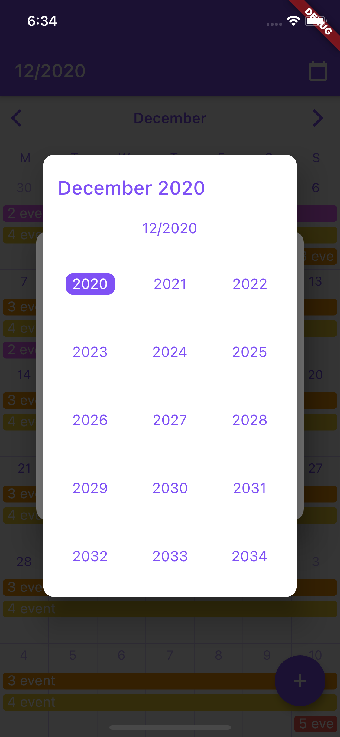
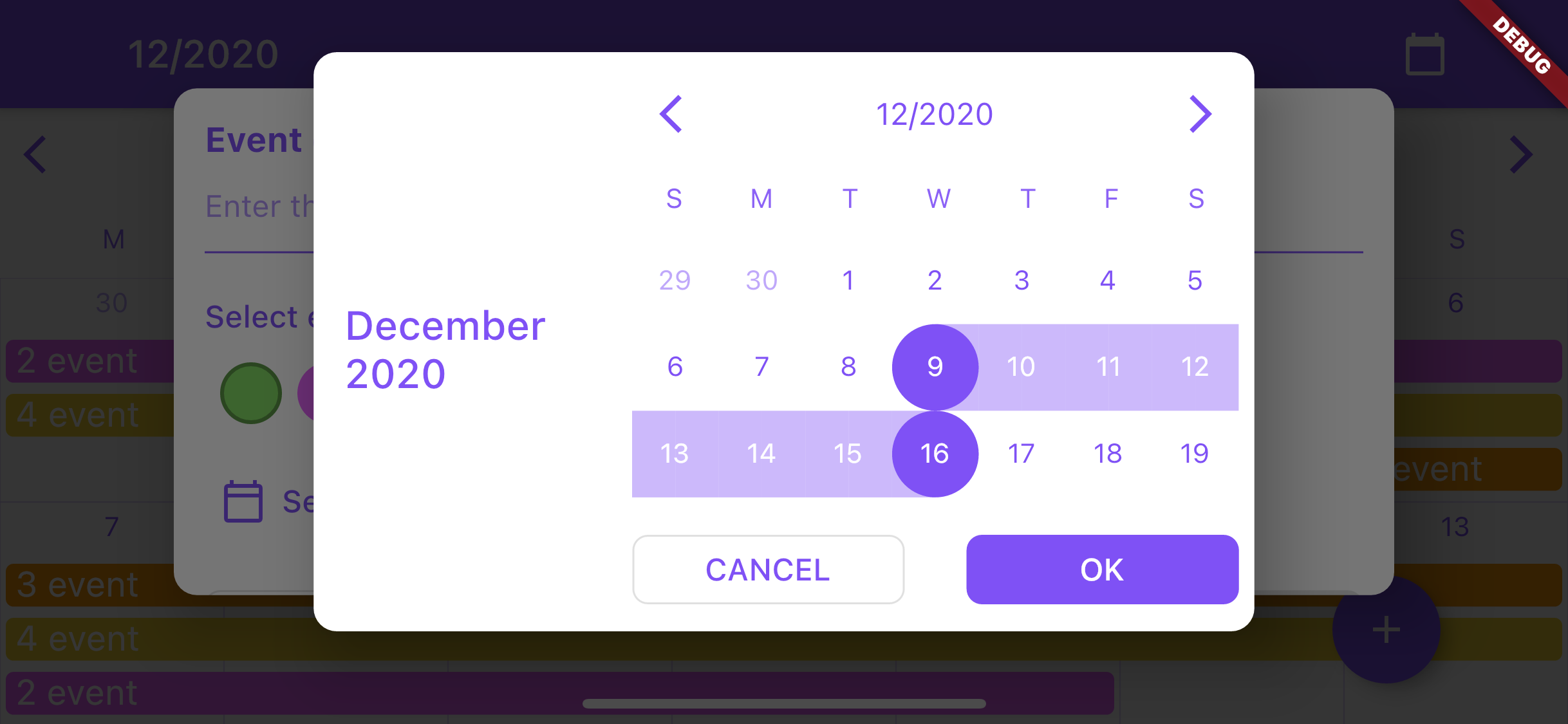
##### Screenshots of [example app](https://github.com/Cleveroad/cr_calendar/tree/main/example):

### Installation
Add `cr_calendar` as a dependency in pubspec.yaml.
Then import it to your project:
`import 'package:cr_calendar/src/cr_calendar.dart';`
---
### Usage of CrCalendar
##### CrCalendar parameters:
|Type|Name|Description|Default value|
|:-------:|:-------:|:---------:|:-----------:|
|CrCalendarController|controller|Calendar controller|-|
|DateTime|initialDate|Initial date to be showed when calendar created|-|
|OnTapCallback|onDayClicked|Callback fired when calendar day is tapped in calendar with TouchMode.singleTap touch mode.|-|
|WeekDays|firstDayOfWeek|Sets day from which week begins|WeekDays.sunday|
|WeekDaysBuilder|weekDaysBuilder|Builder for customization week days row at top of the calendar widget.|-|
|DayItemBuilder|dayItemBuilder|Builder for customization of days cells.|-|
|bool|forceSixWeek|Force calendar to display sixth row in month view even if this week is not in current month.|false|
|Color|backgroundColor|Background color of the calendar|-|
|int|maxEventLines|Number of events widgets to be displayed over day item cell|4|
|EventBuilder|eventBuilder|Event widget builder|-|
|TouchMode|touchMode|Touch mode of calendar.|-|
|double|eventsTopPadding|Padding over events widgets to for correction of their alignment.|-|
|OnRangeSelectedCallback|onRangeSelected|Callback for receiving selected range when calendar is used as date picker.|-|
|int|onSwipeCallbackDebounceMs|Time in milliseconds for debounce CrCalendarController onSwipe callback.|-|
|DateTime|minDate|Earliest allowable date.|-|
|DateTime|maxDate|Latest allowable date.|-|
#### Base usage:
```dart
class MyApp extends StatefulWidget {
@override
_MyAppState createState() => _MyAppState();
}
class _MyAppState extends State {
CrCalendarController _controller = CrCalendarController();
@override
Widget build(BuildContext context) {
return MaterialApp(
home: Scaffold(
body: CrCalendar(
initialDate: DateTime.now(),
controller: _controller,
),
),
);
}
}
```
Note: avoid using setState calls frequently on the page where the CrCalendar widget is used to improve performance.
### Usage of CrCalendar date picker dialog
##### DatePickerProperties parameters:
|Type|Name|Description|Default value|
|:-------:|:-------:|:---------:|:-----------:|
|Color|backgroundColor|Background color for date picker dialog and year selection widget.|Colors.white|
|DateTime|initialPickerDate|Initial date to be opened on dialog creation.|-|
|EdgeInsets|padding|Picker dialog padding.|EdgeInsets.all(8)|
|DayItemBuilder|dayItemBuilder|Builder for day item in dialog.|-|
|TouchMode|pickerMode|Picker selection mode.|-|
|WeekDaysBuilder|weekDaysBuilder|Builder for row of days over month view.|-|
|DateTitleBuilder|pickerTitleBuilder|Title builder for widget on top of picker dialog.|-|
|Alignment|pickerTitleAlignInLandscape|Alignment of picker title in landscape mode.|Alignment.centerLeft|
|Widget|backButton|Back button for picker control bar.|-|
|Widget|forwardButton|Forward button for picker control bar.|-|
|DateTitleBuilder|controlBarTitleBuilder|Builder for control bar title showed between backButton and forwardButton.|-|
|bool|showControlBar|Option for hiding control bar.|true|
|YearPickerItemBuilder|yearPickerItemBuilder|Builder for confirm selection button.|-|
|PickerButtonBuilder|okButtonBuilder|Builder for confirm selection button.|-|
|PickerButtonBuilder|cancelButtonBuilder|Builder for cancel button.|-|
|bool|forceSixWeek|Force showing six week rows in month view.|false|
|WeekDays|firstWeekDay|First day of date picker calendar.|WeekDays.sunday|
|DateTime|minDate|Earliest allowable date.|-|
|DateTime|maxDate|Latest allowable date.|-|
|LandscapeDaysResizeMode|landscapeDaysResizeMode|LandscapeDaysResizeMode.adaptive - days cells will change their height according to parent height LandscapeDaysResizeMode.scrollable - days cells will change their height according to parent height as long as it is larger than the cells width. The month scrolls if there is not enough space|LandscapeDaysResizeMode.adaptive|
#### Base usage:
```dart
/// Show calendar in pop up dialog for selecting date range for calendar event.
void _showDatePicker(BuildContext context) {
showCrDatePicker(
context,
properties: DatePickerProperties(
firstWeekDay: WeekDays.monday,
okButtonBuilder: (onPress) =>
ElevatedButton(child: const Text('OK'), onPressed: onPress),
cancelButtonBuilder: (onPress) =>
OutlinedButton(child: const Text('CANCEL'), onPressed: onPress),
initialPickerDate: DateTime.now(),
),
);
}
```