https://github.com/DimitryDushkin/sliding-pane
Pane that slides out of the window side
https://github.com/DimitryDushkin/sliding-pane
pane popup react
Last synced: about 1 year ago
JSON representation
Pane that slides out of the window side
- Host: GitHub
- URL: https://github.com/DimitryDushkin/sliding-pane
- Owner: DimitryDushkin
- License: mit
- Created: 2017-01-03T16:46:16.000Z (over 9 years ago)
- Default Branch: master
- Last Pushed: 2023-10-20T07:28:17.000Z (almost 3 years ago)
- Last Synced: 2025-06-09T21:48:01.844Z (about 1 year ago)
- Topics: pane, popup, react
- Language: JavaScript
- Homepage:
- Size: 5.82 MB
- Stars: 146
- Watchers: 2
- Forks: 53
- Open Issues: 8
-
Metadata Files:
- Readme: README.md
- Changelog: CHANGELOG.md
- License: LICENSE
Awesome Lists containing this project
README
## React Sliding Pane
Pane that slides out of the window side. Like panes from Google Tag Manager.
Features:
- Animated open-close
- Smooth animation based on CSS translate
- Outside click or left top arrow click to close
- Efficient: pane content is not rendered when pane is closed
- Based on react-modal
- Close on escape support
- Typescript support
- Runtime props validation in dev via "prop-types"
- React [Strict mode](https://reactjs.org/docs/strict-mode.html) covered
- Small — 8 Kb gzip (react-sliding-pane + react-modal as dependency)
See [changelog](https://github.com/DimitryDushkin/sliding-pane/blob/master/CHANGELOG.md).
[](https://www.npmjs.com/package/react-sliding-pane)
[](https://www.npmjs.com/package/react-sliding-pane)
[](https://bundlephobia.com/result?p=react-sliding-pane)

Thanks BrowserStack for support!
### Table of contents
- [Example](#example)
- [When to use (UX)](#when-to-use-ux)
- [How to use](#how-to-use)
- [Properties](#properties)
- [How to develop](#how-to-develop)
### Example
[Try example](https://dimitrydushkin.github.io/sliding-pane/example.html)
### When to use (UX)
I've found sliding pane very helpful in situations when normal modal window (or just popup) is not enough: long list with pagination, multi-step form or nested popups.
### How to use
Install module and peer dependencies:
`npm i --save react react-dom react-sliding-pane`
```js
import React, { Component, useState } from "react";
import { render } from "react-dom";
import SlidingPane from "react-sliding-pane";
import "react-sliding-pane/dist/react-sliding-pane.css";
const App = () => {
const [state, setState] = useState({
isPaneOpen: false,
isPaneOpenLeft: false,
});
return (
setState({ isPaneOpen: true })}>
Click me to open right pane!
setState({ isPaneOpenLeft: true })}>
Click me to open left pane with 20% width!
{
// triggered on "<" on left top click or on outside click
setState({ isPaneOpen: false });
}}
>
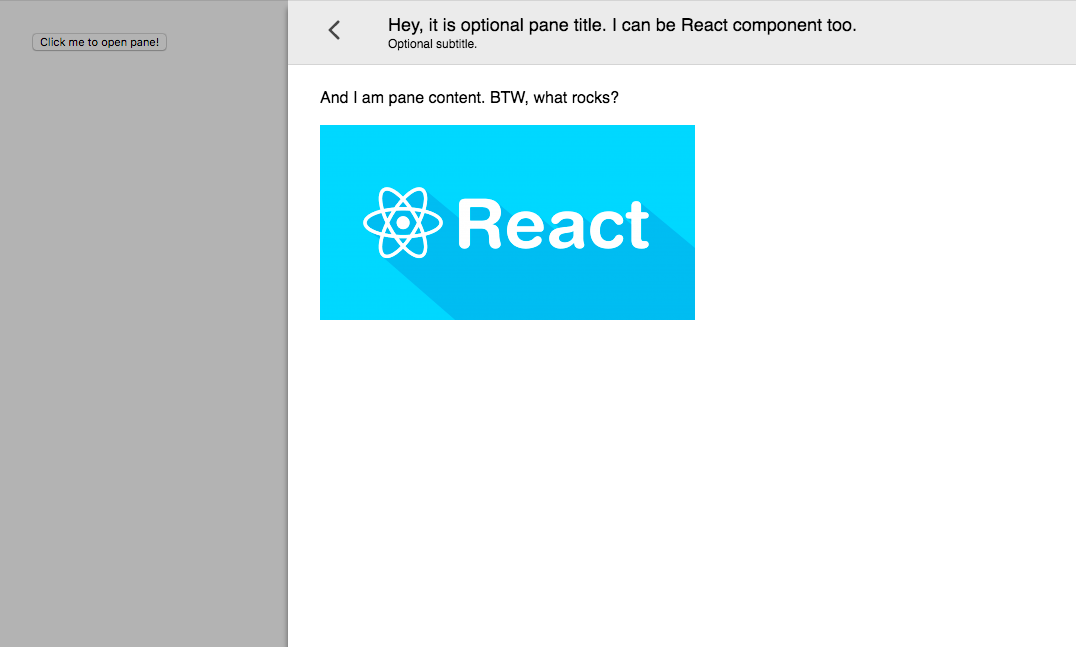
And I am pane content. BTW, what rocks?

Some div containing custom close icon.}
isOpen={state.isPaneOpenLeft}
title="Hey, it is optional pane title. I can be React component too."
from="left"
width="200px"
onRequestClose={() => setState({ isPaneOpenLeft: false })}
>
And I am pane content on left.
);
};
render(, document.getElementById("app"));
```
### Properties
| Prop | Required | Default | Description |
| ---------------- | :------: | ------: | -----------------------------------------: |
| isOpen | ✅ | | Is pane open |
| title | | | Title in header |
| subtitle | | | Subtitle in header |
| from | | "right" | Direction from pane will appear |
| children | | | Content of pane |
| className | | | CSS class name. See react-modal |
| overlayClassName | | | CSS class name of overlay. See react-modal |
| width | | | CSS string for width pane. |
| closeIcon | | | Custom close icon |
| shouldCloseOnEsc | | | Enable pane close on ESC |
| hideHeader | | | Hide pane header |
| onRequestClose | ✅ | | Called on close icon press |
| onAfterOpen | | | Called after open |
### How to develop
```
npm run docs
open docs/example.html
```
### How to release
```
npm