https://github.com/Faisal-Manzer/postcss-viewport-height-correction
PostCSS plugin to solve the popular problem when 100vh doesn’t fit the mobile browser screen.
https://github.com/Faisal-Manzer/postcss-viewport-height-correction
css3 fullscreen hacktoberfest hacktoberfest2021 postcss postcss-plugin viewport-dimensions
Last synced: over 1 year ago
JSON representation
PostCSS plugin to solve the popular problem when 100vh doesn’t fit the mobile browser screen.
- Host: GitHub
- URL: https://github.com/Faisal-Manzer/postcss-viewport-height-correction
- Owner: Faisal-Manzer
- License: mit
- Created: 2020-01-04T18:38:13.000Z (over 6 years ago)
- Default Branch: master
- Last Pushed: 2023-04-16T21:30:17.000Z (over 3 years ago)
- Last Synced: 2025-03-18T12:14:57.871Z (over 1 year ago)
- Topics: css3, fullscreen, hacktoberfest, hacktoberfest2021, postcss, postcss-plugin, viewport-dimensions
- Language: JavaScript
- Homepage:
- Size: 329 KB
- Stars: 245
- Watchers: 2
- Forks: 7
- Open Issues: 5
-
Metadata Files:
- Readme: README.md
- Changelog: CHANGELOG.md
- License: LICENSE
Awesome Lists containing this project
- awesome-list - postcss-viewport-height-correction - Manzer | 167 | (JavaScript)
README
# PostCSS Viewport Height Correction
[PostCSS] plugin to solve the popular problem when 100vh doesn’t fit the mobile browser screen.
## Installation
```shell
yarn add postcss-viewport-height-correction
# --- OR ----
npm install --save postcss-viewport-height-correction
```
And then add this javascript to `public/index.html` (for React), or add to `template.html` (for Preact).
```js
var customViewportCorrectionVariable = 'vh';
function setViewportProperty(doc) {
var prevClientHeight;
var customVar = '--' + ( customViewportCorrectionVariable || 'vh' );
function handleResize() {
var clientHeight = doc.clientHeight;
if (clientHeight === prevClientHeight) return;
requestAnimationFrame(function updateViewportHeight(){
doc.style.setProperty(customVar, (clientHeight * 0.01) + 'px');
prevClientHeight = clientHeight;
});
}
handleResize();
return handleResize;
}
window.addEventListener('resize', setViewportProperty(document.documentElement));
```
[PostCSS]: https://github.com/postcss/postcss
Check you project for existed PostCSS config: `postcss.config.js`
in the project root, `"postcss"` section in `package.json`
or `postcss` in bundle config.
If you already use PostCSS, add the plugin to plugins list:
```diff
module.exports = {
plugins: [
+ require('postcss-viewport-height-correction'),
require('autoprefixer')
]
}
```
If you do not use PostCSS, add it according to [official docs]
and set this plugin in settings.
[official docs]: https://github.com/postcss/postcss#usage
## Configuration
**You really will rarely need this.** Use this when you have some conflicting css variable.
We use `--vh` as variable to fix the viewport height. You can use `--pvh` or any other variable of your choice.
Configure postcss to use your variable.
```diff
module.exports = {
plugins: [
+ require('postcss-viewport-height-correction')({ variable: 'pvh' }),
require('autoprefixer')
]
}
```
Also change variable name in javascript you added. Change `customViewportCorrectionVariable` value to your variable.
```diff
+ var customViewportCorrectionVariable = 'pvh'
- var customViewportCorrectionVariable = 'vh'
```
> NOTE: Only use plain alphabetical characters as custom variable name.
> We are using regex to patch viewport value, any variable with special characters can lead to unknown issues.
## Inspiration
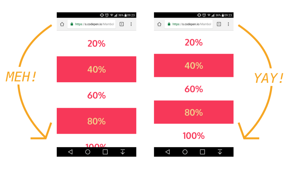
The viewport height which we use as "vh" unit in css does not give the actual viewport height but gives the height of the browser window. This plugin is an implememtation of [CSS Tricks article]( https://css-tricks.com/the-trick-to-viewport-units-on-mobile/) on this issue.
## Example Output
```css
.foo {
/* Input example */
height: 100vh;
}
.bar {
min-height: 50vh;
max-height: 75vh;
margin: -1vh;
}
```
```css
.foo {
/* Output example */
height: 100vh;
height: calc(var(--vh, 1vh) * 100); /* corrected viewport height using css custom variables */
}
.bar {
min-height: calc(var(--vh, 1vh) * 50);
max-height: calc(var(--vh, 1vh) * 75);
margin: calc(var(--vh, 1vh) * -1);
}
```