https://github.com/Kavantix/sliver_tools
A set of useful sliver tools that are missing from the flutter framework
https://github.com/Kavantix/sliver_tools
flutter sliver slivers widgets
Last synced: over 1 year ago
JSON representation
A set of useful sliver tools that are missing from the flutter framework
- Host: GitHub
- URL: https://github.com/Kavantix/sliver_tools
- Owner: Kavantix
- License: mit
- Created: 2020-09-03T15:07:15.000Z (almost 6 years ago)
- Default Branch: master
- Last Pushed: 2024-06-01T18:22:17.000Z (about 2 years ago)
- Last Synced: 2024-08-01T12:25:45.568Z (almost 2 years ago)
- Topics: flutter, sliver, slivers, widgets
- Language: Dart
- Size: 6.14 MB
- Stars: 627
- Watchers: 10
- Forks: 63
- Open Issues: 12
-
Metadata Files:
- Readme: README.md
- Changelog: CHANGELOG.md
- License: LICENSE
Awesome Lists containing this project
README
# sliver_tools
[](https://pub.dartlang.org/packages/sliver_tools)
A set of useful sliver tools that are missing from the flutter framework.
Here is a taste what you can make using this package
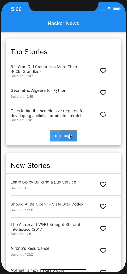
The structure of this app:
```dart
class Section extends State {
@override
Widget build(BuildContext context) {
return MultiSliver(
pushPinnedChildren: true,
children: [
SliverPersistentHeader(
pinned: true,
...
),
if (!infinite)
SliverAnimatedPaintExtent(
child: SliverList(...),
)
else
SliverList(...),
],
);
}
}
class NewsPage extends StatelessWidget {
@override
Widget build(BuildContext context) {
return CustomScrollView(
slivers: [
Section(infinite: false),
Section(infinite: true),
],
);
}
}
```
## [MultiSliver]
The [MultiSliver] widget allows for grouping of multiple slivers together such that they can be returned as a single widget.
For instance when one wants to wrap a few slivers with some padding or an inherited widget.
### Example
```dart
class WidgetThatReturnsASliver extends StatelessWidget {
@override
Widget build(BuildContext context) {
return MultiSliver(
pushPinnedChildren: false, // defaults to false
children: [
SliverPersistentHeader(...),
SliverList(...),
],
);
}
}
```
The `pushPinnedChildren` parameter allows for achieving a 'sticky header' effect by simply using pinned `SliverPersistentHeader` widgets (or any custom sliver that paints beyond its layoutExtent).
## [SliverStack](https://github.com/Kavantix/sliver_tools/blob/master/lib/src/sliver_stack.dart)
The [SliverStack] widget allows for stacking of both slivers and box widgets.
This can be useful for adding some decoration to a sliver.
Which is what some of the other widgets in this package use to get their desired effects.
### Example
```dart
class WidgetThatReturnsASliver extends StatelessWidget {
@override
Widget build(BuildContext context) {
return SliverStack(
insetOnOverlap: false, // defaults to false
children: [
SliverPositioned.fill(
child: Container(
decoration: BoxDecoration(
color: Colors.white,
boxShadow: const [
BoxShadow(
offset: Offset(0, 4),
blurRadius: 8,
color: Colors.black26,
)
],
borderRadius: BorderRadius.circular(8),
),
),
),
SliverList(...),
],
);
}
}
```
The `insetOnOverlap` handles whether the positioned children should be inset (made smaller) when the sliver has overlap from a previous sliver.
## [SliverClip]
The [SliverClip] widget will add a clip around its child from the child's paintOrigin to its paintExtent.
This is very useful and most likely what you want when using a pinned SliverPersistentHeader as child of the stack.
### Example
```dart
class WidgetThatReturnsASliver extends StatelessWidget {
@override
Widget build(BuildContext context) {
return SliverClip(
clipOverlap: true, // defaults to true
child: SliverList(...),
);
}
}
```
The `clipOverlap` parameter allows for configuring whether any overlap with the previous child should be clipped.
This can be useful when one has a SliverPersitentHeader above a SliverList and does not want to give the header an opaque background but also prevent the list from drawing underneath the header.
## [SliverAnimatedPaintExtent]
The [SliverAnimatedPaintExtent] widget allows for having a smooth transition when a sliver changes the space it will occupy inside the viewport.
For instance when using a SliverList with a button below it that loads the next few items.
### Example
```dart
class WidgetThatReturnsASliver extends StatelessWidget {
@override
Widget build(BuildContext context) {
return SliverAnimatedPaintExtent(
duration: const Duration(milliseconds: 150),
child: SliverList(...),
);
}
}
```
## [SliverAnimatedSwitcher]
The [SliverAnimatedSwitcher] widget is simply a pre-configured `AnimatedSwitcher` widget.
If one needs more options than supplied by this widget a regular `AnimatedSwitcher` can be used by giving it the `defaultLayoutBuilder` and `defaultTransitionBuilder` of [SliverAnimatedSwitcher].
## [SliverCrossAxisConstrained]
The [SliverCrossAxisConstrained] widget allows for limiting the cross axis extent of a sliver to a maximum value given by the `maxCrossAxisExtent`.
For instance a long list of text items on an iPad would be too wide to read so one can wrap the SliverList in a [SliverCrossAxisConstrained] and limit its width to something more reasonable.
### Example
```dart
class WidgetThatReturnsASliver extends StatelessWidget {
@override
Widget build(BuildContext context) {
return SliverCrossAxisConstrained(
maxCrossAxisExtent: 700,
alignment: 0, // between -1.0 (left) and 1.0 (right)
child: SliverList(...),
);
}
}
```
## [SliverCrossAxisPadded]
The [SliverCrossAxisPadded] widget allows for adding padding to the cross axis of a sliver.
This can be done either by passing a `paddingStart` and/or `paddingEnd` or by using the `symmetric` constructor which takes a single padding value.
When using `paddingStart` and `paddingEnd` in a vertical sliver it will depend on the `TextDirection` whether start is left or right.
### Example
```dart
class WidgetThatReturnsASliver extends StatelessWidget {
@override
Widget build(BuildContext context) {
return SliverCrossAxisPadded(
paddingStart: 24,
paddingEnd: 48,
textDirection: TextDirection.ltr, // optional, defaults to the Directionality specified by the context
child: SliverList(...),
);
}
}
```
## [SliverPinnedHeader]
The [SliverPinnedHeader] widget allows for easily making a pinned header.
It will size itself to the size of the child and when it reaches the leading edge of the viewport stay there instead of scrolling off the screen.
[MultiSliver]: https://github.com/Kavantix/sliver_tools/blob/master/lib/src/multi_sliver.dart
[SliverAnimatedPaintExtent]: https://github.com/Kavantix/sliver_tools/blob/master/lib/src/sliver_animated_paint_extent.dart
[SliverStack]: https://github.com/Kavantix/sliver_tools/blob/master/lib/src/sliver_stack.dart
[SliverClip]: https://github.com/Kavantix/sliver_tools/blob/master/lib/src/sliver_clip.dart
[SliverAnimatedSwitcher]: https://github.com/Kavantix/sliver_tools/blob/master/lib/src/sliver_animated_switcher.dart
[SliverCrossAxisConstrained]: https://github.com/Kavantix/sliver_tools/blob/master/lib/src/sliver_cross_axis_constrained.dart
[SliverCrossAxisPadded]: https://github.com/Kavantix/sliver_tools/blob/master/lib/src/sliver_cross_axis_padded.dart
[SliverPinnedHeader]: https://github.com/Kavantix/sliver_tools/blob/master/lib/src/sliver_pinned_header.dart
## Buy me a coffee ☕️
