https://github.com/LiewJunTung/pin_code_text_field
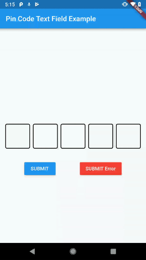
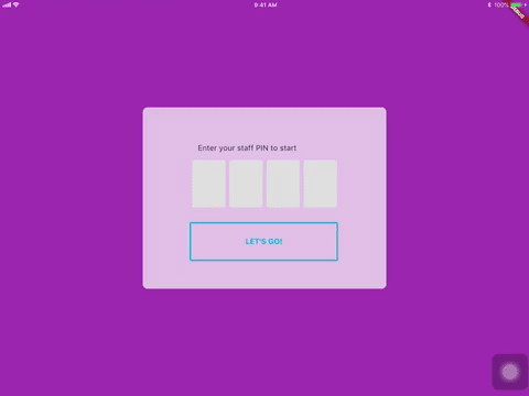
A highly customisable Flutter widget for entering pin code. Suitable for use cases such as login and OTP.
https://github.com/LiewJunTung/pin_code_text_field
Last synced: about 1 year ago
JSON representation
A highly customisable Flutter widget for entering pin code. Suitable for use cases such as login and OTP.
- Host: GitHub
- URL: https://github.com/LiewJunTung/pin_code_text_field
- Owner: LiewJunTung
- License: mit
- Archived: true
- Created: 2018-10-16T05:33:25.000Z (over 7 years ago)
- Default Branch: master
- Last Pushed: 2024-01-30T11:12:12.000Z (over 2 years ago)
- Last Synced: 2024-07-31T15:01:33.760Z (almost 2 years ago)
- Language: Dart
- Homepage:
- Size: 2.87 MB
- Stars: 376
- Watchers: 6
- Forks: 77
- Open Issues: 29
-
Metadata Files:
- Readme: README.md
- Changelog: CHANGELOG.md
- License: LICENSE
Awesome Lists containing this project
- awesome-flutter-cn - Pin Code - 用于登录和OTP的动画和可定制的Pin码,由[Liew Jun Tung](https://github.com/liewjuntung)创建。 (组件 / UI)
- awesome-flutter - Pin Code - A highly customisable Flutter widget for entering pin code. Suitable for use cases such as login and OTP. ` 📝 6 months ago ` (UI [🔝](#readme))
- awesome-flutter-cn - Pin Code - 可定制动画的 pin 码输入器,[Liew Jun Tung](https://github.com/liewjuntung). (组件 / UI)
README
[](https://pub.dartlang.org/packages/pin_code_text_field)
[](https://github.com/Solido/awesome-flutter)
# pin_code_text_field
It's a beautiful and highly customizable Flutter widget for entering pin code. Suitable for use cases such as login and OTP.
# Usage
## Use this package as a library
1. Depend on it
Add this to your package's pubspec.yaml file:
```
dependencies:
pin_code_text_field:
```
2. Install it
You can install packages from the command line:
with Flutter:
```
$ flutter packages get
```
Alternatively, your editor might support flutter packages get. Check the docs for your editor to learn more.
3. Import it
Now in your Dart code, you can use:
```
import 'package:pin_code_text_field/pin_code_text_field.dart';
```
## API
| name | type | default | description |
| --- | --- | --- | --- |
| isCupertino | bool | false | Application wrapped in `CupertinoApp` instead `MaterialApp` |
| maxLength | int | 4 | The total length of pin number & the number of pin boxes. |
| hideCharacter | bool | false | Show or hide the pin code. |
| highlight | bool | false | highlight the focused pin box. |
| highlightAnimation | bool | false | animated highlight of the focused pin box. |
| highlightAnimationBeginColor | Color | Colors.black | the starting color of the animated highlight. |
| highlightAnimationEndColor | Color | Color.white | the ending color of the animated highlight. |
| highlightAnimationDuration | Duration | 500ms | the duration of the highlight animation. |
| highlightColor | Color | Colors.black | Set color of the focused pin box. |
| pinBoxDecoration | BoxDecoration| ProvidedPinBoxDecoration._defaultPinBoxDecoration | Customization for the individual pin boxes. Check `ProvidedPinBoxDecoration` for possible options. |
| pinTextStyle | TextStyle | | TextStyle for styling pin characters. |
| maskCharacter | String | "\u25CF" | Special character to mask the pin code. Will only work if `hideCharacter` is set to `true`. |
| pinBoxHeight | double | 70.0 | Height of pin boxes. |
| pinBoxWidth | double | 70.0 | Width of pin boxes. |
| onDone | void Function(String) | | Callback when the max length of pin code is reached. |
| hasTextBorderColor | Color | Colors.black | Set color of pin box containing text. |
| pinTextAnimatedSwitcherTransition | Function(Widget child, Animation animation) | | Animation of text appearing/disappearing, you can write your own or use a few presets: 1. PinCodeTextField.awesomeTransition 2. PinCodeTextField.defaultScalingTransition 3. PinCodeTextField.defaultRotateTransition|
| pinTextAnimatedSwitcherDuration | Duration | const Duration() | Duration of pinTextAnimatedSwitcherTransition. Check `ProvidedPinBoxTextAnimation` for possible options. |
| errorBorderColor | Color | Colors.red | Highlight all textboxes to this color if hasError is set to `true`
| onTextChange | Function(String) | | callback that returns a text on input |
| hasError | bool | false | set all border color to `errorBorderColor` |
| autofocus | bool | false | Autofocus on view entered |
| wrapAlignment | WrapAlignment | WrapAlignment.start | Alignment of the wrapped pin boxes |
| textDirection | TextDirection | TextDirection.ltr | The direction of the pin code |
| keyboardType | TextInputType | TextInputType.number | The type of the input keyboard |
| pinBoxColor | Color | null| Color of the pin boxes (Will be overridden by custom PinBoxDecoration) |
| pinBoxBorderWidth | double | 2 | Border Width of pin boxes |
| pinBoxRadius | double | 0 | The type of the input keyboard |
| hideDefaultKeyboard | boolean | false | The type of hide default keyboard |
| highlightPinBoxColor | Color | false | The background color of the pin box |
| hasUnderline | bool | false | Added underline to individual pin box |
## Example
refer to `example/lib/main.dart`
## Wishlist
1. ~~Localization (L-R, R-L)~~
2. ~~Highlight animation~~
3. ~~Pin Box animation~~
4. BoxDecoratorBuilder for customizing individual pin boxes
## Tips and Tricks:
1. Copy and pasting
Wrap the `PinCodeTextField` in `GestureDetector`, the launch an AlertDialog to
access the `Clipboard` and paste the strings to the `TextEditController` of
the `PinCodeTextField`
## Contributors
1. [Liew Jun Tung](https://github.com/LiewJunTung)
2. [Serge Shkurko](https://github.com/SergeShkurko)
3. [Angga Dwi Arifandi](https://github.com/blackmenthor)
4. [MozesMa](https://github.com/MozesMa)
5. [jpeiffer](https://github.com/jpeiffer)
6. [Thiago Porto](https://github.com/ThiagoNP)
6. [Samuel](https://github.com/samuelg123)
Star 🌟 to show support!
## More information
[Pub package](https://pub.dartlang.org/packages/pin_code_text_field)
[Flutter documentation](https://flutter.io/).