Ecosyste.ms: Awesome
An open API service indexing awesome lists of open source software.
https://github.com/Microsoft/powerbi-visuals-chord
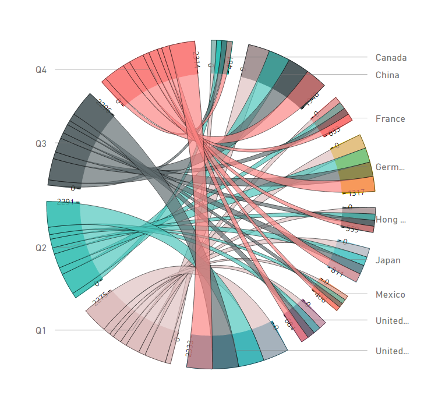
A chord diagram is a graphical method of displaying the inter-relationships between data in a matrix.
https://github.com/Microsoft/powerbi-visuals-chord
Last synced: about 1 month ago
JSON representation
A chord diagram is a graphical method of displaying the inter-relationships between data in a matrix.
- Host: GitHub
- URL: https://github.com/Microsoft/powerbi-visuals-chord
- Owner: microsoft
- License: other
- Created: 2016-11-16T09:32:39.000Z (about 8 years ago)
- Default Branch: main
- Last Pushed: 2024-05-23T05:25:50.000Z (7 months ago)
- Last Synced: 2024-05-23T06:31:14.742Z (7 months ago)
- Language: TypeScript
- Size: 2.92 MB
- Stars: 29
- Watchers: 14
- Forks: 30
- Open Issues: 13
-
Metadata Files:
- Readme: README.md
- Changelog: CHANGELOG.md
- License: LICENSE
- Security: SECURITY.md
Awesome Lists containing this project
- awesome-power-bi - Chord Diagram
README
# powerbi-visuals-chord
[](https://github.com/microsoft/powerbi-visuals-chord/actions/workflows/build.yml) [](https://coveralls.io/github/Microsoft/powerbi-visuals-chord?branch=master)
[](https://dev.azure.com/customvisuals/public/_build/latest?definitionId=2) [](https://snyk.io/test/github/Microsoft/powerbi-visuals-chord)
> A chord diagram is a graphical method of displaying the inter-relationships between data in a matrix.
Cancel changes
# Overview
This type of diagram visualizes the inter-relationships between entities. The connections between entities are used to display that they share something in common. This makes Chord Diagrams ideal for comparing the similarities within a dataset or between different groups of data.
Nodes are arranged around a circle, with the relationships between points connected to each other either through the use of arcs or Bézier curves. Values are assigned to each connection, which is represented proportionally by the size of each arc.
Customize data colors, axis, labels and more.
See also [Chord chart at the Microsoft Office store](https://appsource.microsoft.com/en-us/product/power-bi-visuals/WA104380761)