https://github.com/MindorksOpenSource/RadialProgressBar
Radial ProgressBar inspired by Apple Watch OS. It is highly Customisable
https://github.com/MindorksOpenSource/RadialProgressBar
android applewatch circularprogress circularprogressbar circularview java kotlin progress progress-bar progressbar radial
Last synced: about 1 year ago
JSON representation
Radial ProgressBar inspired by Apple Watch OS. It is highly Customisable
- Host: GitHub
- URL: https://github.com/MindorksOpenSource/RadialProgressBar
- Owner: MindorksOpenSource
- License: apache-2.0
- Created: 2019-01-10T10:41:01.000Z (over 7 years ago)
- Default Branch: master
- Last Pushed: 2020-09-18T02:53:06.000Z (almost 6 years ago)
- Last Synced: 2025-04-24T00:37:58.479Z (about 1 year ago)
- Topics: android, applewatch, circularprogress, circularprogressbar, circularview, java, kotlin, progress, progress-bar, progressbar, radial
- Language: Kotlin
- Homepage: https://mindorks.com
- Size: 792 KB
- Stars: 165
- Watchers: 3
- Forks: 22
- Open Issues: 3
-
Metadata Files:
- Readme: README.md
- Contributing: CONTRIBUTING.md
- License: License.md
Awesome Lists containing this project
- awesome-apple-watch - RadialProgressBar
README

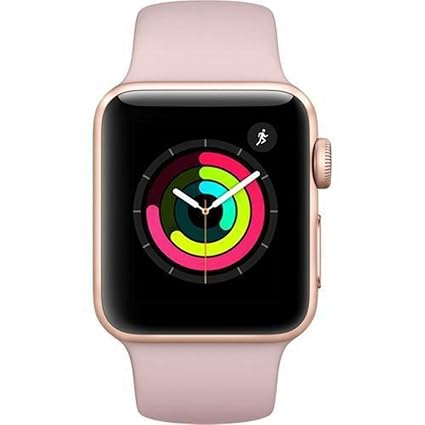
# Radial Progress Bar
Radial ProgressBar inspired by Apple Watch OS. It is highly Customisable
### Preview of Radial Progress Bar

[](https://mindorks.com/open-source-projects)
[](https://mindorks.com/join-community)
[](https://opensource.org/licenses/Apache-2.0)
## Getting Started
##### Step 1. Add the JitPack repository to your Add it in your root `build.gradle` at the end of repositories:
```
allprojects {
repositories {
maven { url 'https://jitpack.io' }
}
}
```
##### Step 2. Add the dependency
```
dependencies {
implementation 'com.github.MindorksOpenSource:RadialProgressBar:v1.3'
}
```
##### Step3. To use this in XML File, use
```
```
##### Step 4. Link the XML in Activity File using,
```
val radialProgressBar = findViewById(R.id.progress_view)
or
RadialProgressBar rpb = findViewById(R.id.progress_view) //if using Java
```
thats it and how you can use the RadialProgressView in your project.
#### To Customise it according to your need you can use,
| Feature | XML | Activity (Java/Koltin) |Default|
| :------------- |:------------- | :----- |:----
|Set Start Angle OuterView|app:outerProgressStartAngle="angle"|rpb.setStartAngleOuterView(angle)|270|
|Set Start Angle CenterView|app:centerProgressStartAngle="angle"|rpb.setStartAngleCenterView(angle)|270|
|Set Start Angle InnerView|app:innerProgressStartAngle="angle"|rpb.setStartAngleInnerView(angle)|270|
|Set EmptyProgressColorOuterView|app:outerEmptyProgressColor="color"|rpb.setEmptyProgressColorOuterView(color)|#F5F5F5|
|Set EmptyProgressColorCenterView|app:centerEmptyProgressColor="color"|rpb.setEmptyProgressColorCenterView(color)|#F5F5F5|
|Set EmptyProgressColorInnerView|app:innerEmptyProgressColor="color"|rpb.setEmptyProgressColorInnerView(color)|#F5F5F5|
|Set MaxProgressOuterView|app:outerMaxProgress="Integer"|rpb.setMaxProgressOuterView(Integer)|100|
|Set MaxProgressCenterView|app:centerMaxProgress="Integer"|rpb.setMaxProgressCenterView(Integer)|100|
|Set MaxProgressInnerView|app:innerMaxProgress="Integer"|rpb.setMaxProgressInnerView(Integer)|100|
|Set OuterProgress|app:outerProgress="Integer"|rpb.setOuterProgress(Integer)|0|
|Set CenterProgress|app:centerProgress="Integer"|rpb.setCenterProgress(Integer)|0|
|Set InnerProgress|app:innerProgress="Integer"|rpb.setInnerProgress(Integer)|0|
|Set OuterProgressColor|app:outerProgressColor="color"|rpb.setOuterProgressColor(listOfColor)|#f52e67|
|Set CenterProgressColor|app:centerProgressColor="color"|rpb.setCenterProgressColor(listOfColor)|#c2ff07|
|Set InnerProgressColor|app:innerProgressColor="color"|rpb.setInnerProgressColor(listOfColor)|#0dffab|
|Set Elevation|app:hasElevation="true/false"|rpb.hasElevation(true/false)|false|
|Set EmptyProgressBar|app:hasEmptyProgressBar="true/false"|rpb.hasEmptyProgressBar(true/false)|false|
|Set Animation|app:isAnimationOn="true/false"|rpb.setAnimationInProgressView(true/false)|true|
|Set RoundedCorner|app:useRoundedCorners="true/false"|rpb.useRoundedCorners(true/false)|true|
|Set ProgressValues|----|rpb.setProgressValues(int,int,int)|----|
|Set MaxProgressValues|----|rpb.setMaxProgressValues(int,int,int)|----|
|Set Only OuterProgress|app:hasOneProgressView="true/false"|rpb.setOneProgressView(true/false)|false|
|Set Only Outer and CenterProgress|app:hasTwoProgressView="true/false"|rpb.setTwoProgressView(true/false)|false|
|Set Circle Thickness***|app:circleThickness="float"|rpb.setCircleThickness(float)|1f|
|Set Circle Padding|app:circlePadding="float"|rpb.setCirclePadding(float)|10f|
> **angle = 0/90/180/270
> ***circleThickness between 0f to 1f
You can also get value related to the RadialProgressView,
| Feature | Value |
| :------------- |:------------- |
|Get Outer Progress|rpb.getOuterProgress()|
|Get Inner Progress|rpb.getInnerProgress()|
|Get Center Progress|rpb.getCenterProgress()|
|Get Start Angle OuterProgress|rpb.getStartAngleOuterView()|
|Get Start Angle InnerProgress|rpb.getStartAngleInnerView()|
|Get Start Angle CenterProgress|rpb.getStartAngleCenterView()|
|Get Start Angle OuterProgress|rpb.getMaxProgressOuterView()|
|Get Start Angle InnerProgress|rpb.getMaxProgressInnerView()|
|Get Start Angle CenterProgress|rpb.getMaxProgressCenterView()|
###
For Gradient Shade,
```
val outerColor = ArrayList()
outerColor.add(Color.parseColor("#fbab00"))
outerColor.add(Color.parseColor("#f5004b"))
progress.setOuterProgressColor(outerColor)
```
### Todo
- If using One progressbar, user can also have an option to display the value in text
## If this library helps you in anyway, show your love :heart: by putting a :star: on this project :v:
[Check out Mindorks awesome open source projects here](https://mindorks.com/open-source-projects)
Contributor
* [Himanshu Singh](https://github.com/hi-manshu)
* [Akshay Nandwana](https://github.com/anandwana001)