https://github.com/ParamoshkinAndrew/ReactNativeCircleCheckbox
Circle checkbox component for React Native
https://github.com/ParamoshkinAndrew/ReactNativeCircleCheckbox
Last synced: 12 months ago
JSON representation
Circle checkbox component for React Native
- Host: GitHub
- URL: https://github.com/ParamoshkinAndrew/ReactNativeCircleCheckbox
- Owner: paramoshkinandrew
- License: mit
- Created: 2016-01-21T05:41:48.000Z (over 10 years ago)
- Default Branch: master
- Last Pushed: 2018-04-24T11:17:13.000Z (about 8 years ago)
- Last Synced: 2024-04-29T16:09:01.806Z (about 2 years ago)
- Language: JavaScript
- Size: 55.7 KB
- Stars: 46
- Watchers: 3
- Forks: 14
- Open Issues: 1
-
Metadata Files:
- Readme: README.md
- License: LICENSE
Awesome Lists containing this project
- awesome-react-native - react-native-circle-checkbox ★37 - Circle checkbox component for React Native (Components / UI)
- awesome-react-native - react-native-circle-checkbox ★37 - Circle checkbox component for React Native (Components / UI)
- awesome-react-native - react-native-circle-checkbox ★37 - Circle checkbox component for React Native (Components / UI)
- awesome-react-native - react-native-circle-checkbox ★37 - Circle checkbox component for React Native (Components / UI)
- awesome-reactnative-ui - ReactNativeCircleCheckbox
- fucking-awesome-react-native - react-native-circle-checkbox ★37 - Circle checkbox component for React Native (Components / UI)
- awesome-reactnative-ui - ReactNativeCircleCheckbox
- awesome-react-native-ui - react-native-circle-checkbox ★15 - Circle checkbox component for React Native (Components / UI)
README
ReactNativeCircleCheckbox
=========
Circle-style checkbox component for React Native.
## Installation
```
npm install react-native-circle-checkbox --save
```
## Usage
```js
import CircleCheckBox, {LABEL_POSITION} from 'react-native-circle-checkbox';
console.log('My state is: ', checked)}
labelPosition={LABEL_POSITION.RIGHT}
label="Checkbox example"
/>
```
## Preview
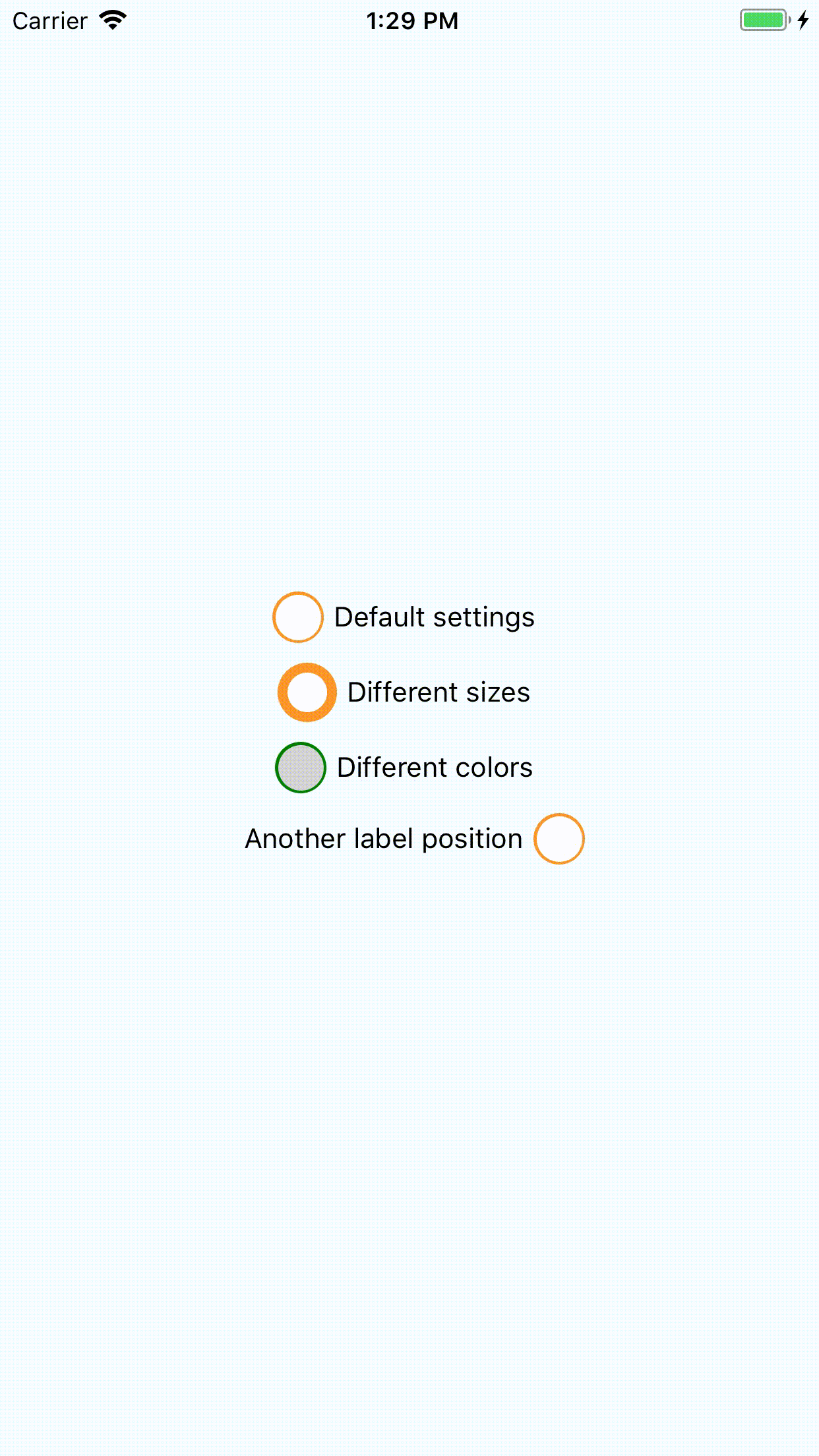
## Available properties:
- `checked` : initial state of checkbox. Default: `false`
- `onToggle` : function that will be invoked by pressing to checkbox with checked property as argument.
- `outerSize` : Diameter of outer circle. Minimum: `10`, default: `26`
- `filterSize` : Diameter of underlayer circle. Minimum: `7`, default: `23`
- `innerSize` : Diameter of flag. Minimum: `2`, default: `18`
- `outerColor` : Color of outer circle. Default: `#FC9527`
- `filterColor` : Color of underlayer circle. Default: `#FFF`
- `innerColor` : Color of flag. Default: `#FC9527`
- `label` : Checkbox label. Default: empty
- `labelPosition` : Label rendering position. Default: `right`, may be 'right' or 'left'. For your convenience this package exports `LABEL_POSITION` object with two keys - `RIGHT` and `LEFT`. You can use it for `labelPosition` definition.
- `styleCheckboxContainer`: Styles for checkbox container.
- `styleLabel`: Styles for label.