https://github.com/PramodJoshi/toggle_switch
A simple toggle switch widget for Flutter.
https://github.com/PramodJoshi/toggle_switch
Last synced: about 1 year ago
JSON representation
A simple toggle switch widget for Flutter.
- Host: GitHub
- URL: https://github.com/PramodJoshi/toggle_switch
- Owner: PramodJoshi
- License: mit
- Created: 2019-11-18T22:47:59.000Z (over 6 years ago)
- Default Branch: master
- Last Pushed: 2024-03-25T19:15:02.000Z (about 2 years ago)
- Last Synced: 2024-08-01T12:24:52.182Z (over 1 year ago)
- Language: Dart
- Homepage: https://pub.dev/packages/toggle_switch
- Size: 1.08 MB
- Stars: 112
- Watchers: 2
- Forks: 61
- Open Issues: 3
-
Metadata Files:
- Readme: README.md
- Changelog: CHANGELOG.md
- License: LICENSE
Awesome Lists containing this project
README
# Toggle Switch
A simple toggle switch widget. It can be fully customized with desired icons, width, colors, text, corner radius, animation etc. It also maintains selection state.
## Getting Started
In the `pubspec.yaml` of your flutter project, add the following dependency:
```yaml
dependencies:
...
toggle_switch: ^2.3.0
```
Import it:
```dart
import 'package:toggle_switch/toggle_switch.dart';
```
## Usage Examples
### Basic toggle switch
```dart
// Here, default theme colors are used for activeBgColor, activeFgColor, inactiveBgColor and inactiveFgColor
ToggleSwitch(
initialLabelIndex: 0,
totalSwitches: 3,
labels: ['America', 'Canada', 'Mexico'],
onToggle: (index) {
print('switched to: $index');
},
),
```

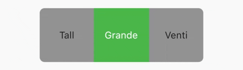
### Basic toggle switch with custom height and font size
```dart
ToggleSwitch(
minWidth: 90.0,
minHeight: 90.0,
fontSize: 16.0,
initialLabelIndex: 1,
activeBgColor: [Colors.green],
activeFgColor: Colors.white,
inactiveBgColor: Colors.grey,
inactiveFgColor: Colors.grey[900],
totalSwitches: 3,
labels: ['Tall', 'Grande', 'Venti'],
onToggle: (index) {
print('switched to: $index');
},
),
```
### With text or icon and custom widths
```dart
ToggleSwitch(
customWidths: [90.0, 50.0],
cornerRadius: 20.0,
activeBgColors: [[Colors.cyan], [Colors.redAccent]],
activeFgColor: Colors.white,
inactiveBgColor: Colors.grey,
inactiveFgColor: Colors.white,
totalSwitches: 2,
labels: ['YES', ''],
icons: [null, FontAwesomeIcons.times],
onToggle: (index) {
print('switched to: $index');
},
),
```

### With icons, text and different active background colors
```dart
ToggleSwitch(
minWidth: 90.0,
initialLabelIndex: 1,
cornerRadius: 20.0,
activeFgColor: Colors.white,
inactiveBgColor: Colors.grey,
inactiveFgColor: Colors.white,
totalSwitches: 2,
labels: ['Male', 'Female'],
icons: [FontAwesomeIcons.mars, FontAwesomeIcons.venus],
activeBgColors: [[Colors.blue],[Colors.pink]],
onToggle: (index) {
print('switched to: $index');
},
),
```

### With border color, border width, icons, custom height and different active background colors
```dart
ToggleSwitch(
minWidth: 90.0,
minHeight: 70.0,
initialLabelIndex: 2,
cornerRadius: 20.0,
activeFgColor: Colors.white,
inactiveBgColor: Colors.grey,
inactiveFgColor: Colors.white,
totalSwitches: 3,
icons: [
FontAwesomeIcons.mars,
FontAwesomeIcons.venus,
FontAwesomeIcons.transgender
],
iconSize: 30.0,
borderWidth: 2.0,
borderColor: [Colors.blueGrey],
activeBgColors: [[Colors.blue], [Colors.pink], [Colors.purple]],
onToggle: (index) {
print('switched to: $index');
},
),
```

### With gradient border color, divider color and gradient active background colors
```dart
ToggleSwitch(
minWidth: 90.0,
minHeight: 70.0,
initialLabelIndex: 0,
cornerRadius: 20.0,
activeFgColor: Colors.white,
inactiveBgColor: Colors.grey,
inactiveFgColor: Colors.white,
totalSwitches: 3,
icons: [
FontAwesomeIcons.facebook,
FontAwesomeIcons.twitter,
FontAwesomeIcons.instagram
],
iconSize: 30.0,
borderColor: [Color(0xff3b5998), Color(0xff8b9dc3), Color(0xff00aeff), Color(0xff0077f2), Color(0xff962fbf), Color(0xff4f5bd5)],
dividerColor: Colors.blueGrey,
activeBgColors: [[Color(0xff3b5998), Color(0xff8b9dc3)], [Color(0xff00aeff), Color(0xff0077f2)], [Color(0xfffeda75), Color(0xfffa7e1e), Color(0xffd62976), Color(0xff962fbf), Color(0xff4f5bd5)]],
onToggle: (index) {
print('switched to: $index');
},
),
```

### With bounceInOut animation
```dart
ToggleSwitch(
minWidth: 90.0,
minHeight: 70.0,
initialLabelIndex: 0,
cornerRadius: 20.0,
activeFgColor: Colors.white,
inactiveBgColor: Colors.grey,
inactiveFgColor: Colors.white,
totalSwitches: 2,
icons: [
FontAwesomeIcons.lightbulb,
FontAwesomeIcons.solidLightbulb,
],
iconSize: 30.0,
activeBgColors: [[Colors.black45, Colors.black26], [Colors.yellow, Colors.orange]],
animate: true, // with just animate set to true, default curve = Curves.easeIn
curve: Curves.bounceInOut, // animate must be set to true when using custom curve
onToggle: (index) {
print('switched to: $index');
},
),
```

### With radius style
```dart
ToggleSwitch(
minWidth: 90.0,
cornerRadius: 20.0,
activeBgColors: [[Colors.green[800]!], [Colors.red[800]!]],
activeFgColor: Colors.white,
inactiveBgColor: Colors.grey,
inactiveFgColor: Colors.white,
initialLabelIndex: 1,
totalSwitches: 2,
labels: ['True', 'False'],
radiusStyle: true,
onToggle: (index) {
print('switched to: $index');
},
),
```

### With custom text styles, null initial label, double tap to de-activate
```dart
ToggleSwitch(
minWidth: 90.0,
cornerRadius: 20.0,
inactiveFgColor: Colors.white,
initialLabelIndex: null,
doubleTapDisable: true, // re-tap active widget to de-activate
totalSwitches: 3,
labels: ['Normal', 'Bold', 'Italic'],
customTextStyles: [
null,
TextStyle(
color: Colors.brown,
fontSize: 18.0,
fontWeight: FontWeight.w900),
TextStyle(
color: Colors.black,
fontSize: 16.0,
fontStyle: FontStyle.italic)
],
onToggle: (index) {
print('switched to: $index');
},
),
```

### With custom icons
```dart
ToggleSwitch(
minWidth: 90.0,
minHeight: 90.0,
cornerRadius: 20.0,
activeBgColors: [
[Color(0xfffdbb0a)],
[Colors.black54],
[Colors.white54]
],
inactiveFgColor: Colors.white,
initialLabelIndex: 2,
totalSwitches: 3,
customIcons: [
Icon(
FontAwesomeIcons.ccVisa,
color: Color(0xff1a1f71),
size: 55.0,
),
Icon(
FontAwesomeIcons.ccMastercard,
color: Color(0xffF79E1B),
size: 55.0,
),
Icon(
FontAwesomeIcons.ccAmex,
color: Color(0xff27AEE3),
size: 55.0,
)
],
onToggle: (index) {
print('switched to: $index');
},
),
```

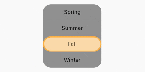
### Vertical toggle switch with active border
```dart
ToggleSwitch(
activeBorders: [
Border.all(
color: Colors.purple,
width: 3.0,
),
Border.all(
color: Colors.yellow.shade700,
width: 3.0,
),
Border.all(
color: Colors.deepOrangeAccent,
width: 3.0,
),
Border.all(
color: Colors.blue.shade500,
width: 3.0,
),
],
activeFgColor: Colors.black54,
isVertical: true,
minWidth: 150.0,
radiusStyle: true,
cornerRadius: 20.0,
initialLabelIndex: 2,
activeBgColors: [
[Colors.purpleAccent],
[Colors.yellow],
[Colors.orange],
[Colors.lightBlueAccent]
],
labels: ['Spring', 'Summer', 'Fall', 'Winter'],
onToggle: (index) {
print('switched to: $index');
},
),
```
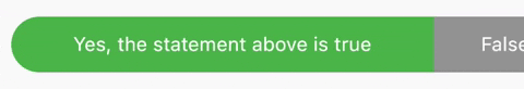
### Custom widths greater than device width
```dart
SingleChildScrollView(
scrollDirection: Axis.horizontal,
child: Scrollbar(
child: Padding(
padding: const EdgeInsets.symmetric(horizontal: 10.0),
child: ToggleSwitch(
customWidths: [300.0, 100.0, 100.0],
cornerRadius: 20.0,
activeBgColors: [
[Colors.green],
[Colors.redAccent],
[Colors.blue]
],
activeFgColor: Colors.white,
inactiveBgColor: Colors.grey,
inactiveFgColor: Colors.white,
labels: ['Yes, the statement above is true', 'False', 'Other'],
onToggle: (index) {
print('switched to: $index');
},
),
),
),
),
```
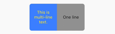
### Multi-line text with custom text style inheriting activeFgColor and inactiveFgColor
```dart
ToggleSwitch(
initialLabelIndex: 0,
minHeight: 100.0,
minWidth: 100.0,
activeBgColor: [Colors.blueAccent.shade200],
activeFgColor: Colors.yellow,
customTextStyles: [
TextStyle(
fontSize: 15.0
)
],
multiLineText: true,
centerText: true,
totalSwitches: 2,
labels: ['This is multi-line text.', 'One line'],
onToggle: (index) {
print('switched to: $index');
},
),
```
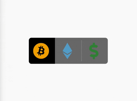
### Cancel toggle
```dart
ToggleSwitch(
initialLabelIndex: 0,
inactiveBgColor: Colors.black54,
activeBgColor: [Colors.black],
totalSwitches: 3,
minHeight: 80.0,
minWidth: 80.0,
customIcons: [
Icon(
FontAwesomeIcons.bitcoin,
color: Color(0xFFF2A900),
size: 50.0,
),
Icon(
FontAwesomeIcons.ethereum,
color: Color(0xFF5ca6ce),
size: 50.0,
),
Icon(
FontAwesomeIcons.dollarSign,
color: Colors.green.shade700,
size: 50.0,
)
],
onToggle: (index) {
print('switched to: $index');
},
cancelToggle: (index) async {
String selection = index == 0
? 'Bitcoin'
: index == 1
? 'Ethereum'
: 'Fiat';
return await showDialog(
context: context,
builder: (dialogContext) => AlertDialog(
content: Text("Select $selection?"),
actions: [
TextButton(
child: Text("No",
style: TextStyle(color: Colors.red)),
onPressed: () {
Navigator.pop(dialogContext, true);
}),
TextButton(
child: Text("Yes",
style: TextStyle(color: Colors.black)),
onPressed: () {
Navigator.pop(dialogContext, false);
})
],
),
);
},
),
```
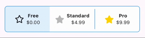
### Custom widgets
```dart
ToggleSwitch(
initialLabelIndex: 0,
minHeight: 75.0,
minWidth: double.maxFinite,
activeBgColor: [Colors.blue.shade50],
inactiveBgColor: Colors.white,
dividerColor: Colors.blue,
borderColor: [Colors.blue],
borderWidth: 1.0,
customWidgets: [
// Overrides default widgets, foreground colors
Row(
mainAxisAlignment: MainAxisAlignment.center,
children: [
Icon(
FontAwesomeIcons.star,
),
const SizedBox(width: 10.0),
Column(
mainAxisAlignment: MainAxisAlignment.center,
children: [
Text(
'Free',
style: TextStyle(
fontWeight: FontWeight.bold,
),
maxLines: 1,
overflow: TextOverflow.ellipsis,
),
Text(
'\$0.00',
maxLines: 1,
overflow: TextOverflow.ellipsis,
),
],
),
],
),
Row(
mainAxisAlignment: MainAxisAlignment.center,
children: [
Icon(
FontAwesomeIcons.solidStar,
color: Color(0xffC0C0C0),
),
const SizedBox(width: 10.0),
Column(
mainAxisAlignment: MainAxisAlignment.center,
children: [
Text(
'Standard',
style: TextStyle(
fontWeight: FontWeight.bold,
),
maxLines: 1,
overflow: TextOverflow.ellipsis,
),
Text(
'\$4.99',
maxLines: 1,
overflow: TextOverflow.ellipsis,
),
],
),
],
),
Row(
mainAxisAlignment: MainAxisAlignment.center,
children: [
Icon(
FontAwesomeIcons.solidStar,
color: Color(0xffFFD700),
),
const SizedBox(width: 10.0),
Column(
mainAxisAlignment: MainAxisAlignment.center,
children: [
Text(
'Pro',
style: TextStyle(
fontWeight: FontWeight.bold,
),
maxLines: 1,
overflow: TextOverflow.ellipsis,
),
Text(
'\$9.99',
maxLines: 1,
overflow: TextOverflow.ellipsis,
),
],
),
],
),
],
onToggle: (index) {
print('switched to: $index');
},
),
```
### TextDirection.rtl and corner radius
```dart
// When ToggleSwitch is used with Directionality widget and textDirection is set to TextDirection.rtl (right-to-left),
// switches are displayed right to left along with their respective index values. In this case, corner radius of switches aren't set correctly.
// To fix this, please use textDirectionRTL parameter and set it to true as shown in the example below.
Directionality(
textDirection: TextDirection.rtl,
child: ToggleSwitch(
initialLabelIndex: 0,
cornerRadius: 12.0,
textDirectionRTL: true,
activeFgColor: Colors.white,
totalSwitches: 2,
labels: ['left', 'right'],
onToggle: (index) {
print('switched to: $index');
},
),
),
```
### setState() inside onToggle
[Example code with explanation](https://github.com/PramodJoshi/toggle_switch/issues/11#issuecomment-679277018)
## Code Contributors
[](https://github.com/PramodJoshi/toggle_switch/graphs/contributors)