https://github.com/TakeScoop/SwiftyButton
Simple and customizable button in Swift
https://github.com/TakeScoop/SwiftyButton
ios mobile swift uibutton uikit
Last synced: 11 months ago
JSON representation
Simple and customizable button in Swift
- Host: GitHub
- URL: https://github.com/TakeScoop/SwiftyButton
- Owner: TakeScoop
- License: mit
- Created: 2015-11-16T23:44:49.000Z (over 10 years ago)
- Default Branch: master
- Last Pushed: 2021-08-07T05:53:38.000Z (almost 5 years ago)
- Last Synced: 2024-12-05T20:03:10.306Z (over 1 year ago)
- Topics: ios, mobile, swift, uibutton, uikit
- Language: Swift
- Size: 234 KB
- Stars: 553
- Watchers: 46
- Forks: 43
- Open Issues: 10
-
Metadata Files:
- Readme: README.md
- Changelog: CHANGELOG.md
- License: LICENSE
Awesome Lists containing this project
- awesome-ios - SwiftyButton - Simple and customizable button in Swift (UI / Button)
- awesome-ios-star - SwiftyButton - Simple and customizable button in Swift (UI / Button)
- awesome-swift - SwiftyButton - Simple and customizable button component. (UI and SwiftUI)
- fucking-awesome-ios - SwiftyButton - Simple and customizable button in Swift (UI / Button)
- awesome-swift - SwiftyButton - Simple and customizable button in Swift (UI)
README
SwiftyButton
============
**Maintainer(s):** [@nickm01](https://github.com/nickm01) [@pmacro](https://github.com/pmacro) [@aryamansharda](https://github.com/aryamansharda)
Simple and customizable button in Swift.

[](https://github.com/Carthage/Carthage)
Installation
------------
Cocoapods
```
pod 'SwiftyButton'
```
Carthage
```
github 'TakeScoop/SwiftyButton'
```
Usage
-----
### Flat Button

```swift
let button = FlatButton()
button.color = .cyan
button.highlightedColor = .blue
button.cornerRadius = 5
```
### Pressable Button

```swift
let button = PressableButton()
button.colors = .init(button: .cyan, shadow: .blue)
button.shadowHeight = 5
button.cornerRadius = 5
```
### All Properties
Here is a list of all the properties that you can modify. Those are all editable directly from Interface Builder. See `FlatButton.Defaults` or `PressableButton.Defaults` to set defaults for those properties.
#### `FlatButton`
```swift
button.color = .cyan
button.highlightedColor = .cyan
button.selectedColor = .blue
button.disabledButtonColor = .gray
button.cornerRadius = 8
```
#### `PressableButton`
```swift
button.colors = .init(button: .cyan, shadow: .blue)
button.disabledColors = .init(button: .gray, shadow: .darkGray)
button.shadowHeight = 10
button.cornerRadius = 8
button.depth = 0.5 // In percentage of shadowHeight
```
### Interface Builder (Storyboard/XIB)
Add a `UIButton` as usual, then:
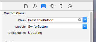
- Modify the underlying class to `FlatButton/PressableButton`, and that the module is set to `SwiftyButton`
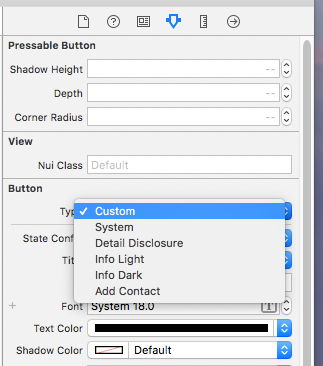
- Make sure that the button type is set to `Custom`
Defaults
--------
You can set defaults that will be applied for any new instance of SwiftyButton by modifying the `FlatButton.Defaults` or `PressableButton.Defaults` structure:
```swift
FlatButton.Defaults.color = .cyan
PressableButton.Defaults.cornerRadius = 8
...
```
Custom Content
--------------

Use `CustomPressableButton` to add custom content in a Swifty Button.
This is a subclass of `SwiftyButton` that exposes a content view that moves when the button state changes. All you have to do is add your views inside `button.contentView` and setup layout constraints relative to this view.
### Install
```
pod `SwiftyButton/CustomContent`
```
### Usage
Here is how you would create a button similar to the one above (here we used [PureLayout](https://github.com/PureLayout/PureLayout) for constraints):
```swift
let button = CustomPressableButton()
let indicator = UIActivityIndicatorView(activityIndicatorStyle: .white)
button.contentView.addSubview(indicator)
indicator.autoPinEdgesToSuperviewEdges(with: UIEdgeInsets(top: 10, left: 15, bottom: 10, right: 0), excludingEdge: .right)
indicator.startAnimating()
let label = UILabel()
button.contentView.addSubview(label)
label.autoPinEdgesToSuperviewEdges(with: UIEdgeInsets(top: 10, left: 0, bottom: 10, right: 10), excludingEdge: .left)
label.autoPinEdge(.left, to: .right, of: indicator, withOffset: 10)
label.text = "Loading..."
label.textColor = .white
```
### Known limitations
- `PressableButton` only works with plain colors (no alpha / transparency) because of the way its background image is rendered. See [#2](https://github.com/TakeScoop/SwiftyButton/issues/2)
- `PressableButton` manages title and image insets automatically (`titleEdgeInsets` and `imageEdgeInsets`). See [#5](https://github.com/TakeScoop/SwiftyButton/issues/15)
- User-specified inset values for `top` and `bottom` will be overridden.
- You may specify inset values for `left` and `right`.
More examples
-------------
Look at the [Examples](Examples/) folder to see more button examples.
Contribute
----------
### Publishing a new version
Here's an example of a version bump: [bump to 0.8.0](https://github.com/TakeScoop/SwiftyButton/commit/d6e85522835db6f4c39e4c3ee8114d37f6dc9531).
Replace `NEW_VERSION` with the version you're about to publish.
- Checkout the `master` branch and ensure it's up-to-date.
- Open `SwiftyButton.xcworkspace` and edit settings for the `SwiftyButton` target. Change the target version to `NEW_VERSION`.
- Open `CHANGELOG.md` and add a new section `[NEW_VERSION]`. At the bottom of the document, copy a version anchor and link to the new version tag (which we'll create later). Insert a new empty `[master]` section on top.
- Open `SwiftyButton.podspec` and edit `s.version` to `NEW_VERSION`.
- Commit your changes as `Bump to NEW_VERSION`.
- Create a new git tag named `NEW_VERSION` and push your commit + tag to Github.
- Push the new pod version with `$ pod trunk push ./`
License
-------
This project is copyrighted under the MIT license. Complete license can be found here:
Credits
-------
- Inspired by HTPressableButton:
- Colors used in examples come from