https://github.com/abhilash-chandran/number_inc_dec
A flutter widget to accept numeric inputs with button to increment and decrement.
https://github.com/abhilash-chandran/number_inc_dec
decrement flutter increment number-inc-dec widget
Last synced: 2 months ago
JSON representation
A flutter widget to accept numeric inputs with button to increment and decrement.
- Host: GitHub
- URL: https://github.com/abhilash-chandran/number_inc_dec
- Owner: Abhilash-Chandran
- License: mit
- Created: 2020-05-22T10:23:44.000Z (about 5 years ago)
- Default Branch: master
- Last Pushed: 2024-06-06T07:33:06.000Z (12 months ago)
- Last Synced: 2025-03-19T09:14:33.562Z (3 months ago)
- Topics: decrement, flutter, increment, number-inc-dec, widget
- Language: Dart
- Homepage: https://pub.dev/packages/number_inc_dec
- Size: 10.7 MB
- Stars: 10
- Watchers: 2
- Forks: 7
- Open Issues: 12
-
Metadata Files:
- Readme: README.md
- Changelog: CHANGELOG.md
- License: LICENSE
Awesome Lists containing this project
README

[](https://pub.dev/packages/number_inc_dec)
[](https://codecov.io/gh/Abhilash-Chandran/number_inc_dec)

# number_inc_dec
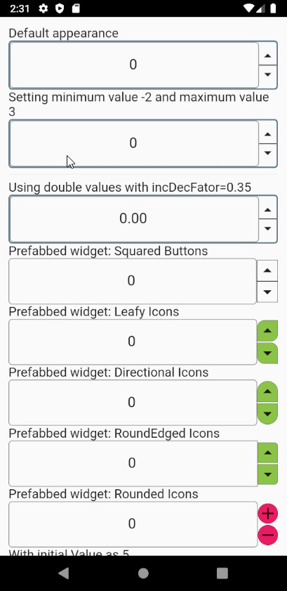
A flutter widget that accepts numbers along with buttons to increment and decrement. This is a simple TextFormField with buttons and logic to handle factored increments/decrements and with some additional properties like minimum and maximum allowed value. The factor of incrementing/decrementing is also configurable.
Please check the [example](https://pub.dev/packages/number_inc_dec/example) section which provides granular examples for each options.
> If you like this package give it a thumbs-up 👍.
## Breaking Changes from v0.7.x
Some major changes are introduced. I am bumping the version to 0.7.x because following changes may break existing users. Please do report for any issues in the repository, which I will try to address.
1. `autovalidate` has been replaced with `autovalidateMode`. More details in TextFormField [docs](https://api.flutter.dev/flutter/material/TextFormField-class.html)
* In your code replace `autovalidate: true` to `autovalidateMode: AutovalidateMode.always`
* In your code replace `autovalidate: false` to `autovalidateMode: AutovalidateMode.disabled`
2. `autovalidateMode` is by default set to `always`. The morale behind this is to perform validations similar to html's `` tag kind validation performed in chrome. Its not upto the specification but at least mimics to its best.
3. New attribute `enableMinMaxClamping` is created to and handles the behaviour of clamping the values to `min` and `max` when provided. For example if `min` is -2 and user enter -5 this is auto-corrected to -2. By default this is attribute is set to `true`.
4. New attribute `onChanged` is introduced which when provided will be called whenever the user edits the value. Note this callback will not be called if any validation error exists.
5. By default the numbers will be validated for stepped increments like in browser and suggest valid nearest possible values. The intention is to mimic the behaviour of number field in Chrome.
## Getting Started
1. Install the latest version of the package by adding it to `pubspec.yaml` as noted in the [install](https://pub.dev/packages/number_inc_dec/install) page.
2. Import the `number_inc_dec.dart` as follows `import 'package:number_inc_dec/number_inc_dec.dart';`.
3. Utilize the `NumberIncrementDecrement` as usual like any other flutter widget.
- e.g.
```dart
NumberInputWithIncrementDecrement(
controller: TextEditingController(),
min: -3,
max: 3,
),
```
## Demo with different options
Check the [examples](https://pub.dev/packages/number_inc_dec/example) sections for the corresponding code snippets.
## Configurable options
` NumberInputWithIncrementDecrement`widget comes with some configurable options. The same configurations are application for `NumberInputPrefabbed` widgets.
| Property | Type | Purpose | Default Value |
| --------------------------- | ----------------------- | ---------------------------------------------------------------------------------------------------------------------------------------------------------------------------------------------------------------------------------------------------------------------------------------------------------------------------------------------------------------------------------------------------- | ----------------------------------------------------------------------------------------------------------------------------------------------------------------------------------------------------------------- |
| `controller` | `TextEditingController` | A mandatory text editing controller to be used by the TextFormField. | This is a mandatory field because its the easiest way to access the field's value, when not using a Form widget. |
| `buttonArrangement` | `ButtonArrangement` | Decides the layout of the increment/decrement buttons. Following values are possible.
1. leftEnd
2. rightEnd
3. incLeftDecRight
4.incRightDecLeft
| `ButtonArrangement.rightEnd` |
| ~~`autovalidate`~~ | ~~`bool`~~ | ~~This is passed down to the TextFormField. It auto-validates the field with the provided validators. Check TextFormField documentation for more details.~~ | ~~`true`~~ |
| `autovalidateMode` | `AutovalidateMode` | This is passed down to underlying TextFormField. However this is by default to set to `AutovalidateMode.always` to perform some default validations like `min` , `max` and `incDecFactor` based validations. This validation closely mimics html's `` tag available in chrome. | `AutovalidateMode.always` |
| `min` | `num` | Minimum acceptable value for this numeric field. Note: No error message will be shown. To show error a `validator` can be used and the widget should wrapped in `Form` widget. | `0` |
| `max` | `num` | Maximum acceptable value for this numeric field. Note: No error message will be shown. To show error a `validator` can be used and the widget should wrapped in `Form` widget. | `double.infinity` |
| `enableMinMaxClamping` | `bool` | Clamp the values to either `min` or `max` depending on which value is exceeded. e.g if `min` is 3 and `max` is 5 and user enters 7 it will clamped to 5 and if user enters 1 it will be clamped to 3. | `true` |
| `incDecFactor` | `num` | Factor by which the increment or decrement should happen. e.g. setting it 0.5 increments/decrements the field value by 0.5. This also decides what are valid steps of increment or decrement starting from the `min` value. | `1` |
| `initialValue` | `num` | An initial value to be set to the field. | `0` |
| `isInt` | `bool` | A flag to indicate if the field only accepts integer values. To use double values set this field to false. | `true` |
| `numberFieldDecoration` | `InputDecoration` | This decoration will be used by the TextFormField to handle its decoration. | An `InputDecoration` with an `OutlineInputBorder` to create a circular border. |
| `widgetContainerDecoration` | `Decoration` | This is the decoration for the `Container` that wraps this widget. | A simple `BoxDecoration` with a circular border in `Colors.bluegrey` color. |
| `enable` | bool | Passed down to the `enable` attribute of `TextFormField`. Note, this also disables the inc/dec buttons to avoid accidental changes. | `true` |
| `validator` | `FormFieldValidator` | A validator function which accepts a string and performs some validation. This is called when this field is wrapped inside a `Form` widget and called during its validate cycle. The error message to be shown should be returned form this method. | A validator that parses the number into a `int` or `double` is enabled by default. Additionally it enables a min/max validator if `enableMinMaxClamping` is false. Refer the API documentation for more details. |
| `style` | `TextStyle` | Passed down to the `style` attribute of `TextFormField` | `null` |
| `fractionDigits` | `int` | The number of digits after the decimal point. Used only if `isInt` is `false`. | `2` |
| `incIcon` | `IconData` | The icon to be used for the increment button. | Icons.arrow_drop_up |
| `decIcon` | `IconData` | The icon to be used for the decrement button. | Icons.arrow_drop_down |
| `incIconDecoration` | `Decoration` | Decoration for the Increment Icon | Defaults to a black border in the bottom and/or top depending on the `buttonArrangement`. |
| `decIconDecoration` | `Decoration` | Decoration for the decrement Icon | Defaults to a black border in the bottom and/or top depending on the `buttonArrangement`. |
| `incIconColor` | `Color` | Icon color to be used for Increment button. | Defaults to color defined in `IconTheme` |
| `decIconColor` | `Color` | Icon color to be used for Decrement button. | Defaults to color defined in `IconTheme ` |
| `incIconSize` | `double` | Icon size to be used for Increment button. | Defaults to size defined in IconTheme |
| `decIconSize` | `double` | Icon size to be used for Decrement button. | Defaults to size defined in IconTheme |
| `onIncrement` | `DiffIncDecCallBack` | A call back function to be called on successful increment. This will not be called if the internal validators fail. | `null` |
| `onDecrement` | `DiffIncDecCallBack` | A call back function to be called on successful decrement. This will not be called if the internal validators fail. | `null` |
| `onSubmitted` | `ValueCallBack` | A call back function to be called on users action denoting completion of editing the value. e.g. pressing the tick mark button. This will not be called if the internal validators fail. If `enableMinMaxClampling` is `true` and the value is entered is out of the range `min` to `max` it is corrected to be equal to either `min` or `max` - depending on which side of the range was exceeded. | `null` |
| `onChanged` | `ValueCallBack` | A call back function to be called on users action editing the value. e.g. typing a new number. This will not be called if the internal validators fail. If `enableMinMaxClampling` is `true` and the value is entered is out of the range `min` to `max` it is corrected to be equal to either `min` or `max` - depending on which side of the range was exceeded. | null |
| `scaleWidth` | `double` | A scaling factor for the width of the widget. | `1.0` |
| `scaleHeight` | `double` | A scaling factor for the height of the widget. | `1.0` |
| `separateIcons` | `bool` | Show a transparent separator between the increment & decrement buttons. | false |
| `incDecBgColor` | `Color` | Background color of the increment decrement button.
This is set to `Colors.lightGreen` for all the `NumberInputPrefabbed` widgets to capture users attention. | widget to`null` |